

Fall square nails can lose their appeal when the color is judged separately from the edge. The same shade may look crisp on a compact outline, dense on a long one, or unexpectedly soft when a pale gap interrupts it. What matters first is the relationship between the straight boundary and the amount of visual weight placed behind it, because that decides whether the manicure feels balanced before any detail is noticed.
Choose by relationship, not by the name of a shade. Ask whether the base needs warmth, coolness, light, or a pause, then decide how much surface can carry that change without becoming crowded. A practical choice leaves enough room for the color to read clearly and enough margin for ordinary growth, movement, and clothing to remain part of the overall balance.
Orange Waves Add Heat to a Pale Square
The short square base is pale and quiet, so the thin orange wave becomes the only strong color relationship on the nail. Warm saturation against a light neutral creates a quick point of focus, while the loose curve prevents the accent from feeling as rigid as the square outline. Because the mark is narrow, the base still controls most of the visual field and keeps the design easy to read.
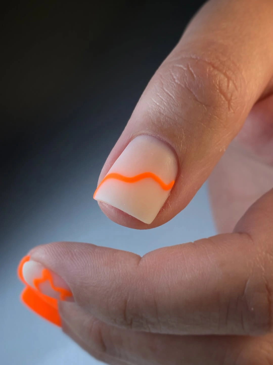
This proportion works because the orange is not repeated as a full block. On a very short nail, keep the wave broad enough to remain visible but leave the surrounding space open; on a longer square, the line can travel farther without needing extra motifs. A gray sweater, cream shirt, or denim layer would support the warm accent without competing with its clean contrast.
The limitation is line precision. A small curve can look intentional when its path is clear, but a broken or uneven edge will be more noticeable against the pale base than it would inside a dense print. If you want a softer result, shift the orange toward a muted rust; if you want more energy, keep the orange bright and reduce the number of accent nails.
Earthy Spots Fill the Square with Controlled Contrast
This medium square manicure uses a warm neutral foundation with dark brown and black leopard-like spots, so the contrast comes from pattern value rather than a bright color. The print occupies much of the nail, but the limited earthy palette keeps it from scattering in too many directions. The square edge acts like a frame, making the irregular marks feel contained rather than loose.
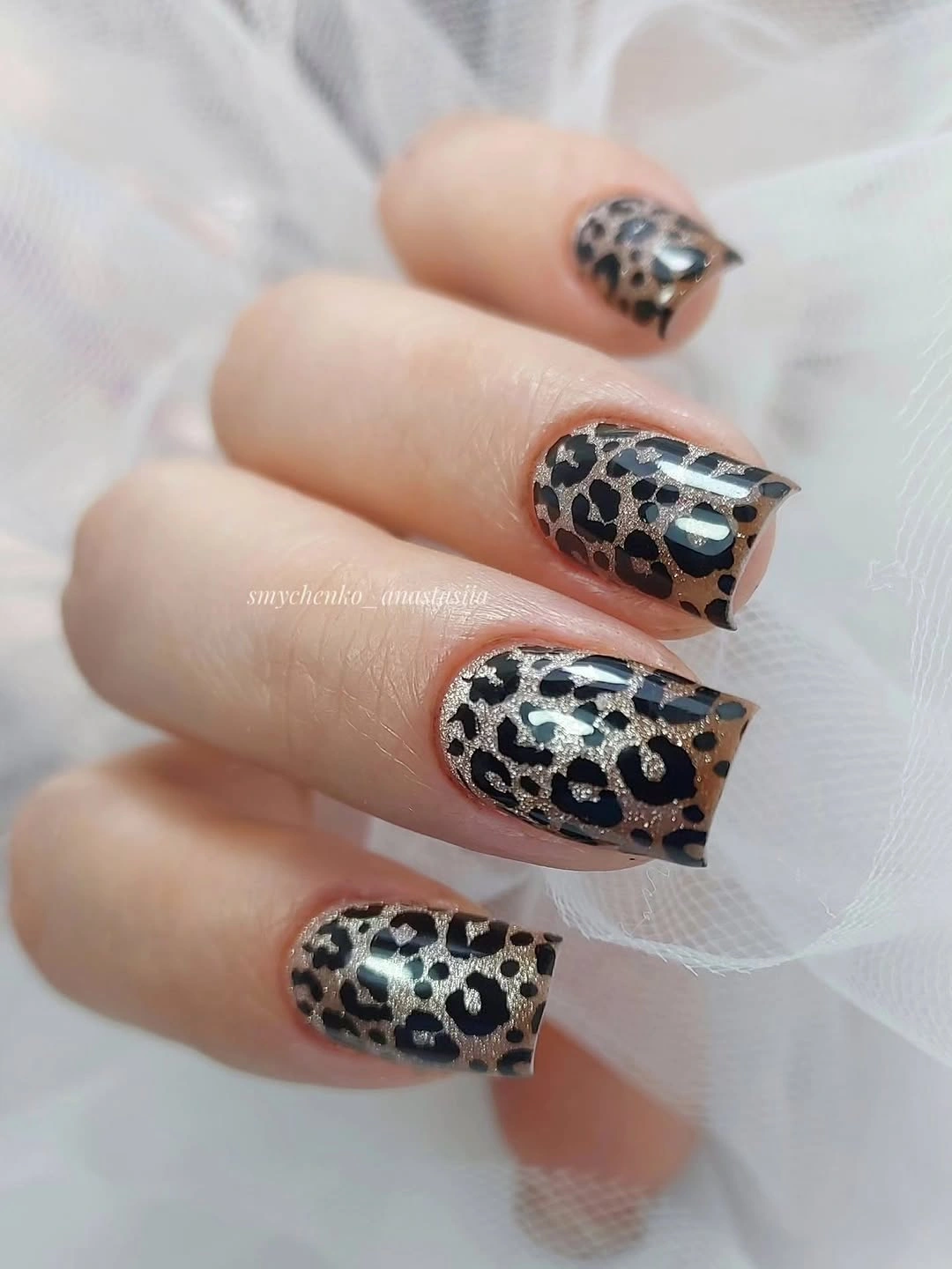
The strongest way to adapt this design is to compare density with nail length. Medium squares can hold the all-over pattern, while short squares will usually look clearer with the print on one or two accent fingers and a plain warm base elsewhere. A neutral outfit gives the spots room to function as the focal point, while another strong print could compete for the same visual attention.
Pattern repetition creates cohesion, but exact matching is not necessary. Keep the spot scale varied while preserving the same brown, black, and pale relationship, and the set will retain its character without becoming mechanically uniform. If the manicure feels too busy, remove marks before changing the palette; the earthy contrast is doing the seasonal work already.
Burgundy and Blush Create Long Vertical Rhythm
The long square silhouette is divided between deep burgundy, pale blush, and narrow light lines, so the color relationship moves vertically rather than spreading randomly. Burgundy supplies depth, blush opens the center, and the thin stripes keep the two values visually connected. The result feels graphic because the straight edges and repeated lines reinforce one another across the set.
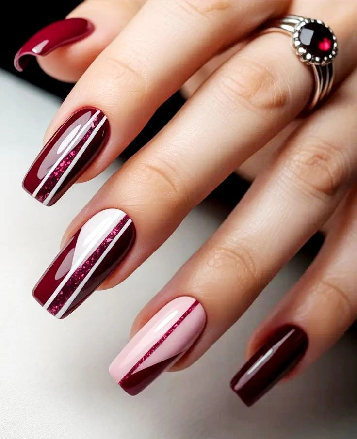
A shorter version should preserve the value order before preserving every stripe. Keep burgundy at the tip or on one accent nail, use the blush as the larger field, and let one narrow line provide the directional cue. That is the useful lesson behind many square fall nail ideas: a small square does not have enough room for several narrow panels to remain distinct.
The palette is warm and high contrast, so styling around it can stay simple. Black, cream, or muted brown would support the burgundy, while a second saturated red could flatten the difference between the base and the accent. If you want a gentler result, reduce burgundy saturation rather than adding another pale shade; the structure depends on clear value separation.
Dark Tips Give Nude Squares a Fall Shift
The short square base stays light, while burgundy is concentrated along the tips and a small edge detail appears on selected fingers. This placement creates a strong value contrast without covering the whole nail, which is why the manicure feels seasonal but still restrained. The straight edge of the square gives the dark tip a clean boundary and makes the proportion easy to evaluate.
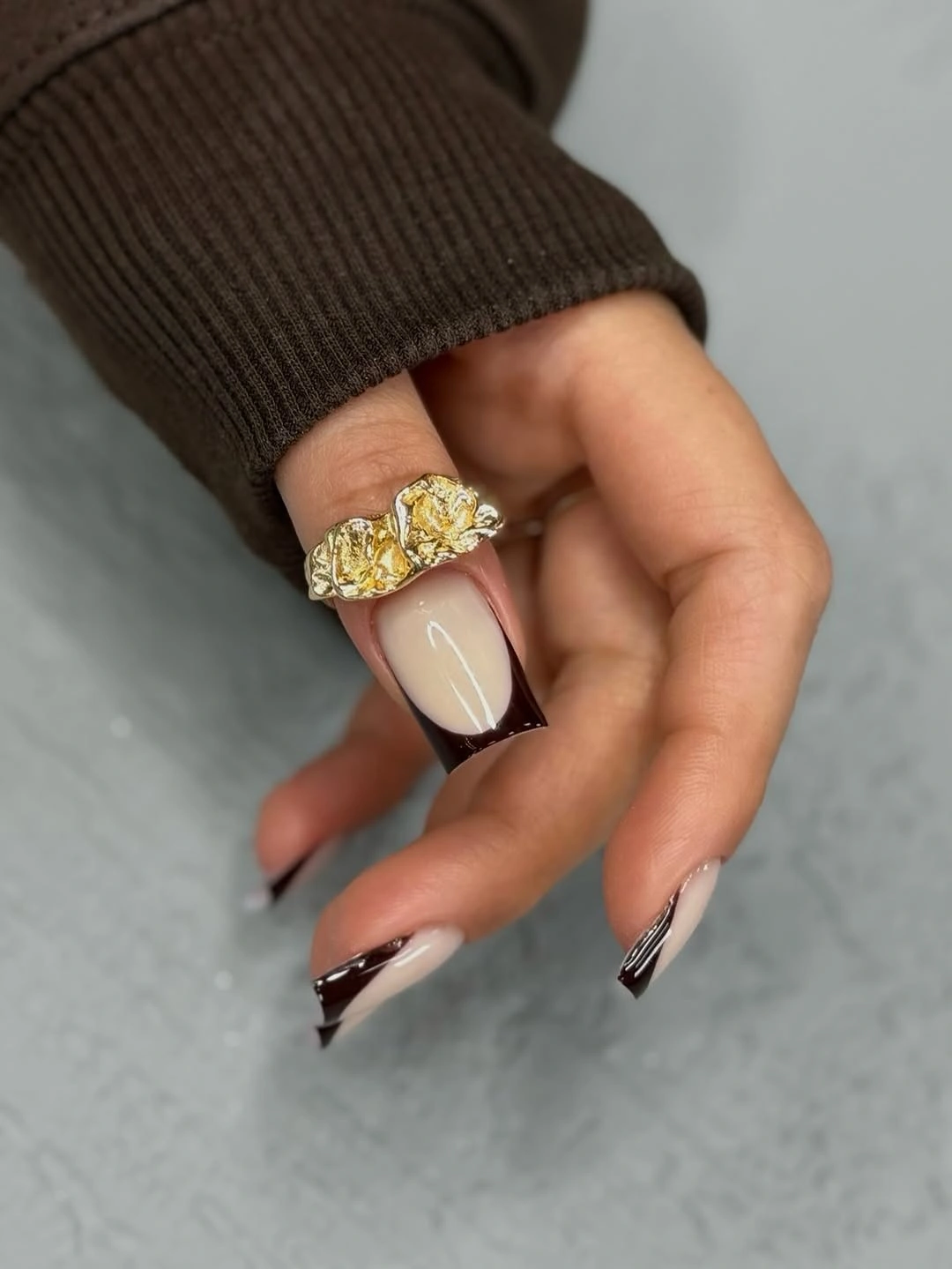
The controlled variation here is simple: keep the burgundy at the edge if you want a quiet result, or make one accent nail fully dark if you want a stronger focal point. Readers browsing square French fall nails can use the same light-center, dark-edge relationship while adjusting the curve to suit a shorter nail bed. The contrast remains readable as long as the pale base has enough room around it.
Tip placement also brings a maintenance consideration. A clean boundary will show growth and small chips more clearly than a blended surface, especially on a light base. Keep the line simple, avoid adding a second strong pattern, and let the burgundy act as a measured seasonal border rather than turning the entire square into a dark block.
Black and Gold Geometry Turns Neutral into Structure
These medium square nails use pale cream space as the background for repeated black and metallic gold square outlines. The color relationship is restrained, but the geometry adds a strong rhythm because the small frames echo the shape of the nail itself. Gold warms the contrast, while black gives the pattern enough definition to stay legible at a normal viewing distance.
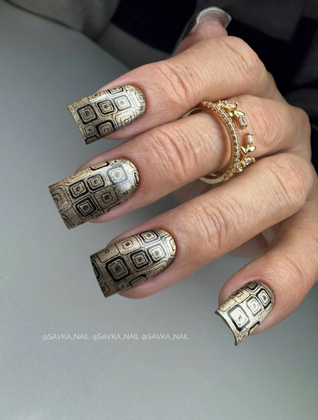
The design benefits from repetition, yet it does not require every nail to carry the same number of frames. A shorter square can keep one or two geometric accents and use a plain cream base on the rest, preserving the grid idea without compressing too many lines. Keep other accessories simple if you want the small black-gold relationship to remain the most structured detail in the look.
The tradeoff is scale. Tiny squares inside a tiny nail can blur into visual noise, while larger frames may overpower the pale base. Adjust the size of the motif before changing the palette, and remember that the square silhouette already supplies a strong geometric cue. The design works because the pattern supports the outline, not because every available space is filled.
Pink and Silver Build a Bright Framed Accent
The medium square design places vivid pink inside a narrow silver-looking border, with a darker accent appearing on selected nails. Bright saturation creates the first impression, but the reflective edge controls how that color meets the surrounding space. The result is more graphic than a solid pink manicure because the border creates a visual panel and the dark detail adds a second value.
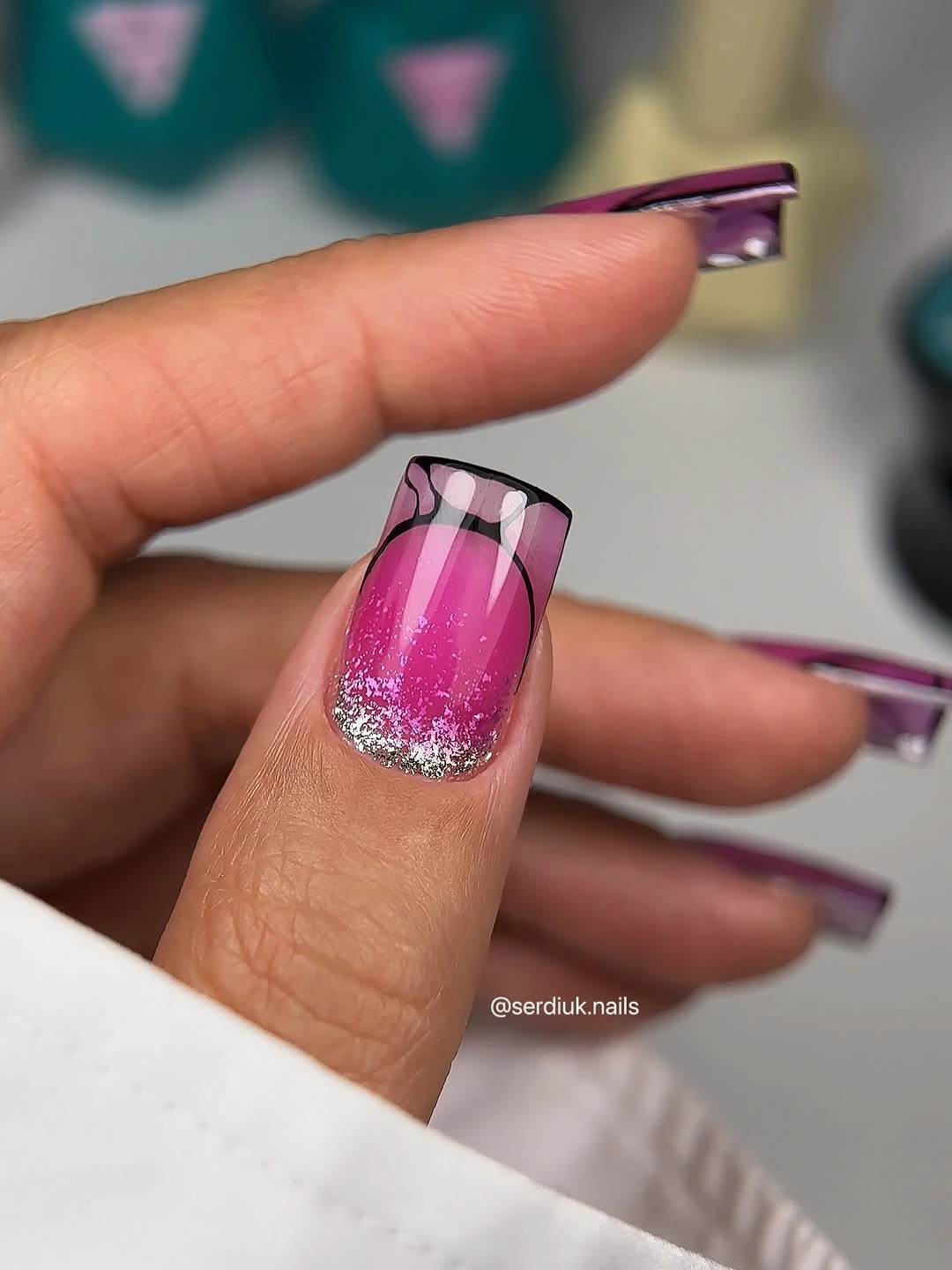
For a controlled variation, keep the bright pink on one or two accent nails and use a pale or neutral square on the rest. That preserves the framing idea while reducing the amount of high-saturation color on the hand. A shorter nail can support a single border more clearly than several narrow layers, so simplify the edge before shrinking the whole design.
Warm pink and cool reflective detail can either balance or clash depending on the surrounding colors. Gray, black, and white clothing would clarify the contrast, while several bright warm accessories could compete with the pink center. The key relationship is saturation against a reflective boundary; adding more colors would weaken the reason the design reads as a framed accent.
One Textured Nail Keeps Plum from Looking Flat
The short square set is mostly a glossy deep plum, with one accent carrying a darker dotted or grid-like texture. Because the base and accent stay close in value, the contrast comes from surface change rather than color change. That makes the manicure feel almost monochrome while still giving the eye one place to pause.
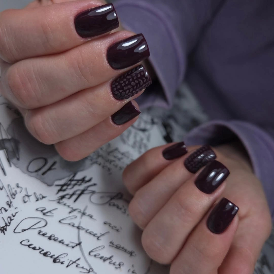
The compact shape helps the dark color stay balanced, and the single accent keeps the texture from becoming a repeating obligation. If the nail bed is smaller, reduce the accent to a short panel or a few marks; the design will still work as long as the surface difference remains visible. Pairing the plum with gray, cream, or muted rose would keep the palette coherent.
This is a useful example of changing value, repetition, and texture without adding a bright shade. A second accent could be appropriate on a longer square, but too many textured fingers would erase the relief created by the plain nails. Let the deep base carry most of the hand, then use one controlled interruption to make the monochrome choice feel purposeful.
Fine Shimmer Gives Pale Pink More Depth
The medium square base is pale pink, but fine shimmer spreads across the surface and changes the way the color responds to light. There is no separate motif, so the visual relationship stays between low saturation and gentle reflection. The square shape adds enough structure to keep the soft color from looking washed out, especially against neutral surroundings.
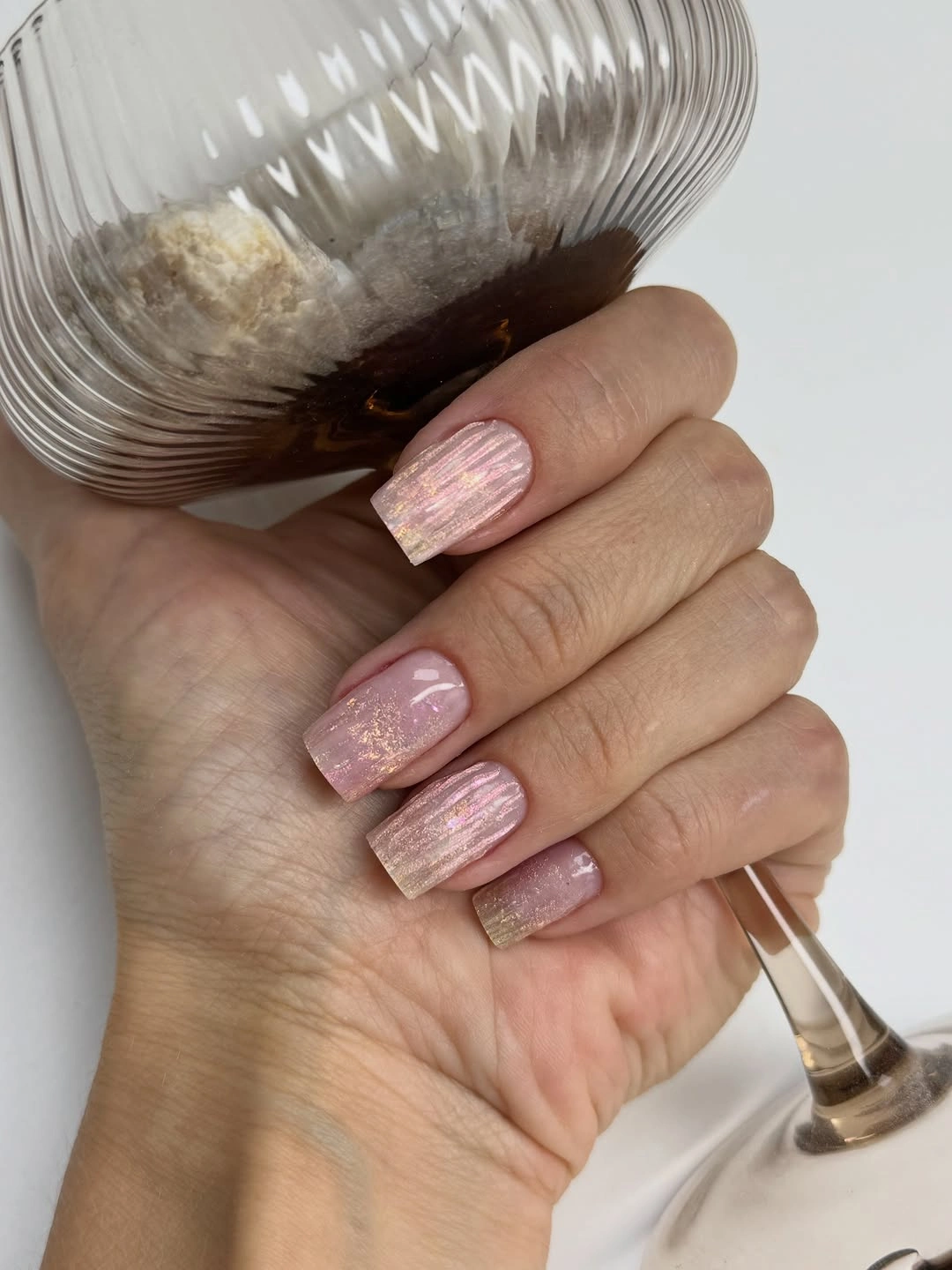
A controlled variation would keep the shimmer on every nail but increase or decrease its intensity rather than introducing a second color. Shorter squares can carry the same reflective veil if the surface stays smooth and the edge remains clear. This is a good option when you want a small amount of light without the higher contrast of glitter pieces or patterned accents.
The finish is delicate, but it still benefits from balance. A very shiny outfit or several reflective accessories could compete with the pale surface, while matte clothing would make the shimmer easier to notice. If the manicure feels too cool, choose a warmer pink base; if it feels too sweet, keep the pale color and sharpen the square corners instead of adding dark art.
Burgundy Opens Up with Pale Curved Space
The long square nails use deep burgundy as the main field, then interrupt it with pale curved or vertical openings that act like internal negative space. This creates a value relationship between dark coverage and light relief, so the color feels dimensional rather than solid. The straight outer edge and curved inner shapes work together because one supplies order and the other supplies movement.
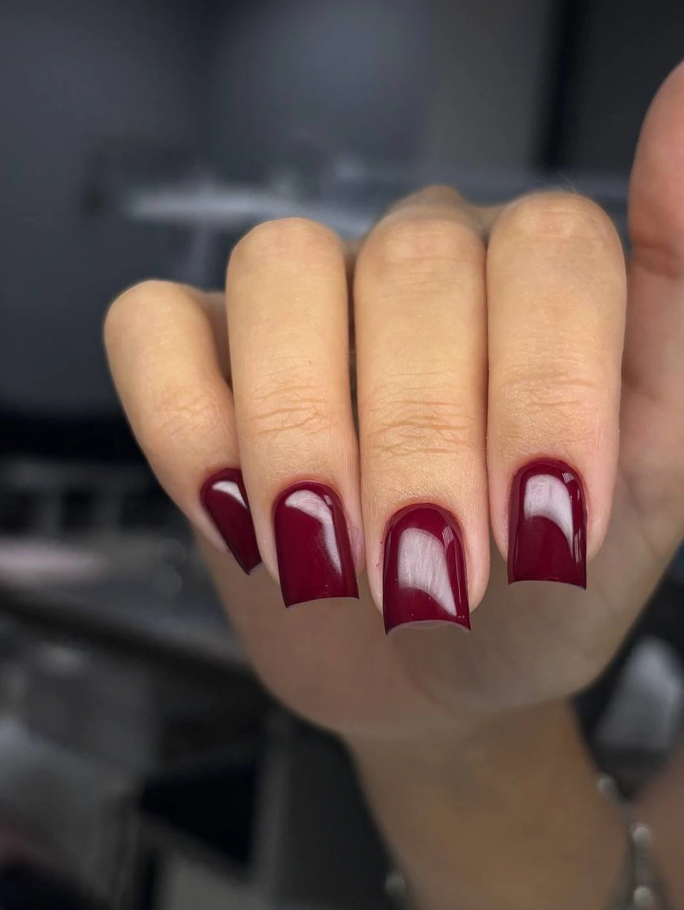
On a shorter square, keep one pale opening near the center or tip and reduce the number of internal divisions. The key is preserving enough burgundy to make the contrast obvious while leaving enough light space to stop the nail from looking dense. A simple wardrobe in cream, black, or denim would support the graphic palette without adding another busy pattern.
Negative space changes the maintenance conversation because growth can sometimes blend into the open areas, but crisp curves still depend on a clean outline. If the design feels too formal, soften the burgundy toward brown-red; if it feels too heavy, widen the pale opening rather than adding white decoration. The contrast should remain deliberate and easy to see.
Light Arcs Make Black Less Dense
These medium square nails begin with a glossy black base, then add pale curved edges that read as restrained tips. The high value difference makes the arcs immediately visible, but the black still covers most of each nail and remains the dominant color. This balance is why the set feels graphic rather than delicate: the light is an edge, not a replacement for the dark field.
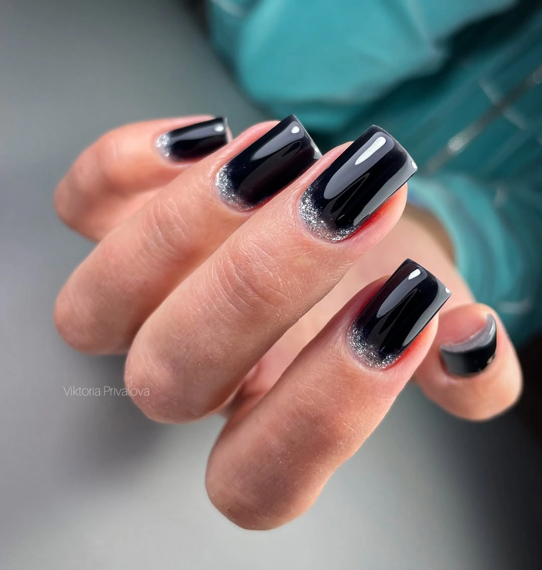
A shorter square can use thinner arcs, while a longer one could carry slightly wider tips without losing the black center. The contrast would sit well beside gray, white, denim, or silver accessories, and a warm brown sweater would soften the cool edge. Avoid adding another saturated color because the black and pale relationship already provides the necessary focus.
The boundary is the part that needs attention as the nail grows. Small chips or uneven curves become visible against both values, so a simple design still asks for tidy edges. If the dark field feels too severe, round the corners or shift the pale arc toward a warm cream; change the proportion first, not the number of motifs.
Green and Red Share a Rich Seasonal Palette
This long square set mixes deep green, red, and small botanical-looking accents across different fingers, creating a varied palette with a common seasonal value. The colors are rich rather than pastel, so the manicure feels layered even when one nail carries only a simple block. Variation works here because the dark undertones connect the set and stop the colors from looking randomly assembled.
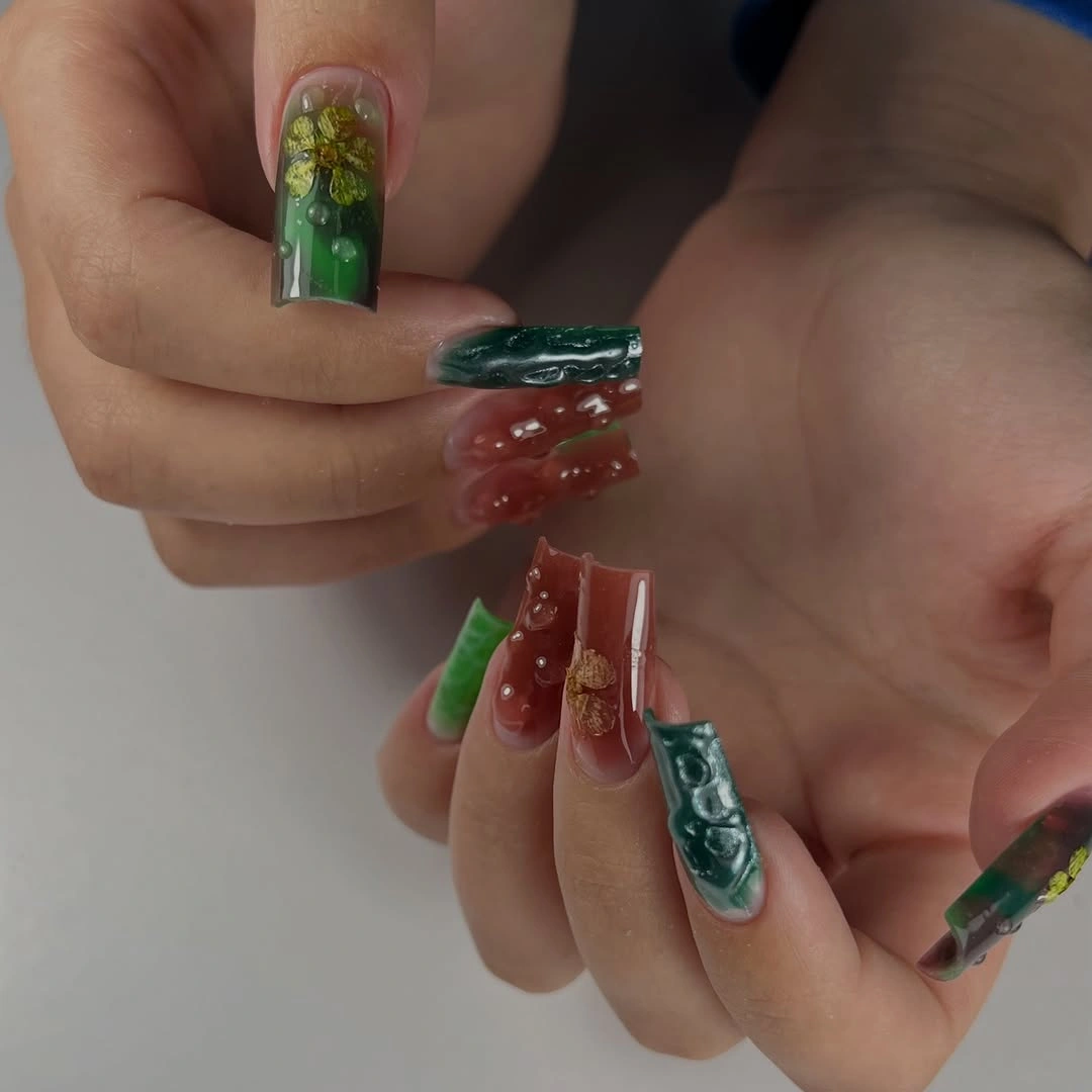
The most useful adaptation is to choose one main color and one supporting accent rather than copying every visible change. Green can occupy the larger field while red appears on one or two fingers, or the order can reverse if you want a warmer result. A shorter square will look clearer with fewer botanical marks and more solid color, because the palette already creates enough activity.
Several deep colors can make the hand feel visually dense, especially beside a dark outfit. Cream, denim, or muted brown would create useful separation, while another saturated accessory could blur the hierarchy. Preserve the rich undertones and the alternating rhythm, then edit the number of accents until the pattern feels intentional rather than overfilled.
Cool Gray Blue Gains Warmth from Tiny Dots
The short square base is a muted gray-blue with a matte-looking surface, while small warm reddish or orange dots appear near selected edges. The main color is low in saturation and cool in temperature, so the tiny warm marks provide contrast without changing the overall quiet mood. This is a color relationship built on temperature rather than brightness alone.
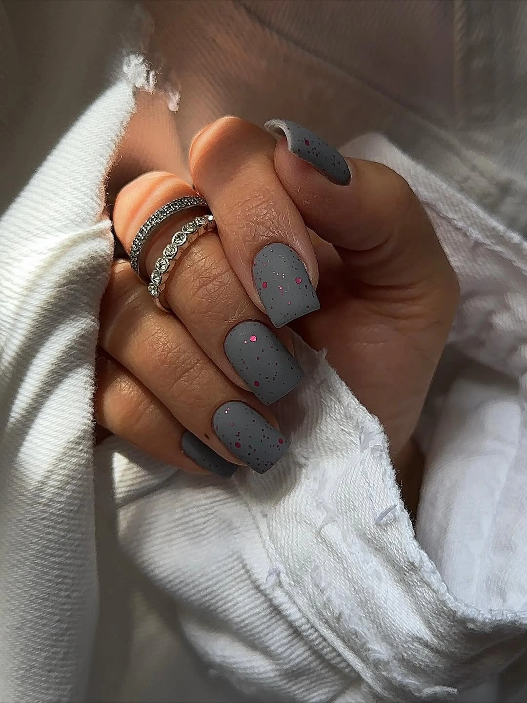
A controlled variation would keep the dots on one or two fingers and allow the gray-blue base to remain almost uninterrupted. The short shape makes that distribution practical, and the cool color would pair comfortably with denim, charcoal, or pale gray clothing. If you want the design to feel more autumnal, warm the dots toward rust rather than adding a large orange nail.
The matte-looking surface changes how imperfections behave. It may soften reflection, but uneven texture or edge wear can still show because the base is muted and close in value. Keep the dots small and the outline clear; the contrast works because the warm marks punctuate the cool field, not because they compete with it.
Chocolate Solids Frame One Spotted Accent
The medium square set alternates dark chocolate nails with pale nails, then places a small spotted motif on one light finger. The palette is warm and grounded, while the accent introduces a pattern without taking over the full hand. Contrast arrives in two stages: first the dark-light alternation, then the smaller shift from plain pale space to patterned detail.
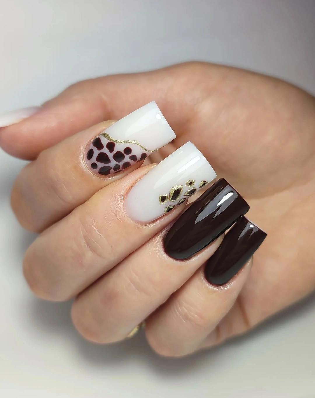
Keeping the pattern isolated is the reason the composition remains wearable. A shorter square can use one dark nail, one pale spotted accent, and several plain pale fingers, or it can reverse the ratio if you prefer more depth. Brown, cream, and muted green clothing would echo the palette, while a loud animal print could make the small accent feel unnecessary.
The design shows why a focal finger should not be judged separately from its support nails. The plain chocolate and pale surfaces create the quiet contrast that lets the spot read clearly. If the accent becomes too strong, reduce its size or move it closer to the tip before removing the dark-light relationship that gives the whole manicure its structure.
Milky Lightness Needs Only Small Punctuation
The medium square base is pale and milky-looking, with fine shimmer and tiny dark or metallic-looking points on selected nails. The background carries most of the visual weight, so the small accents function as punctuation rather than a competing design. This makes the set gentler than the black-gold geometry while preserving enough contrast to keep it from looking blank.
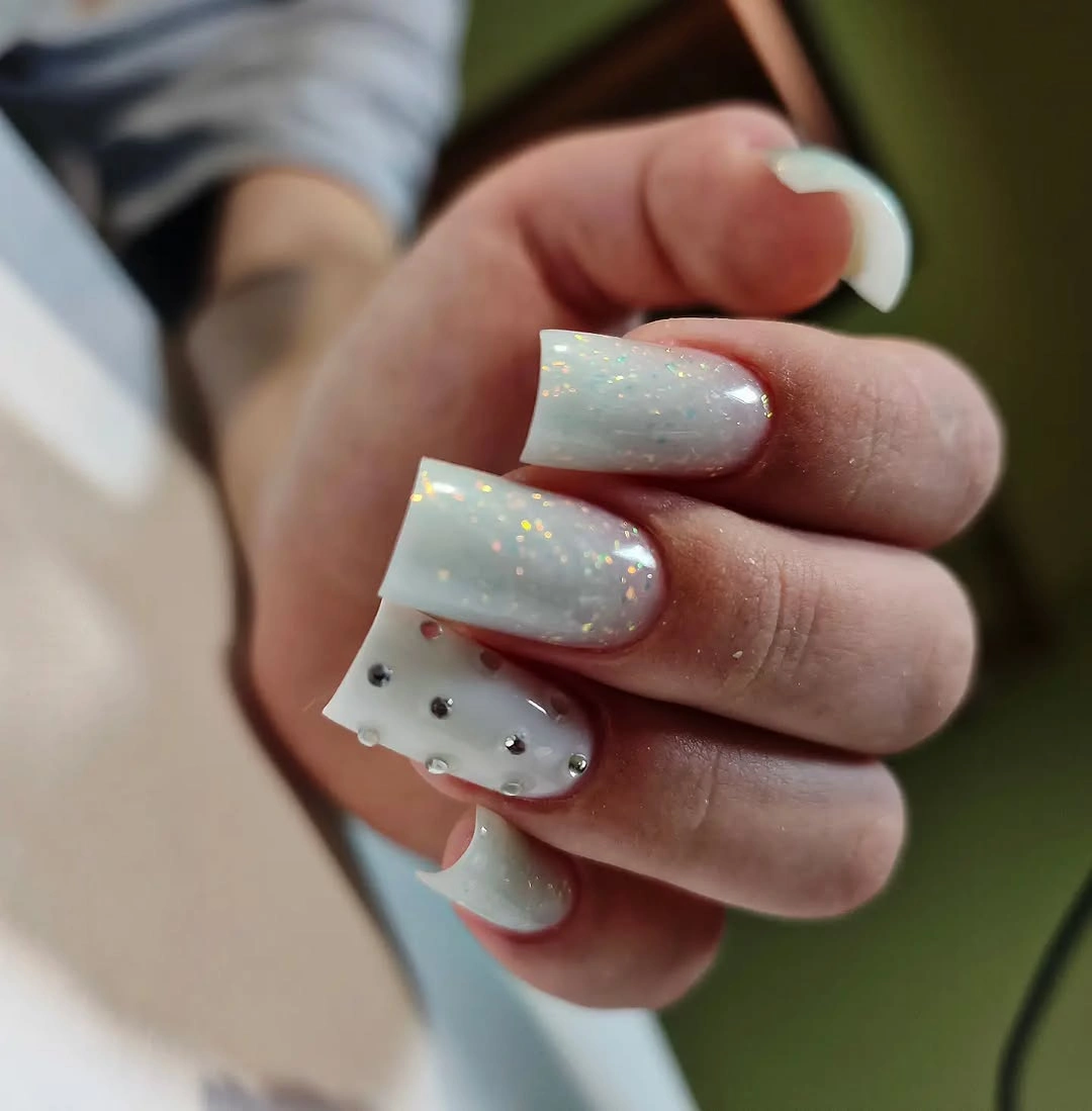
A shorter version should keep fewer marks and let the pale surface do more of the work. One accent nail can carry the dots, while the rest remain light and reflective, producing a clear hierarchy at a smaller scale. Soft gray, denim, cream, or pale brown clothing would support the cool-light palette without creating another strong focal point.
The useful adjustment is to change spacing before changing color. Spread the marks farther apart if the nail bed is narrow, or move them toward one edge so the center stays open. The manicure succeeds because the accents remain small against a calm base; adding more contrast would change its character from light punctuation to graphic pattern.
Cobalt Blue Uses Saturation Instead of Decoration
These short square nails are a saturated cobalt blue with a clean glossy surface and no visible art. The color is intense enough to become the focal point immediately, while the compact outline keeps the saturation from turning into a long, dramatic statement. Repetition across every nail gives the set unity and makes the blue feel chosen rather than accidental.
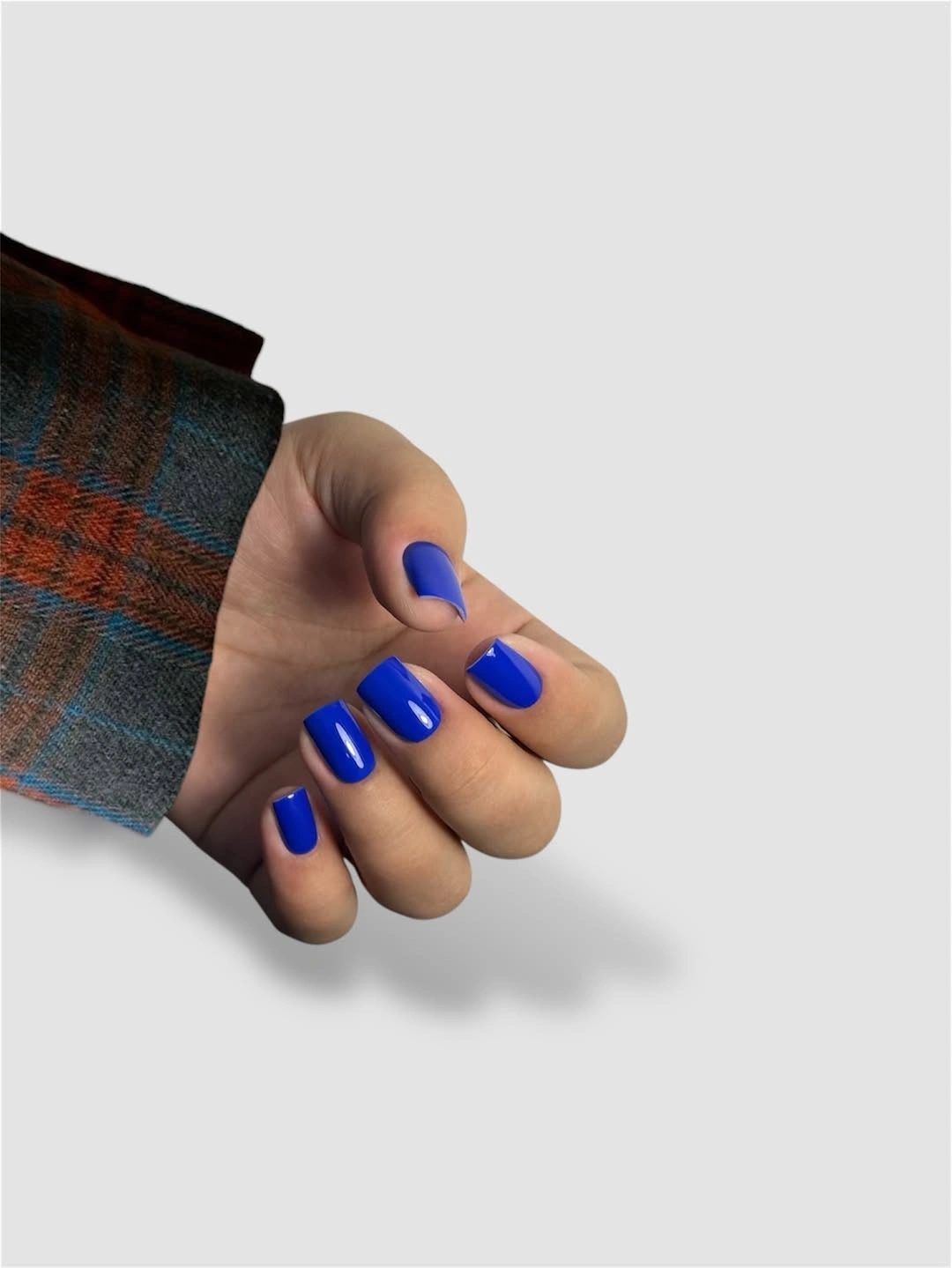
A color this strong can sit beside white, gray, black, or washed denim, and it needs no extra accent to feel complete. If you want a more seasonal mood, pair it with warm brown textures rather than adding a second nail color. A rounded square would soften the effect, while a sharper corner would reinforce the graphic quality of the blue.
The main maintenance issue is the edge, not the design. Saturated blue exposes gaps and chips, especially on a light background, so the short length is helpful but not a substitute for an even outline. Keep the surface uninterrupted if the color already solves the focal-point problem; adding small art would reduce the clarity that makes this solid set work.
Milky White Lets the Square Outline Lead
The medium square manicure is a soft milky white with smooth gloss and no visible motif, so the relationship is between pale value and a defined straight edge. The color feels bright but not harsh because the surface is slightly softened by its creamy impression. With no accent finger to interrupt the set, consistent length and corner shape become the main sources of polish.
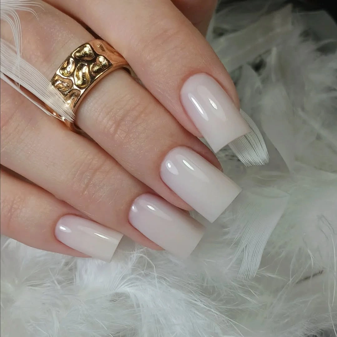
This is a useful base for readers who want a bright neutral before adding any seasonal detail. Wear it beside gray wool, denim, black leather, or warm brown and the white will shift in mood without needing a new design. It also shows why fall square nail shapes can change the mood of a pale color before any accent is added. If the medium square feels too formal, round the corners slightly; if it feels too plain, add one small accent rather than distributing art across the whole hand.
Light polish shows uneven edges and chips quickly, so the clean look has a practical cost. The moderate length helps with daily wear, but it still pays to keep the shape consistent because one shortened corner changes the visual rhythm. The strength of this manicure is its clarity, and clarity depends on a surface that stays even from base to tip.
Purple Glitter Makes Pale Ornament Feel Cooler
The medium square design combines rich purple glitter with pale ornamental or floral-looking details, creating a cool relationship between reflective depth and light line work. The glitter supplies saturation and movement, while the pale accents keep the purple from becoming a single dark field. Because both choices stay in the cool family, the set feels coordinated even though the surfaces are busy.
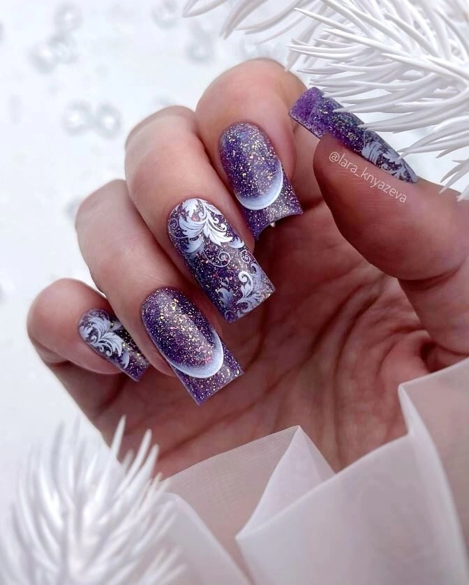
A shorter square can preserve the color story by keeping purple on every nail and moving the pale ornament to one or two accent fingers. The reduction works because the glitter already provides texture, so the detailed marks do not need to repeat everywhere. Pairing the manicure with white, gray, or denim would clarify the cool palette, while warm orange accessories could create a deliberate but stronger contrast.
The design has more visual workload than a solid purple set, and that affects upkeep. Reflective particles and fine accents can make small chips or crowded spacing easier to notice, especially on a compact nail. If the hand begins to look over-detailed, keep the glitter base and remove some ornament; saturation and texture are already carrying the seasonal mood.
Vertical Pale Lines Stretch Dark Brown Squares
The long square base is deep brown or nearly black, while narrow pale reflective stripes travel along the nail. The color contrast is restrained to two values, but the repeated vertical direction makes the long silhouette feel even more deliberate. Instead of adding a motif, the design uses line placement to explain the shape and pull the eye from cuticle to tip.
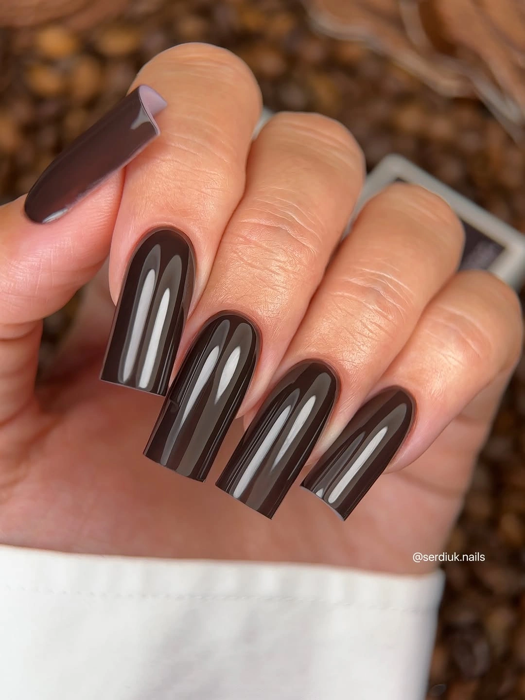
A shorter square should keep one stripe on an accent nail rather than compressing several lines into every small surface. That controlled change preserves the directional relationship and leaves enough dark base to make the pale line visible. The palette would work with gray, cream, denim, or brown fall nails styling, but a busy pattern could compete with the clean geometry.
The dark field remains the dominant value, so the stripes should stay narrow and spaced. Widening them too much would turn the manicure into alternating blocks and remove the quiet graphic quality. If the long square is impractical, shorten the nail first and preserve the dark-to-light line relationship; the idea depends on direction, not maximum length.
Pale Blue Keeps the Final Solid Look Soft
The short square nails use a light pale blue with a glossy, uninterrupted surface, so the color relationship is gentle rather than high contrast. The cool pastel has enough saturation to remain visible, while the compact shape prevents it from feeling too delicate or stretched. This is a quiet color-led choice that does not need a motif to explain itself.
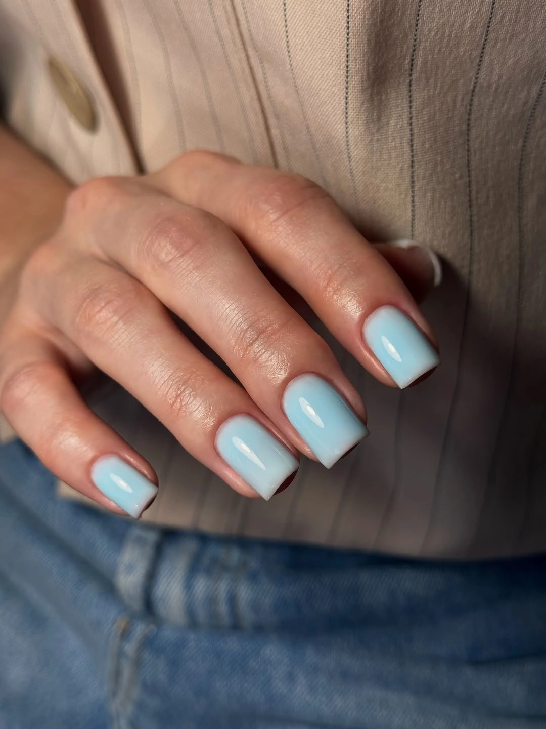
The shade would sit easily beside white, gray, denim, or silver accessories, and warm knitwear would make the cool undertone more noticeable. A rounded square could soften the pastel further, while a straight square keeps it clean and slightly graphic. If the color feels too light, deepen the blue a little before adding decorative marks that might crowd the short surface.
Pastel surfaces can reveal chips and uneven corners, especially when the hand is styled against a pale background. The short length helps with daily use, but the outline still needs to stay consistent for the manicure to look intentional. Let the color remain the focal decision and use texture in clothing or jewelry to add interest around it.
Short Black Squares Keep a Dark Color Direct
This short square manicure returns to glossy black, but the compact outline makes the shade feel concentrated and graphic rather than elongated. There is no accent or contrasting tip, so the relationship is simply between deep value, straight corners, and reflected light. The result is direct because the dark color does not need a second idea to explain its presence.
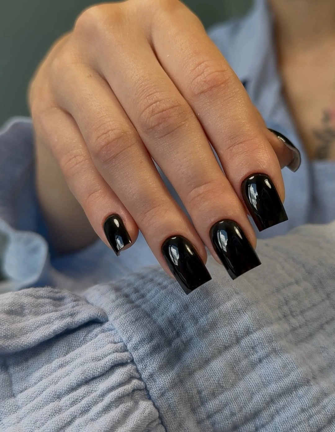
A short black square would sit comfortably beside cream, gray, denim, or a soft brown sweater, and the simple surface gives jewelry room to add warmth. If you want less severity, round the corners slightly while keeping the same length; if you want more edge, sharpen the square and leave the color uninterrupted. The shape can change the mood without adding a new shade.
Dark glossy polish makes small chips and uneven corners visible, but the short proportion reduces snagging and keeps the silhouette practical. That balance is useful for readers who want a strong fall color without committing to long nails or patterned upkeep. Keep the surface smooth and the edge clean, because the simplicity of the design makes those basics part of the visual result.
Fine Red Sparkle Changes the Mood without a Motif
Most of the medium square nails are bright red with fine glitter, while one finger appears smoother, creating a small surface contrast inside an otherwise unified set. The red provides saturation, and the fine sparkle shifts it from classic solid color toward a more festive finish. Because the glitter remains small, the manicure still reads as red first rather than as a separate glitter design.
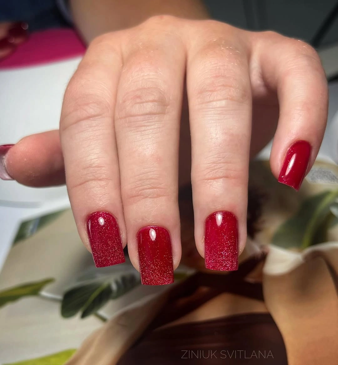
A controlled variation would keep the shimmer consistent across the main fingers and leave one smoother accent if you like the change in texture. Shorter squares can use the same idea because the fine particles do not require much space, while a longer nail could support a slightly denser reflective surface. Pairing the set with neutral clothing lets the red remain clear and avoids a competition between several bright details, much like the cleaner options in these red fall nail ideas.
The practical difference between fine sparkle and a plain red surface is subtle but worth noticing. Small texture can catch on fabric or make edge wear more visible, even when the color itself stays easy to style. If the design begins to feel too festive, reduce the reflective density rather than changing the red; the palette remains useful when the surface becomes quieter.
Taupe Gray Shows How Undertone Does the Work
The final medium square set is a muted taupe-gray with a glossy finish and no visible decoration. Depending on the light, the color leans warmer beige or cooler gray, so undertone creates the movement that a motif would normally provide. The square outline adds clarity to a subdued shade and keeps the manicure from disappearing into the hand.
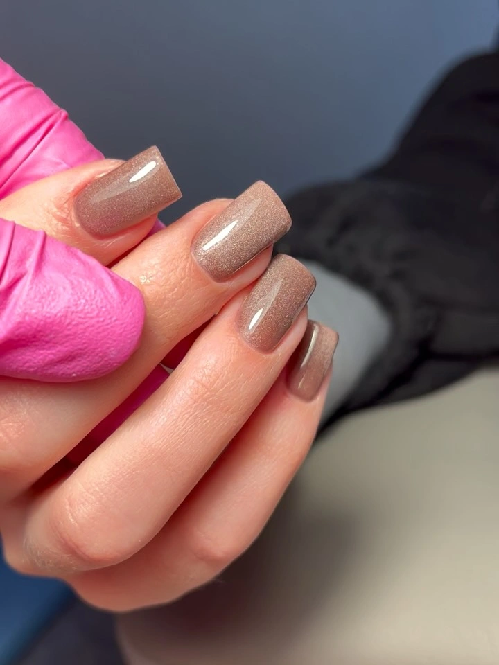
This kind of neutral works with both warm and cool wardrobes, which makes it useful when you want a fall color that does not commit to red, brown, or pink. Cream and camel will emphasize its warmth, while denim and silver will pull out the cooler side. Keep the shape medium if you want the color to remain understated, or shorten it for a more practical everyday result.
The honest limitation is that muted color can look unfinished if the edges are uneven or the surface lacks clarity. There is no pattern to distract from a rough corner, so the simple design asks for consistent proportion. Let the undertone remain the point of interest, and resist adding a busy accent unless the gray-beige base truly needs more contrast.