
The quietest manicure can be the hardest to judge on fair skin tone because softness and disappearance are only a few shades apart. A pale surface may look intentional in one light and unfinished in another, while a dark accent can suddenly take over the whole hand. The useful question is not whether the color is light; it is whether the contrast has a clear stopping point.
Choose the base first, then give one detail a defined boundary. That boundary might come from a line, a tip, a change in finish, or simply enough empty space around a small mark. When the accent has room to breathe, the manicure feels delicate without becoming vague; when it does not, adding more detail usually makes the imbalance harder to correct.
Orange, Black, and White Graphic Balance
Medium-long nails open with a soft almond outline and a small conversation between orange, black, white, and pale pink. Some nails carry a saturated orange field, while others use curved black-and-white panels or a pink base, so the design changes without losing its center. The warmth of orange gives the pale set a seasonal anchor, and the darker graphic areas keep the light colors from fading into the background.
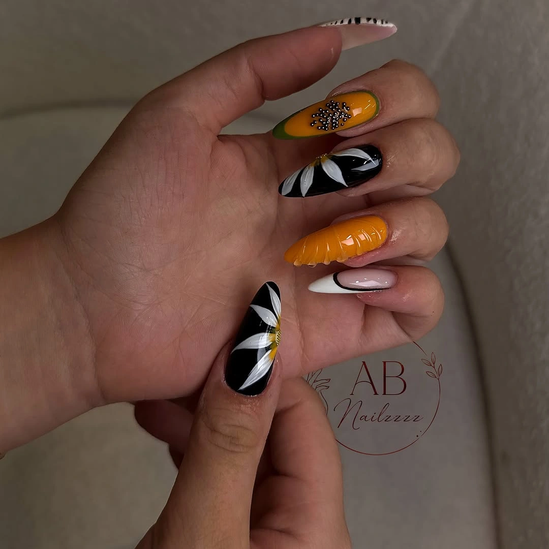
What makes the arrangement feel gentle is the amount of pale pink left visible around the stronger accents. Black creates a crisp edge, orange supplies warmth, and white keeps the graphic lines from becoming too heavy against fair skin. If you want a quieter interpretation, place orange on two nails, keep one black-and-white panel as a focal point, and let the remaining fingers repeat the pale pink rather than adding another motif.
The moderate length is useful because it lets the shapes read without making every panel feel oversized. A very short nail would need wider, simpler blocks, while a much longer point could make the same orange look more forceful than intended. Keep the contrast at the tips or on selected fingers if you prefer a lighter wardrobe, and let the pink base provide the soft transition between graphic choices. The site’s fall nail colors make the same case for choosing contrast before decoration.
Airy Pale Blue and White Almonds
Long almond nails in pale blue and white create an almost translucent-looking conversation between cool color and soft light. Curved sections move through the tapered tips, with only a few delicate details interrupting the open surfaces. The design feels airy not because it lacks structure, but because the lines remain spacious and the cool palette changes gently instead of stacking several dark accents together.
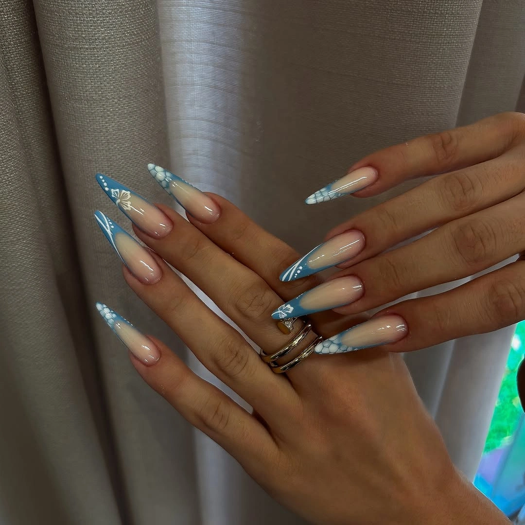
Blue gives the white a cooler edge while the white keeps the blue from looking dense on fair skin. The long outline supplies elegance through proportion, so the manicure does not need glitter, print, or a heavy focal nail to feel finished. A shorter oval or soft almond would preserve the same lightness, especially if the blue is kept to the tips and the center remains pale.
There is a practical limit to low-contrast art: in dim light, the pale transitions may become less visible than the shape itself. That is not a flaw if you want a quiet manicure, but it matters when you need the details to read from a distance. Add one slightly deeper blue accent or a thin dark line only where definition is needed, rather than changing the entire delicate palette. For a softer white comparison, the site’s fall white nails keep the same attention on value and light.
Sheer Pink With Lime Tips and Tiny Flowers
Long tapered nails pair a sheer pink base with bright lime green edges, tiny flower-like marks, and small dark or metallic points. The green tips supply the clearest contrast, while the pink center remains open enough for the small details to feel delicate instead of crowded. This is a soft design with one vivid interruption, and that interruption gives the pale base a fresher, more directional character.
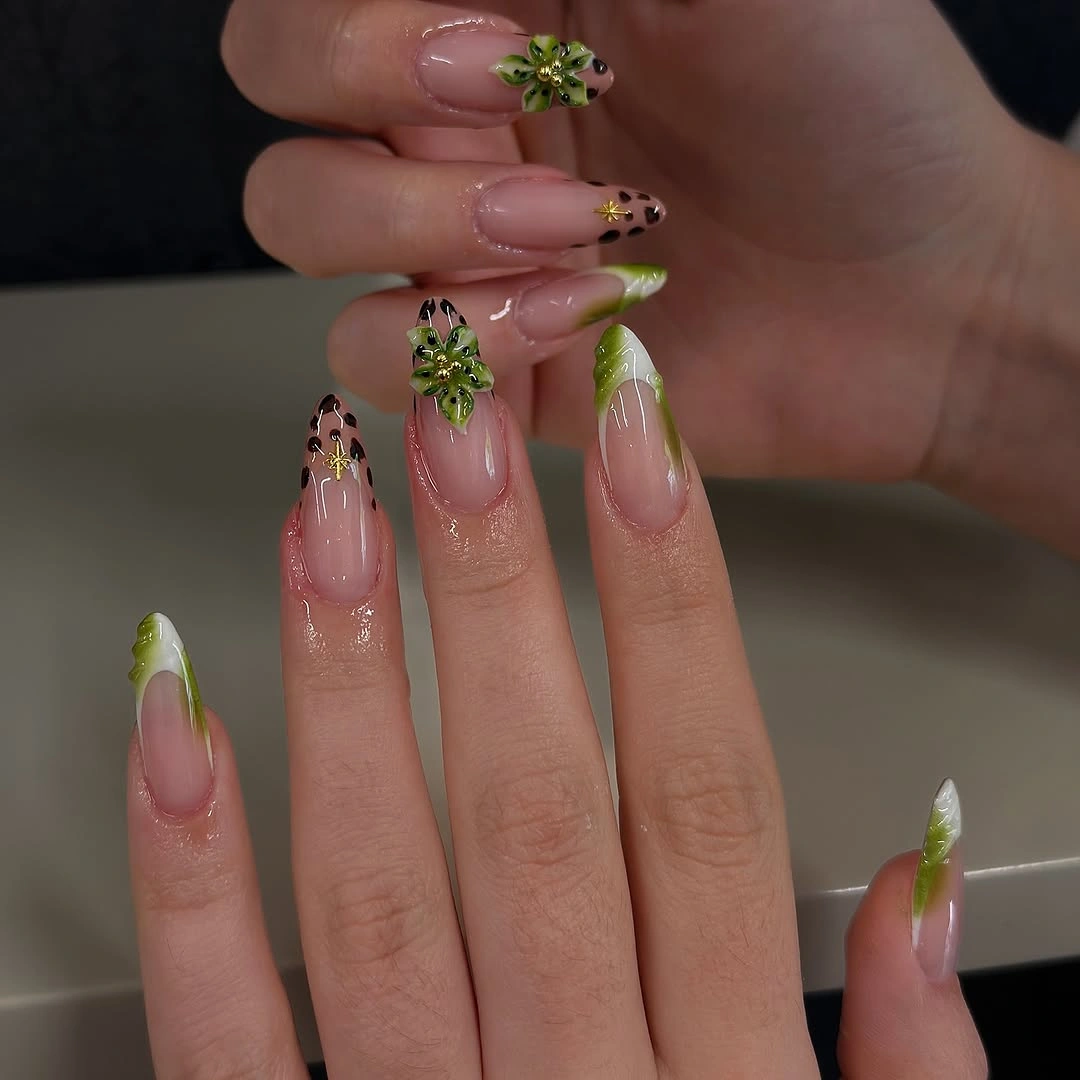
Lime is effective because it stays concentrated at the edge rather than covering every surface. The eye notices the bright boundary first, then moves inward to the small decorative marks, while the pink keeps the overall value light. For a more understated version, use lime on two tips, move one small floral accent to each hand, and leave the other nails softly pink so the open space remains part of the story.
Fine details on a long tapered nail need room and deliberate spacing. If the shape is shortened, tiny flowers can lose their definition, so it is better to enlarge one motif than to squeeze several into a smaller surface. The lime edge may also become more noticeable as the nail grows, making a narrow tip or a medium almond outline the most natural adaptation when you want the contrast to stay controlled.
Spotted Accents Beside Soft Pink
Medium almond nails use soft pink as the main field and place black-and-white irregular spots on selected accent nails. A few tiny pale marks add another layer, but the composition remains open because most fingers repeat the quiet pink rather than a second print. The spotted sections create a crisp focal point without forcing the whole hand into a maximal pattern, which keeps the rounded almond silhouette gentle.
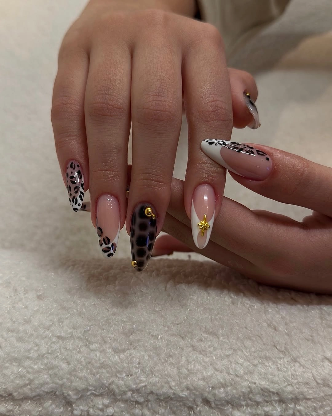
The contrast works through concentration. Black and white are strong against the pale base, yet they appear only where the eye needs a sharper pause, so the pink surrounding them continues to soften the design. If you prefer a more delicate result, use the spotted pattern on one nail per hand and replace the tiny extra marks with a single dot or a plain pink surface.
A printed accent can look very different depending on scale. On short nails, small spots may merge, while a large almond gives them enough room to remain irregular and readable. Keep the pattern broad and sparse if you shorten the shape, and do not add another unrelated accent color unless the wardrobe calls for it; the balance here comes from pink space around a dark graphic interruption. That restraint is close to the logic behind the site’s simple fall nails.
Orange and Turquoise With Sculptural Energy
Very long pointed nails move between vivid orange, bright turquoise, white, and yellow, with curved or petal-like pieces spread across the fingers. The colors are high in saturation, but the pale accents create breathing room between the strongest panels. The point length amplifies every color transition, so the manicure feels energetic before any small decorative detail becomes visible.
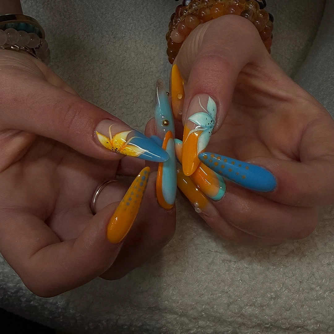
Orange and turquoise are doing equal work as opposing focal colors. Orange brings warmth, turquoise cools the composition, and white helps separate them so the set remains readable rather than turning into one bright blur. A medium almond adaptation would keep the same warm-cool relationship with fewer panels, perhaps using orange on two nails, turquoise on two, and a quiet pale base for the rest.
The honest tradeoff is visual intensity. Very long points and saturated color naturally ask for simpler accessories, and the small relief-like details may feel more prominent when the hand moves. If you want the color story without the full drama, shorten the silhouette first and keep the largest color blocks; reducing every accent at once would leave only a generic bright manicure instead of the structured contrast that makes this one memorable.
Tiger-Like Stripes On A Long Narrow Shape
Long narrow nails are covered with thin brown and black stripes over a warm tan or nude ground. The lines follow the length, so the pattern and the silhouette reinforce one another rather than competing for direction. The warm neutral background keeps the print connected to fall, while the dark stripes give the pale hand a clear edge without requiring additional color families.
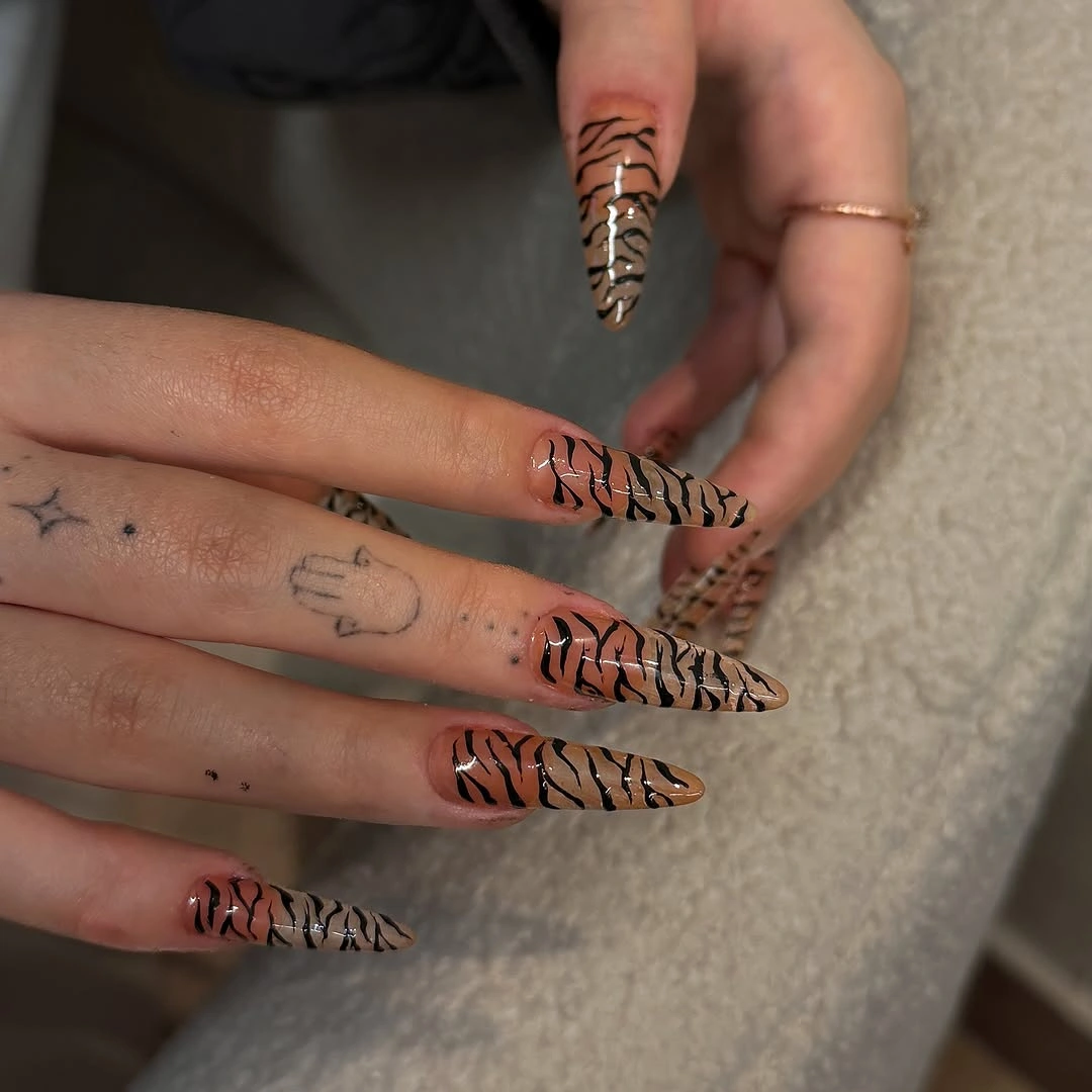
The pattern feels composed because its line language repeats from nail to nail. Thin dark marks create movement, but the tan ground prevents them from looking as severe as they would on a stark white base. For an easier adaptation, keep the stripe pattern on two accent nails, repeat the warm nude on the others, and choose a shorter almond so the direction remains visible without making length the only statement.
Stripes are forgiving about color variety but less forgiving about spacing. If the lines become too dense, a long nail can look visually compressed; if they are too sparse on a short nail, the print may lose its identity. Preserve the warm ground and adjust the interval between marks to suit the shape, letting the silhouette carry part of the pattern’s rhythm rather than adding more lines.
Pale Pink Tips With Small Red Florals
Long almond nails use a pale pink or nude base, red tips, tiny floral-looking details, and a few dark marks. Red is concentrated at the edge and on selected decorations, so the seasonal color appears clearly without covering the whole hand. The result has a gentle surface but a defined perimeter, with the almond outline extending the tip color into a long, elegant point.
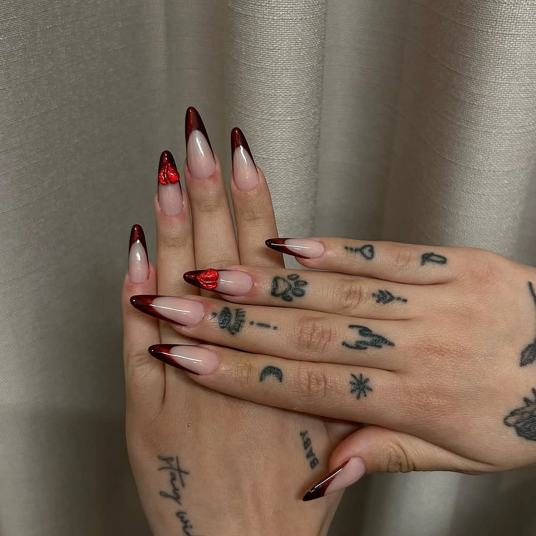
The light base is what lets the red feel deliberate rather than loud. White or pale space surrounds the accent, and the small green or dark marks add just enough variation to keep the tips from being the only event. If you want to reduce effort, keep the red edge on two nails and use plain pale pink elsewhere; the seasonal contrast will remain, but the hand will have more visual rest.
Tip-focused designs change as the nail grows because the distance between the base and the red edge becomes more visible. A medium almond or a thinner edge can make that transition feel less abrupt, while a shorter shape may need a broader tip to keep the red readable. Keep the tiny floral detail sparse, since too many small marks would compete with the clean boundary that gives the manicure its softness. The site’s fall nail art ideas are useful here only as a reminder to protect the negative space.
Muted Nude With Burgundy and Olive Tips
Long almond nails place deep burgundy, olive, and dark pointed accents over a warm nude base. The palette is autumnal through muted contrast rather than sparkle: the nude areas stay visible, the burgundy gives the tips depth, and olive supplies a quieter change of temperature. The narrow silhouette sharpens the dark accents, but the soft ground keeps them from becoming heavy.
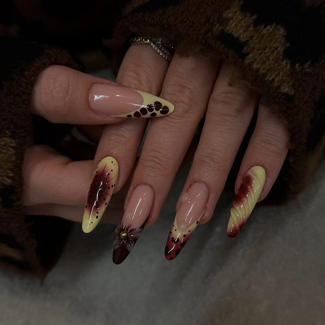
Deep colors work well here because they are limited to the edges and selected focal nails. The eye sees the nude first, then follows the burgundy and olive into the tapered points, which creates a calm progression instead of a full-coverage dark set. For a shorter version, use burgundy as the main tip and keep olive to one accent nail so the muted relationship remains easy to read.
The design’s restraint depends on the amount of open nude space. If every nail receives a dark panel, the palette may become more formal and less airy, while a very short nail could make the tips look broad. Keep the base generous, adjust the width of the edge to the nail shape, and choose simple jewelry if you want the burgundy and olive to remain the strongest accents.
Pink Nails With Checkered Edge Detail
Long pink nails carry black-and-white grid or checkered tips concentrated at the edge. The center remains pale and smooth, which gives the high-contrast pattern a clean boundary and prevents the print from filling the entire hand. The design feels crisp because the graphic tip is treated like a frame around a quiet field, while the elongated shape makes the border visibly directional.
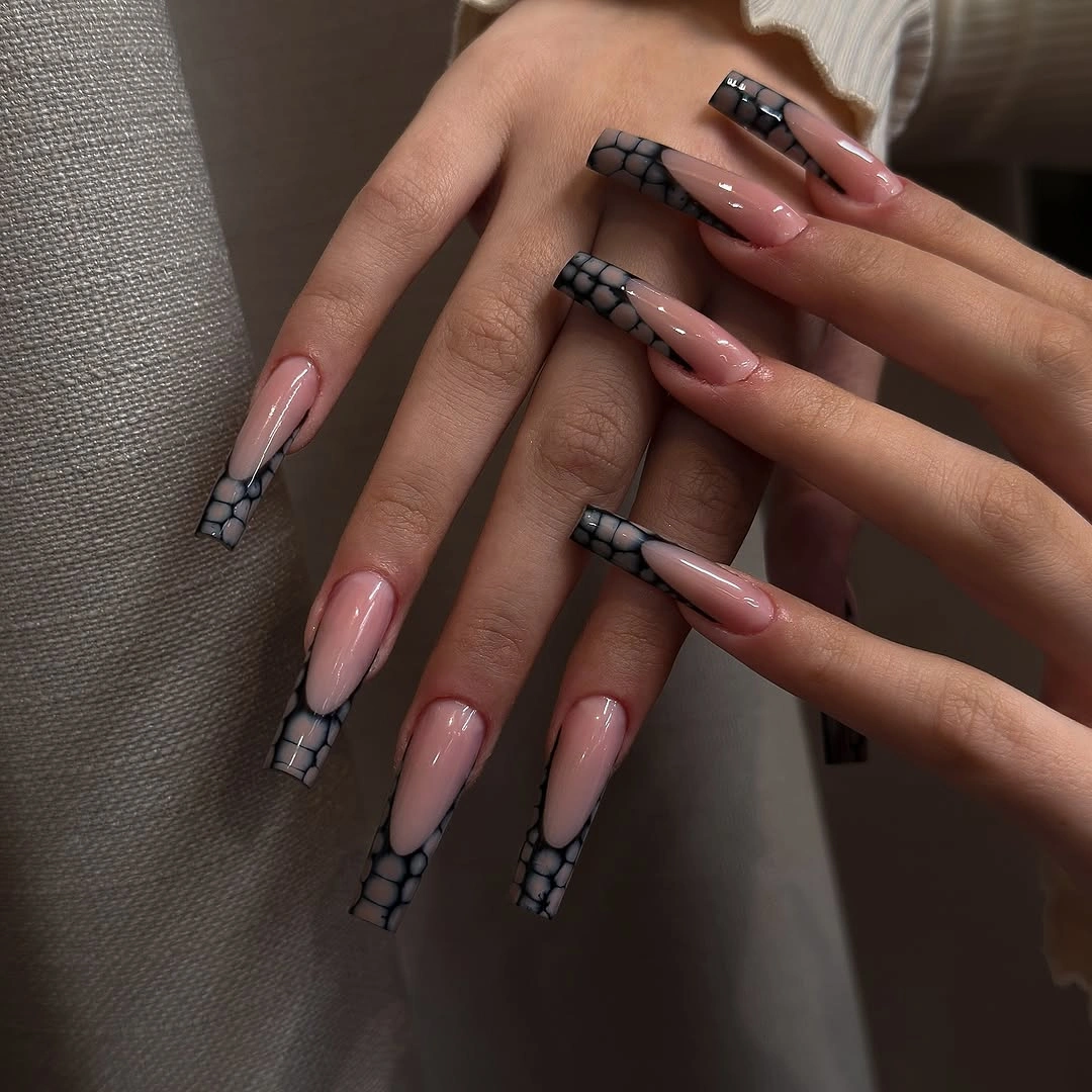
The pale pink base softens the black-and-white contrast, and the repeated grid supplies enough structure to make the manicure feel graphic without many colors. If you want a less formal version, keep the grid on one nail per hand and use solid black or pink tips elsewhere. A shorter square or almond can carry the same idea, but the checks should be larger so the pattern does not collapse into noise.
Precision at the edge is the main visual requirement. A broken grid or inconsistent border will show more clearly than it would under a scattered design, and long tips can make small spacing changes noticeable. Reduce the number of squares before reducing the contrast if you simplify; a few clean black-and-white marks will preserve the concept better than many tiny checks squeezed into limited space.
Neutral Mix Of Texture Spots and Shine
This long mixed set combines pale nude, a black glossy-looking accent, creamy nails with small dark spots, and a metallic ribbed or ridged detail. Its interest comes from changing surface language rather than from a large number of colors. Texture appears on one area, black shine on another, and tiny spots elsewhere, so each finish has enough room to register against the neutral palette.
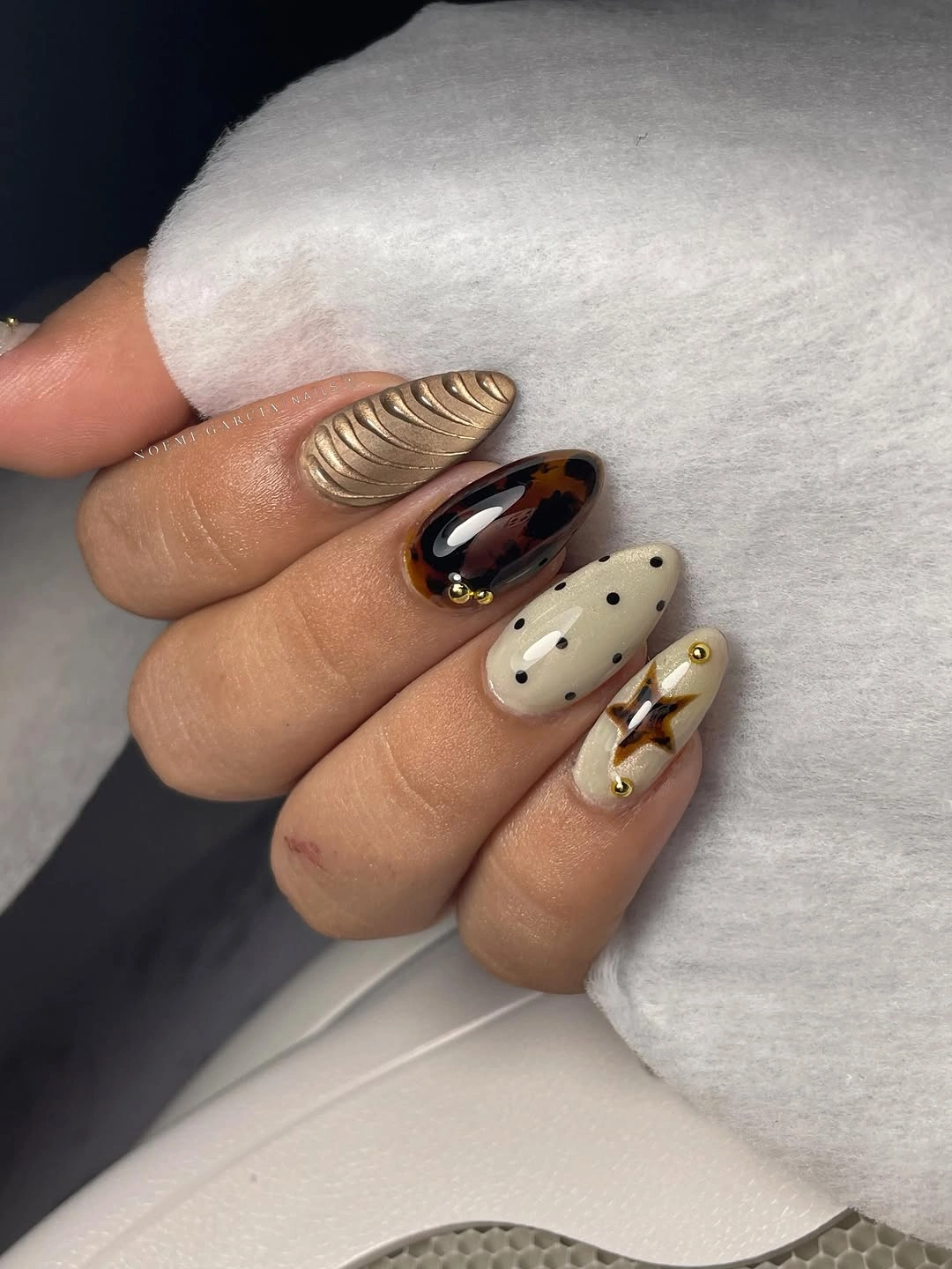
The design feels layered because the contrasts are distributed. A textured accent catches light differently from the smooth black nail, while the spotted cream surfaces add a small graphic note without competing with either. For a more restrained interpretation, choose one textured nail, one spotted nail, and plain creamy or nude neighbors; the variety will remain, but the hand will have a quieter visual rhythm.
Surface changes can be more demanding than color changes because they remain visible from several angles. A raised-looking accent may catch on clothing or simply draw more attention than expected, although no hidden material can be confirmed from the visible result. Keep the dark accent where the nail has enough width and let the pale neutrals carry the rest, especially if you need a design that works across different settings.
Soft White Almonds With Hidden Sparkle
Long soft white almond nails use pale pink sections and tiny reflective-looking marks that appear only when the light catches them. The low-contrast palette shifts attention to the contour first, then reveals small detail on closer inspection. This makes the design feel quiet without becoming empty, since the white surface is interrupted by just enough blush and light-catching texture.
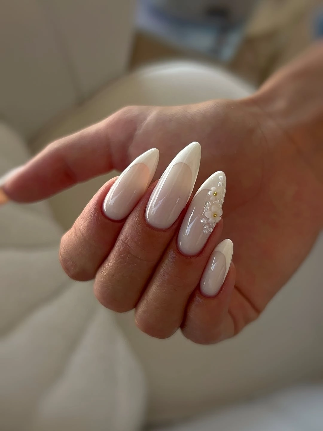
White and blush stay close in value, so the manicure reads as one calm field rather than a group of separate blocks. The small reflective points add dimension while preserving the airy mood, and the long almond outline supplies the strongest visible structure. If you want more definition, deepen the pink on one nail or add a fine pale-gray line, but avoid covering the open white space that makes the details feel delicate.
Low contrast has a real limitation: the smaller marks may disappear in flat lighting, and the shape will carry more of the design than the decoration. That can be exactly right for an understated look, but a shorter oval may be more practical if you want the manicure to feel less formal. Keep one soft white accent rather than adding a dark motif, because a sudden heavy line would change the whole atmosphere.
Mint Green Tips On A Pink Base
Medium-long almond nails pair a clean pink center with bright pastel green tips. The shape is consistent, the surface appears smooth, and the color boundary remains the only major design decision, which gives the manicure a fresh clarity. Mint brings a cool note to the pink base without creating a deep seasonal contrast, so the result feels light and deliberate.
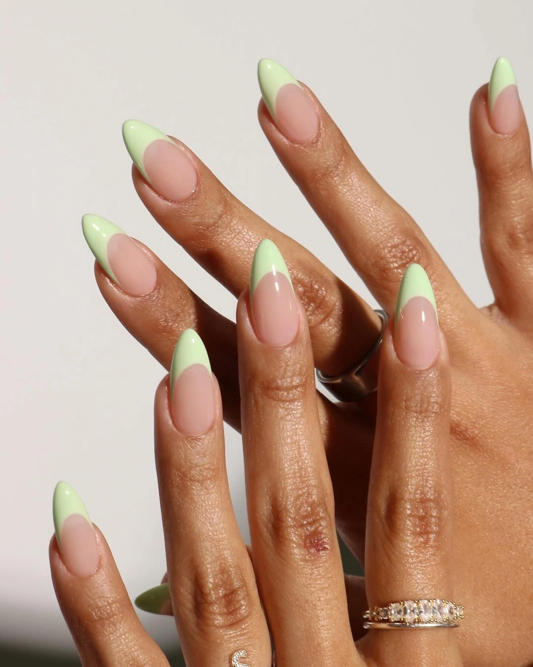
The balance comes from repetition. Every visible tip uses the same green relationship to the pink center, allowing the eye to enjoy the contrast without searching for a different motif on each finger. A micro-tip would be a subtle adaptation, while two feature nails with fuller green edges would make the design more noticeable without abandoning its clean structure.
Because the boundary is the entire design, uneven spacing will be easy to notice. As the nails grow, the pink center becomes larger and can change the visual proportion, so the tip width should be chosen with the shape in mind. If you shorten the nails, use a broader but simpler edge rather than a tiny line that loses clarity; the pink-to-mint division should remain the first thing the eye understands.
Brown and Nude With Gold Medallion Accents
Long almond nails mix soft nude-pink fingers with deep brown accent nails, round gold details, and tiny pale or metallic-looking dots. The brown gives the set an autumn center, while the nude nails keep the hand open and the gold ornaments create small points of focus. Rather than decorating every surface equally, the design places its strongest detail where the darker color can support it.
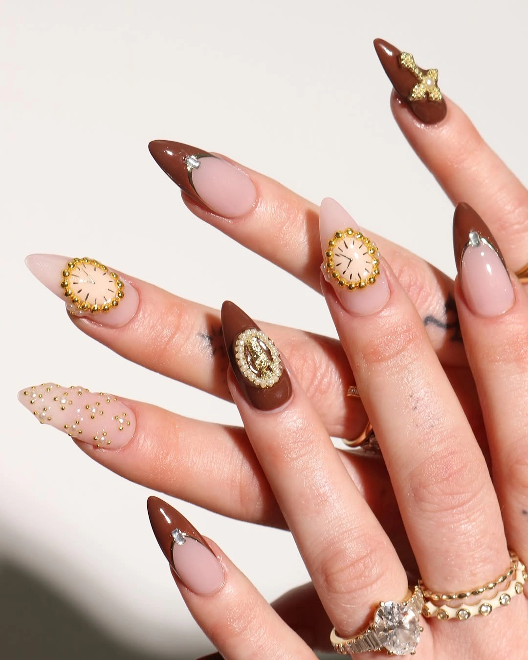
Gold appears most clearly because the surrounding palette is restrained. Against brown it feels warm and concentrated, while on nude it becomes a smaller glint that prevents the plain nails from disappearing. For a softer interpretation, keep brown on two fingers and place one round gold detail on a nude nail; the visual hierarchy will remain, but the overall density will drop.
The long almond shape gives the ornaments room, yet it also makes the set feel more decorative than a short rounded manicure. If the gold details are too prominent for everyday styling, change the length before changing the palette, then reduce the number of centered accents only if needed. A simple brown or nude neighbor will do more to restore balance than adding another small embellishment.
Aqua and Brown With Dense Metallic Ornament
Long pointed nails combine aqua, brown, nude, and metallic-looking decorative panels. Cool aqua separates the warm brown from the pale base, while the dense ornament gathers visual weight around the tapered tips. The contrast is richer than a simple two-color manicure because color and surface detail are working together, yet the repeated pale areas keep the design from becoming uniformly dark.
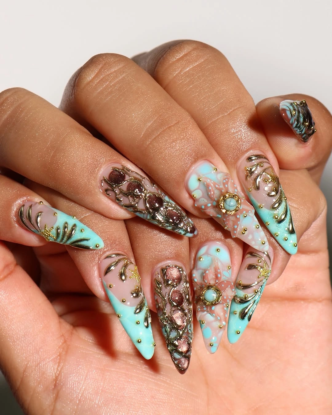
Aqua is the useful bridge in this palette. It gives the warm brown a cooler partner and makes the metallic details easier to distinguish, especially where the nude base remains open. If you want to streamline the look, keep aqua on two nails, use brown as one solid accent, and move the metallic detail to a single focal finger; the temperature contrast will still carry the design.
Dense ornament changes the visual weight even when the colors stay soft. The pointed length amplifies the decorated tips, and a shorter shape may require fewer pieces so the surface does not feel crowded. Preserve the aqua-to-brown relationship first, then reduce the number of metallic marks; simplifying the surface while keeping the color bridge is the most faithful practical adjustment.
Cool Blue and White With Raised-Looking Detail
Long pointed nails use pale blue, white, silver-looking accents, and sculptural details that make the surface appear more dimensional. The palette stays cool and light, allowing texture to become the main event instead of relying on dark contrast. Because the nails are long and sharp, even small decorative pieces contribute to a bold silhouette, while the white and blue keep the overall color story clean.
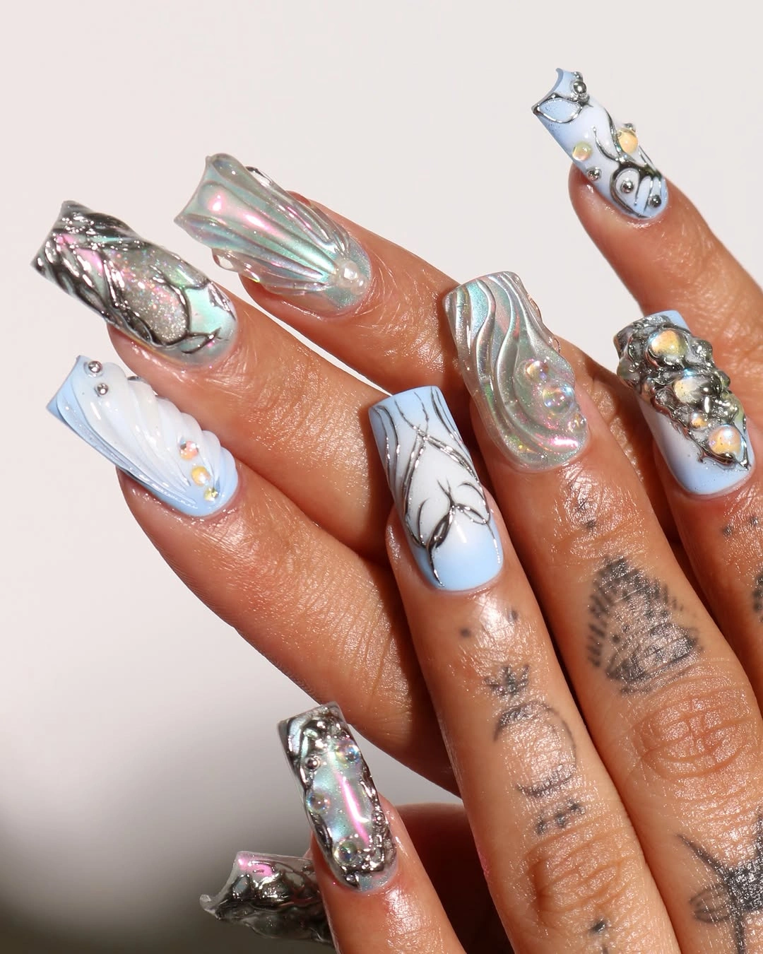
Light colors give the relief-like details a clear outline. White catches the background softly, pale blue adds separation, and silver-looking pieces provide the brightest points without introducing a heavy black shape. For a more wearable version, keep one textured accent nail per hand and let the rest be pale blue or white; the cool surface story will remain, but the eye will have fewer places to stop.
Texture is the practical limitation because it can be more noticeable than a flat color from every angle. The long points also make the relief feel more statement-like, so a shorter almond could lower the effect without removing the palette. Do not replace the surface detail with random sparkle if you simplify; use one clearly placed accent, since the contrast between smooth pale nails and one textured nail is the design’s strongest relationship.
Blush Almonds With Fine White Linework
Long almond nails use pale pink as a soft ground for white tips, fine sweeping lines, and tiny gold accents. The colors remain close, so the design feels romantic through placement rather than through a large floral motif or a deep contrast. The almond outline lengthens the gestures, allowing the white lines to travel with the nail instead of sitting as isolated marks.
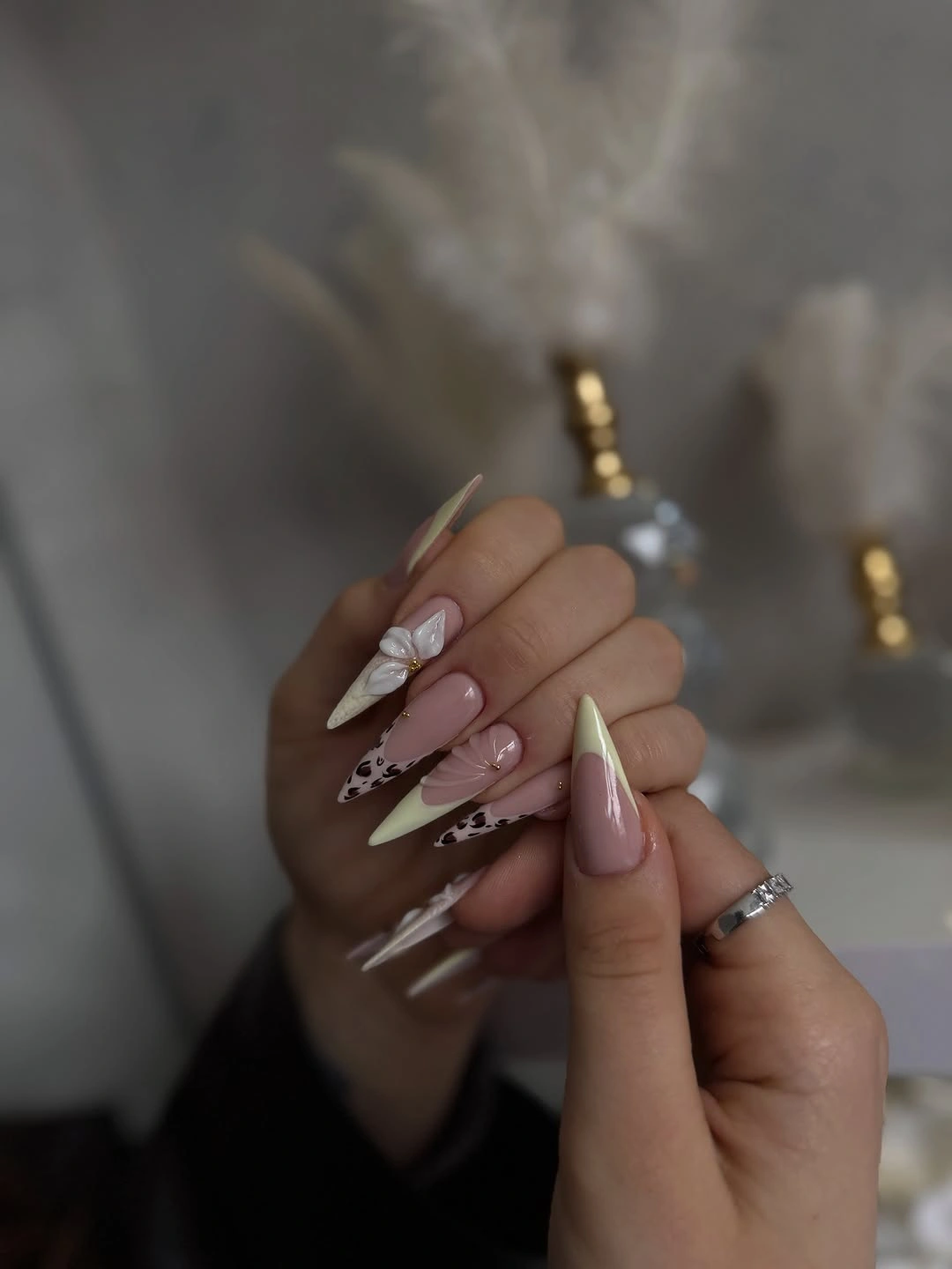
White linework remains visible because the base is pale but not identical in value, and the gold accents appear as small warm interruptions rather than a second main color. The open ground keeps the details from becoming crowded, especially where the lines curve near the tips. To adapt the idea, keep white tips on every nail but reserve the finer linework and gold for two feature fingers.
The long silhouette can make delicate lines look more ornate than expected, while a short nail might not provide enough room for several curves. A medium almond is a useful middle ground, but the spacing should change with the surface; fewer lines with more air will look intentional, whereas copying every mark onto a smaller nail may blur the gentle structure.
Solid Turquoise Blue With Rounded Contour
Medium rounded nails are painted one saturated turquoise blue with a smooth reflective-looking surface. The color is vivid, but the compact shape prevents the manicure from feeling overly dramatic, and the absence of art lets the clean contour remain visible. This is a useful reminder that a bright shade does not need a pattern when its relationship to length and finish already creates enough focus.
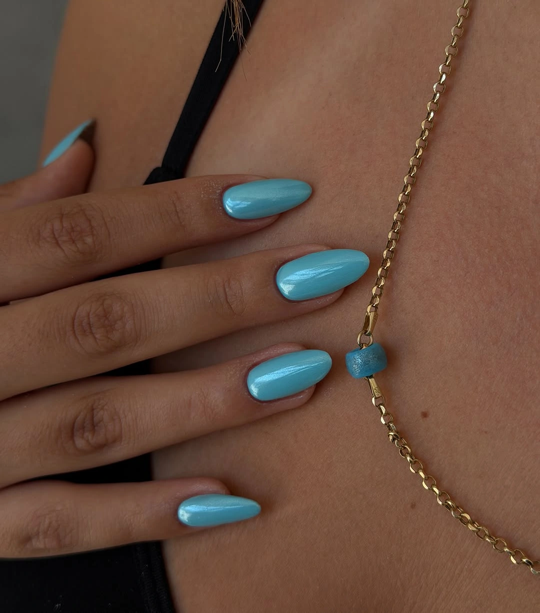
Turquoise gives fair skin a clear cool contrast, while the rounded ends soften the intensity that a sharp point might add. The surface appears even from nail to nail, so the set reads as one color decision rather than a sequence of accents. If you want a more seasonal variation, deepen the blue slightly or place the turquoise on two nails beside a pale neutral, but keep the simple silhouette.
Solid color leaves less room to hide inconsistent shaping, which is the honest upkeep consideration. The eye will notice uneven lengths or a rough edge before it notices anything else, although the moderate shape makes the overall commitment reasonable. Use the saturated blue when you want a clear focal point, and avoid adding several unrelated accessories that would compete with the one-color clarity.
Peach Nude With Spotted Black Accents
Medium almond nails use a peachy nude base with black irregular spots on selected fingers and one small light accent. The print is partial rather than full coverage, which leaves the warm base visible and keeps the moderate shape approachable. A few dark marks are enough to change the mood of the nude manicure without making every nail carry a dense pattern.
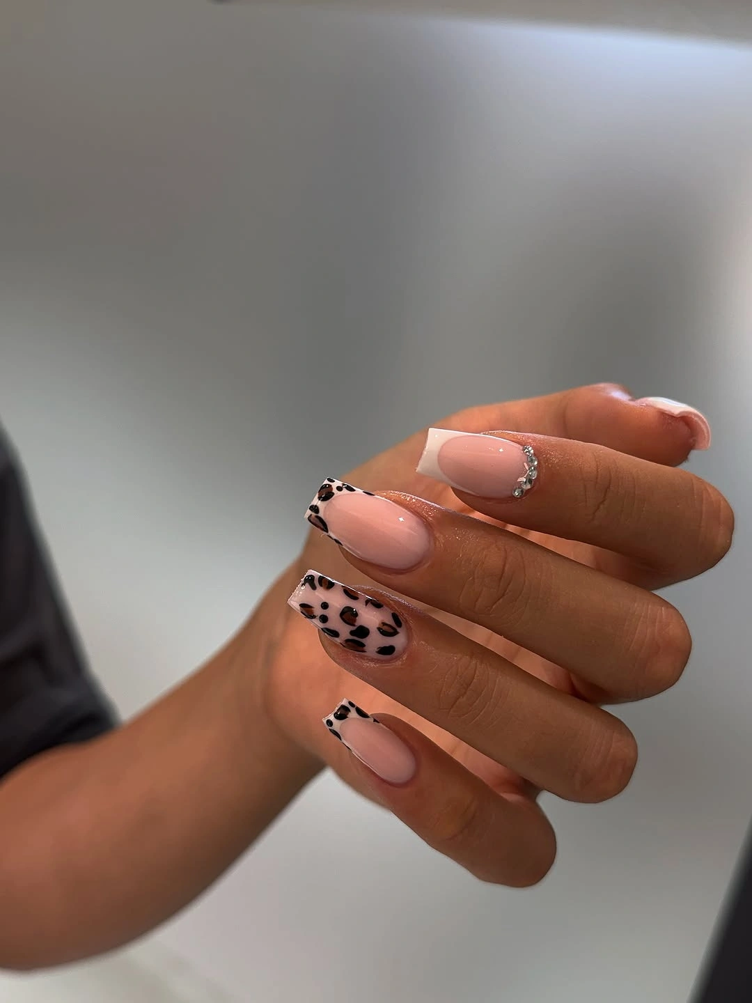
Concentration is what keeps the contrast soft. The black spots are strongest where they appear, but the peach base surrounds them and creates a visual pause on the plain nails. For a simpler adaptation, keep the spotted detail on two nails and replace the remaining accents with a few individual dots, or use a darker peach only on the feature fingers to give the pattern a little more depth.
A moderate almond shape gives the spots enough room to stay irregular, while a very short nail would need larger, fewer marks. Avoid adding another major print or bright color, because the design is already built around the shift from warm nude to black. The result is most wearable when the spotted fingers remain focal points and the rest of the hand continues the quiet peach base.
White and Blush Blocks With Silver Lines
Long squared or softly squared nails combine white sections, pale pink areas, and fine silver-looking lines or reflective details. The straight edge adds an architectural quality that differs from the almond designs, while the light palette keeps the structure gentle. Rather than relying on a dark outline, the manicure uses changes between white, blush, and small metallic marks to create visible order.
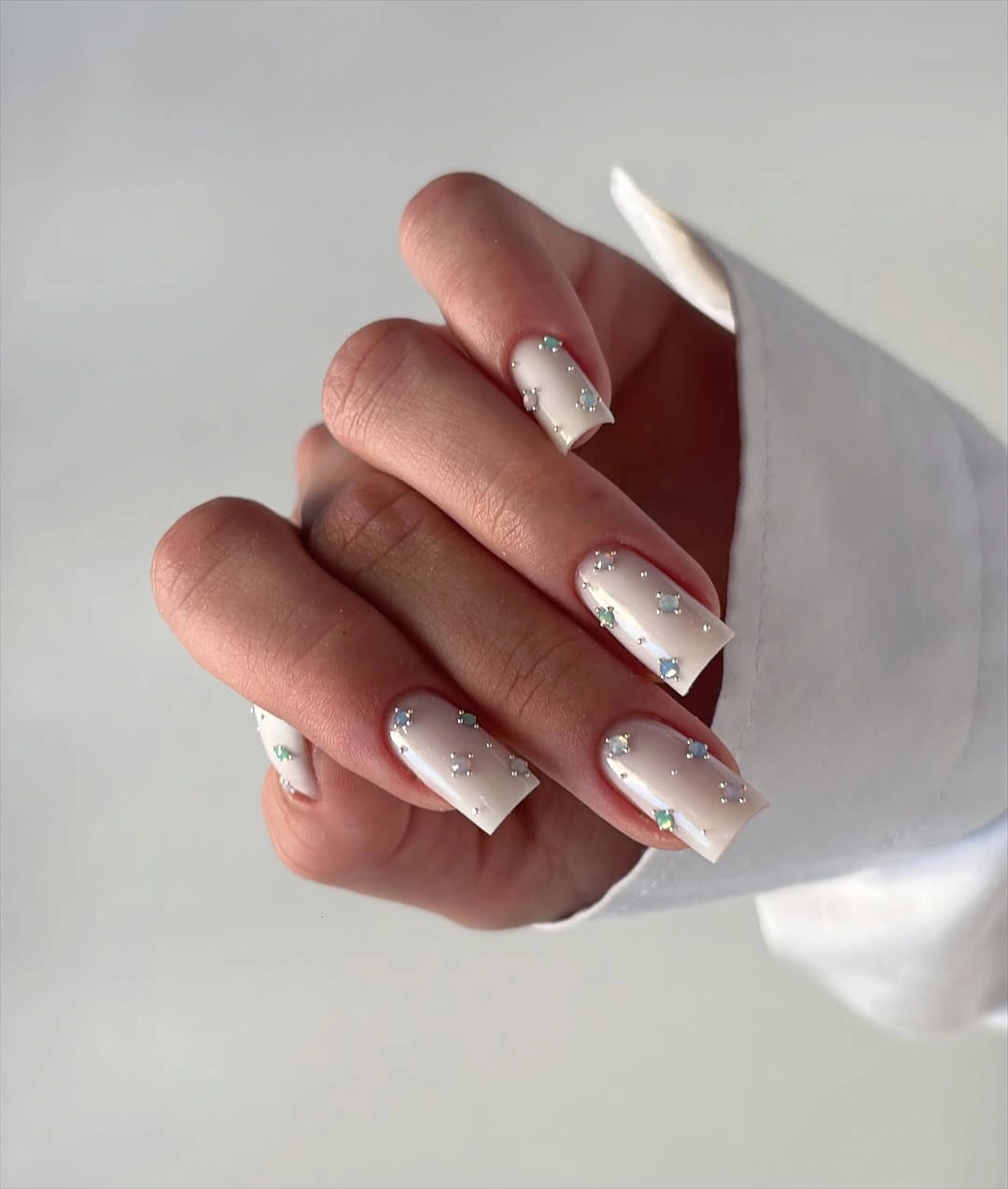
The square contour gives each color block a stable frame, making even small shifts in placement easy to notice. White supplies the largest visual pause, pink adds warmth, and silver catches light without dominating the pale balance. A shorter square would preserve the graphic relationship, while an oval adaptation would soften the blocks but also make their boundaries feel less architectural.
Light blocks can look polished but they require deliberate edges. As the length changes, the proportion of white to pink may shift, so keeping the metallic line fine helps the design remain calm through that transition. If you want less maintenance, remove the silver from most nails and let one accent carry it; changing the shape alone will not reduce the visual importance of the clean color divisions.
Pink Tips With Small Black and Red Marks
Long almond nails use pale pink as a base, white tips as a boundary, and tiny black spots with occasional red or dark marks. The strongest colors appear in small placements, so the hand stays light even though the palette includes clear contrast. The design feels delicate because the pink and white occupy most of the surface, while the dark details act like punctuation rather than full sentences.
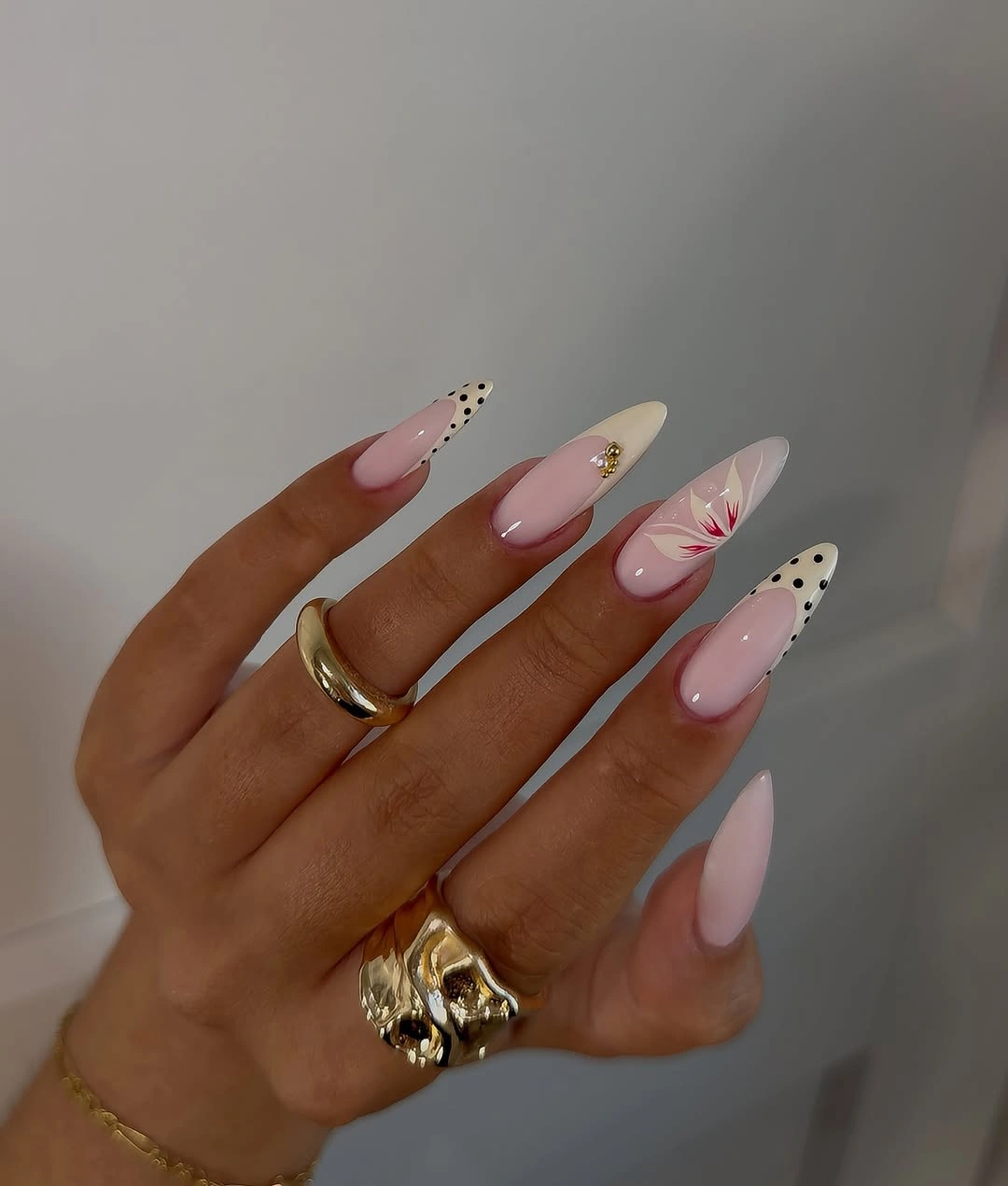
White separates the pink base from the edge, and the black spots give the pale field a graphic point without overwhelming it. Red adds warmth where it appears, but it remains secondary to the pink-and-white relationship. To simplify the look, keep the white tips on every nail and place the spotted detail on one or two fingers; preserving the sparse placement will keep the manicure airy.
The long almond silhouette provides room for tiny marks, yet it also makes the tip boundary more visible as the nail grows. A shorter almond may need a broader white edge and fewer spots so the design does not become cramped. Resist the urge to fill empty space simply because the base feels plain; the open pink surface is what lets the small dark accents remain special.
Slate Blue Brown and White Geometry
Moderate square nails alternate slate blue, brown, white, and dark angular blocks. The palette is muted enough for fall, while the straight outline gives every panel a clear frame and a slightly modern edge. There is no need for extra ornament because the design is built from proportion: each color receives a defined area, and the repeated blocks create a steady rhythm across the hand.
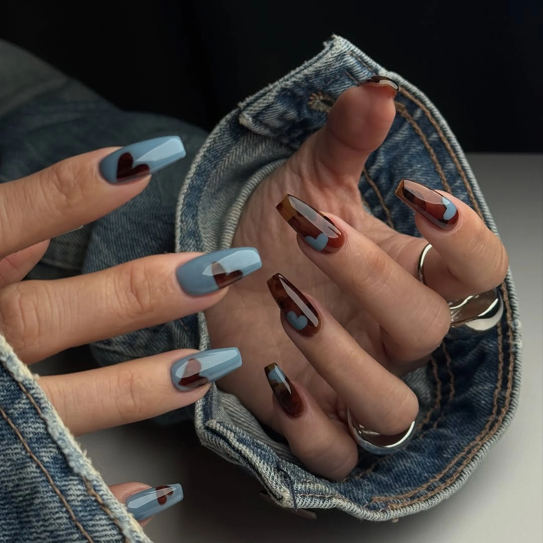
Slate blue and brown keep the contrast grounded, while white opens the composition so the dark panels do not merge. The square shape supports the geometry because its broader edge gives the blocks room to remain crisp. If you prefer a shorter manicure, reduce the set to slate blue and white on the accent nails and use plain brown or nude elsewhere; the structural idea will remain easy to read.
Muted color blocking can become flat if the boundaries are too similar in value, so the white panel is useful as a deliberate pause. A very long shape would make the angular pattern more dominant, while a rounded edge would soften the design and change its language. Keep the moderate square proportion if the graphic structure matters, and edit the number of blocks before introducing another color.
Pink and Burgundy With A Spotted Panel
Medium almond nails combine soft pink and nude bases with burgundy sections and one brown-and-black spotted panel. The warm accent colors link the print to the surrounding solid nails, making the pattern feel framed rather than scattered. The shape is moderate enough for the manicure to stay approachable, while the burgundy gives the pale palette a deeper seasonal note.
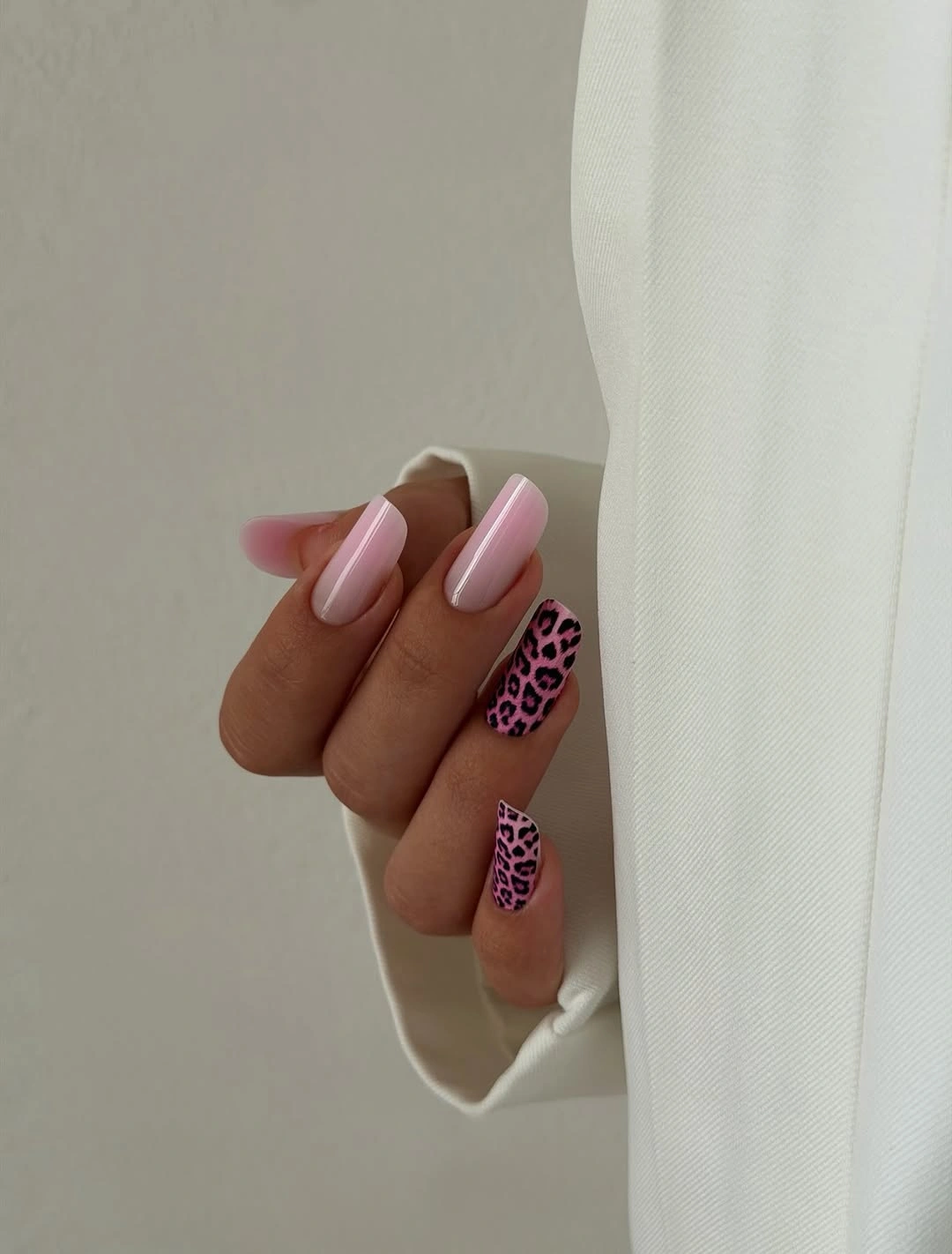
Burgundy acts as the bridge between the gentle pink and the darker print. It repeats the warmth of the spotted panel without asking every nail to carry the same pattern, and the nude areas leave room for the eye to rest. A practical version would keep the print on one nail per hand, use burgundy tips on two others, and leave the remaining fingers softly pink.
The design works best when the print stays a focal point rather than becoming background texture. On a smaller nail, many spots could merge, so use broader marks or a single panel instead of reducing every spot until it is unreadable. The moderate almond length is already a useful compromise, but a short oval would require an even simpler print and stronger reliance on the burgundy solid accents.
Pink Almonds With White Flower Accents
Medium almond nails close with a pale pink base, white flower-like shapes on selected fingers, small gold details, and thin dark outlines or tips. The soft base keeps the flowers legible without making them loud, while the gold adds warmth in tiny points around the pale design. The rounded almond contour supports the motif by keeping the edges gentle rather than sharply graphic.
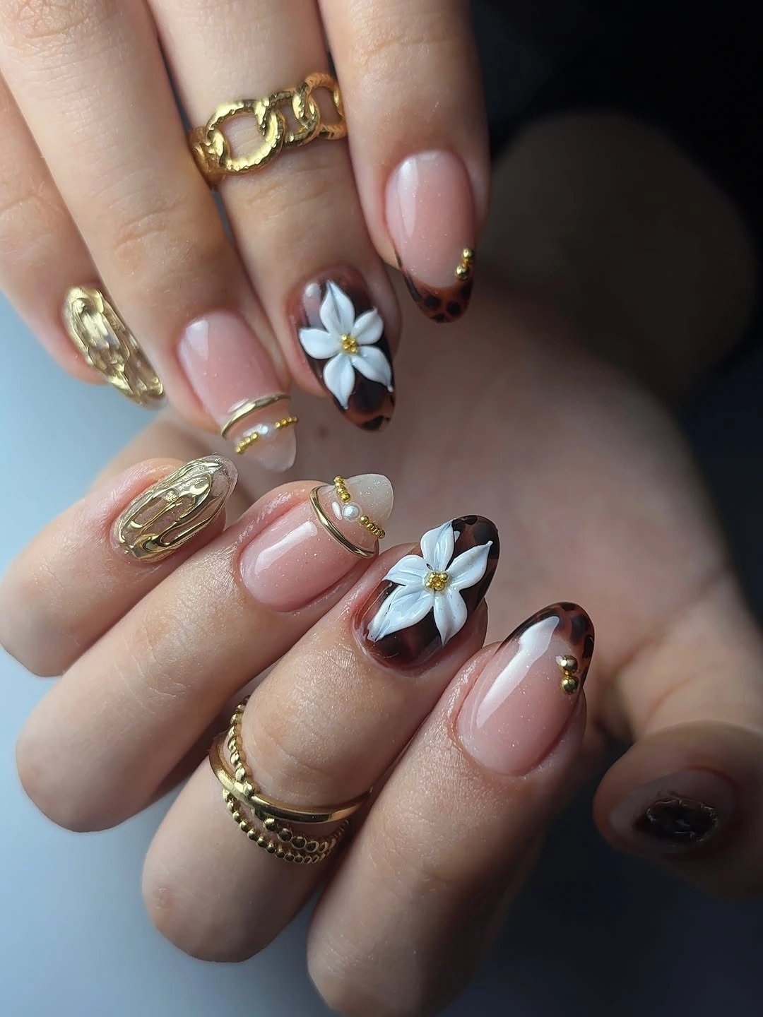
White blooms stand out because the pink ground is quiet and the dark outlines are used sparingly. Gold provides a warm glint, but it remains a supporting detail, so the manicure still reads as pale pink first. If you want a simpler adaptation, place one floral accent on each hand and use plain pink or a very thin pale tip on the other nails; the spacing will keep the design delicate.
The small flowers need enough surface area to remain recognizable, which is why the medium almond proportion works better than a very short shape for this particular placement. As the nail grows, a centered motif may shift visually, so fewer larger flowers can be easier to live with than many tiny ones. Keep the palette limited to pink, white, and one warm metallic note, since additional color would weaken the gentle finish. A related pale-pink reference is the site’s pink fall nails, where the base stays quieter than the accent.