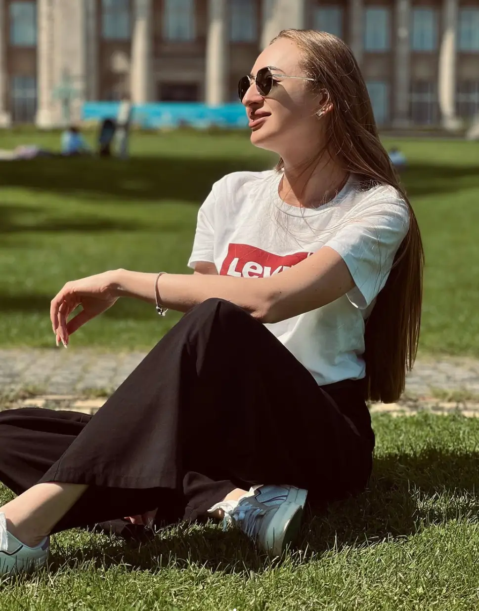

Christmas outfits for kids 2026 can signal the season without covering every surface in red, green, or obvious motifs. A compact chest graphic may carry as much visual weight as broad plaid, while one oversized bow can turn a restrained palette into something far more decorative. What matters is not the number of festive details, but where they appear, how large they are, and whether the rest of the outfit stays quiet enough to let them register.
Christmas outfits for kids become especially interesting when color and detail are treated as parts of the same composition. A strong upper motif can sit above a neutral lower half, repeated tones can connect accessories with clothing, and a simple silhouette can give surface pattern more room to stand out. Large decorative elements create a different rhythm from tiny repeated accents, so the overall effect can shift from restrained to playful or highly detailed without relying on one fixed holiday formula.
A Small Graphic Makes the Holiday Point
The focal point stays concentrated at the center of the torso, where the red-and-white "Archie Believes" lettering breaks across an otherwise pale blue sweatshirt. Because the surrounding color is quiet and largely uninterrupted, the graphic does not need to spread across the whole top to register clearly. Its compact placement gives the festive message a defined visual boundary instead of turning the sweatshirt into an all-over pattern.
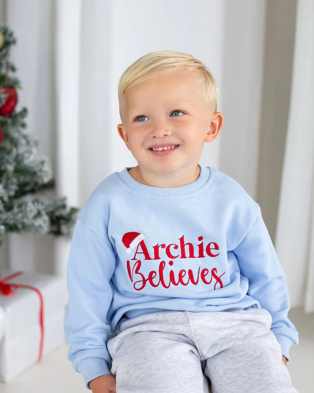
Photo via Instagram
Color does most of the separating work. Red lettering creates the strongest contrast against pale blue, while the smaller white details soften that transition without becoming a competing block. Gray pants continue the restrained direction below the sweatshirt, so the eye returns naturally to the graphic rather than moving between several equally intense areas of color.
Keeping the festive detail confined to one central area gives this festive outfit for kids a restrained scale. The Christmas cue is clear, but it remains one element within a mostly quiet palette rather than covering the entire silhouette.
Pink Goes Playful With One Oversized Bow
Scale gives the sweater its strongest decorative effect, with a large white bow outline stretching broadly across the pink front. The motif is simple in line and limited in color, yet its size makes it impossible to read as a minor accent. Instead of depending on several small details, the design lets one oversized shape occupy most of the visual space across the upper body.
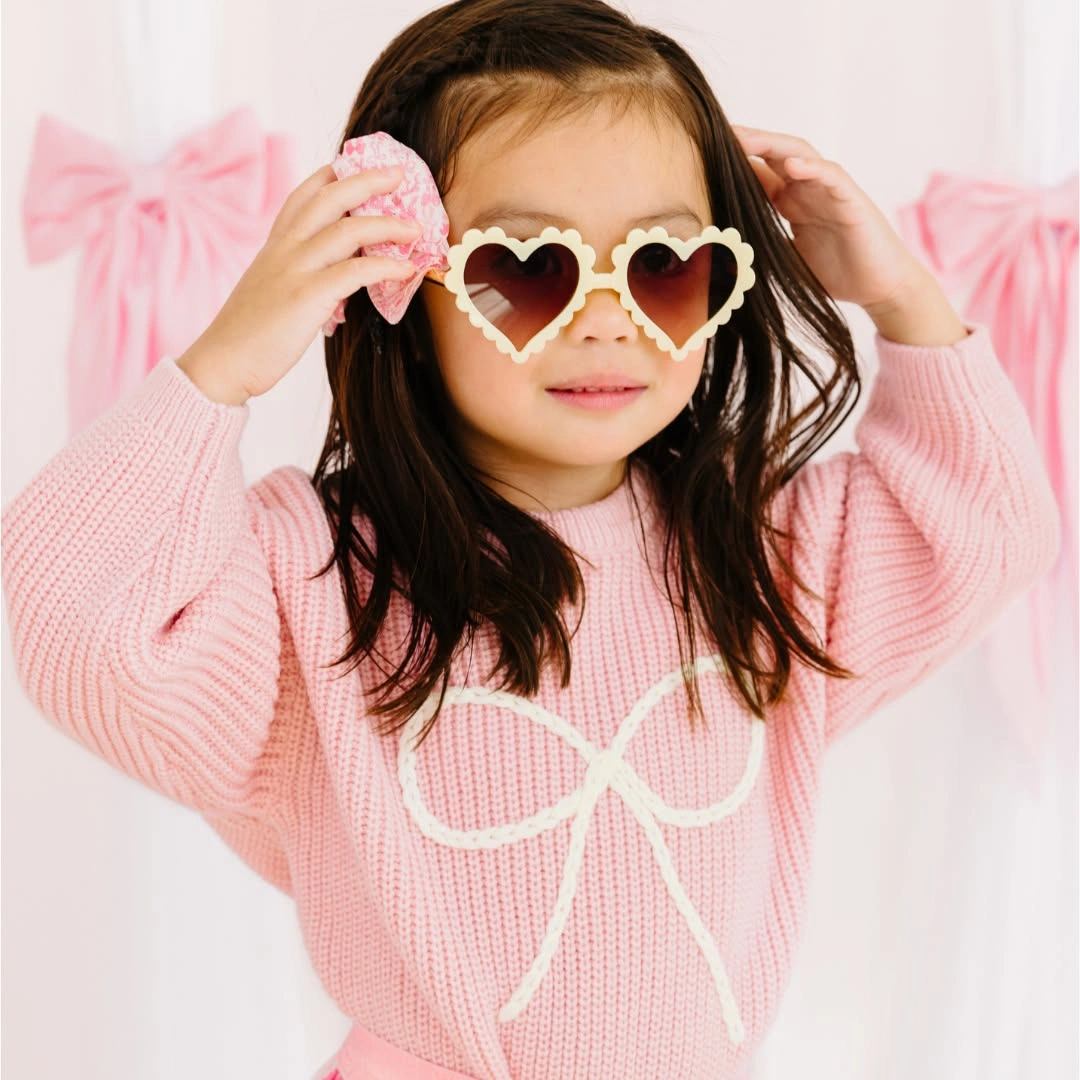
Photo via Instagram
Rounded forms repeat above the sweater through the cream heart-shaped sunglasses, linking the accessory to the sweeping loops of the bow without duplicating its exact shape. That relationship keeps the composition decorative even though the palette remains almost entirely pink, white, and cream. The repeated curves create visual continuity without relying on traditional red-and-green Christmas coloring.
Decorative energy can come from exaggerated scale as easily as from seasonal color. A large motif and equally noticeable accessory give the nearly monochromatic palette enough variation to feel expressive without adding a dense print.
Red Plaid Gains Focus From Black Accents
Pattern is concentrated across the upper half, where red-and-black plaid fills the loose-looking top from neckline through the sleeves and body. Below it, black leggings replace repeated lines with one uninterrupted dark field. That clear shift from busy pattern to solid color keeps the plaid visually dominant while preventing the lower half from adding another competing design.
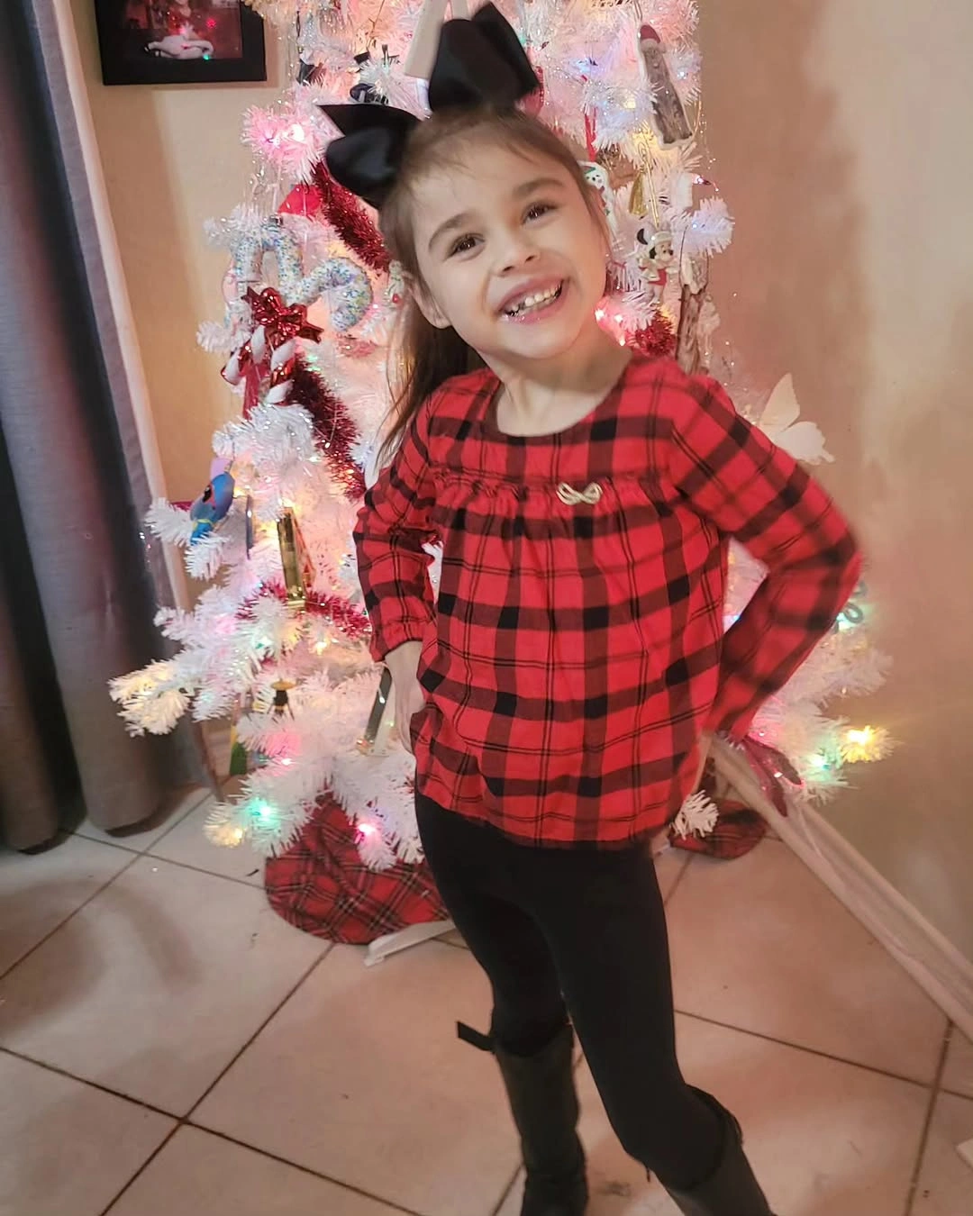
Photo via Instagram
The large dark bow above the head picks up the deepest lines running through the plaid, creating a connection between the top of the silhouette and the black leggings below. Because it repeats an existing color rather than introducing a new one, the bow feels visually tied to both parts of the outfit. The result is a strong three-point rhythm of dark accessory, dark plaid lines, and solid black lower half.
Proportion strengthens the effect because the patterned top occupies more visible area than the narrow dark lower section. Red remains the most noticeable color, while black gives the plaid enough structure to stay defined rather than visually spreading into every part of the outfit.
Silver Patterning Turns White Into Dressy Contrast
Surface contrast changes the character of the light dress before another color is even introduced. Silver-toned ornamental patterning spreads across the white base, creating enough density to separate the dress from a plain monochrome silhouette. The knee-length shape remains relatively direct, so attention stays on the changing light-and-silver surface rather than on complicated volume or multiple garment layers.
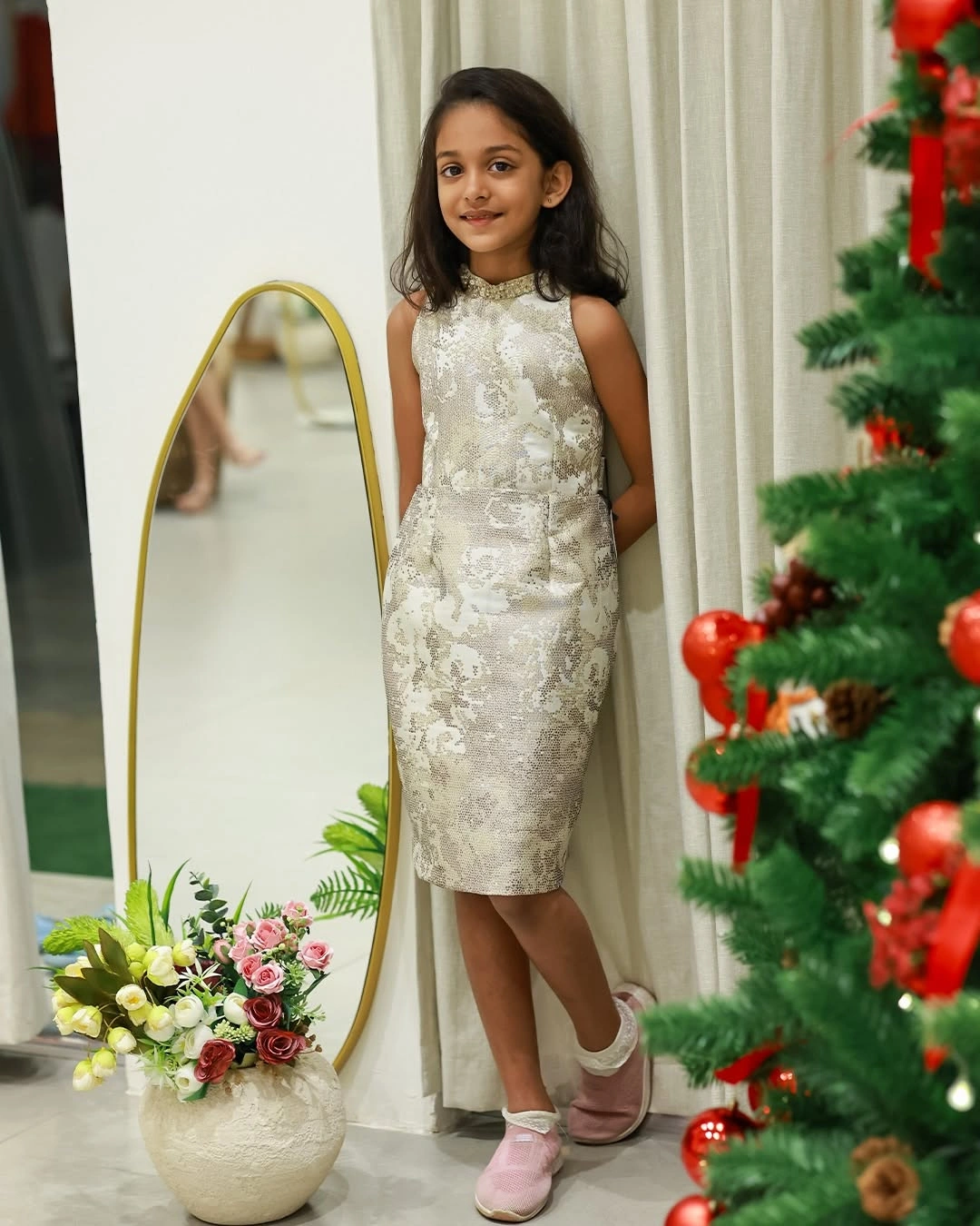
Photo via Instagram
The relatively straight outline gives the ornamental pattern a broad, continuous area in which to remain visible from the upper body toward the hem. Instead of dividing the dress into sharply contrasting sections, the design repeats its silver-toned detail across the same pale foundation. That continuity makes surface decoration the main source of variation rather than color blocking or an oversized accessory.
Pale pink shoes make a controlled departure from the white-and-silver direction without pulling focus away from the dress. Their softer color adds a distinct note at the bottom of the silhouette while leaving the patterned surface as the strongest decorative element.
Soft Pink Becomes Ornate Through White Trim
Color continuity runs almost the full length of the outfit, beginning with the muted pink long-sleeve dress and continuing through pink tights and pink shoes. Because those areas stay within the same narrow color family, the silhouette reads as one extended vertical statement rather than several separate blocks. The restrained palette also makes the lighter decorative edging around the upper dress easier to notice.
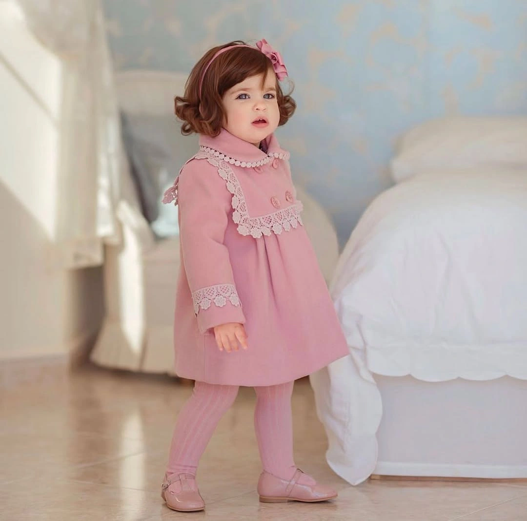
Photo via Instagram
White detailing is placed where it can frame the dress rather than cover it, with a broad decorative band high across the front and lighter edging repeated at the cuffs. These interruptions are relatively narrow compared with the surrounding pink, so they create structure without breaking the color flow completely. Their placement draws attention toward the upper body and sleeves while the lower half remains visually continuous.
Limited contrast can still create an ornate effect when it appears in deliberate, repeated positions. Here, the white accents work because they interrupt a long field of pink selectively, allowing the decoration to remain noticeable without becoming the dominant color.
ChatGPT сказав:
Red Plaid Meets an Extra-Large Hair Bow
Dense plaid already fills most of the outfit with intersecting red, black, and lighter lines, yet the oversized bow above it still becomes an immediate focal point. Its solid red surface separates it from the busier pattern below, so the accessory does not disappear into the garment. The contrast between one broad block of saturated color and many narrow plaid lines gives both elements enough visual presence.
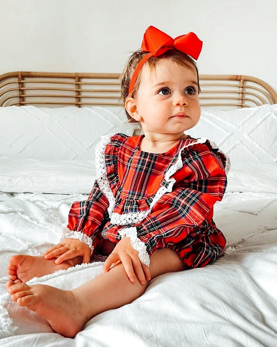
Photo via Instagram
Red connects the bow directly to the dominant color running through the plaid, while the white decorative edging introduces small breaks around the patterned surface. Those lighter details keep the red-and-black field from becoming visually continuous from edge to edge. Because the accessory repeats the strongest color instead of adding a new one, the upper and lower parts remain tied together despite their different visual densities.
Scale changes the impact of the accessory because the bow is large enough to stand beside an already active pattern rather than merely decorate it. The result shows how one oversized element can intensify a festive design without needing additional motifs or another strong color.
Neutral Layers Let the Setting Carry More Color
Contrast comes from placing a restrained cream-and-brown outfit against surroundings filled with lights, greenery, small trees, and other holiday decoration. The clothing itself avoids strong graphics and saturated seasonal colors, which makes its quieter palette especially noticeable beside the more detailed background. That difference creates a calm visual center without requiring the garments to repeat the colors around them.
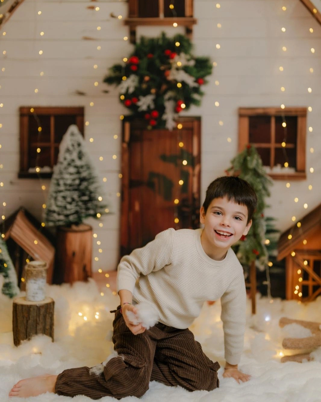
Photo via Instagram
A light cream top and darker brown pants divide the outfit into two broad tonal areas, giving the silhouette a simple top-to-bottom structure. With no obvious chest graphic or all-over print competing for attention, the color change between the upper and lower halves becomes the main clothing detail. The darker lower section also gives more visual weight to the base while the pale top stays comparatively open.
Festive outfits for kids do not need obvious Christmas motifs to create a seasonal impression when the clothing itself stays visually restrained. Neutral color blocking can remain distinctive on its own, while nearby decoration contributes a separate layer of holiday color rather than defining the outfit completely.
Large Red Plaid Defines the Pajama Look
Repetition drives the whole design because the same large red-and-white plaid continues across both the button-front top and the matching pants. Instead of concentrating the pattern in one area, the checks extend from the shoulders through the lower half, creating one continuous visual system. The scale of the plaid keeps the set bold and readable without depending on separate decorative motifs.
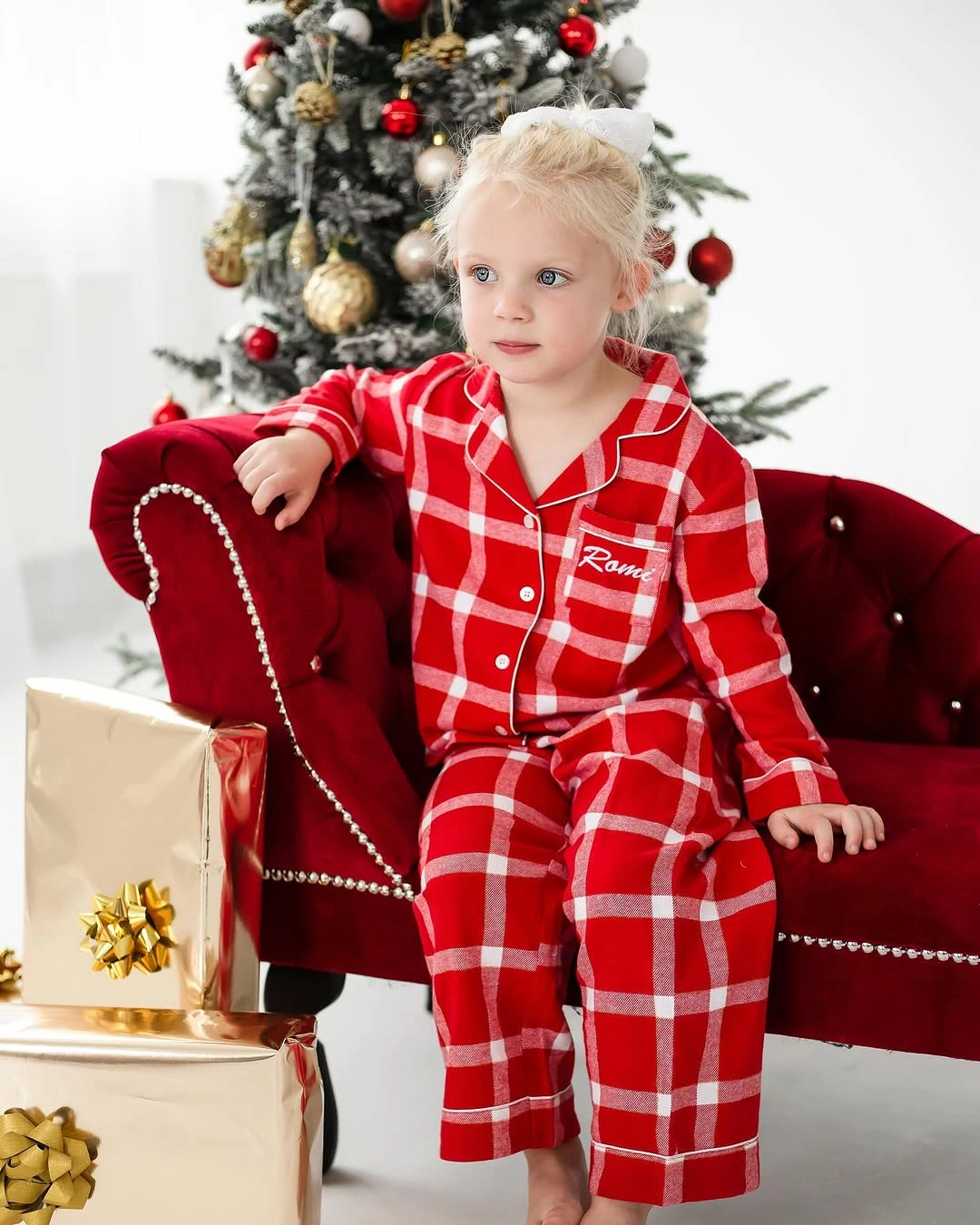
Photo via Instagram
White piping traces the edges of the top and collar, while white buttons introduce small vertical points through the center of the red plaid field. These narrow details sharpen the boundaries between stronger red sections and echo the lighter lines already running through the checks. Their smaller scale gives the pattern structure without breaking the continuity created by the repeated plaid.
Christmas pajamas gain a particularly unified look when one large-scale pattern carries across both pieces instead of stopping at the waist. The repeated red-and-white checks create consistency from top to bottom, while the white trim adds definition without changing the central pattern story.
A Wide White Collar Reframes Red Plaid
The wide white collar changes the entire balance of the red plaid dress by placing a bright horizontal shape across the shoulders. Its scale is large enough to interrupt the all-over pattern rather than simply edge it, so the upper part of the outfit develops a separate visual zone. The result is a clear contrast between a broad light frame above and the denser red plaid continuing below.
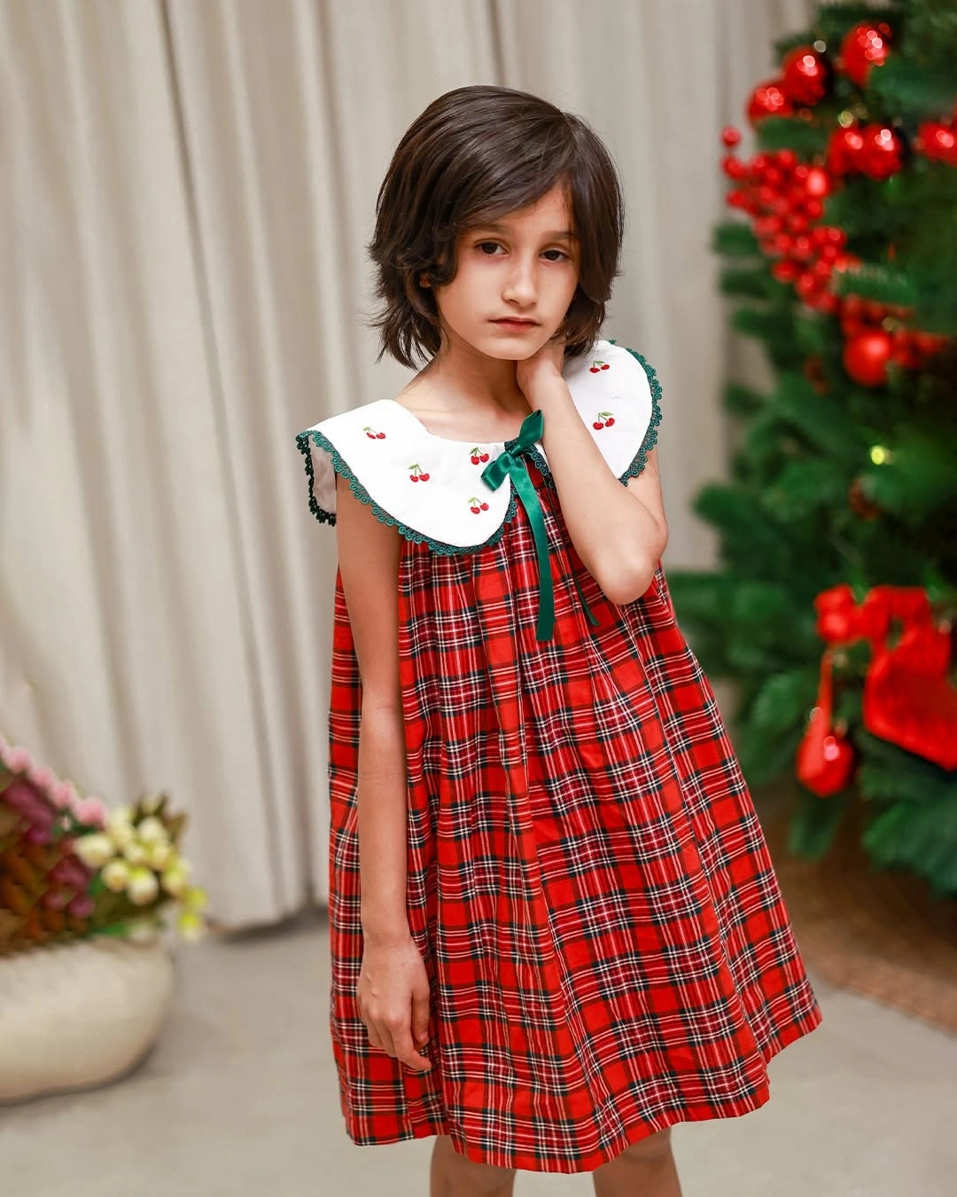
Photo via Instagram
Green edging outlines parts of the collar, and a small green tie detail at the center introduces a narrow third color beside the dominant red and white. Tiny red motifs on the collar also bring some of the dress color upward into the light area. These small repetitions connect the collar back to the plaid without reducing the strong contrast created by its white base.
Proportion is what gives the collar its authority because it occupies enough space to compete directly with the surrounding plaid. Rather than acting as minor trim, it becomes a major structural feature that changes how the patterned dress is read from the shoulders downward.
Cream and Red Give the Reindeer Motif Space
Vertical color separation is the strongest organizing feature, with cream covering the hood and main one-piece section while bright red footed legwear takes over below. The light upper area creates a broad neutral field, and the saturated red lower section provides the clearest color contrast. Because the two tones occupy distinct zones, the outfit reads as intentionally divided rather than densely patterned.
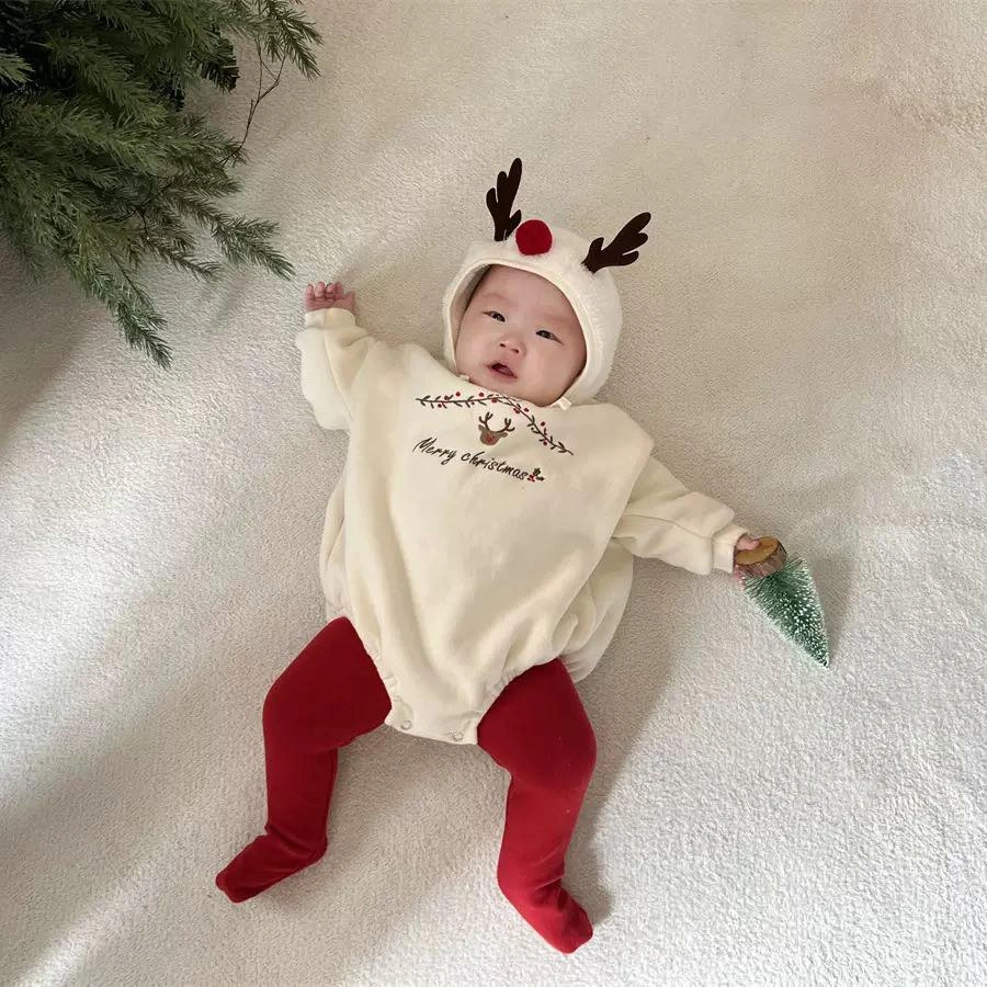
Photo via Instagram
The reindeer reference stays localized instead of spreading across the entire garment, appearing through the hood decoration and a smaller chest graphic. That limited placement gives each motif more breathing room against the cream background. The rest of the upper section remains comparatively plain, so the seasonal details stay visible without competing with an all-over print.
A light neutral base can make a small seasonal motif feel more pronounced because there is little surrounding pattern to distract from it. The red lower section adds a stronger festive color signal while leaving the reindeer details concentrated in the upper half.
ChatGPT сказав:
Green Repetition Connects Bow Pants and Details
Green repeats in two widely separated areas, with the oversized bow creating a strong accent above while the patterned pants carry the same dominant color below. Between them, the cream sweater acts as a lighter central zone, so the outfit is visually framed by green rather than covered by one uninterrupted field. That separation gives the repeated color more structure across the full silhouette.
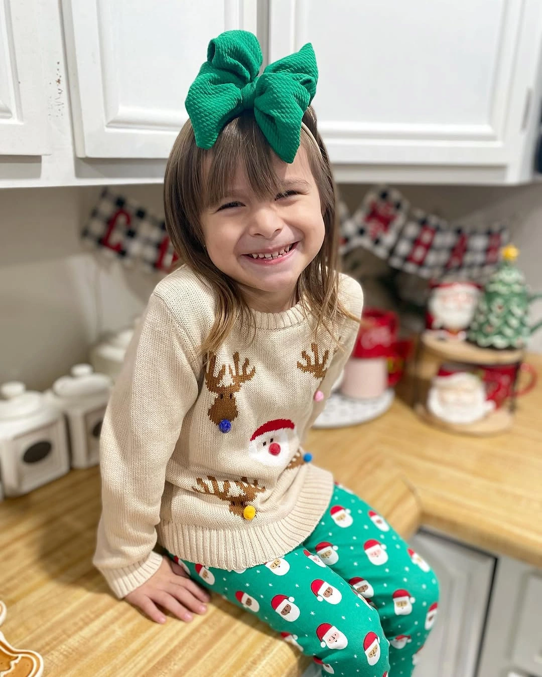
Photo via Instagram
Pattern density changes sharply between the upper and lower halves. The cream sweater uses spaced Christmas motifs with generous gaps of plain background, while the green pants are covered by a busier repeating print. This contrast keeps the outfit from becoming visually flat, because the eye moves between open areas and denser decoration instead of reading every surface at the same intensity.
Multiple festive details can coexist without feeling disconnected when one color keeps returning across different elements. The green bow and pants create that link, while the cream sweater gives the surrounding motifs enough room to remain distinct.
One Giant Bow Anchors an All-White Dress
The large front bow establishes the strongest focal point by sitting directly at the center of the dress and extending broadly across the upper body. Because the rest of the look stays within the same white palette, the bow gains emphasis through scale, placement, and shape rather than contrasting color. Its size makes it the main structural feature before the smaller surface details become noticeable.
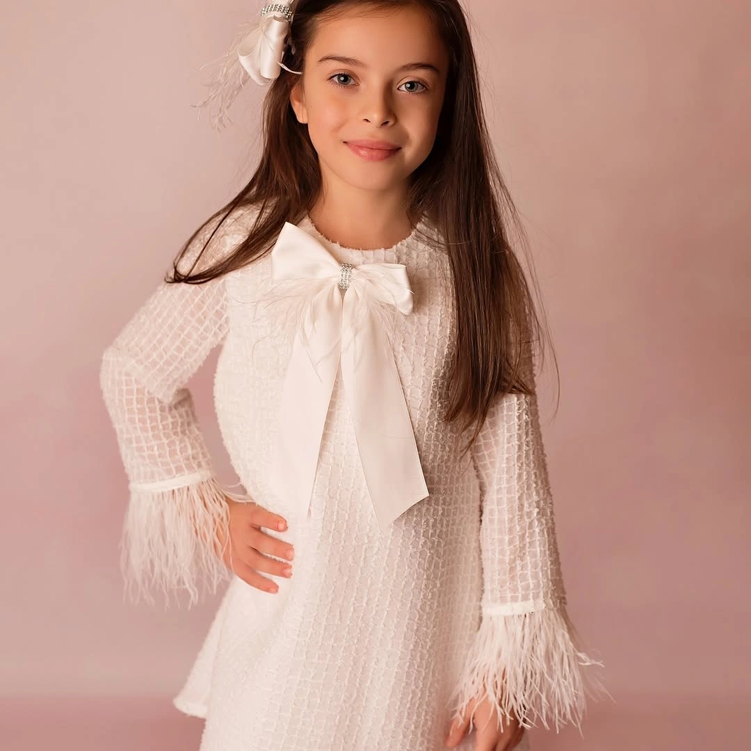
Photo via Instagram
Texture becomes more pronounced away from the clean central body, especially through the patterned sleeve surfaces and the fluffy, feather-like edges at the cuffs. These areas introduce visible variation without changing the color story, so the all-white direction still contains clear contrasts between smoother and more detailed sections. The sleeves frame the central bow rather than competing with it through a separate hue.
Monochrome does not have to mean visually minimal when surface treatment changes from one area to another. The repeated white keeps the palette unified, while the oversized bow, textured sleeves, and soft-looking cuff edges create dimension through shape and finish.
Gingham and Gingerbread Create Layered Festive Detail
Checks establish the broad patterned foundation, with the green-and-white gingham jumper covering the largest area of the outfit. Over that base, the gingerbread motif at the chest introduces a separate figurative focal point, so the design builds interest in layers rather than relying on one type of decoration. The white top underneath keeps both the checks and central motif clearly separated.
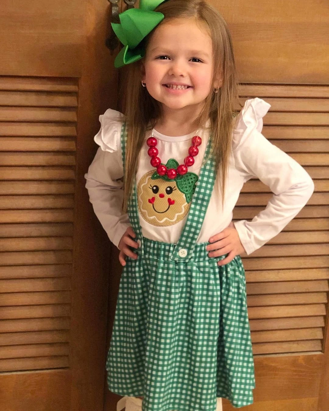
Photo via Instagram
Red appears in smaller concentrated accents instead of occupying a large garment section, while green repeats through the jumper, oversized hair bow, and parts of the bead-like necklace. That difference in scale gives green the dominant role and lets red function as punctuation. Because the two colors recur in several places, the necklace and gingerbread detail remain tied to the broader palette.
Decorative density feels deliberate when several independent elements share the same limited color system. The gingham, gingerbread motif, necklace, and bow all contribute different shapes, yet repeated green and red keep the overall arrangement visually connected.
Pink Volume Sits Below a Simple White Top
Proportion changes dramatically from top to bottom, with the white long-sleeve top staying relatively restrained above a much fuller pink skirt made from several visible tiers. The small pink bow motif on the chest occupies only a compact area, while the lower half expands outward and carries far more visual volume. That reversal makes silhouette, rather than print, the dominant feature below the waist.
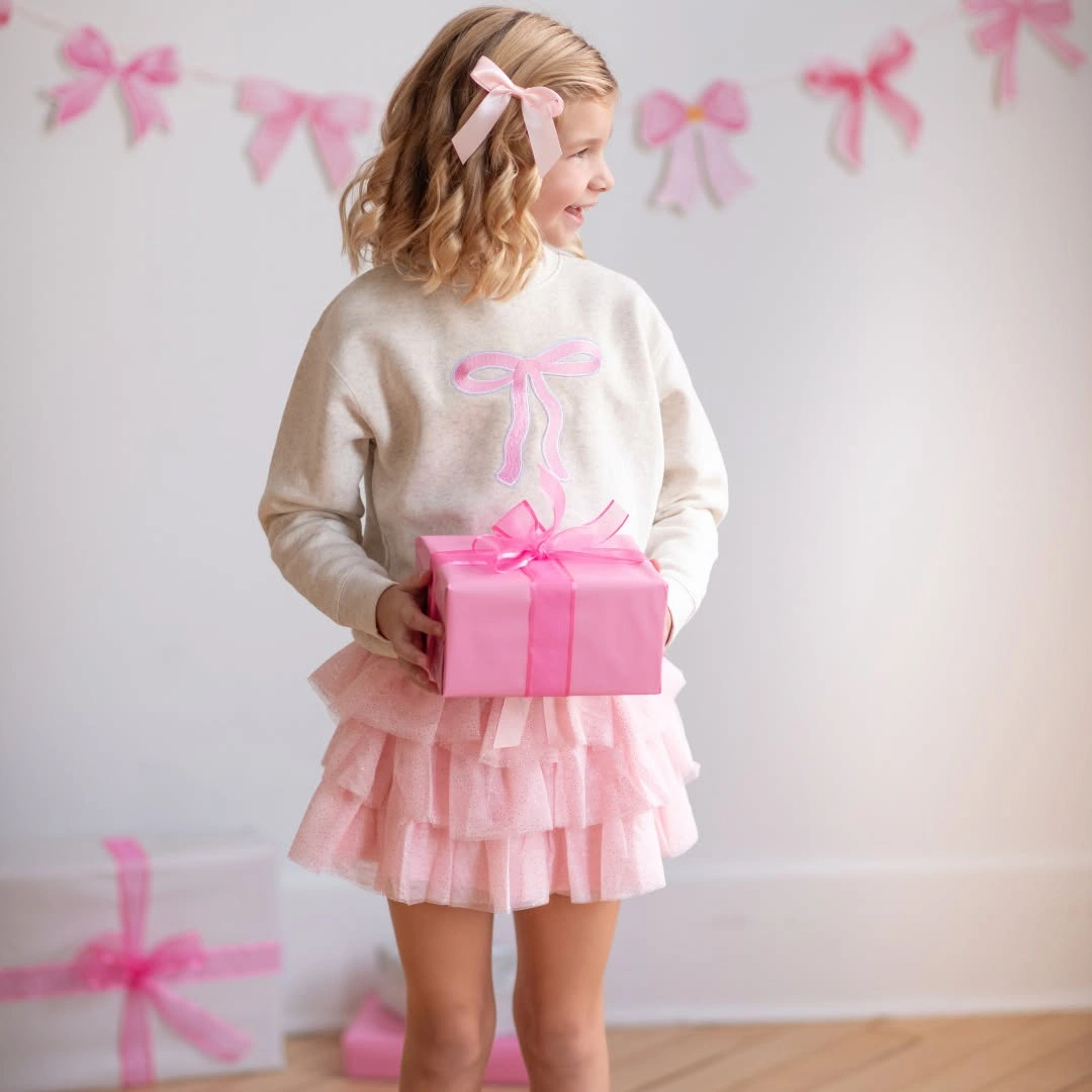
Photo via Instagram
Bow shapes recur across the chest motif, the pink hair accessory, and the ribbon tied around the visible gift, creating a repeated visual language without making every bow identical in size. The same color family also moves through these smaller accents and into the much broader skirt area. This repetition connects the separate elements while allowing the tiered lower half to remain the largest pink statement.
One color can shift noticeably in impact depending on how much space it occupies. Pink appears as a small motif and compact accessory above, then expands into broad layered volume below, giving the palette both fine detail and large-scale presence.
Gold Concentrates at the Top of White Volume
The silhouette is divided clearly between a compact gold-toned upper section and a much broader white layered skirt below. Because the stronger decorative surface is confined to the bodice, it attracts attention despite occupying less total area. The pale lower half creates enough visual space around it for the upper section to remain concentrated and pronounced rather than blending into a more evenly decorated dress.
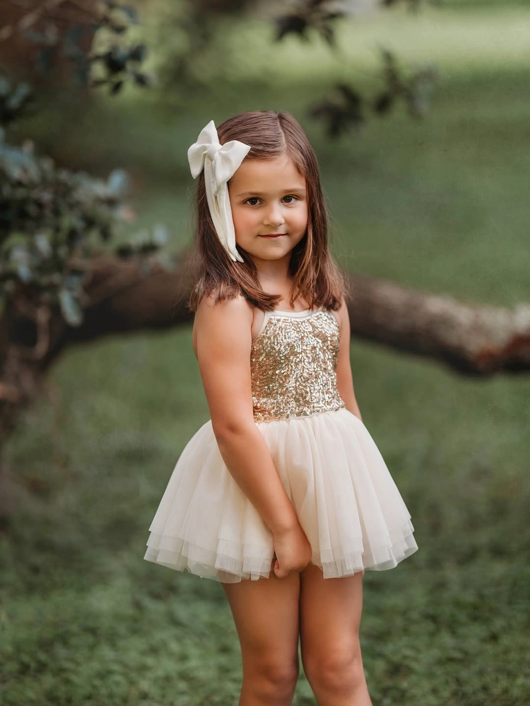
Photo via Instagram
A large white hair bow repeats the skirt color high above the bodice, carrying the pale tone into a second separated area. That repetition prevents the gold-toned section from becoming the only point of connection between top and bottom, while still leaving it framed by white on both sides. The result is a clear color rhythm built from pale, decorated, and pale zones rather than a simple two-color split.
A relatively small area of shine-like decoration can hold strong visual weight when it is surrounded by a larger light base. The gold-toned upper section remains the concentrated focal point, while the white skirt and bow extend the softer color across two different parts of the silhouette.
ChatGPT сказав:
Red Pants Sharpen a White Graphic Sweatshirt
The strongest visual signal comes from the lower half, where saturated red pants form a broad block of color beneath the white sweatshirt. Red occupies enough of the silhouette to establish the dominant festive note before the smaller upper graphic is considered. Keeping the two garment areas clearly separated also makes the contrast feel deliberate rather than dispersed across several competing colors or patterns.
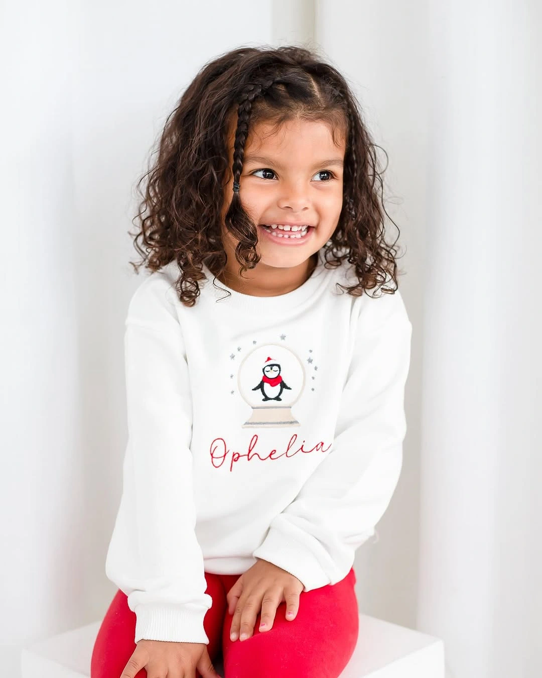
Photo via Instagram
Above that bold lower section, the small penguin graphic sits near the center of the white sweatshirt and introduces a compact point of detail without challenging the strength of the red pants. The surrounding white area gives the motif plenty of visual space, so it remains easy to notice despite its smaller scale. This balance keeps the upper half graphic-led while the lower half stays color-led.
Red and white Christmas outfits can read distinctly festive through a clean two-color division rather than an all-over seasonal print. The concentrated red lower half supplies the strongest color cue, while the centered graphic gives the white upper section a separate focal point.
Suspenders Structure a Red and Green Dress
Red and green divide the dress into clearly recognizable color areas, giving the outfit a strong Christmas palette without needing several additional hues. The contrast is direct enough that each color remains easy to distinguish across the silhouette, while the overall composition stays focused on the relationship between those two dominant tones rather than on smaller decorative details.
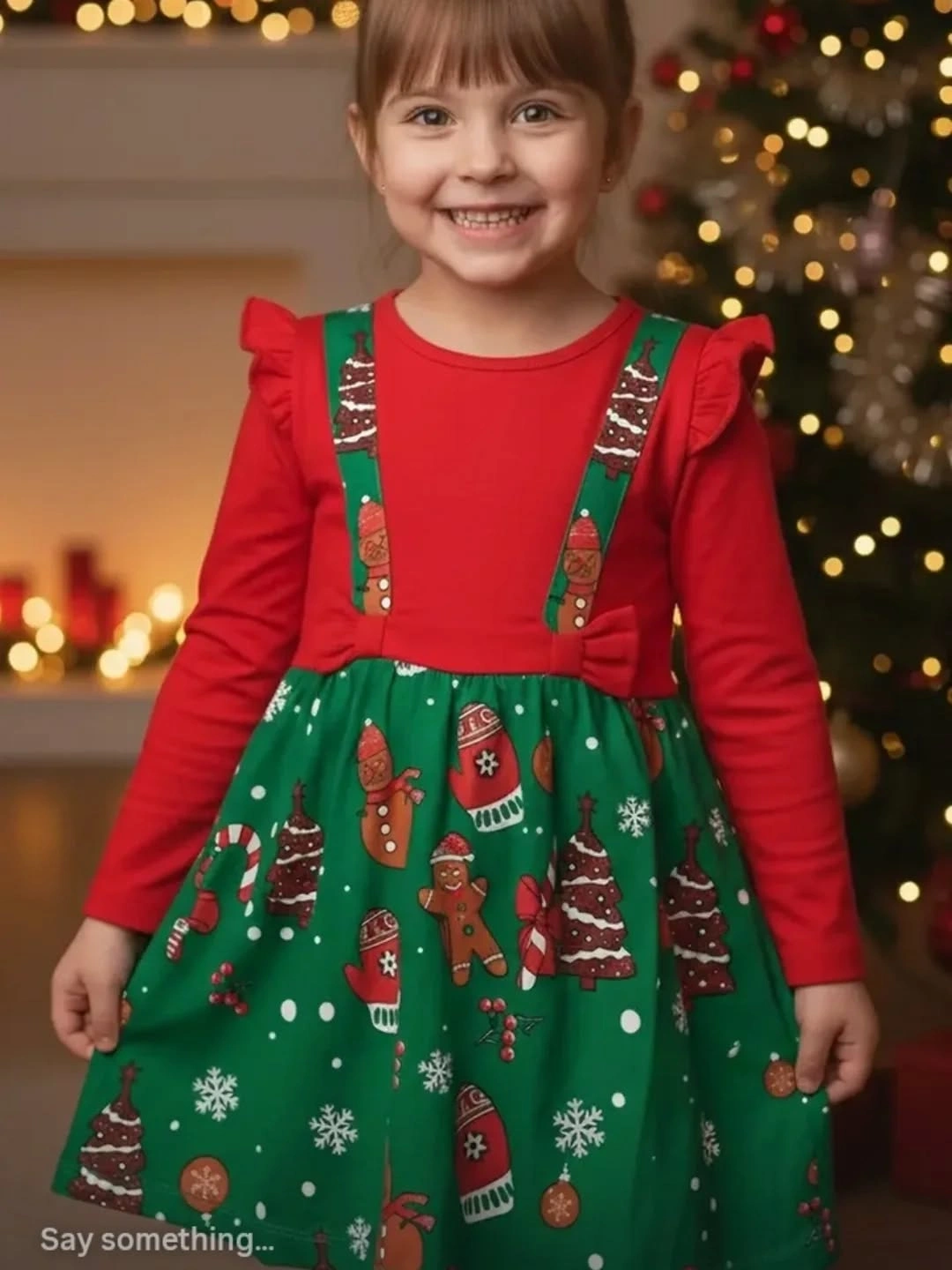
Photo via Instagram
The suspender-like straps add a visible vertical structure to the dress, drawing attention upward and giving the upper section a more defined framework. Instead of relying only on color blocking, the outfit also uses those narrow lines to organize the silhouette. Their placement creates a clear connection between the upper and lower parts of the dress without requiring extra accessories.
Red and green carry most of the festive effect through simple color recognition and clear separation. The suspender-like straps add another layer of structure, so the outfit combines a familiar Christmas palette with a distinctly vertical silhouette.
Green and White Split the Silhouette Cleanly
A green sweater forms the darker upper section of the outfit, while the white skirt creates a much lighter area below. That clear top-to-bottom division gives the silhouette an immediate two-part structure, with color contrast doing most of the visual work. The palette stays limited, so the difference between the green upper half and white lower half remains especially easy to read.
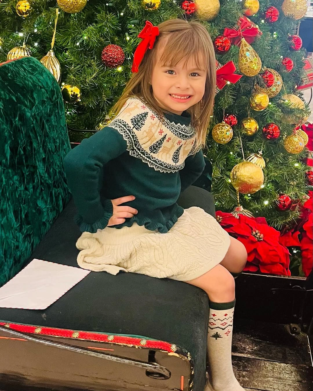
Photo via Instagram
The Christmas tree beside the child adds another visible area of green to the composition, creating a subtle connection between the sweater and the surrounding seasonal setting. At the same time, the white skirt keeps the clothing from becoming visually absorbed into the darker background colors. The result is a balanced contrast between a stronger upper tone and a brighter lower section.
A reduced green-and-white palette can feel festive without depending on dense prints or multiple decorative accents. The simple color split gives each garment its own visual role while keeping the overall composition clear and restrained.
Coordinated Pajama Patterns Create a Shared Festive Rhythm
Two patterned pajama sets create an immediate sense of coordination because both children are dressed in festive-looking designs that belong to the same visual direction. The effect comes from repetition across two separate outfits rather than from a single garment, so the eye reads the pair together while still recognizing each pajama set as its own complete look.
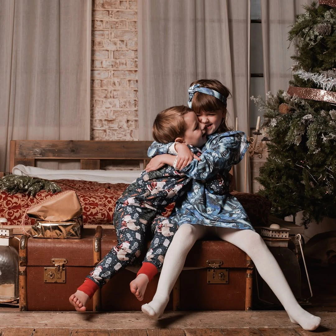
Photo via Instagram
Pattern becomes the main connecting device, with both sets carrying enough visible decoration to establish a shared festive character. That coordination makes the phrase matching Christmas outfits appropriate in a cautious visual sense, because the clothing clearly relates across the two figures without requiring any claim about who they are to one another or whether every design detail is identical.
Christmas pajamas can create a stronger collective effect when two visible sets share a coordinated visual language. The repeated festive patterning links the outfits across the composition while allowing each set to remain individually readable.
Pink Pajamas Keep the Palette Visually Focused
Pink carries nearly the entire visual identity of the Christmas pajama set, keeping the outfit within one clearly defined color direction rather than dividing attention among several strong hues. Because the same dominant color continues across the visible pieces, the overall silhouette reads as connected from top to bottom. That continuity gives the set presence through color concentration instead of sharp contrast.
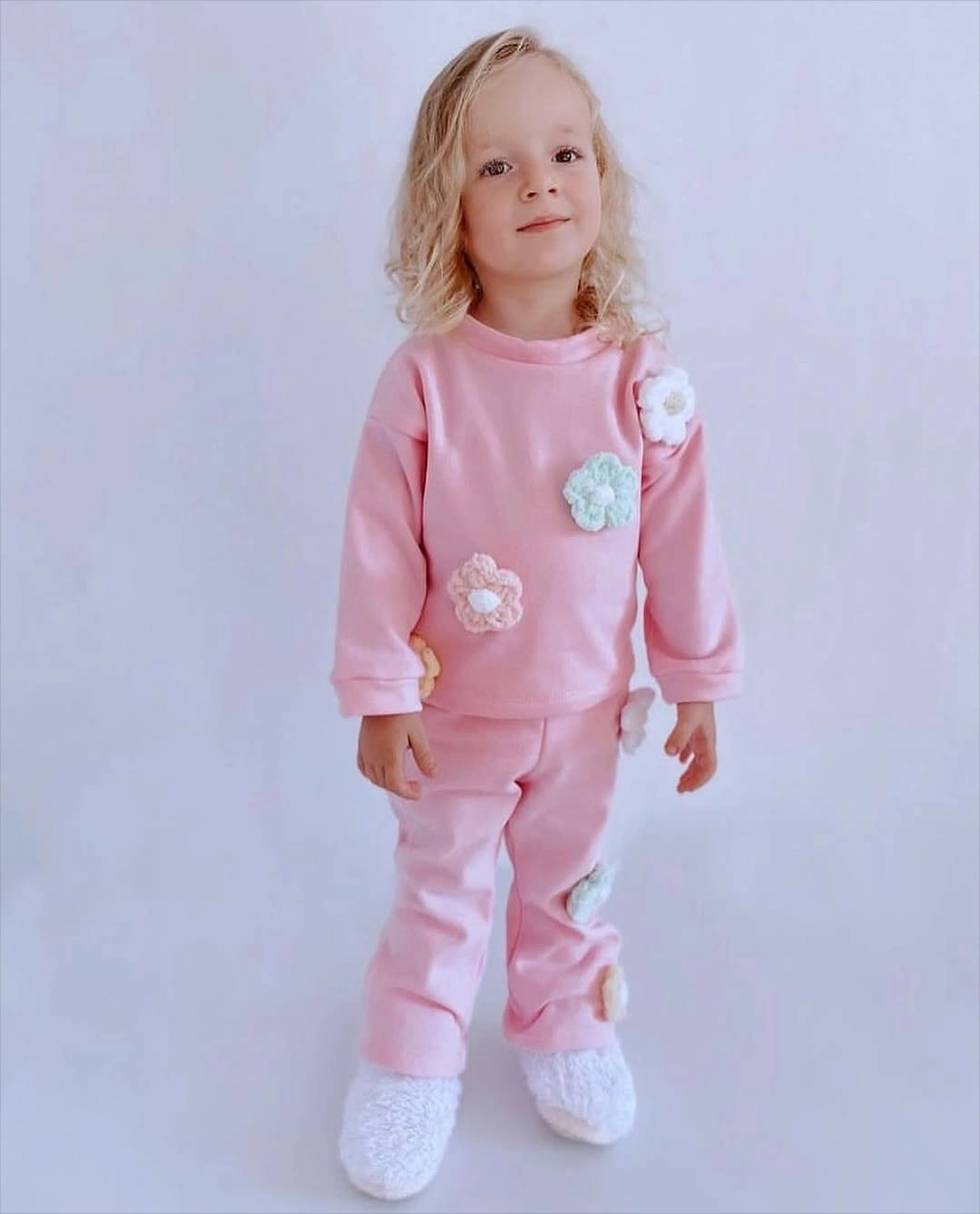
Photo via Instagram
The pajama composition stays visually straightforward, allowing the broad pink areas to establish most of the look. With the upper and lower pieces sharing the same color family, there is little interruption between them, so the outfit reads as one coordinated set rather than separate competing blocks. The emphasis falls on repetition, proportion, and the continuous spread of one dominant hue.
Christmas pajamas do not need a complicated color scheme to create a distinct visual identity. Here, the concentrated pink palette keeps attention on the relationship between the two pieces and the uninterrupted color flow across the set.