

There is something quietly satisfying about a repeated circle when it has enough air around it. On a nail, that tiny mark can read playful or polished depending on the space it is given, and polka dot fall nails 2026 feel most personal when the pattern leaves room for the hand itself to remain part of the composition.
Trust the version that makes your hands feel more like an extension of your own style than a theme you have to perform. A small pattern does not need to be made louder to matter; when its scale and placement feel right, it can stay lighthearted without becoming childish and decorative without asking for every glance in the room.
Pink and Brown Dots in Reverse
Long almond nails show two versions of the same idea: soft pink with dark dots and deep brown with pale dots. Reversing the contrast gives the motif a gentle rhythm, because the dot scale stays related while the base colors trade places. The result feels coordinated without forcing every nail into one repeated color arrangement.
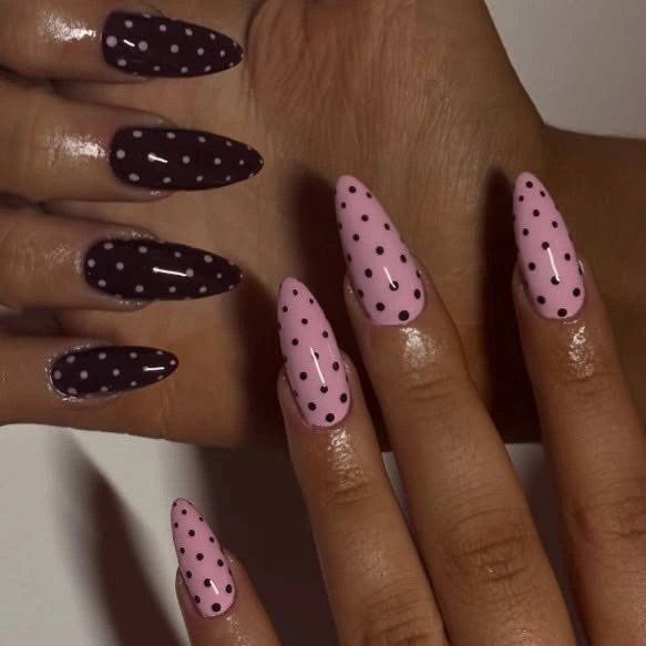
Choosing only one of the two base colors would make a more composed version, especially for anyone who prefers a quieter manicure. The mixed pairing succeeds because pink and brown are both warm enough to speak to each other. Introducing a cool third base could disrupt that soft balance unless it appeared only as a very small accent.
The dots are evenly visible rather than crowded at the cuticle or tip, which lets the almond outline remain part of the design. A larger circle would make the look bolder, while a smaller circle would feel more delicate. Keeping that scale consistent is what allows the color reversal to feel intentional instead of like two separate nail ideas.
Dotted French Tips in Brown and Cream
Sheer nude nails end in alternating dark brown and cream French tips, each carrying a line of small dots along the colored edge. The center remains almost bare, so the pattern feels airy even though two contrasting tip colors are present. The almond shape gives the dotted border a curved, continuous path to follow.
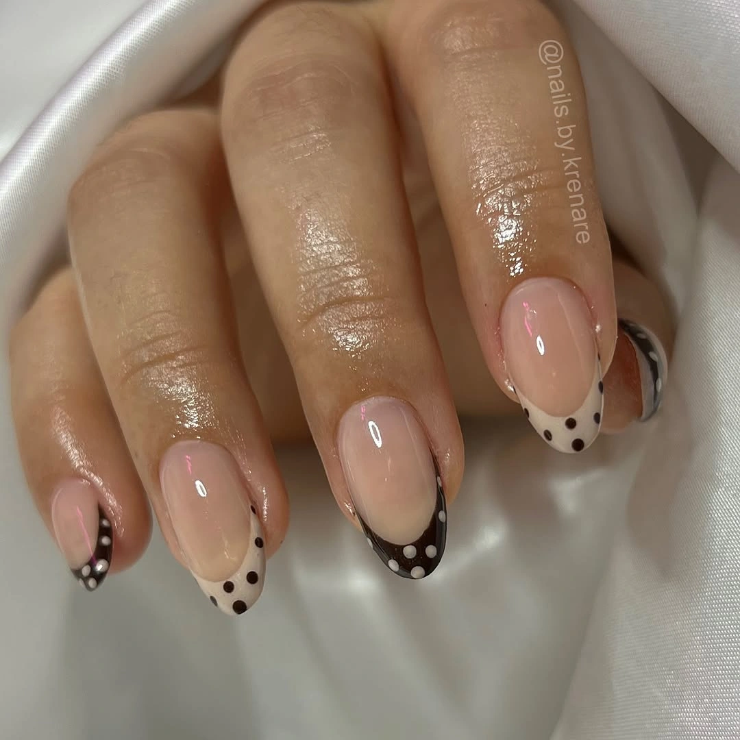
A more minimal adaptation would use one tip color across the hand and keep the dot color unchanged. That preserves the soft French structure while reducing the visual conversation between brown and cream. The nude base should remain visible, because it provides the calm space that keeps the dotted tips from feeling like full coverage nail art.
Tip depth matters more than dot quantity here. A shallow French edge allows the circles to act as trim, while a deep edge turns the dots into a full pattern block. Keeping the brown and cream sections similar in width makes the alternating colors feel measured and prevents one side of the manicure from looking visually heavier.
Blue and Brown Dotted French Edges
Pale blue and chocolate brown alternate along long almond French tips, with small dots placed over the colored sections. The cool blue adds a fresh note to the warm brown, yet the shared nude base keeps both colors from pulling apart. It is a lively pairing that still leaves plenty of open nail space around the pattern.
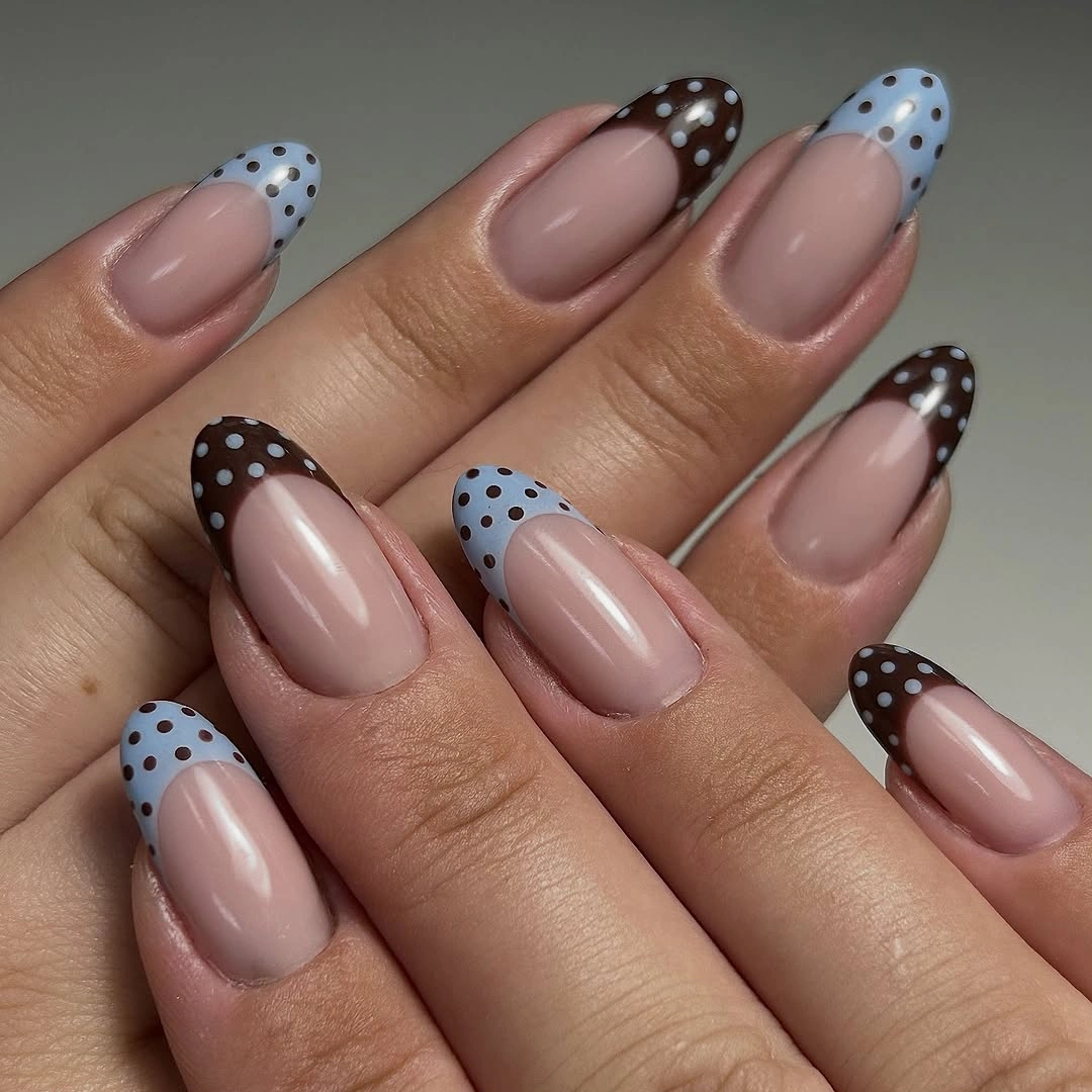
For a softer result, use the blue on only two nails and let brown lead the rest of the hand. That change keeps the unusual color relationship while giving it a clearer hierarchy. The dot spacing should remain consistent across both shades, since matching rhythm is what allows mixed colors to look like one planned manicure.
The almond tip makes the blue and brown feel less blocky because each French edge follows a gradual curve. A square shape could still carry the same palette, but the color sections would look more graphic and direct. Here, the taper and exposed nude center keep the contrast light, which is especially useful when both colors are visible at once.
Caramel Dots and Small White Bows
Warm caramel brown covers short rounded nails with tiny white dots and small bow-like pale marks, creating a compact decorative surface. The rounded shape helps the small details feel friendly rather than crowded, and the caramel base keeps the white pattern soft enough that it reads as ornament instead of a sharp black-and-white graphic.
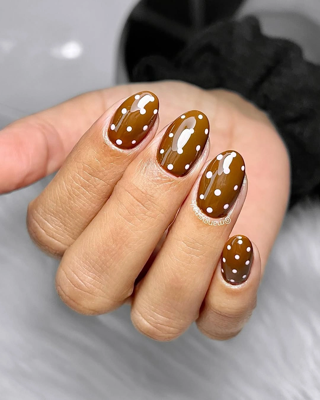
Anyone who likes the brown but wants less decoration could choose either dots or bow-like marks, not both. On a short nail, a single motif has more room to breathe, a useful rule when adapting fall nail art ideas to a smaller surface. The warm base will still feel seasonal, while the reduced detail will make the shape easier to read and keep the manicure from becoming too visually compact.
Small circles work here because their scale matches the nail length. Enlarging them would quickly make the caramel surface feel busy, especially beside the curved corners. The pale marks should stay scattered rather than perfectly lined up, since a little irregularity gives the design softness while the repeated color keeps it from losing its structure.
Soft Nude With Brown and White Dots
Long almond nails combine a soft nude base with chocolate and white dotted sections, allowing pale and dark circles to meet without making the design feel harsh. The open nude areas are essential: they create a resting point between the patterned tips and give the mixed color placement an airy quality even on an extended shape.
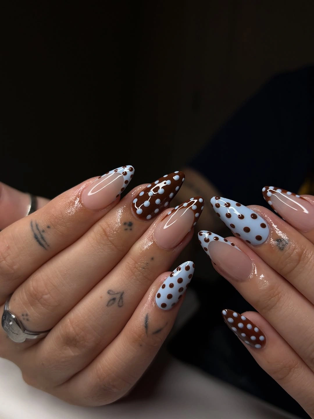
A streamlined version could keep the brown sections and use white dots only, which would make the contrast easier to follow. The current mix has a fuller decorative effect, but it remains balanced because the neutral base repeats on every nail. Retaining that shared ground is more important than copying every individual color arrangement.
Polka dots look most graceful on an almond when they follow the direction of the tip rather than sitting as a square grid. The circles here have enough space between them to feel placed, not packed. If a manicure needs a little less ornament, reduce the number of dots before reducing the nude areas that give the whole composition its softness.
Pink Nails With Chocolate Dotted Tips
Pink nails meet dark chocolate French tips edged with bright blue dots, an unexpected trio that stays playful because the cool color appears only in small circles. The pink base softens the dark brown, while the narrow blue notes lift the edge just enough to make the French placement feel more like a deliberate pattern than a standard color block.
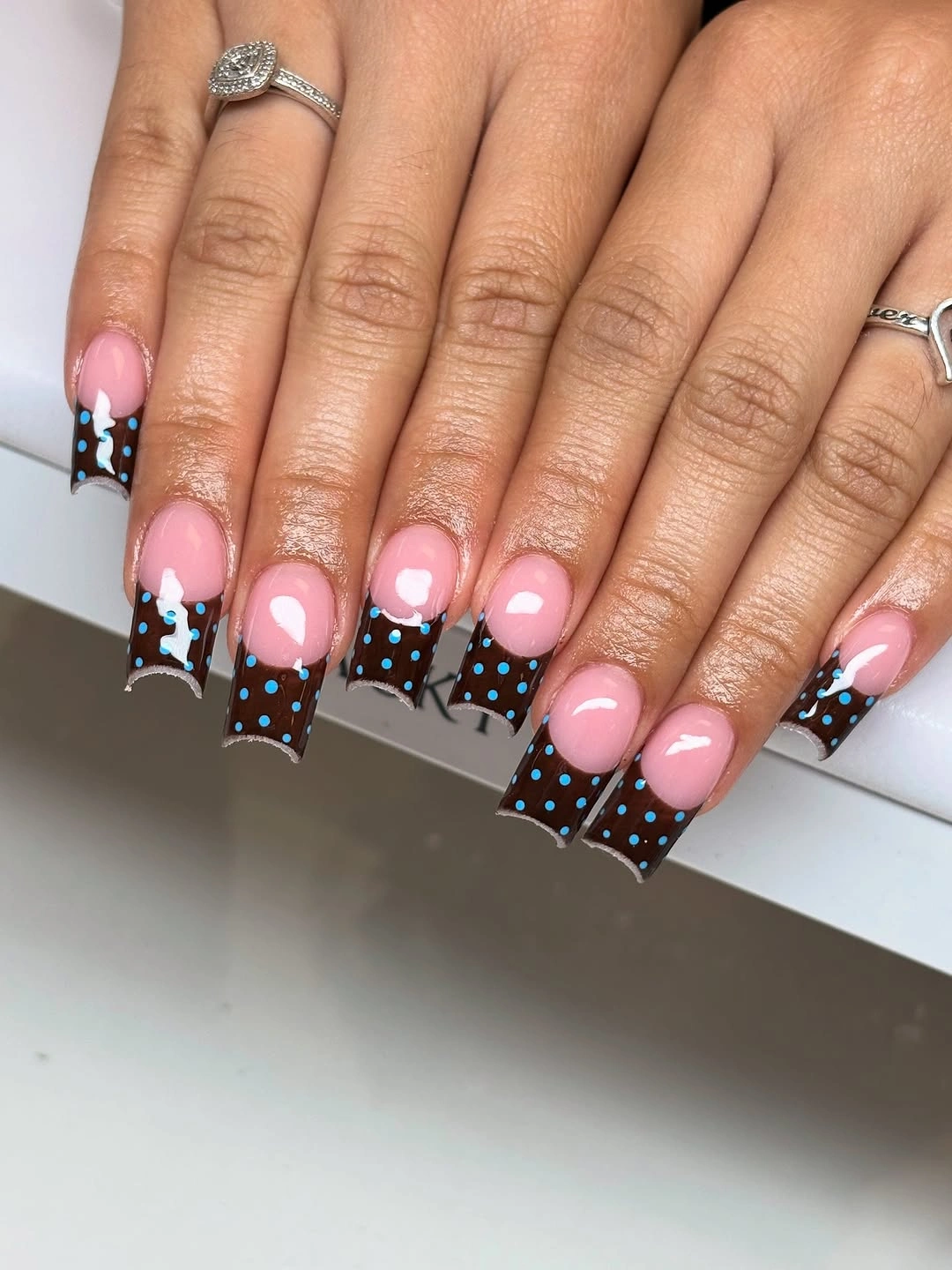
The most practical edit is to keep the pink and brown, then remove the blue dots on all but one accent nail. That would preserve the warm contrast with a quieter finish. The darker tip should remain relatively shallow, because its job is to frame the pink base rather than replace it with a broad chocolate band.
Blue is effective here precisely because it is not asked to cover a whole nail. Small cool dots can change the mood of brown without making the palette feel cold. On a squared shape, consistent tip width is especially useful, since uneven dark edges would become more noticeable and could disturb the neat balance of pink space above them.
Black Gloss With Soft Cream Circles
Short black nails carry soft cream dots on selected fingers, creating a bold contrast that still feels contained by the compact rounded-square shape. The high shine gives the black surface depth, while the pale circles appear like small points of light. Leaving other nails plain prevents the pattern from becoming visually heavy across the whole hand.
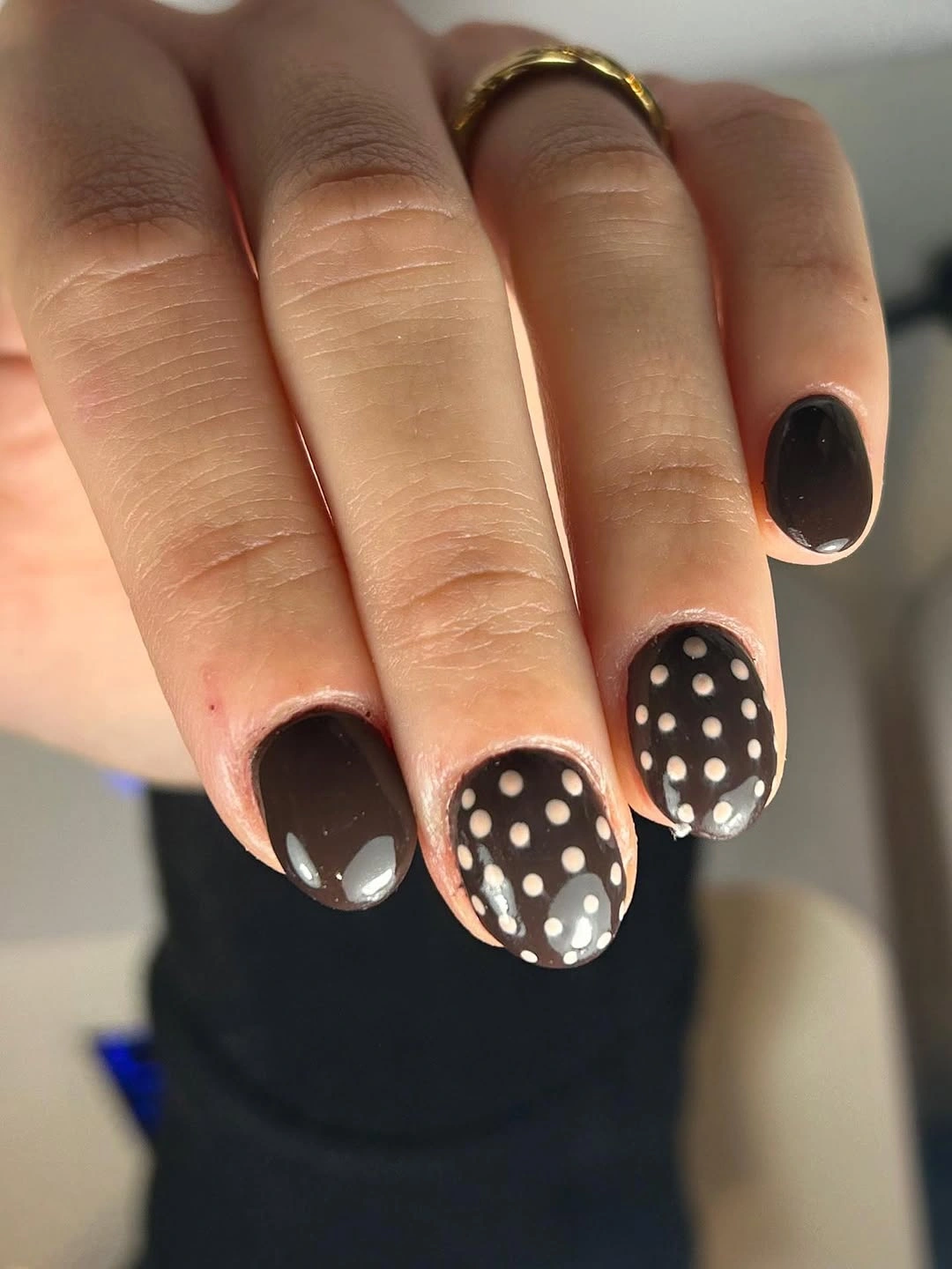
A quieter version could use dots on one black nail only, or switch the cream to a muted beige for a lower contrast. The motif itself does not need much alteration because its clear circle shape already provides the interest. What changes the mood most is how much empty black surface is left visible around each pale dot.
Short nails make a high-contrast pattern easier to wear because the circles remain small in proportion to the hand. If the same black-and-cream idea moved onto long points, the dots would need more spacing or a partial placement near the tip. Here, restraint in distribution is what keeps the glossy black from feeling overly decorative.
Pink and Chocolate Dots With Soft Balance
Soft pink and deep chocolate alternate through a medium almond manicure, with pale and dark dots changing depending on the base underneath. The arrangement has a gentle, composed quality because neither color is treated as an accent only. Both return often enough to create rhythm, while the rounded taper keeps the pattern from looking rigid or overly graphic.
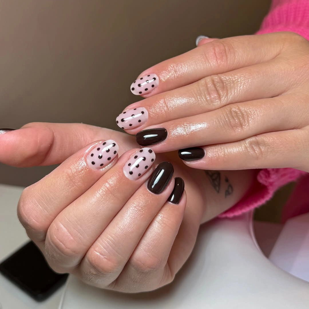
For a more subtle version, let pink appear on most nails and use chocolate only on two dotted accents. That would keep the color relationship but make the overall effect lighter. The polished surface helps the darker shade feel rich rather than flat, while the pale pink gives the dots a softer setting than a stark white base would.
The design depends on repetition with variation: circles recur, but their contrast changes with the base color. Repeating exactly the same dot arrangement on every nail would make the manicure feel more mechanical. A little shift in placement keeps the eye moving, while the limited palette makes sure the variation remains coherent and not simply busy.
Dark Brown With Cool Blue Tiny Dots
Deep brown oval nails are scattered with small light blue dots and fine pale marks, a color contrast that feels unexpectedly fresh without losing its autumnal warmth. The cool dots do not cover much of the surface, so the brown remains dominant. Their small size also keeps the short oval shape smooth and visually uncluttered.
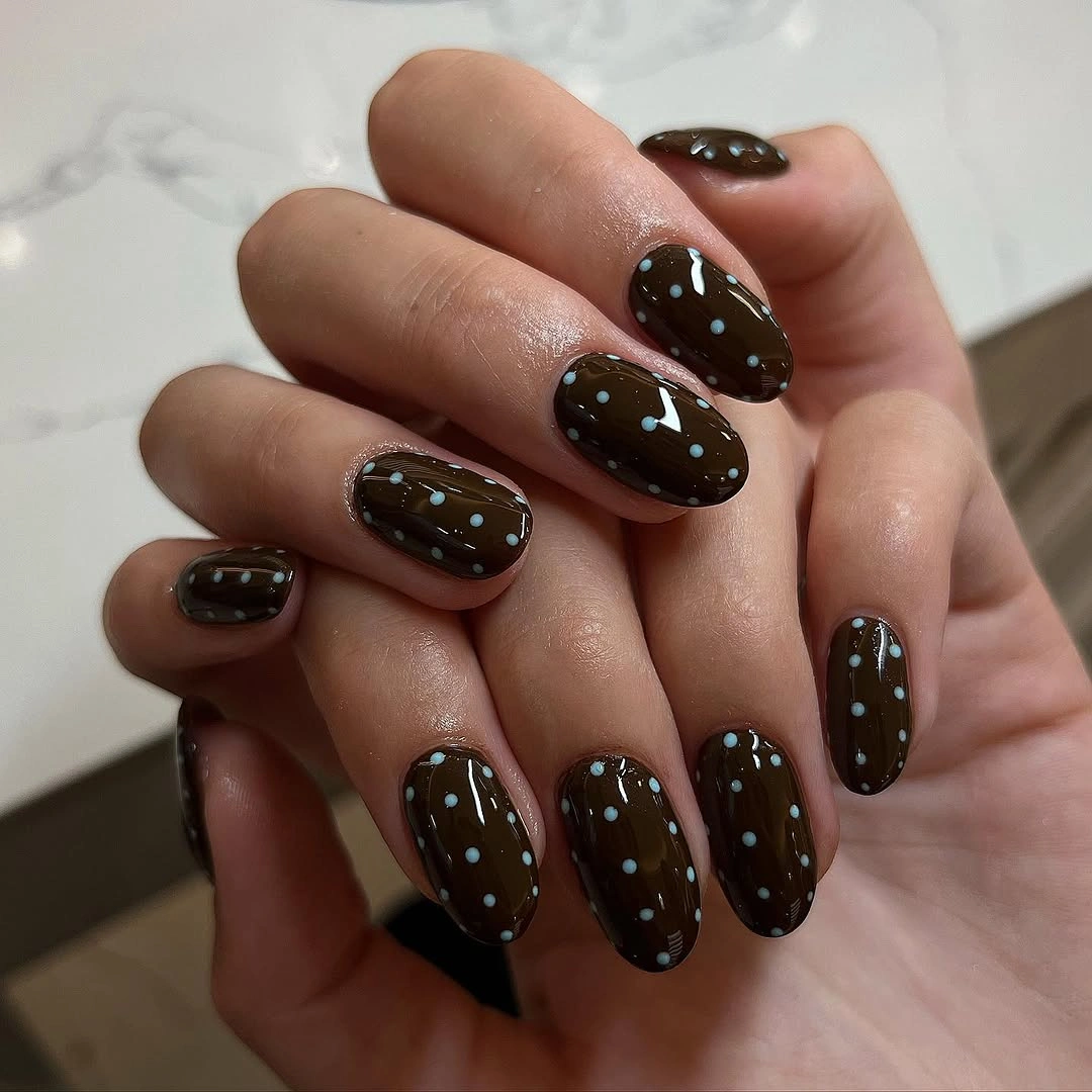
Use the blue on just one or two nails if the contrast feels too playful for everyday wear. Brown can remain solid elsewhere, allowing the dotted fingers to act like a quiet color lift. A dusty blue would soften the same idea further, while a brighter blue would make the manicure more graphic and less understated.
The circles need enough distance from the sidewalls to preserve the oval outline. When dots move too close to the edge, a short shape can look visually wider and more crowded. Keeping them centered or gently scattered lets the cool blue feel like a delicate interruption, not a border competing with the dark brown base.
Teal Dots Along Warm Brown Details
Long almond nails pair sheer nude areas with teal and brown painted sections, then add dots and small star-like outlines for a more decorative finish. The teal is the unexpected note, but it remains balanced because warm brown repeats beside it and the nude base continues to show through, keeping the ornament from becoming a solid field of color.
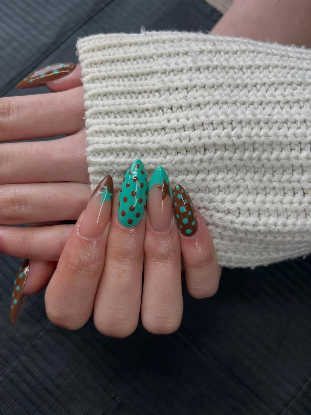
A gentler adaptation would remove the star-like outlines and keep only teal dots on one or two brown sections. That edit retains the unusual color relationship while letting the almond shape remain visible. With several details already present, reducing one motif is more effective than introducing another neutral shade to try to calm the design.
The design feels airy because the colored sections are separated by nude space rather than stacked tightly together. That proportion is worth preserving on any length. Teal and brown can look surprisingly soft when they are broken into small placed areas, but they become much louder if each color occupies a large uninterrupted block across the nail.
One Pink Accent Among Chocolate Nails
Deep chocolate nails sit beside a single pale pink polka-dot accent, creating a simple change in value that feels playful without being loud. The short rounded shape gives the dark polish a friendly outline, while the pink nail provides a light pause. Its dots are enough to make the accent feel intentional rather than merely different in color.
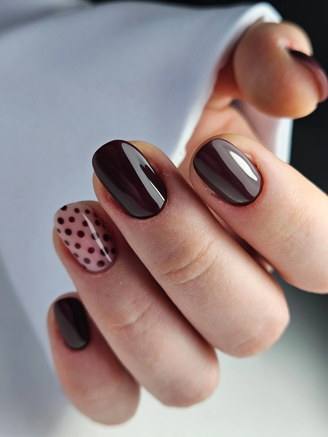
For an even more restrained take, keep the pink accent but reduce the dots to three or four evenly spaced marks. The chocolate base can then remain the clear lead color. This approach is useful when you want a small decorative element but do not want the same motif repeated across every nail or every hand.
One accent nail works because the palette already has a clear hierarchy: brown supplies depth and pink supplies relief. Reversing that ratio would make the look sweeter and lighter, but it would lose the grounded contrast. The small scale of the dots matters, too, since oversized circles would overpower the compact pink surface and break the quiet balance.
Yellow Dotted Edges on Nude Almonds
Pale yellow appears along the tips of long nude almond nails, with tiny black dots and small gold bead-like details adding a delicate edge treatment. The yellow is low in contrast against the base, which keeps the manicure luminous rather than bright. The dots give the soft color a little definition without turning the tip into a heavy graphic band.
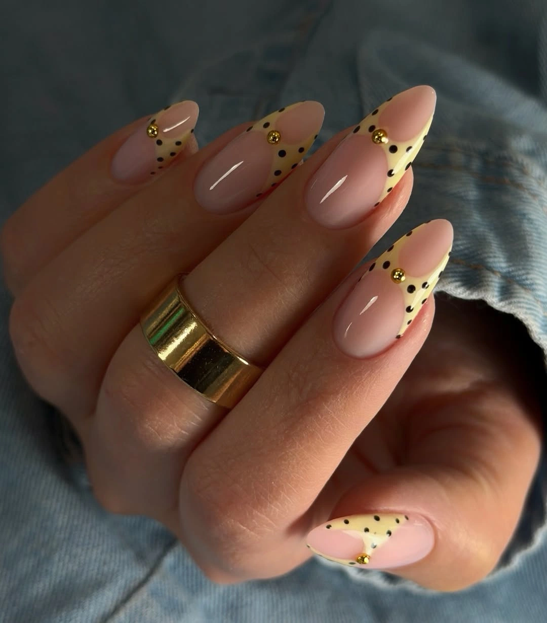
If the small raised-looking accents are not practical, remove them and keep the yellow and black dot relationship. The design would still feel refined because the pale tip has enough presence on its own. Keeping the yellow shallow is important, since a broad section would make the light color look more opaque and reduce the airy nude space.
The visual softness comes from scale rather than from an absence of detail. Tiny dots and narrow pale edges can carry more delicacy than a large floral motif would on this length. A warm cream could replace the yellow for an even quieter option, but the gentle sunny undertone gives the nude base a subtle lift that plain white would not.
Red French Tips Softened by White Dots
Bright red French tips curve across long almond nails, with small white dots placed over the vivid red sections. The dots soften the sharpness of the color without weakening it, and the nude center remains open enough that the red feels like a lively border rather than a full, high-saturation manicure from cuticle to tip.
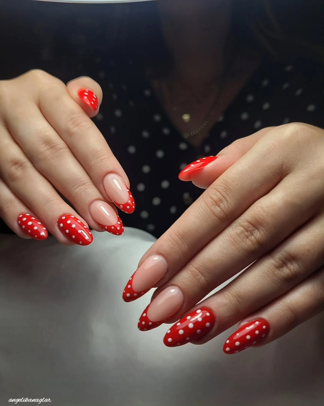
A thinner red edge would make the design more subtle, while keeping the same white dot scale would preserve the playful rhythm. If the goal is stronger contrast, deepen the red rather than adding another color. The clean two-color relationship is what gives the manicure its clear visual direction and keeps the dots easy to read.
The almond outline helps each red tip look slightly curved and elongated, which makes the white circles feel placed along a soft path. A square tip would make the same pattern more graphic and direct. Neither interpretation is wrong, but the current combination of curved edge and small dots is what lets a bright red look expressive without becoming too blunt.
Sheer Pink With Floating White Dots
Translucent pink almond nails hold scattered white dots that appear to float across the glossy surface instead of forming a rigid grid. The pale base keeps the contrast light, and the dots remain small enough that the nail still reads as soft pink first. It is a simple design with a surprisingly delicate sense of spacing.
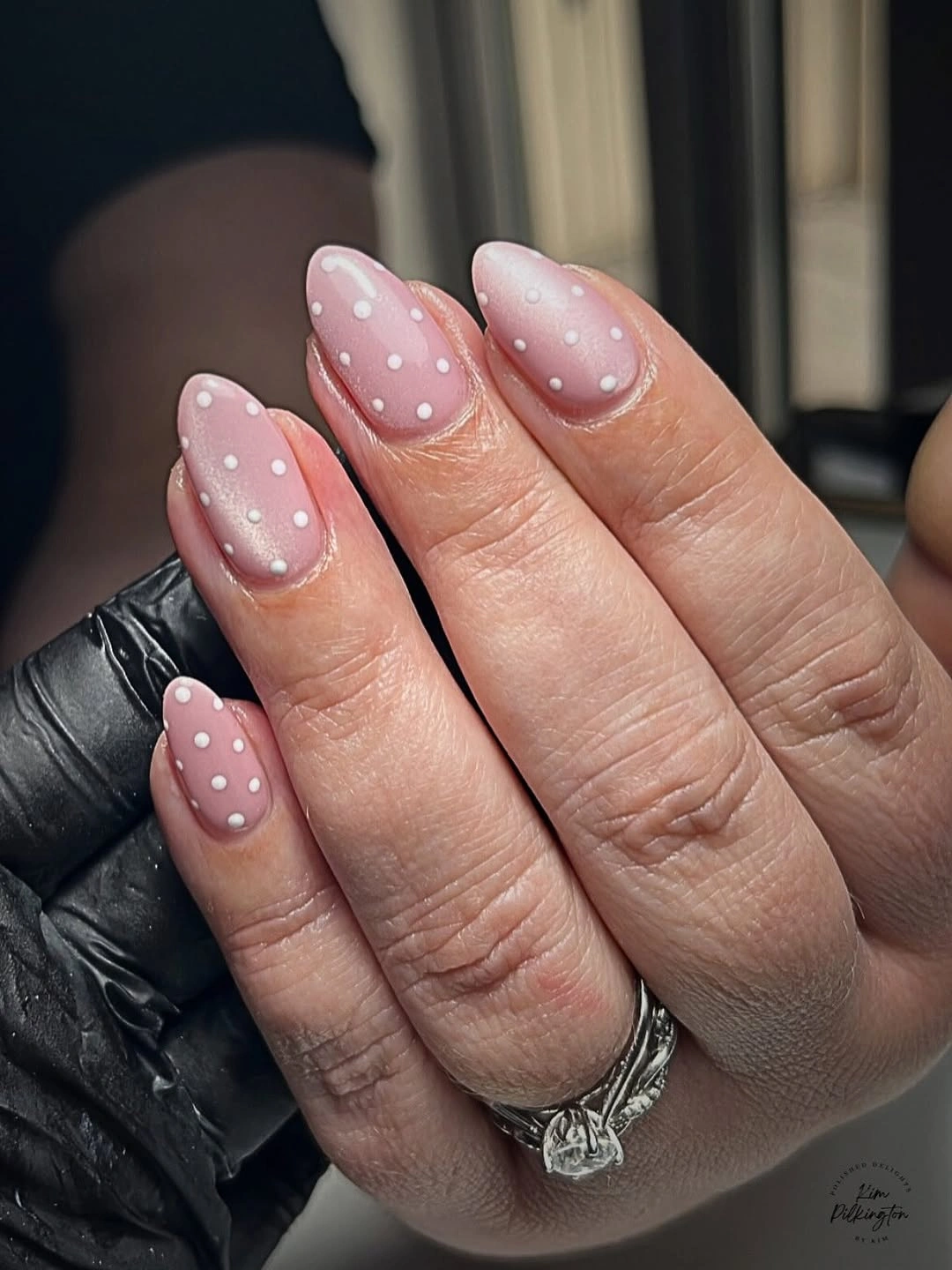
For a more tailored version, concentrate the dots toward the tip and leave the cuticle area almost clear. That creates a softer transition as the nails grow while keeping the same airy effect. A denser dot arrangement would make the white more dominant, so reducing quantity is a better choice than shrinking the almond shape if delicacy is the priority.
White dots are especially effective over a translucent base because they do not need a second accent color to be noticed. The surrounding pink does the softening work. Keeping the dots slightly irregular in placement avoids a stamped appearance, but their size should remain consistent so the manicure feels intentionally composed rather than casually scattered.
Pale Pink With Dots and Textured Accents
Pale pink nails combine black dots on one finger with light raised-looking leaf or flower details on others, producing a decorative finish while staying within a quiet color family. The pale base connects the different accents, and the small dark circles give the softer textured-looking elements a useful point of contrast without turning every nail into the same type of ornament.
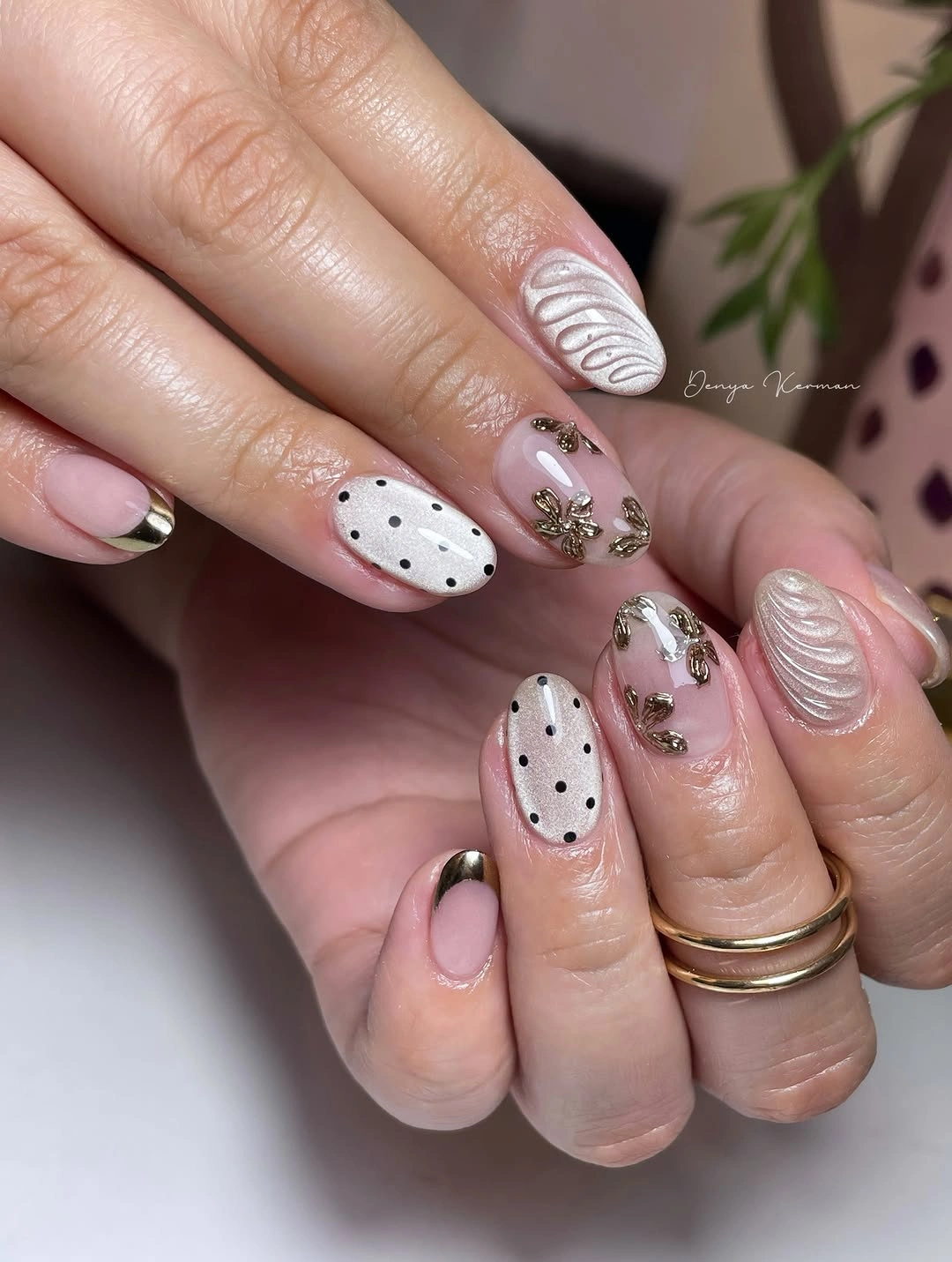
The most balanced way to adapt this is to choose one textured-looking accent nail and one dotted nail, leaving the rest pale pink. That preserves the contrast while creating more visual relief. On a short rounded shape, too many kinds of detail can quickly crowd the surface, so the soft base needs room to remain visible and calm.
Different motifs can coexist when they share a palette and a scale, which is the quiet strength of this pairing. The dark dots are small, and the pale accents are light in value, so neither competes too aggressively. Adding a bright third color would break that accord and make the manicure feel busier instead of more expressive.
Tiny Multicolor Dots on a Blush Ground
Sheer blush nails carry tiny dots in several colors, creating a confetti-like effect while leaving most of the nail bare. The open base is what keeps the multicolor detail graceful. Rather than forming large blocks, the little marks offer flashes of color that move across the hand without taking away from the gentle line of the nails.
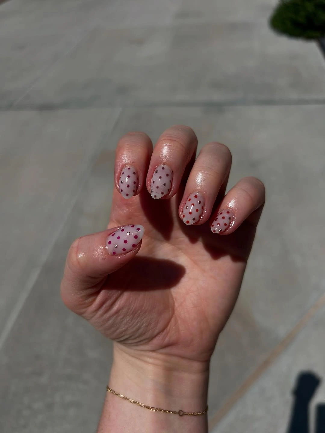
Choose two or three dot colors instead of many if you want a quieter version with the same lightness. The base should stay translucent or soft pink, because a strong opaque ground would make the dots look more graphic. This is a useful approach when color is wanted in small doses but a full rainbow-like manicure would feel too busy.
Scale protects the delicacy here. Tiny marks read as an airy scatter, while larger circles would turn the same layout into a more obvious statement pattern. The dots can vary in position, but they should not all gather at the tip or center. Even distribution keeps the blush space visible and lets each small color note remain a quiet surprise.
Blue and Brown Tips on Square Nails
Medium square nails use nude bases with pale blue and brown French tips, then layer small dots over the colored edges. The straight free edge makes the color blocks more graphic than on an almond shape, but the exposed nude center keeps the look from becoming too heavy. Shared dot spacing gives the two tip colors a common visual language.
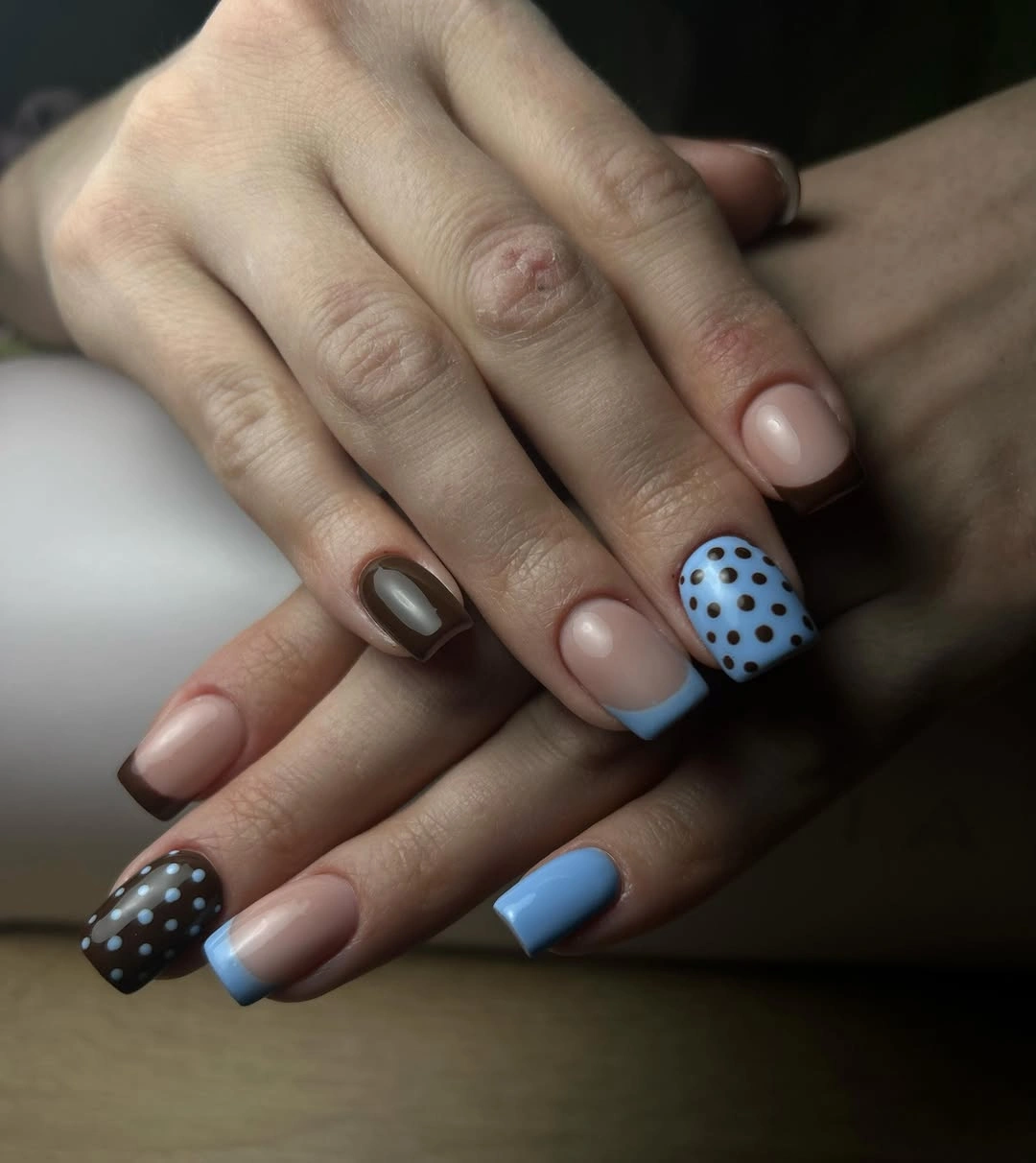
A more refined option would alternate blue and brown tips but use dots only on the brown nails, letting the pale blue stay clean as relief. That creates a clearer hierarchy without losing the mixed palette. The square shape benefits from matched tip depth, because uneven colored bands would be especially noticeable against the straight edges.
For readers drawn to defined outlines, this pairing can sit naturally beside fall square nails that rely on crisp shape rather than elaborate coverage. The dots add softness to the geometry, but the nude base is still doing the most important work by separating the blue and brown sections from the cuticle area.
Long Pink and Brown Dotted Squares
Long square nails alternate pale pink and dark brown panels with white and dark polka dots, using the blunt silhouette as a strong frame for the small circles. The contrast is more graphic than the almond versions, yet the pink prevents the brown from feeling too severe. Repetition of both colors gives the varied dot placement a clear underlying order.
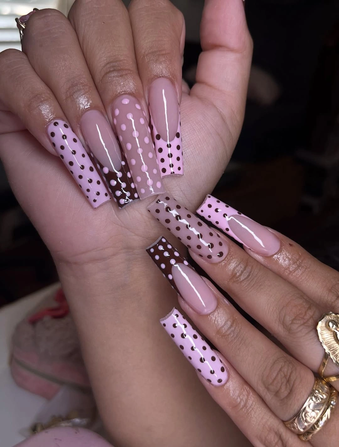
Keeping the brown on fewer nails would make a softer version, while using brown on alternating fingers gives the design its strongest pattern rhythm. The squares can handle a bolder contrast, but they still need visible pink or nude space around the dots. Without that relief, the long shape could make the pattern feel overly dense from a distance.
The dots become more assertive against a straight edge because the geometry around them is so clear. That is why consistent circle size matters here more than on a soft oval. A mix of large and tiny marks would make the panel arrangement feel less controlled, whereas even dots let pink and brown carry the playful contrast without visual confusion.
Soft Pink With Small Black Dot Contrast
Short rounded nails in a soft pink shade are punctuated with small black dots, a simple pairing that gains interest from its scale rather than from a complicated pattern. The dark marks are distinct enough to be seen, but they do not cover much of the nail. That leaves the pale base luminous and keeps the overall mood composed instead of stark.
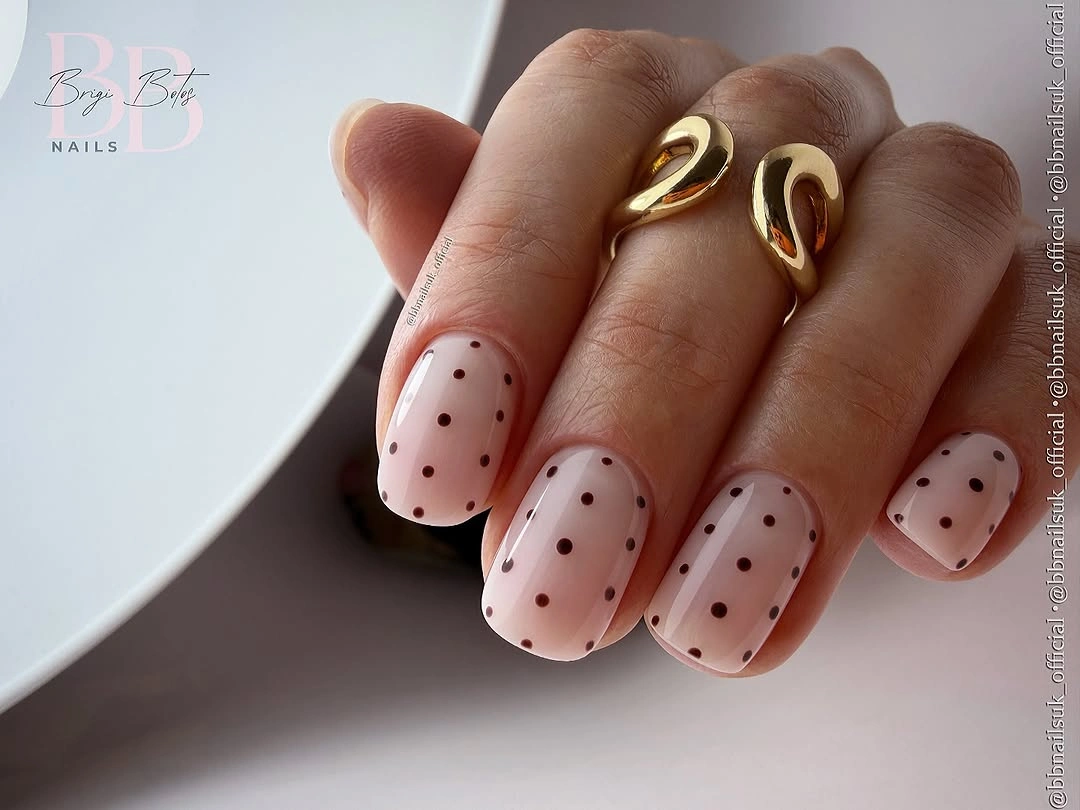
For a gentler version, swap black for deep brown or charcoal, which would preserve the small-dot idea while reducing the contrast slightly. The rounded shape is already soft, so the color of the dots becomes the main dial for adjusting the mood. Keep the marks separated enough that the pink background still looks like the leading surface.
A short nail can make a tiny pattern feel more polished because there is no excess area to fill. The dots do not need to form a full row or a perfectly symmetrical layout. Their quiet spacing is what keeps the contrast light. Adding a metallic outline or larger accent would take away from the clean, minimal conversation between pink and black.
Red Dotted Tips Across Both Hands
Vivid red French tips recur across both hands, with white dots clustered along the red portions while the nude nail beds remain clear. The repetition creates a confident rhythm, and the dot placement softens the sharp color enough that the manicure feels lively rather than severe. Each almond tip carries the same essential relationship between red, white, and nude.
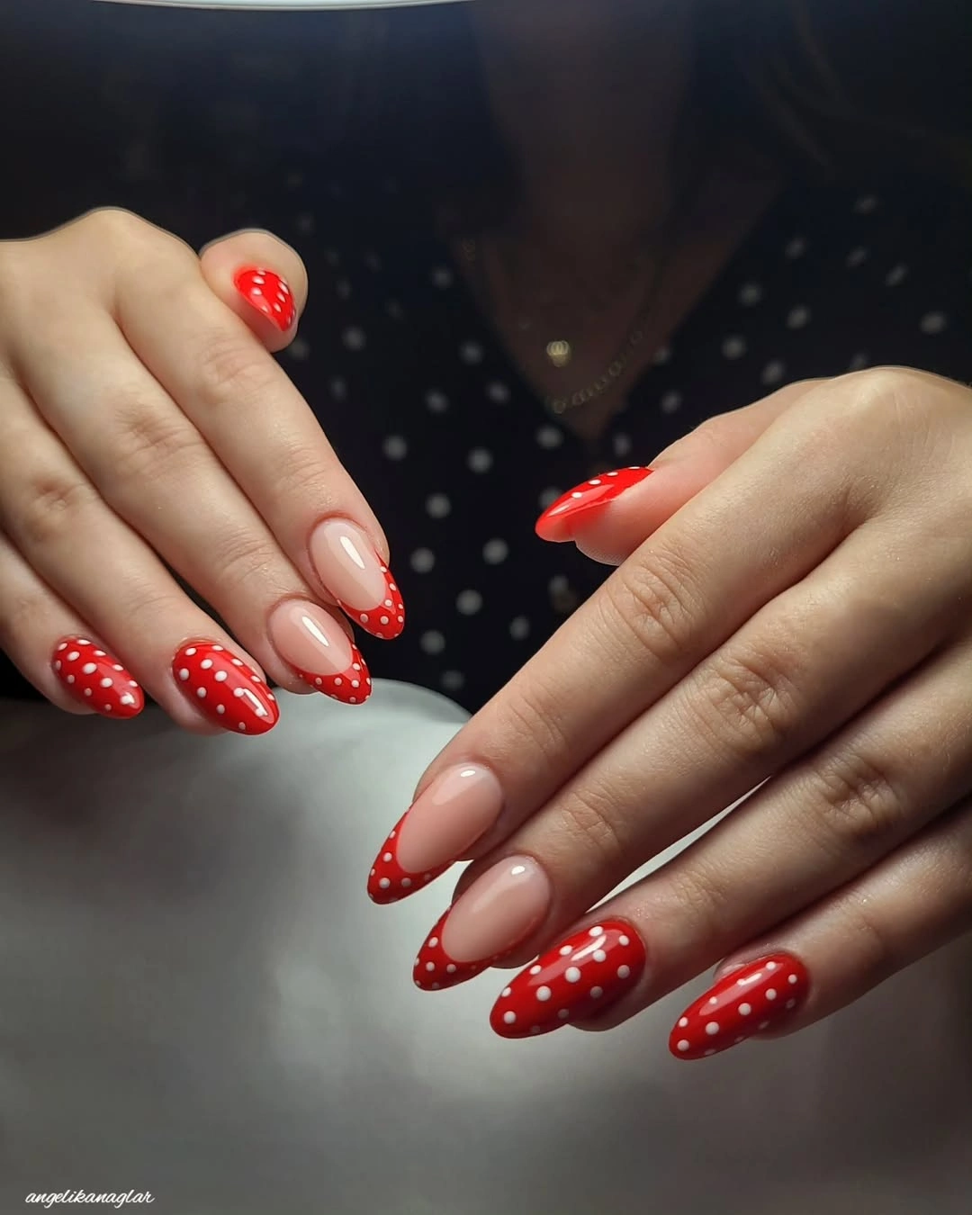
A more understated interpretation would narrow the red tips and keep the dots on just two fingers per hand. That would preserve the bright color moment without letting it dominate every angle. The exposed center space should stay generous, because it is what gives the red edge room to look fresh instead of turning into an all-over scarlet manicure.
Consistency is particularly important when a motif repeats across both hands. Matching the red depth and dot scale allows the design to feel intentional even when the circles are not in identical positions. If variation is wanted, change the spacing slightly, not the color palette, so the bright French line remains the clear visual thread from finger to finger.
Pastel Stripes and Dots in Gentle Mix
Pastel yellow, blue, pink, and white appear in small sections with dots and thin stripes, creating a mixed nail design that stays soft because every color remains light in value. The varied marks do not overwhelm one another since no single nail carries every motif. Instead, each surface offers a small portion of the overall playful pattern language.
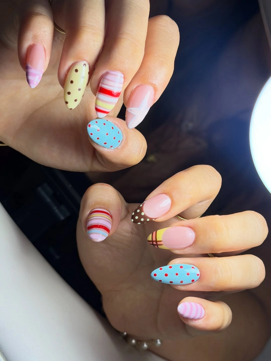
Choose a maximum of two patterns per nail if you want the same pastel spirit with more breathing room. Dots and stripes can coexist beautifully when one is used as a fine accent rather than a full background. The pale palette is forgiving, but careful spacing still matters, especially when several colors are visible across the hand at once.
The soft result comes from preserving separation between colors instead of blending them all into one busy surface. A neutral or pale pink base can help connect the different patterns, but it should remain visible on some nails. That pause makes the decorative pieces feel curated and lets the pastel range remain airy rather than turning into an uncontrolled mix.
Cobalt Blue With Clear White Circles
Saturated cobalt blue almond nails are covered with medium white dots that appear crisp and luminous against the deep glossy base. The color contrast is bold, yet the simple circle shape keeps it clean. There is no need for another shade because the blue supplies depth and the white dots provide all the bright punctuation the manicure needs.
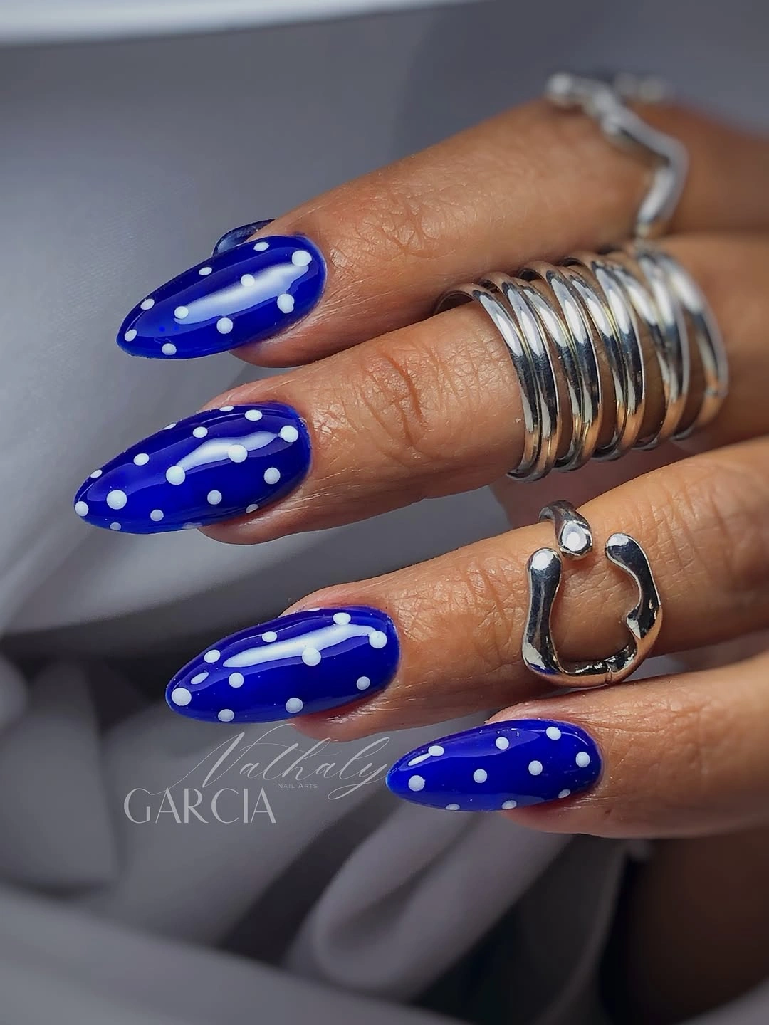
A subtler adaptation would reduce the dot size or leave one cobalt nail completely plain, allowing the blue to become a larger uninterrupted field. The current version is more graphic and direct, which suits someone who wants the pattern seen at a glance. Keeping the almond shape prevents the high contrast from feeling too blunt at the tip.
White circles work best here when their scale is consistent, because uneven dots would compete with the strong clarity of cobalt. The glossy finish adds a soft highlight between the marks and keeps the blue from reading flat. If a fall variation needs more warmth, a deep navy could replace cobalt, but the white dots should remain equally clean and well-spaced.