

Toes rarely ask for attention directly, which is exactly why a small mismatch can make an otherwise considered look feel unresolved. A color may be lovely on its own yet disappear beside a shoe, while a tiny detail can become too loud when the foot is already framed by texture or pattern. Fall toe nails colors 2026 are easiest to choose when the pedicure is treated as part of the surrounding silhouette, not as an isolated swatch.
Start with the amount of visibility you expect, then decide how much contrast the big toe can hold without making the smaller toes feel unrelated. A quiet base can give one focal detail room, while an even finish can carry the whole decision without extra art. This approach keeps the pedicure adaptable to open or closed footwear and makes maintenance part of the choice rather than an afterthought.
Creamy White With Brown Cow Spots
The pale base keeps the brown spots soft, while different spot sizes stop the pattern from looking mechanically repeated. Short square tips give the toes a tidy frame, and the big toe remains easy to read even when the smaller toes are partly covered by fabric. The contrast feels warm without making every nail dark.
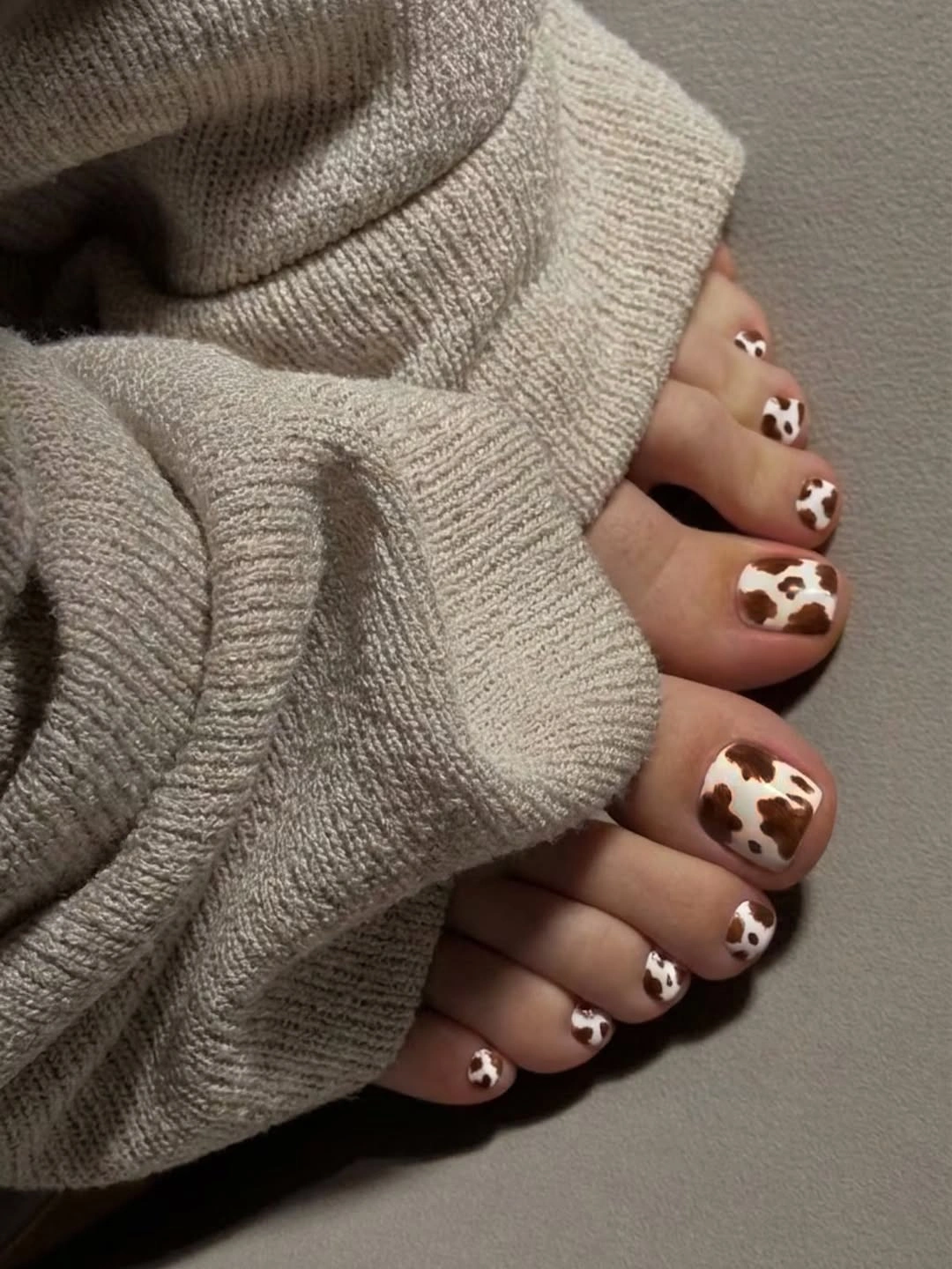
The pattern works because the cream background leaves space around each irregular mark. If the spots were packed tightly, the pedicure would feel heavier and the square shape would become less visible. Keep the print on the big toes for a calmer version, or repeat a few smaller marks on the little toes when you want the pattern to travel across the foot.
Animal print can become the first thing people notice, so plain shoes and quiet clothing help the pedicure feel intentional rather than crowded. The short shape is practical, but brown edges will still show wear against the pale base. This is a gentle starting point for fall toe nail colors because the motif supplies the seasonal interest.
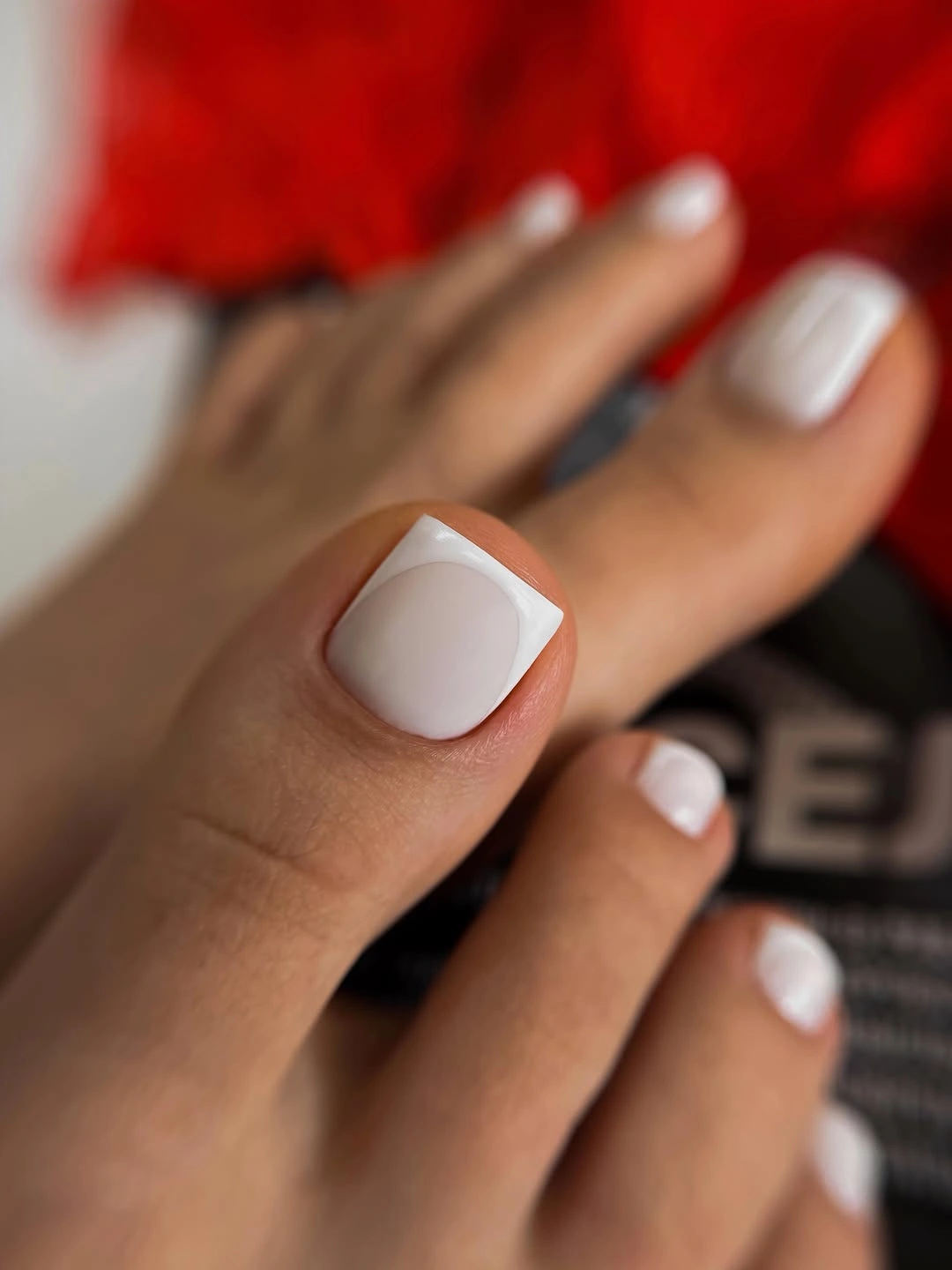
Blush Base With White French Edges
The big toe uses a soft blush center framed by a broad white edge, and the smaller toes repeat the same light relationship. The square tips make the white band look clean and architectural, while the pale pink keeps the contrast gentler than a bright red or black design. The result is polished without needing a separate motif.
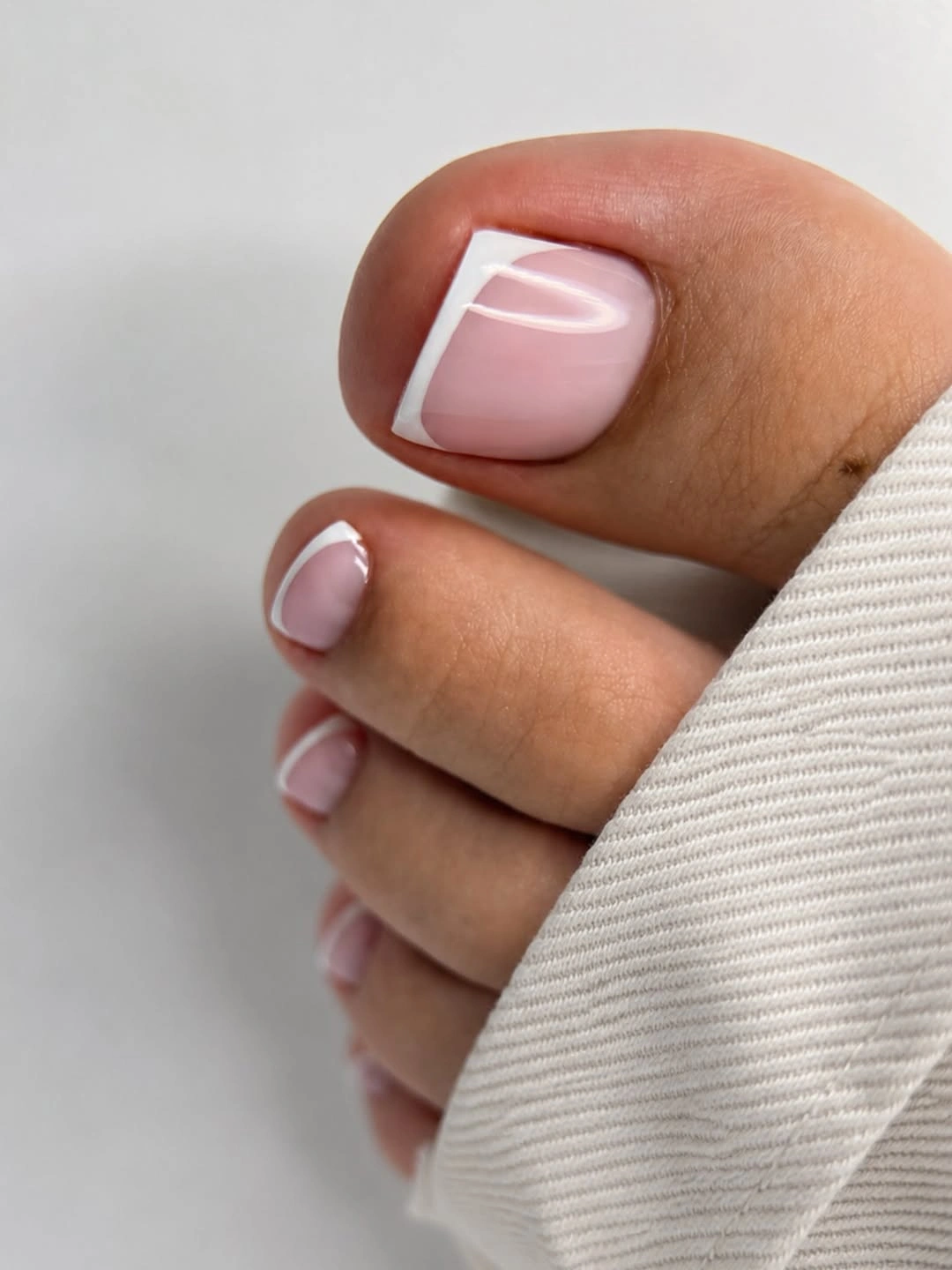
The broad edge is doing the visual work, so its spacing matters more than extra decoration would. On a shorter or narrower toe, a thinner white line may keep the base from feeling crowded; on the visible big toe, the wider band gives the design enough presence for sandals. Keeping the remaining toes simple protects the clean two-tone balance.
Light French edges reveal chips and growth clearly, especially because the base is pale and the toe shape is compact. That is the tradeoff for a fresh, edited appearance. A warmer blush or softer white can make the idea feel more seasonal, while the original stays useful when you want a classic fall French pedicure with a gentle fall palette.
Solid Glossy Red Across Both Feet
Every visible toe is covered in the same bright red, so symmetry and clean spacing become the defining features. The short square tips keep the color direct and wearable, while the glossy surface reflects enough light to make the solid shade feel finished rather than plain. Both feet reinforce the strength of a single repeated decision.
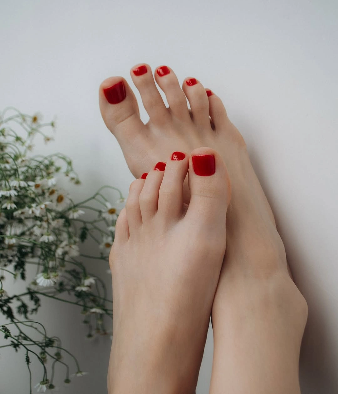
Solid red works because it does not ask the eye to decode a motif. The color can remain the focal point even when the sandals or background are simple, and the square edge gives it a neat frame. For a moodier adaptation, shift toward wine or burgundy; for a lighter version, keep the red on the big toes and use a pale base elsewhere.
The saturated surface will show chips quickly, particularly at the outer corners of short square toes. That makes edge care more visible, but the compact shape keeps the design easy to refresh. It is a reliable choice for readers who want fall pedicure color with impact and no pattern to coordinate.
Soft Nude Pink With Quiet Shine
The pale nude-pink base is almost translucent, and the short square edges remain visible without any painted art. A clean highlight on the big toe gives the simple color enough depth to feel deliberate. The design blends gently into the skin while maintaining a neat, polished outline. It is especially useful when the footwear or clothing already supplies a strong detail and the toes need to remain a quiet supporting element.
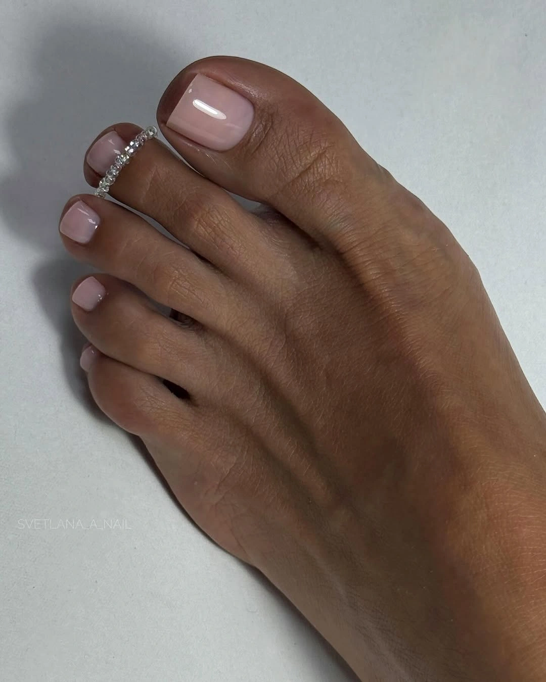
Minimal pedicures depend on shape because there is no motif to create contrast. Here the short square tip gives the soft color a crisp boundary, while the low contrast keeps the result calm with open footwear or neutral clothing. You can deepen the pink slightly for more visibility or keep the sheer effect when you want the toes to support rather than lead the look.
A nude base is less forgiving of uneven edges and patchy shine, even though it is visually understated. That is the practical cost of choosing quiet polish over a bold accent. This idea is useful when you want an everyday fall pedicure that can sit beside richer nail colors without competing with them.
Dark Spotted Toes With Gold Context
The dark base makes the tan and yellow-brown spots much sharper than the creamy version. The pattern is concentrated on the larger toes, while jewelry and a patterned textile echo the pedicure’s statement quality without changing the nail design itself. Short square edges keep the dense contrast contained.
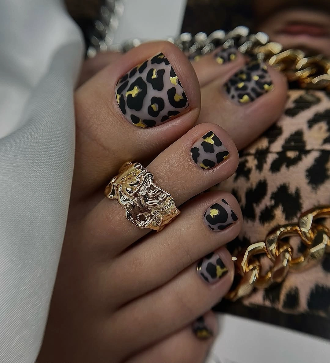
The important adjustment is the base color. Using a near-black or deep brown background turns a soft animal print into a stronger accessory, so the surrounding styling can remain simple. For less density, keep the dark spotted design on the big toes and use a solid brown or cream on the others; the contrast will still read clearly.
A dark patterned base shows regrowth and edge wear more quickly than a pale background, and the combination of print plus jewelry can become visually busy. The edited version is easier to wear, while the full repeat suits readers who want the pedicure to be a statement. The key is to let the big toe hold the strongest detail.
One Leopard Big Toe On A Cream Base
The main toe carries a pale base with scattered tan-brown spots, while the neighboring toe stays mostly plain. That placement creates a clear focal point and lets the compact square shape remain visible around the pattern. The print is decorative, but it does not spread far enough to dominate the whole foot.
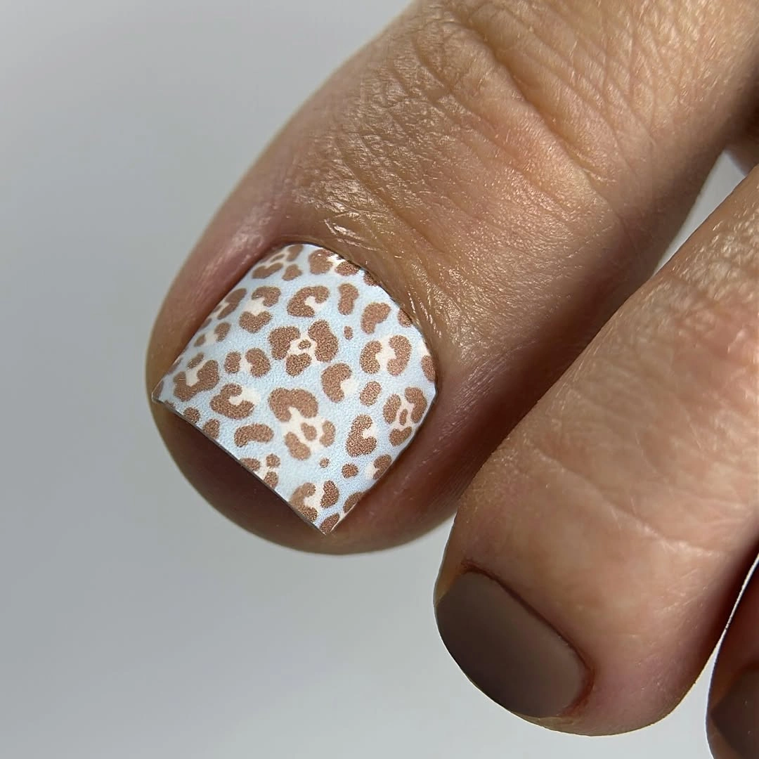
Concentrating detail on one large toe is an efficient way to test animal print. The smaller toes provide visual relief, and the pale background keeps the spots readable without a heavy dark contrast. Add one small mark to a neighboring toe if you want more continuity, or leave every companion plain for the lowest-density version.
A single decorated big toe is easier to maintain than a full patterned set, but the contrast makes any smudged edge obvious. It also works with more footwear because the design stays small in scale. This placement is a practical reference for readers who like seasonal art but prefer their pedicure to remain edited.
Warm Orange With Tiny Autumn Leaves
Warm orange and rust tones appear across the compact toes, with small leaf-like marks adding an explicit seasonal cue. Denim and layered clothing frame the palette, but the design itself remains centered on the toes. The motifs are small enough to keep the orange base visible rather than turning the pedicure into a full illustration.
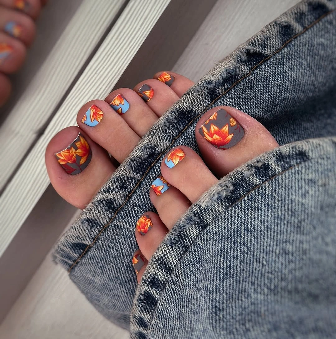
The detail works because the marks repeat at a modest scale. Large leaves would compete with the square shape, while tiny accents give the color a reason to feel seasonal. For a simpler adaptation, keep the motifs on the big toes and use solid orange on the smaller ones; the warmth will remain even when the art is reduced.
Small painted details can blur visually or show edge wear sooner than a solid color, so spacing is important. The orange base also has strong personality and pairs best with quieter clothing if you want the toes to lead. This is a direct fall design for readers who want the color and seasonal motif to arrive together.
Aqua With Black Irregular Spots
The pale aqua big toe reverses the usual warm animal-print palette, and black irregular spots supply the contrast. Short square tips keep the design compact, while the cool base makes the familiar pattern look brighter and less traditional. Other toes carry related cool accents without pulling attention away from the main motif.
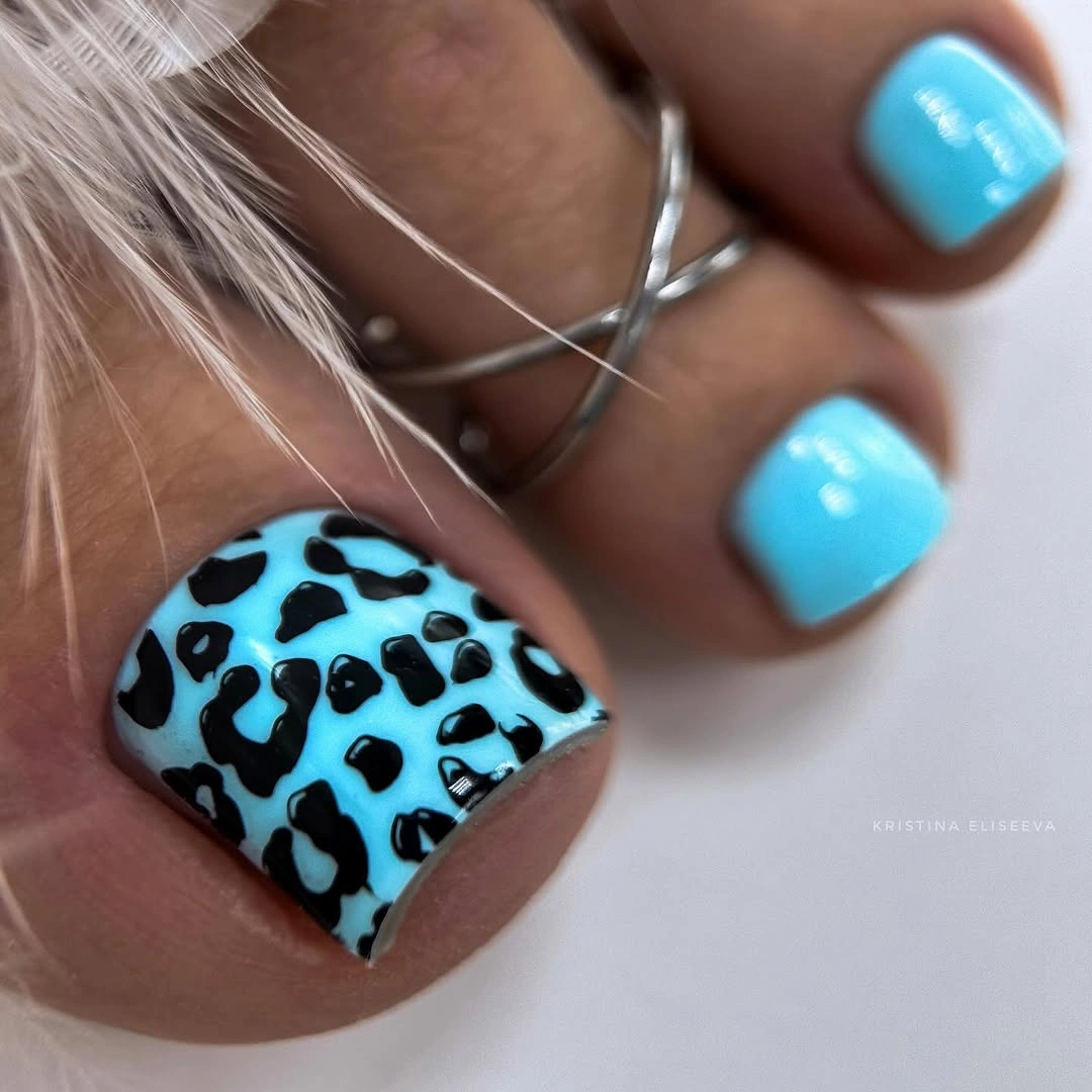
Aqua changes the mood more than a new pattern would. The black spots remain easy to read, but the cool background makes them feel playful and unexpected instead of earthy. Use aqua on one big toe with plain blue companions for a quieter version, or repeat the spots when you want the contrast to be the whole point.
Bright aqua may compete with warm fall clothing, and dark spots will reveal wear against the light base. That is the tradeoff for choosing freshness over a classic autumn palette. The idea shows how color substitution can modernize a familiar print without adding visual complexity. A cool blue-gray background would lower the contrast if you want the same spotted structure to feel more restrained in closed-toe season.
Lavender Tones With A Single Flower
The toe set combines several soft purple tones, while the big toe carries a small pale flower-like detail. Solid companion toes keep the mixed palette organized and give the single motif a clear focal position. Glossy reflections make the lilac shades feel connected even when their depth changes slightly.
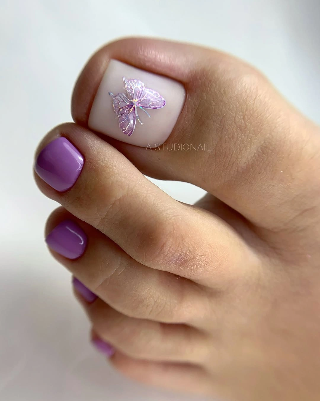
The floral accent works because it is isolated. If every toe received a flower, the soft purple palette would lose its open quality and the design would become more decorative. Keep one flower on the big toe for a gentle version, or repeat a tiny mark on the other foot when you want the focal point to feel balanced.
Small floral detail can require precise spacing and may be less forgiving when the toe grows out. The calm palette makes the upkeep less visually intense than a dark pattern, however. This is a soft option for readers seeking fall pedicure ideas that feel decorated without becoming loud. Leaving the other toes in solid lavender also means the design can be refreshed selectively rather than treating every nail as an equally detailed surface.
Bright Waves And Star-Like Marks
This is the most colorful toe design in the batch, using bright blocks, curved lines, and small star-like marks across a compact square set. The big toe carries the strongest contrast, while the surrounding colors repeat the playful energy rather than settling into one neutral base. The result is intentionally graphic and highly visible.
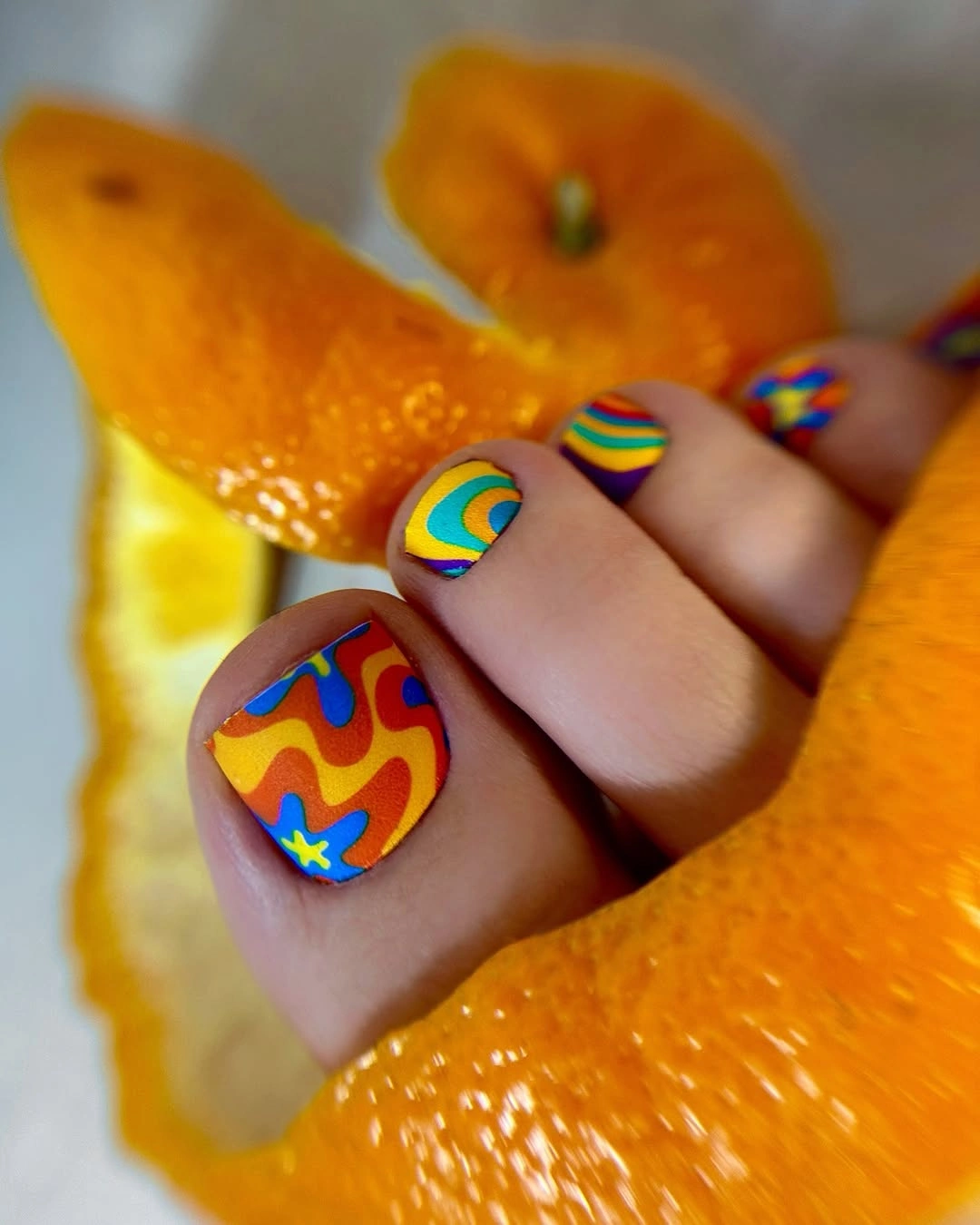
A bold palette needs a clear focal hierarchy. Let the big toe carry the most complicated arrangement and use simpler color blocks on the smaller toes so the foot does not become a flat field of competing marks. For a more wearable version, keep the waves on the big toes and choose one solid color for the rest.
Many colors create a real styling tradeoff: patterned shoes or busy clothing can compete with the pedicure, and small details will need more careful placement. The full version suits open footwear when you want the toes to be the accessory. A reduced palette keeps the playful idea while making the design easier to coordinate.
Burgundy Spots In One Color Family
Burgundy-on-burgundy spots create texture without leaving the deep wine family. The short rounded-square shape softens the dark palette, and the lower contrast lets the pattern appear as shadow before it reads as a clear motif. The set feels richer than a solid color but quieter than black-and-tan animal print.
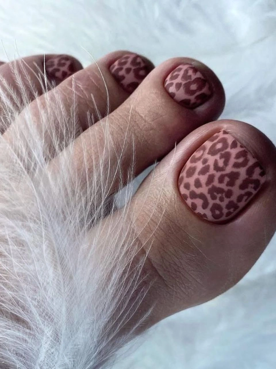
Keeping the spots close to the base color is the reason the design remains calm. The eye notices variation, but the foot still reads as one dark seasonal statement. Use solid burgundy on the smaller toes for an edited version, or keep the tone-on-tone pattern across the set when you want the texture to be more apparent.
Low contrast can hide small details at a distance, so the design depends on light and close viewing more than a bright print would. The dark base will still show chips and grow-out, even though the pattern is subdued. It is a useful choice for readers who want animal texture without a high-contrast result.
Deep Green Texture With Pale Companions
The dark green big toe supplies a dense textured focal point, while pale mint and white companion toes break up the depth. Short square tips make the contrast easy to organize, and the light nails keep the set from reading as uniformly dark. The design uses a small palette but creates several levels of visual weight.
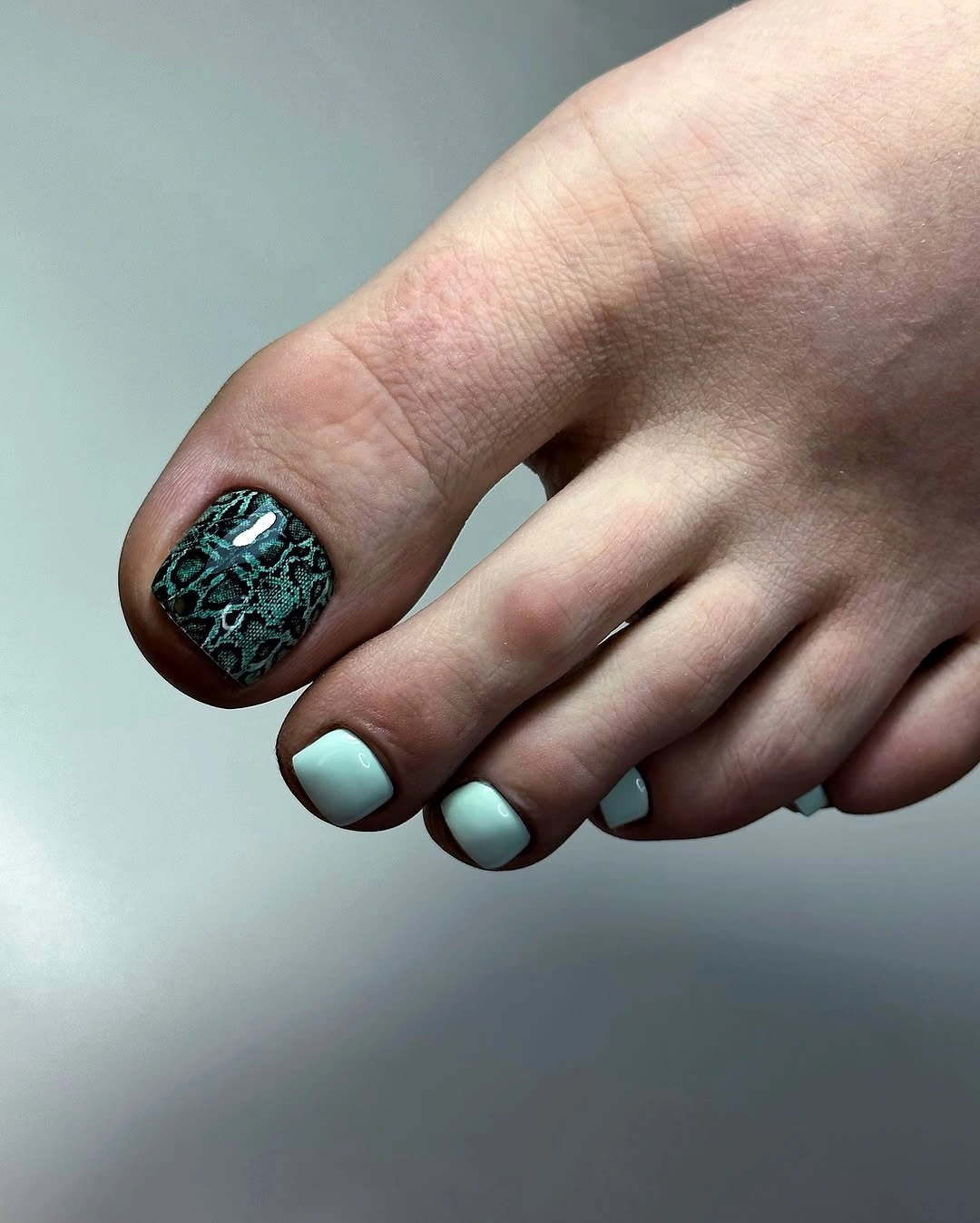
The balance depends on the pale toes appearing as relief rather than separate themes. If every toe were dark, the texture would feel heavier; if every toe were pale, the big-toe pattern would lose its anchor. Substitute cream for mint when you want a softer version, or keep the cool pale pairing for a fresher contrast.
A textured dark surface may show scuffs or uneven relief more than a smooth glossy color. The pale companion toes can also reveal edge wear quickly, so both sides of the contrast ask for clean boundaries. This is a good example of using one dense nail to organize a lighter pedicure. If the texture feels too assertive, a plain deep green big toe will keep the same dark anchor while making the surface easier to maintain.
Black Spots On One White Big Toe
The high-contrast pattern is isolated on one pale big toe, while the surrounding toes remain white and compact. That simple placement makes the black spots easy to read without covering the entire foot in animal print. The square edge gives the focal nail a clean frame and keeps the companions from disappearing.
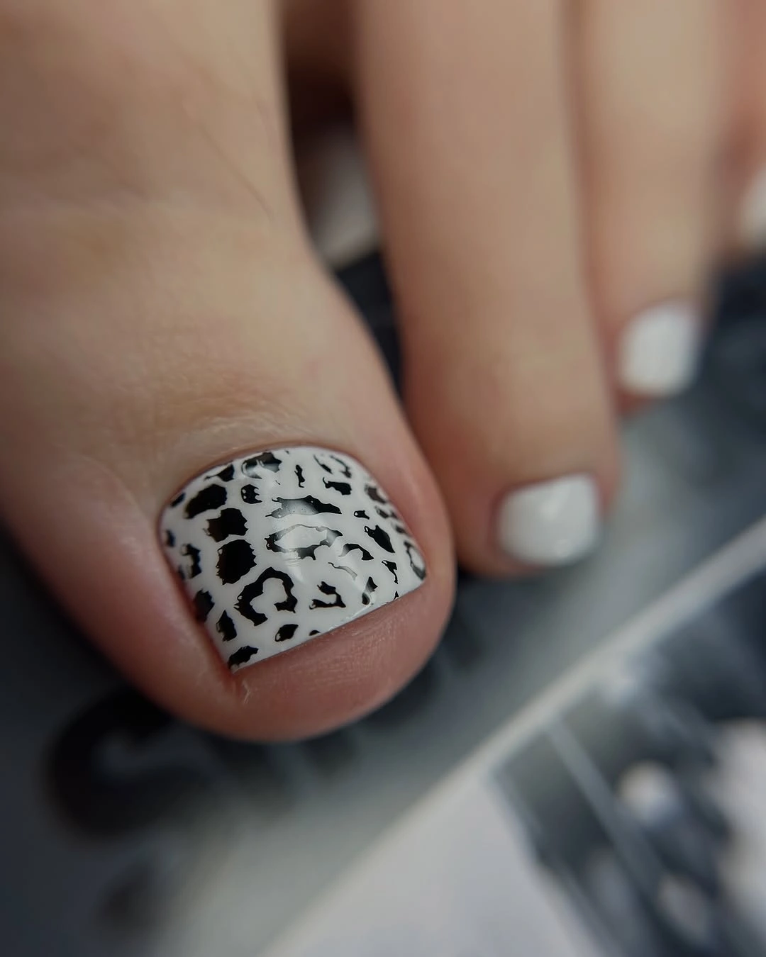
One patterned big toe is enough when the contrast is this strong. Plain white companions create negative space, and the repeated base color ties the design together without adding a second motif. If you want more continuity, place one tiny dark mark on a neighboring toe; leaving them plain is the more restrained option.
The white base makes every spot and edge visible, which is useful for clarity but less forgiving during wear. A dark shoe can sharpen the black-and-white contrast, while a patterned shoe may compete. The idea is practical when you want a graphic fall pedicure that stays controlled in scale. Keeping the smaller toes plain is the detail that prevents the high-contrast big toe from becoming visually overwhelming.
Blue Purple Shimmer On Short Toes
The dark base shifts between blue, purple, and black as the light changes, and fine shimmer supplies the movement instead of a painted motif. Short square tips keep the reflective color grounded, so the pedicure feels polished rather than overly dramatic. The design is finish-led from the first glance.
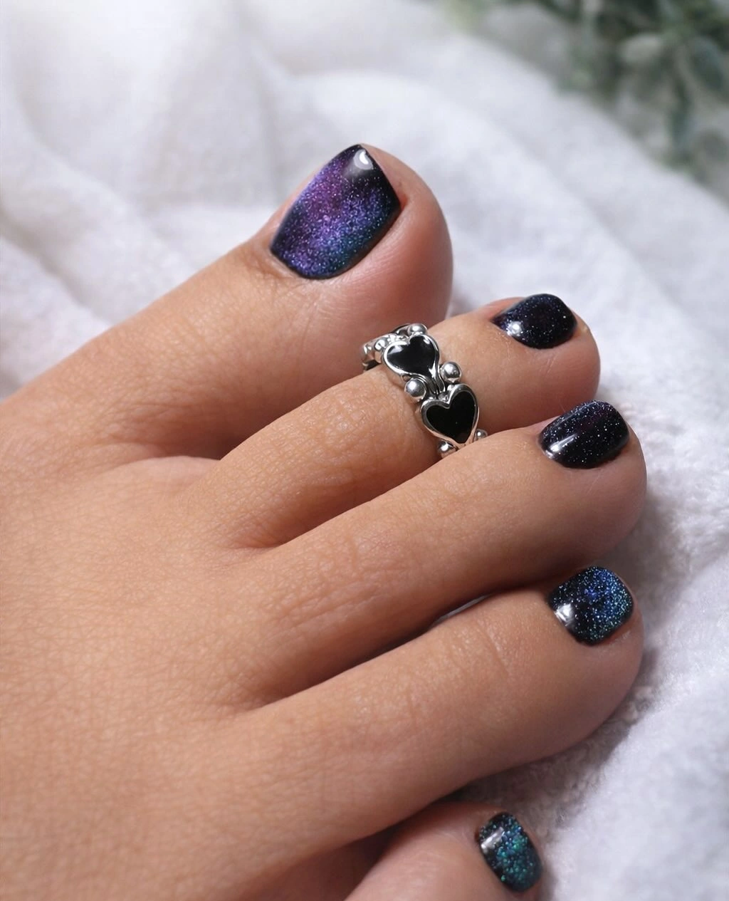
Reflective color is most effective when the rest of the surface stays uninterrupted. The eye can follow the shift without having to separate it from a pattern, and the compact shape keeps the dark palette practical. Use plain navy for a quieter version, or choose a slightly brighter blue if you want the shimmer to remain visible in softer light.
Dark shimmer will reveal chips and edge wear, while the color shift may look subtler indoors than in direct light. That is the honest limitation of a finish that depends on reflection. It remains a strong evening direction for readers who want depth without floral, animal, or graphic art. Choosing the same dark base on every toe gives the reflective particles a consistent field, so the finish rather than the pattern remains the reason the pedicure stands out.
Dark Base With Bright Floral Focal Toe
The big toe uses a deep blue-black base to frame bright purple flowers and green leaf-like marks, while the smaller toes repeat darker color with tiny accents. The strong contrast makes the floral detail immediately legible, and the short square shape keeps the decorative focal point compact. The dark background also gives the light marks enough separation that the design remains readable even when the smaller toes are viewed from a distance.
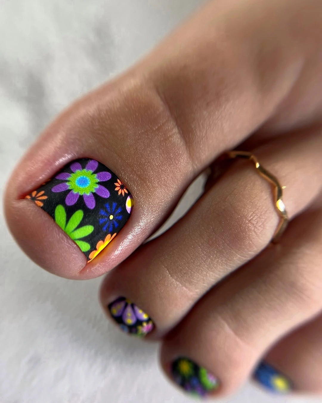
The dark background is what gives the bright colors their clarity. Keeping the flowers concentrated on one large toe prevents the entire foot from becoming a busy field, while plain companions create a visual pause. For a softer version, use one flower instead of several or change the base to a deep plum rather than near-black.
Bright floral detail asks for more precise placement than solid color, and the dark base will show wear around the edges. It suits readers who want a moody background with a cheerful interruption. The design feels seasonal through contrast, not through a literal autumn symbol. Reducing the flowers to one larger mark on each big toe makes the idea easier to maintain while preserving the same dark-and-bright relationship.
Clean White Squares With No Motif
Every visible toe is coated in clean opaque white, making the compact square outline and even coverage the only visual decisions. There is no pattern to interrupt the surface, so the big toe reads as a simple bright block against the denim and surrounding background. The result is crisp, open, and deliberately minimal.
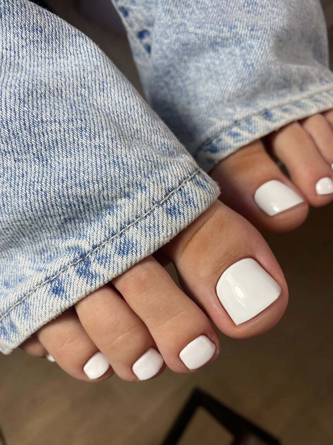
A plain white pedicure works because it leaves maximum room around the foot and can support almost any clothing color. The square tip gives the pale shade structure, while the absence of art keeps the design easy to adapt. Add one tiny accent to the big toe if you want more personality, or keep the whole set white for the quietest version.
The lack of decoration makes edge wear and uneven coverage easy to notice, especially on a pale base. That is the practical cost of the clean look, but the short shape remains simple to manage. This is a useful neutral reference when richer animal prints, shimmer, and florals need a visual pause. Its strength is the clear reset it creates between more expressive images, not a need for another accent color.
Matte Charcoal With Pale Organic Spots
The charcoal base is subdued and low-shine, so pale irregular spots carry the visible contrast. The short square shape keeps the dark pedicure neat, while the matte surface changes the mood from reflective glamour to a softer, more tactile finish. The surrounding denim and feathers reinforce the muted palette without becoming the subject.
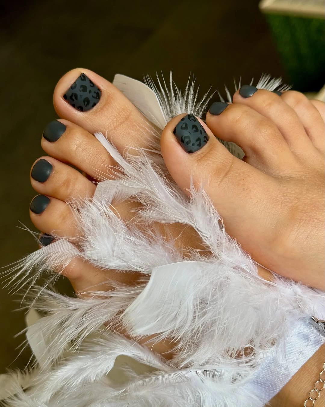
Matte works because it removes the reflection that might compete with the spot shapes. The pale marks stay readable, and the dark base feels grounded rather than glossy. If you want easier visual upkeep, use a smooth gloss; keeping the matte finish preserves the quiet texture and makes the pedicure look less conventional.
Low-shine surfaces can reveal scuffs or uneven texture more readily than a glossy color, so the finish has its own maintenance tradeoff. The pale spots also need enough spacing to avoid blending into one large field. This is a useful alternative for readers who want dark fall toe colors with texture but not sparkle. A glossy charcoal base would make the spots less tactile and more reflective, while the matte version keeps the visual mood quieter.
Creamy White With Tiny Red And Green Marks
The creamy white base remains dominant, while tiny red and green marks appear across the big toe and smaller companions. The spacing is open, so the accents add personality without turning the pedicure into a full pattern. Short square tips keep the miniature details within a clean, practical shape.
The contrast works because the colored marks are small and separated. A denser arrangement would make the pale base disappear, while fewer accents would make the set feel almost plain. For a quieter version, place the red and green only on the big toes; repeating them across all toes creates more continuity but also more visual upkeep.
Small marks are the most fragile part of the concept because a tiny smudge can change their shape. The pale background makes that visible, yet it also keeps the overall look light and easy to pair. This is a playful detail-led option for readers who want color in doses rather than one saturated block. Limiting the accents to the larger toes makes the design easier to read and gives the smaller nails a useful visual rest.
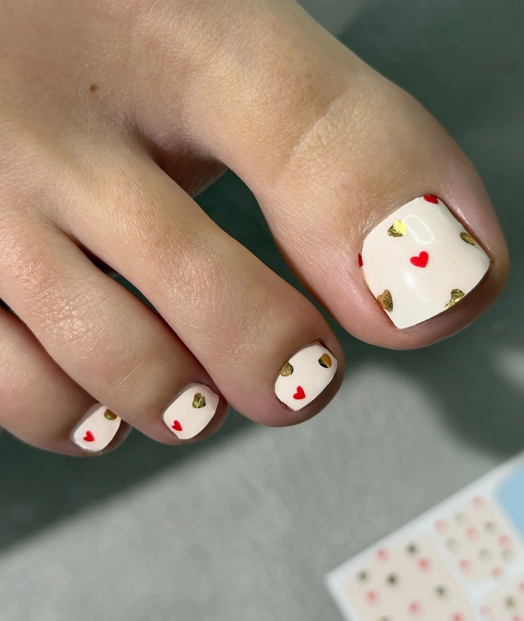
Creamy White With Tiny Red Hearts
The creamy white base stays dominant while tiny red heart-like marks appear on the big toe and smaller companions. The short square shape gives each little accent a clear boundary, and the wide spacing prevents the design from becoming a dense repeated pattern. The result is playful, but still light enough to work as an edited pedicure.
The small red marks succeed because they are surrounded by open pale space. If they were larger or placed on every visible surface, the white base would disappear and the design would feel more themed than balanced. Keep the accents on the big toes for a quieter version, or repeat a few small marks when you want stronger continuity.
Tiny symbols are more sensitive to smudging and growth than a solid color, and the pale background makes any change visible. That is the tradeoff for using detail in a small scale. The idea remains easy to adapt because the red accent can be reduced without changing the square shape or creamy base. One small mark on each big toe is enough to preserve the playful contrast if a full set of symbols feels too delicate.
Pale Blue In A Macro Square
The close-up isolates a single short square nail in pale blue, letting the glossy highlight and crisp edge become the entire subject. There is no pattern, so the smoothness of the surface and the evenness of the color are easy to assess. The cool shade feels clean and bright against the surrounding skin.
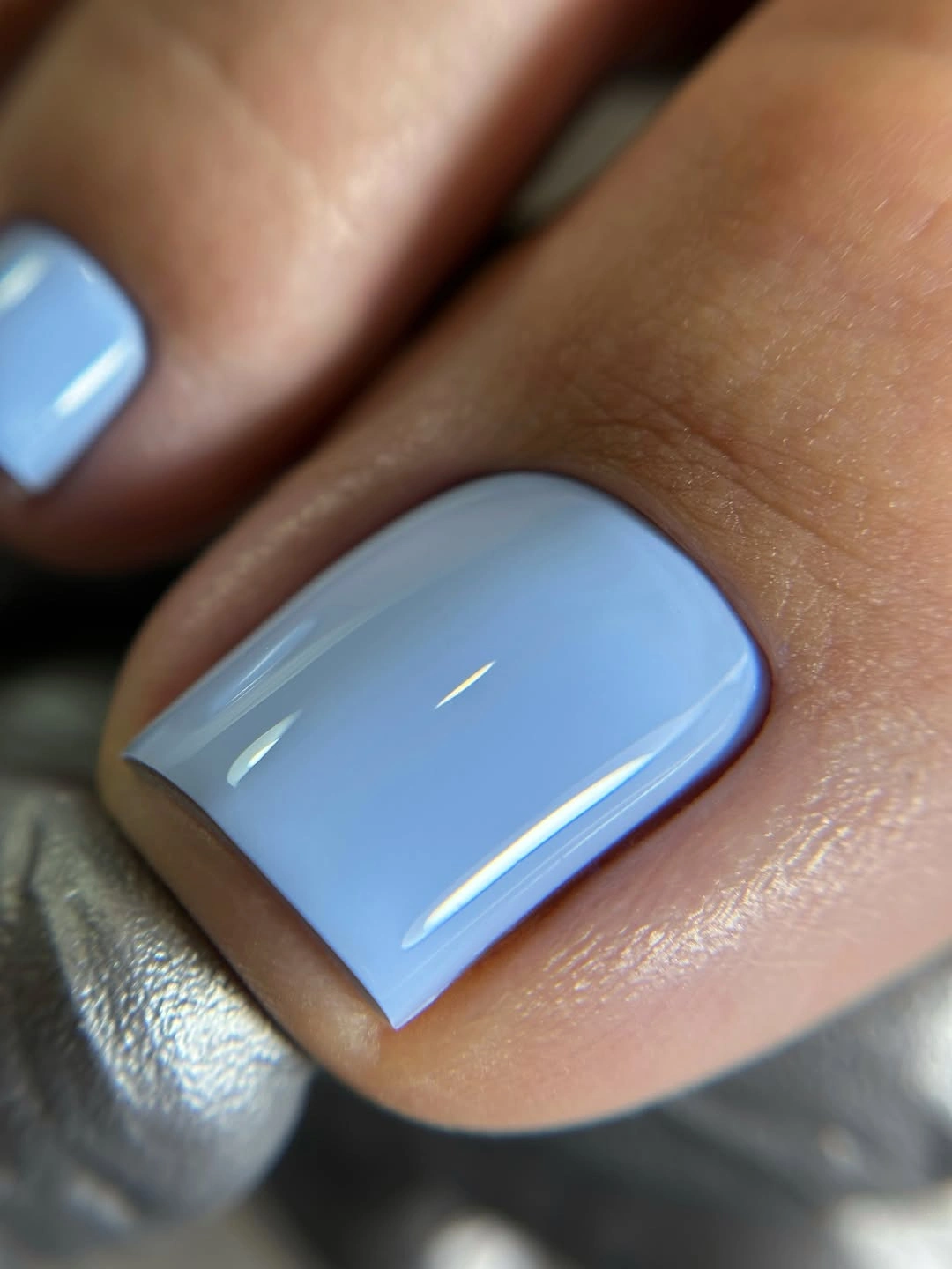
A single-color macro view shows why a simple shade can still feel designed when the outline is precise. Pale blue benefits from the square edge because the straight tip gives the light color structure. Use a blue-gray for a more muted fall direction, or keep the clear blue when you want the pedicure to feel fresher and more visible.
The pale surface can reveal streaks, uneven coverage, or edge wear under direct light. That is the cost of relying on finish and shape alone, but it also makes the design easy to adapt. A short square keeps the color practical even when the close-up makes every detail noticeable. If the clear blue feels too bright for the season, a muted blue-gray can lower the contrast while preserving the same glossy square structure.
Soft Sage On Short Square Toes
The pale sage green stays consistent across the compact square toes, and clean glossy highlights keep the muted color from feeling dull. There is almost no decoration, so the contrast with gray fabric and the neat edge of the big toe supply the visual interest. The result is gentle but not colorless.
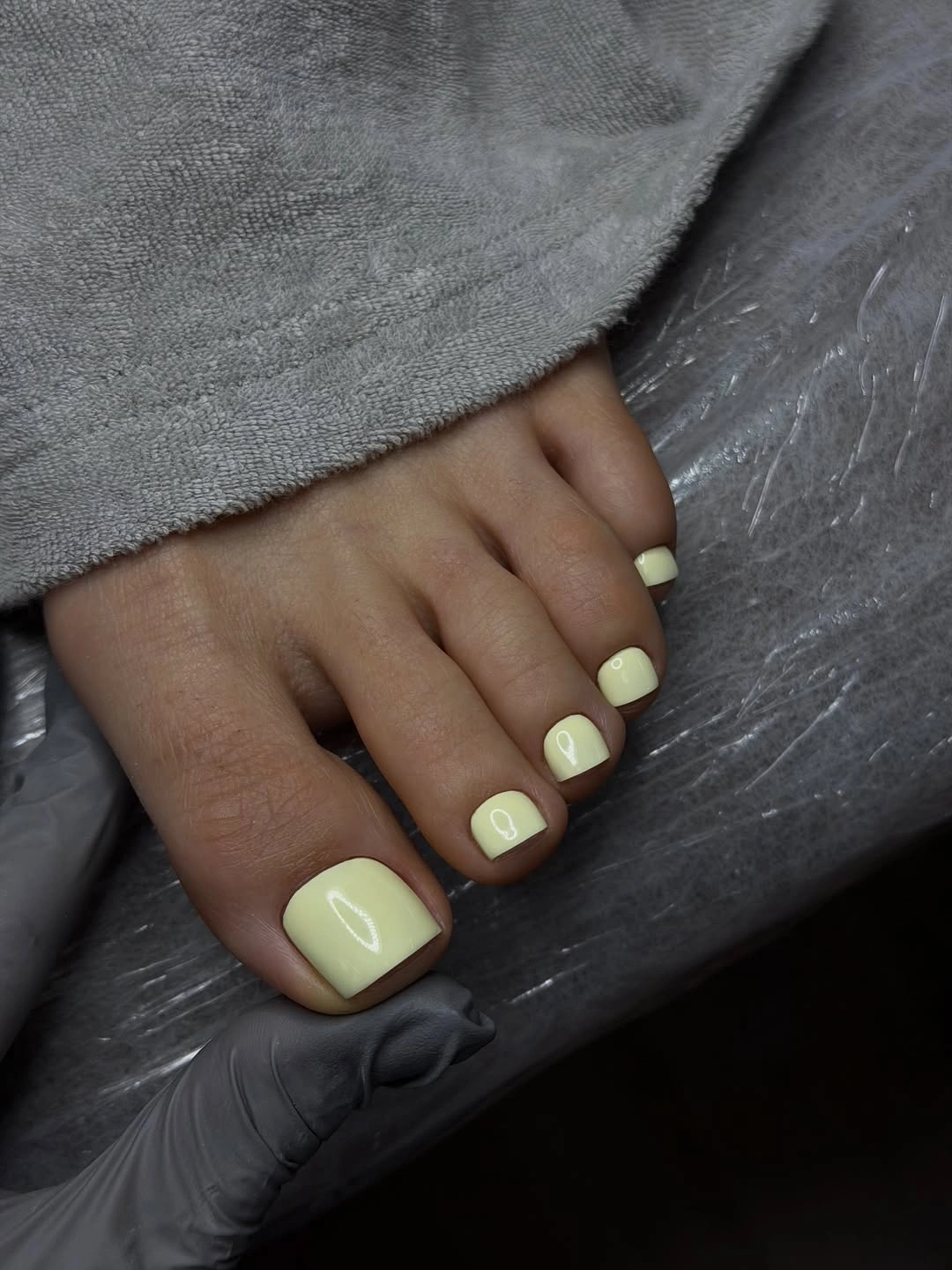
Sage gives a short pedicure more personality than nude or white without becoming as intense as burgundy. A cream base would make the set quieter, while a deeper green would make it more grounded. Keeping the square shape ensures that the soft color still has a clear outline and does not blend into the surrounding styling.
Pale green is less forgiving of uneven edges than a dark color with visible contrast, even though the overall mood is relaxed. The glossy finish may also show small marks in direct light. It is a useful middle ground for readers who want seasonal color that stays light and wearable. Keeping the shade on a short square shape lets the color remain fresh without adding length or decorative density.
Deep Plum Brown In Bright Sun
The final color is a dark plum-brown that shifts between wine and brown in bright light. Short square tips keep the set simple, while strong reflections show that the shade has more depth than a flat dark neutral. There is no motif, so the color’s undertone and clean edge provide the closing impression.
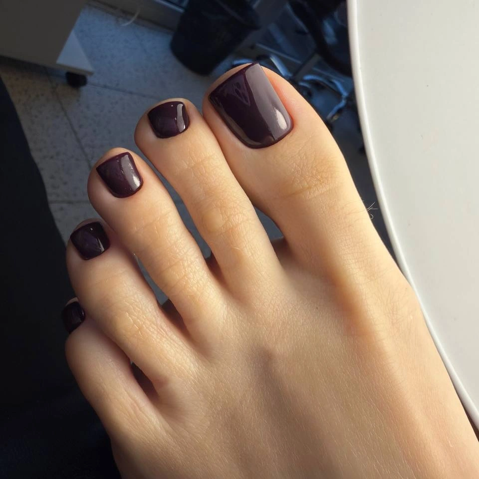
The simple shape lets the rich tone feel intentional rather than heavy. A softer mauve would make the pedicure lighter, but the plum-brown version gives a stronger seasonal anchor without needing animal print, flowers, or sparkle. Keeping the finish glossy helps the dark color show its subtle change in the light.
Deep color reveals chips and growth around the compact square edge, so neat boundaries remain important even in a minimal design. The payoff is a polished shade that works with many fall textures and fabrics. It closes the selection with depth created by undertone and reflection rather than additional decoration.