
Late fall outfits for women can become difficult to edit when seasonal layers, transitional colors, and competing details all seem to demand attention at the same time. A practical approach is to choose one organizing idea for the outfit, such as a clear proportion, a repeated color, a controlled print, or a strong outer layer, and let the other pieces support it.
That approach makes it easier to compare long coats with cropped jackets, denim with tailoring, skirts with trousers, and quiet neutrals with patterned or vivid accents. The details do not need to match exactly; they need to create a readable relationship between the top layer, the base, the footwear, and the accessories so the finished outfit feels intentional rather than overloaded.
Leopard Pumps Sharpen a Long Gray Coat
A long gray coat creates the dominant vertical frame here, with the black base underneath keeping that frame visually uninterrupted. Instead of adding interest through another large layer, the look shifts attention to two smaller details: a burgundy shoulder bag near the hip and leopard-print pumps at the hem. Their scale lets the coat remain the main shape.
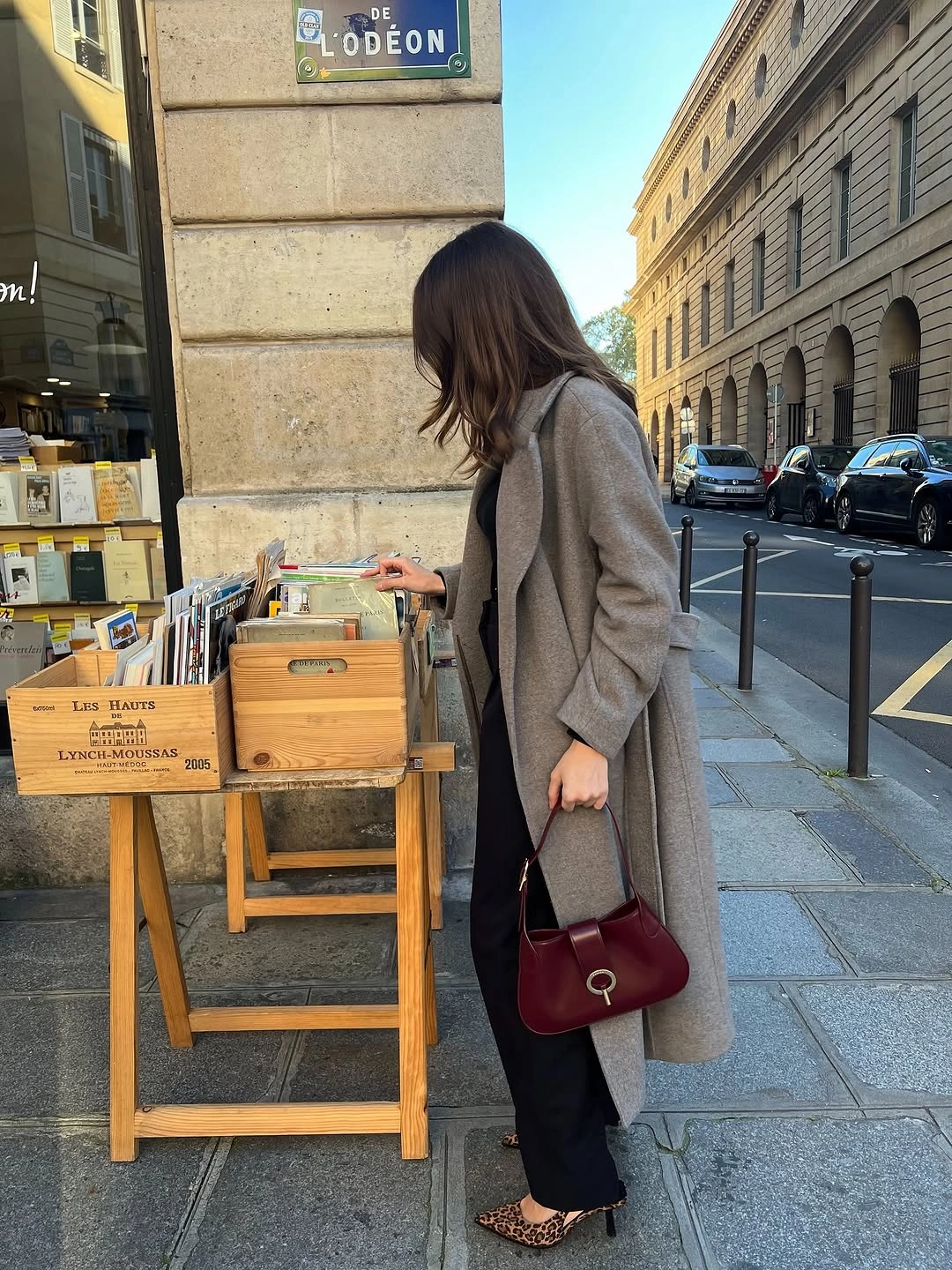
Photo via Instagram
The bag introduces a compact block of deep color against gray and black, while the pumps bring pattern into a much narrower area close to the ground. Because those two details sit apart from one another, they do different jobs rather than blending into a single focal point. The result is a useful lesson in distributing interest without crowding the center of the outfit.
This is a strong example of letting outerwear establish the silhouette while accessories handle contrast. A long neutral layer can carry both color and pattern around it when those additions remain controlled in scale.
A Belt Gives Quilted Volume Definition
The white quilted jacket has visible surface volume, but the waist tie pulls that shape inward at the center instead of leaving it uniformly boxy. That tied point gives the upper half a clear structure, while the dark cropped jeans create a shorter, narrower lower line beneath it. Black loafers finish that lower section without adding another bulky shape.
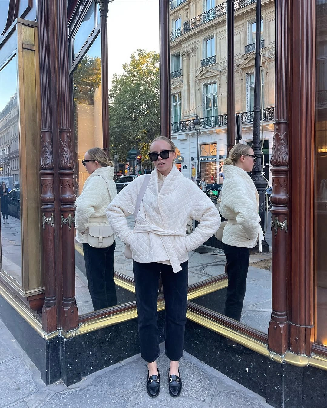
Photo via Instagram
The small white bag repeats the jacket color at a reduced scale, so the accessory supports the upper palette instead of competing with it. Reflections around the figure make the jacket's outline especially easy to read, including the tied waist and the fuller areas above and below it. The contrast with the dark jeans keeps that shaping visually distinct.
The main takeaway is about definition within volume, not about adding more layers. A waist tie can become the organizing line when an outer piece already carries pronounced quilting and a fuller outline.
One Red Scarf Redirects a Dark Look
Seen from behind, the outfit reads as a dark outline interrupted high on the body by a vivid red scarf. The scarf wraps near the neck and then drops vertically, creating a strong color line against the darker clothing without requiring any guess about the garments that are not fully visible. A black shoulder bag stays inside the same dark visual field.
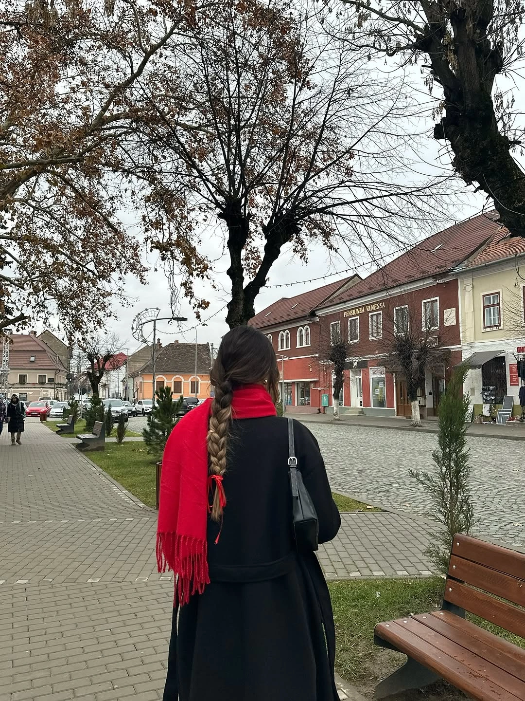
Photo via Instagram
The placement of the red matters as much as the color itself because it begins near the top of the silhouette and extends downward in a narrow band. That vertical movement pulls attention through the outfit while the surrounding dark areas remain broad and visually restrained. The leaf-strewn surroundings add other colors, but the clothing contrast still comes primarily from red against black.
A scarf can organize an outfit through placement rather than sheer size. Keeping the bag and visible clothing dark allows the red strip to remain clearly defined without turning the whole look into a multi-color composition.
Cropped Brown Layers Balance Wide Blue Denim
The cropped brown jacket stops high on the torso, while the light blue jeans open into a much wider shape below, creating a clear short-over-wide proportion. A white top remains visible between those two larger color blocks, so brown does not run directly into blue. That slim white separation makes the change in both color and volume easier to read.
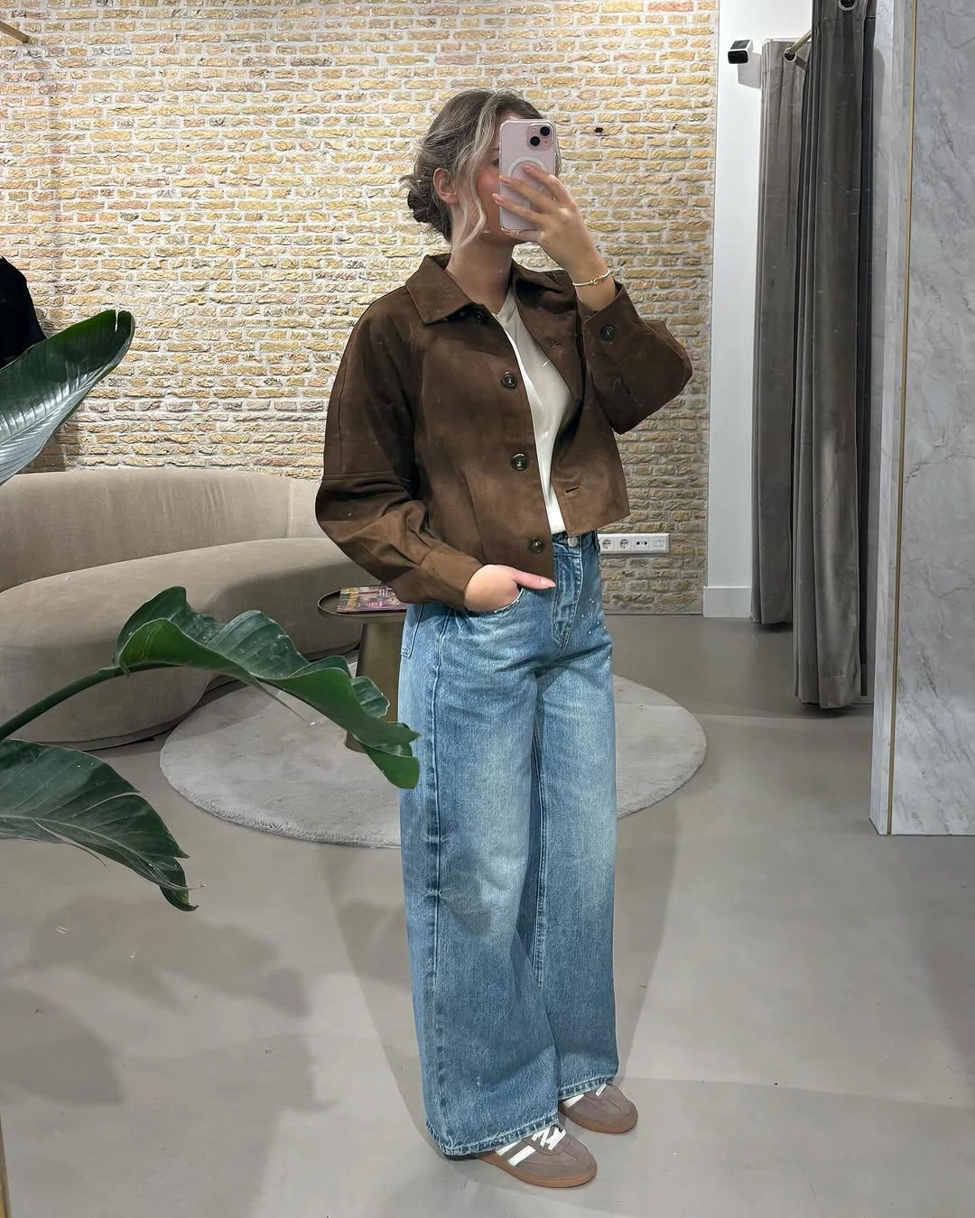
Photo via Instagram
Because the jacket is compact relative to the jeans, the lower half carries more of the outfit's visual width. The taupe shoes stay close to the neutral family of the jacket rather than introducing a sharp new color at the bottom. This keeps the proportion lesson focused on the contrast between a shortened upper layer and expansive denim.
The useful styling idea here is to let length and width counterbalance each other. A cropped outer layer gives wide-leg jeans a defined starting point, while the visible white top prevents the two larger shapes from appearing abruptly joined.
Black Tailoring Meets a Higher Trouser Line
A black blazer and black cropped top form a concentrated dark block through the upper half, while the gray pleated trousers shift the palette lighter below the waist. Because the inner top ends high enough to leave the trouser waist visible, the transition is clearly marked instead of being hidden beneath one continuous black layer. The pleats reinforce that boundary with vertical structure.
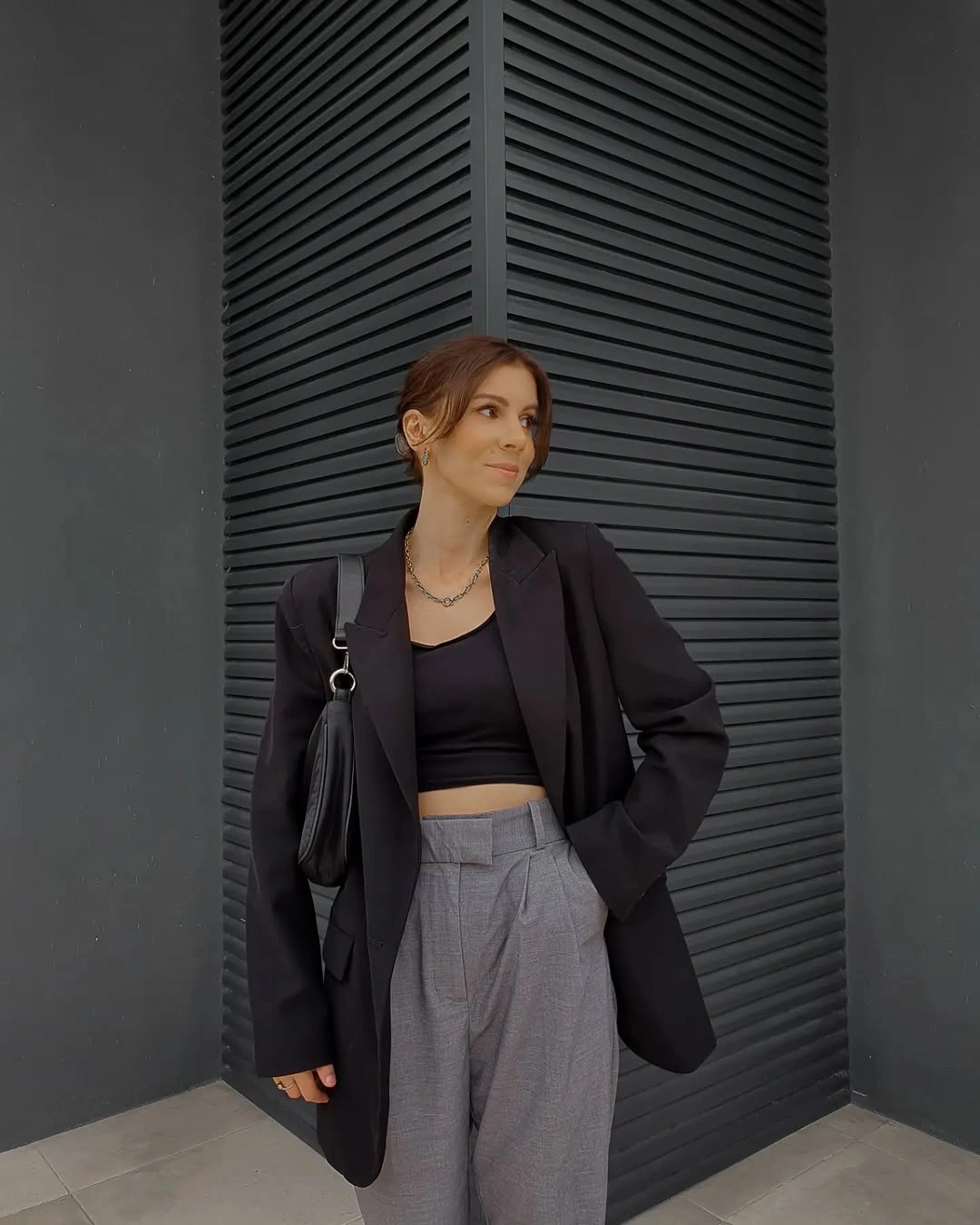
Photo via Instagram
The black bag repeats the upper color rather than introducing a new accent, so the visual change comes from tailoring and proportion instead of accessory contrast. Gray trousers carry more detail through the waistband and pleats, while the blazer supplies a longer outer line around the cropped inner layer. Those overlapping lengths give the upper half more depth without changing the restrained palette.
This look shows how a limited color range can still contain several distinct structural breaks. The visible waist, pleated front, cropped inner top, and longer blazer each create a separate line, while the black accessories keep the overall composition connected.
Cream Layers Brighten an Oversized Brown Jacket
The oversized brown jacket creates a broad outer shape, but the white button-up and wide cream pants form a much lighter column through the center. Because those pale pieces sit next to each other, the eye reads them as one connected core rather than as separate accents. The contrast makes the brown layer feel more clearly outlined without adding another strong color.
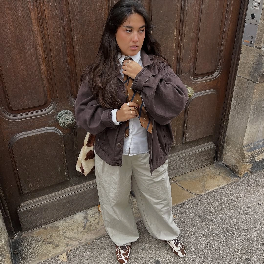
Photo via Instagram
The shoes bring brown and white back together in a smaller patterned detail near the ground, which gives the palette a visual return point. Their pattern is compact compared with the large jacket and trousers, so it adds variation without taking over the look. This is a practical way to repeat the main colors at a different scale and keep a roomy silhouette visually coordinated.
A light inner column can make an oversized outer layer easier to read by separating its edges from the rest of the outfit. Repeating the same brown-and-white relationship in the footwear ties the top and bottom together without relying on a matching set.
Texture Above, Burgundy Below, Denim Between
The textured-looking black cropped coat carries most of the visual density at the top, while the blue jeans create a calmer middle section underneath it. That denim break is important because it keeps the coat's surface and the burgundy pointed heels from competing directly with each other. Each element gets a separate zone, so texture, color, and shape stay easy to distinguish.
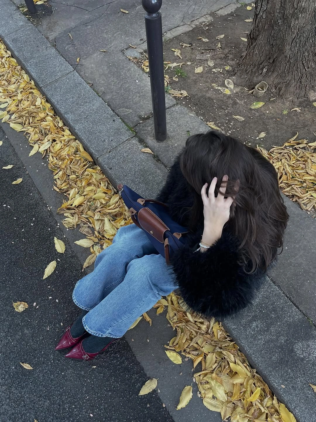
Photo via Instagram
Burgundy appears at the feet in a narrow, pointed form, giving the lower edge of the outfit a precise color accent rather than another large block. The shoulder bag stays secondary, while the jeans act as the neutral bridge between the darker upper layer and the colored footwear. The result shows how spacing can be as useful as matching when several strong details share one outfit.
This combination works through separation: texture is concentrated above, color is concentrated below, and straightforward denim occupies the space between them. That arrangement gives each detail enough visual room to register without requiring the same color or surface to be repeated everywhere.
White Layers Frame a Dark Denim Center
A dark denim sleeveless layer sits over a white blouse, creating a clear light-and-dark structure through the center of the outfit. White also appears again at the socks, so the lighter details are visible both above and below the denim shape. Because the exact construction of the sleeveless piece is not fully clear, the strongest takeaway comes from the layering rather than from naming a specific dress style.
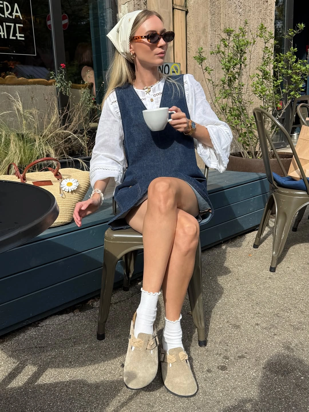
Photo via Instagram
The headscarf adds another light detail near the top, while the tan shoes shift the palette gently at the bottom instead of repeating either dark blue or white. Those tan shoes keep the lower finish distinct from the socks, making the boundary between each layer easy to see. The look demonstrates how repeated light details can frame a darker central garment without making every accessory match.
The useful idea here is placement: white details recur at separated points, giving the darker denim center a clear visual boundary. A headscarf and contrasting footwear can extend that framing effect while still keeping the main layered shape easy to read.
Graphic Black Outerwear Bridges Into Pale Denim
The varsity-style jacket supplies the strongest graphic contrast through its dark body and lighter sleeve details, while the white tee creates a clean transition into light blue jeans. That white middle layer keeps the jacket from meeting the pale denim too abruptly. Instead of reading as two disconnected blocks, the upper and lower halves are linked by a simple, visible color bridge.
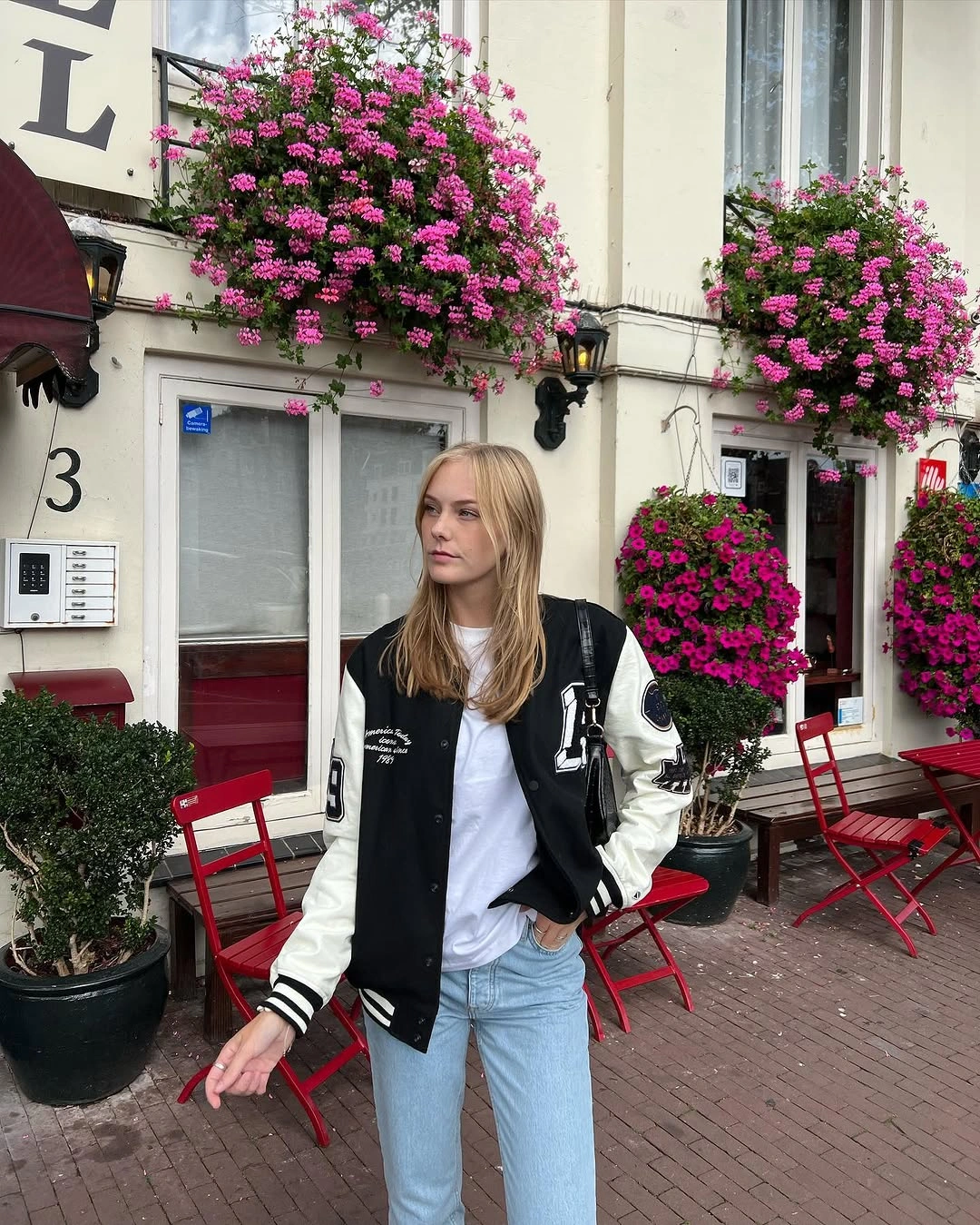
Photo via Instagram
A dark bag repeats the jacket's deeper tone at a smaller scale, which keeps the accessory connected to the outer layer rather than turning it into a new focal point. The jeans remain visually quiet, allowing the jacket's lettering and contrasting details to carry the graphic emphasis. This is a useful approach when one garment already has enough visual information to lead the outfit.
When outerwear has strong contrast built into it, the surrounding pieces can work best as connectors rather than competitors. Repeating the dark tone in the bag and using white between black and pale blue keeps the color progression deliberate without adding extra pattern.
Black Edges Frame Wide Brown Trousers
Black at the shoulders and again at the feet creates a visual frame around the broad brown trousers, which occupy most of the lower silhouette. The white blouse sits between those darker upper and brown lower areas, giving the outfit a clear break at the torso. That separation lets the trousers keep their width without making the whole look read as one heavy block.
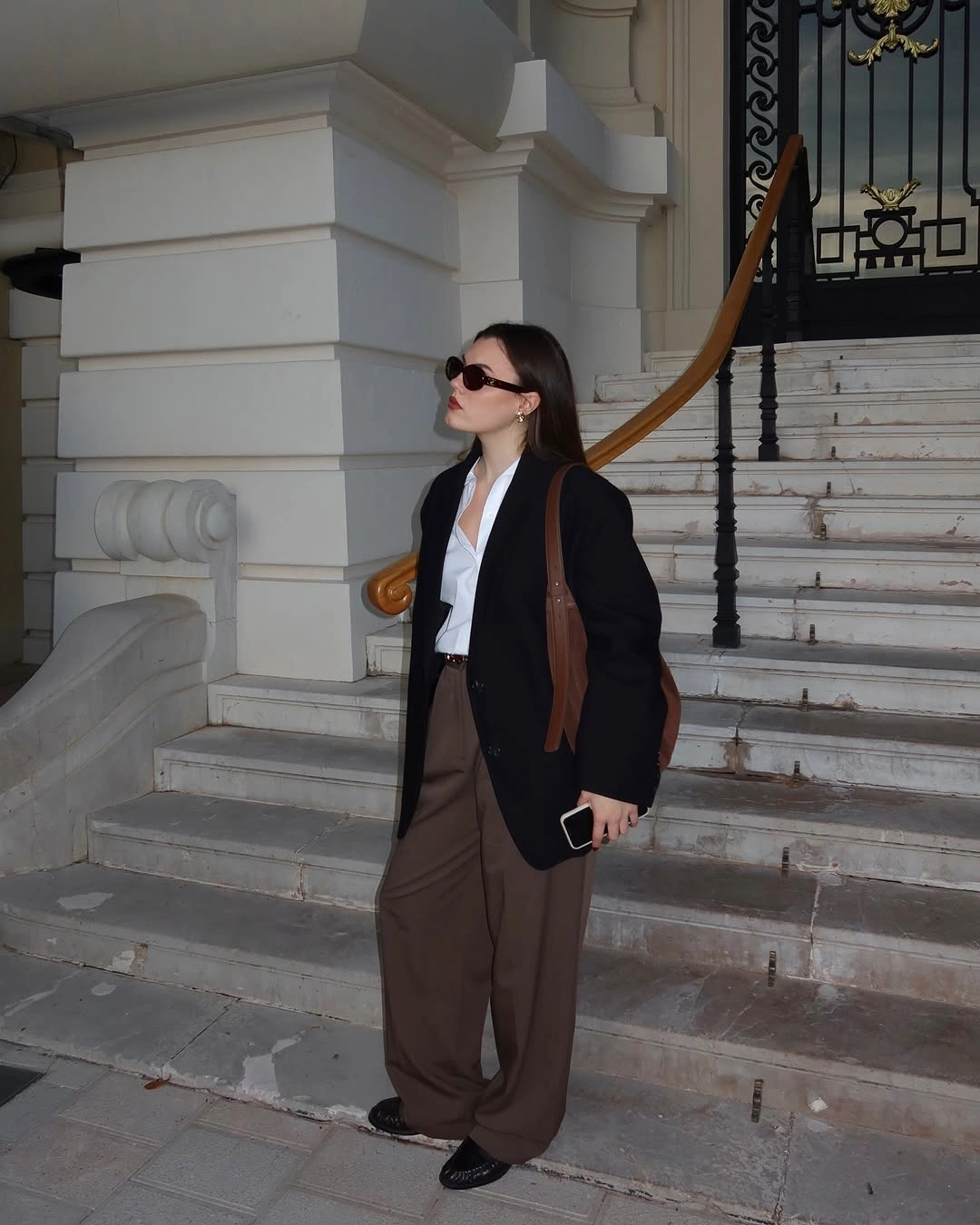
Photo via Instagram
The black flats repeat the upper dark layer at the opposite end of the outfit, while the shoulder bag supports the same darker outline. Because the brown trousers are wide and visually substantial, those repeated black edges help define where the lower shape begins and ends. The white blouse remains the quiet separator that keeps all three color areas distinct.
This look is organized by framing rather than by a single accent. Dark details above and below contain the wide brown center, while the white blouse prevents the upper layer from blending directly into the trousers.
Taupe Layers Create One Continuous Neutral Line
The taupe coat and long scarf stay close in color, so the upper portion reads as one extended neutral field rather than as separate pieces competing for attention. The scarf drops well below the neckline and continues the same muted tone down the front, adding length to the composition while preserving the coat as the dominant shape.
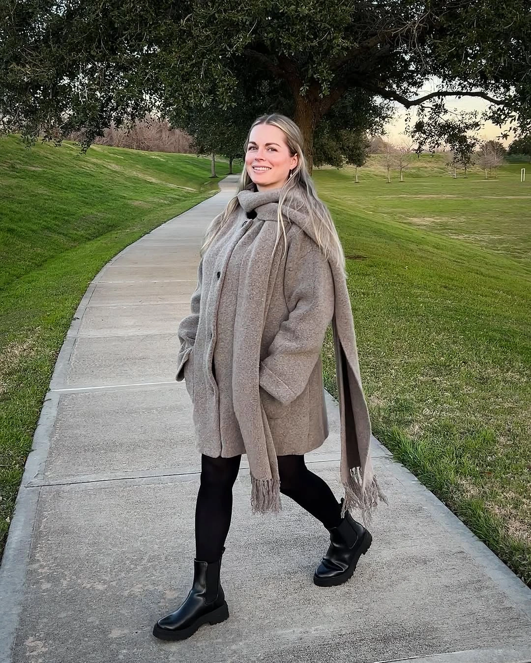
Photo via Instagram
Black tights and black ankle boots create a clearly different section beneath that neutral upper area. Because both lower pieces share the same dark value, there is little interruption between leg and footwear, which makes the contrast with the taupe coat more decisive. The outfit gains definition through a clean division between tonal continuity above and a compact dark anchor below.
This is a useful way to work with closely related neutrals without making the entire outfit visually flat. Extending one color family through both coat and scarf creates continuity, while a unified darker lower section gives that long neutral line a clear stopping point.
Stripes and Pleats Build Opposing Visual Rhythms
Horizontal black-and-white stripes draw the eye across the sweater, while the pleats in the short black skirt send a different rhythm downward. Those directions contrast with each other, but the repeated black keeps the upper and lower sections from feeling unrelated. The result depends less on extra accessories and more on how line direction changes across the outfit.
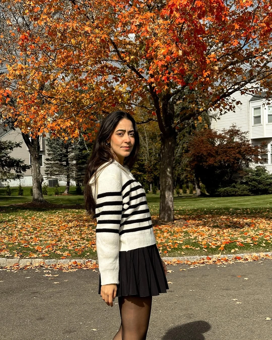
Photo via Instagram
Black tights extend the skirt color below the hem, giving the pleated section a stronger visual base instead of introducing another pattern or shade. That dark continuation also lets the white bands in the sweater remain the clearest light element. For practical styling, the lesson is that two strong structural details can coexist when one shared color gives them a common reference point.
Mixing directional details does not require matching their shapes. Horizontal stripes can sit comfortably above vertical pleats when a repeated dark color links the two sections and prevents the composition from becoming fragmented.
Mint Color Expands Beneath a Brown Vest
The mint hoodie occupies a broad area beneath the brown puffer vest, so the color is treated as a major part of the outfit rather than a small accent. Sleeves, hood, and the visible front section all keep that pale green tone present around the darker outer layer. The vest then works as a concentrated brown block through the center instead of covering the mint completely.
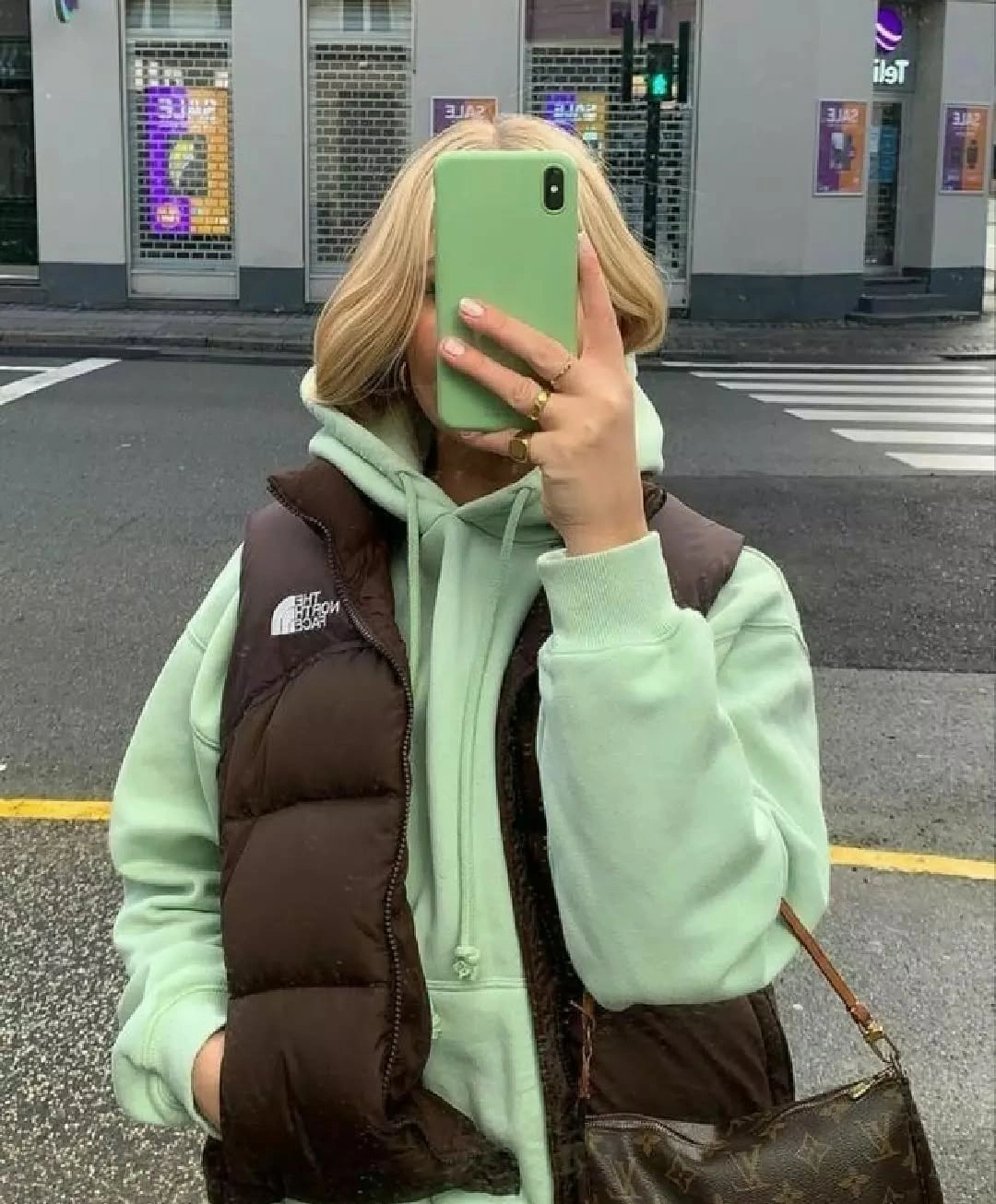
Photo via Instagram
A dark crossbody bag introduces a smaller patterned-looking surface near the lower edge of the vest, adding detail without expanding the palette into another large color zone. Its scale is important because the hoodie and vest already establish two substantial areas. The accessory can therefore stay secondary, giving the eye a smaller point of visual complexity after the larger mint-and-brown contrast is established.
This approach works when color is allowed to occupy real space instead of appearing only through accessories. A pale inner layer can remain highly visible around a darker sleeveless outer piece, while one compact patterned accessory adds detail without changing the main color balance.
Brown Details Ground a Leopard Print Blouse
The leopard-print blouse concentrates most of the visual activity above the waist, while the beige wide-leg trousers remain solid and comparatively quiet below. That division gives the print a clear boundary instead of carrying pattern through the full silhouette. A brown belt sits directly at the transition, creating a narrow visual link between the printed upper half and the broad neutral trousers.
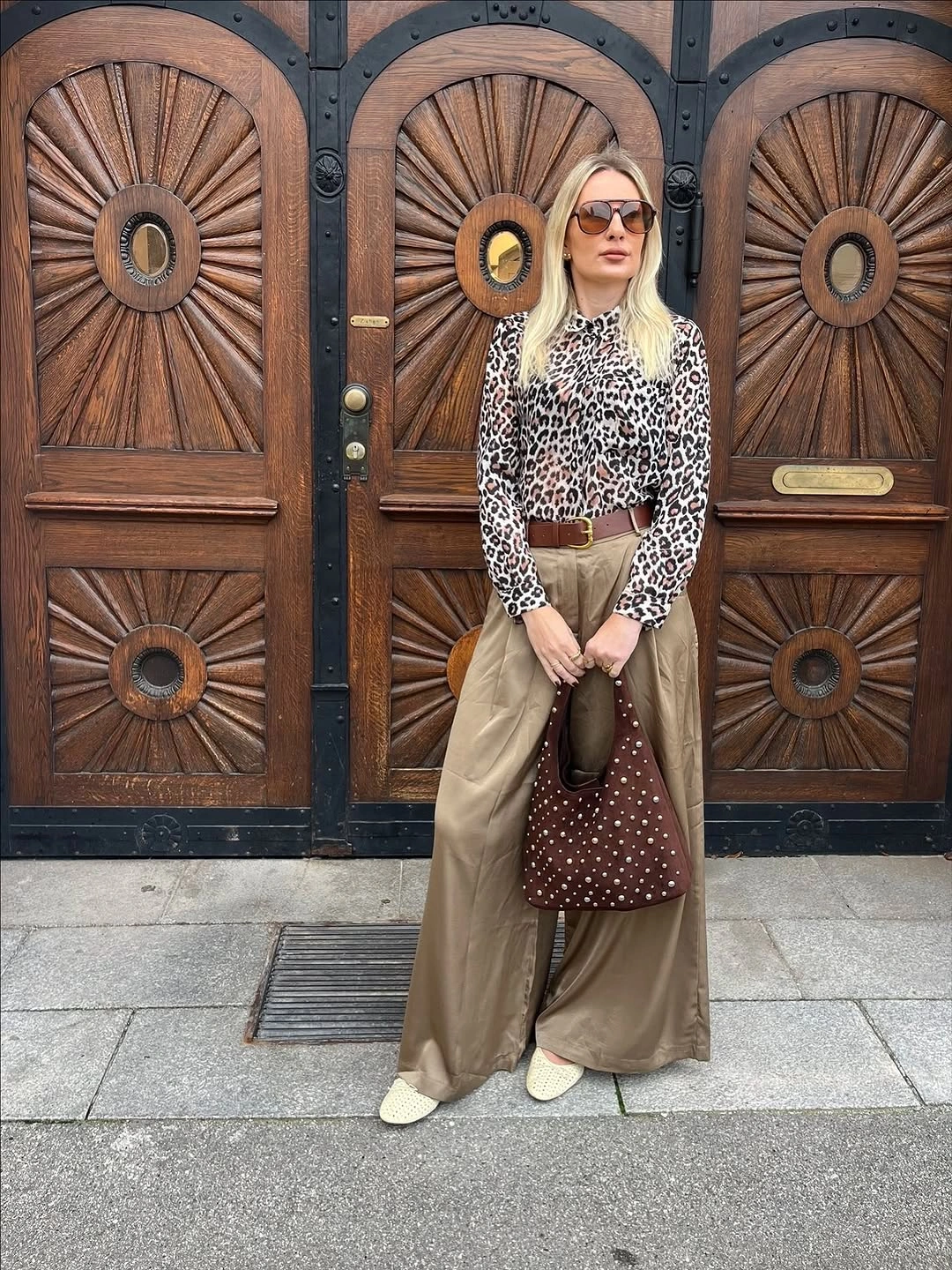
Photo via Instagram
The brown bag repeats that grounding color at a larger scale and adds its own dotted or studded-looking detail without competing directly with the blouse pattern. Because the trousers stay unpatterned, there is enough visual space between the two decorated areas. The outfit shows how accessories can echo colors already present in a print while leaving the widest garment relatively simple.
Concentrating pattern in one major garment gives the eye an obvious place to start. Solid wide trousers create breathing room below, while brown accessories can pull selected tones out of the print and carry them through the rest of the look.
Pale Colors Let Surface Texture Stand Out
From the mostly back-facing view, the cream textured-looking pullover and light blue jeans create a soft, low-contrast pairing with no sharp color boundary between top and bottom. Because both pieces stay relatively pale, the visible surface of the upper layer becomes more noticeable. Its textured-looking finish supplies depth where a stronger color contrast might otherwise take over.
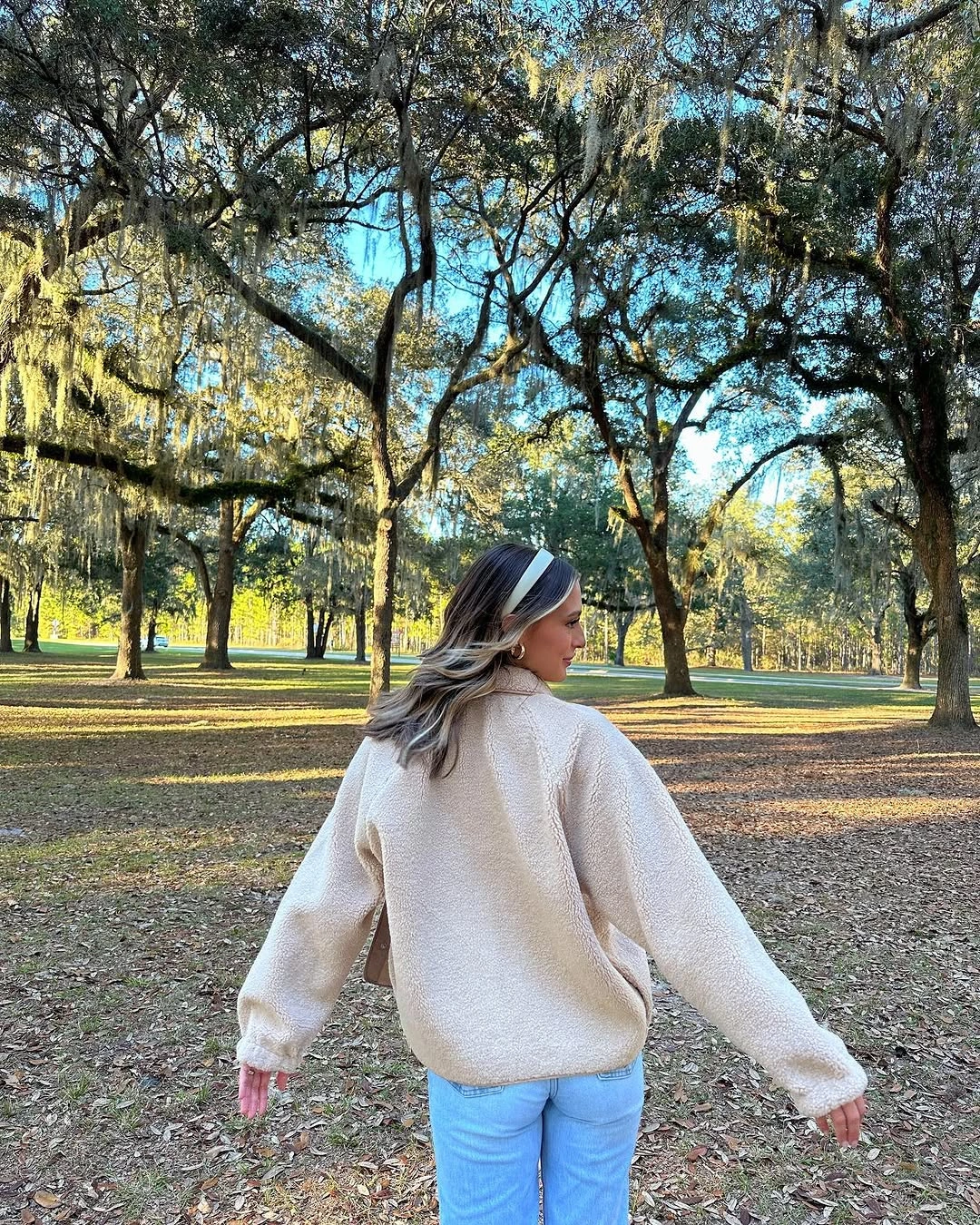
Photo via Instagram
The jeans keep the lower half visually straightforward, which leaves the cream upper layer to carry most of the surface variation. There is no need for a bold accessory or dense print to create distinction here because the change between texture and smoother-looking denim already provides enough separation. The pale palette makes those material-like visual differences easier to notice without requiring any claim about fiber content.
Low-contrast outfits can rely on surface rather than color to create definition. When the shades remain close in visual weight, a textured-looking upper piece can become the main point of interest while simple denim keeps the rest of the composition quiet.
Cream Vest Breaks Up a Dark Base
A cream textured-looking vest sits directly over a dark long-sleeve top, cutting a light block across an otherwise dark upper and lower base. Because the black trousers continue the deeper tone below, the vest becomes a clear interruption at the torso rather than part of a gradual color fade. Its shorter, lighter shape makes the layering order easy to read from a distance.
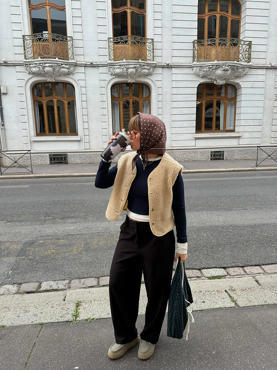
Photo via Instagram
The patterned headscarf adds another point of detail much higher in the outfit, but at a smaller scale than the vest. A brown shoulder bag introduces a separate muted accent near the side without competing with either feature. This arrangement shows how a large light layer and a compact patterned accessory can occupy different visual zones while the dark base keeps them connected.
The practical idea is to place contrast at two different heights instead of concentrating every detail in one area. A light vest can define the center of a dark outfit, while a smaller head detail adds variation without changing the main silhouette.
Loose Patterned Volume Meets an Oversized Sweater
The oversized dark brown sweater creates substantial volume through the upper half, while the loose patterned lower garment continues that relaxed scale instead of narrowing sharply beneath it. Its exact construction is not fully clear, so the stronger styling point comes from the relationship between the roomy top and the patterned shape below. The pattern gives the lower half movement without relying on a new bright color.
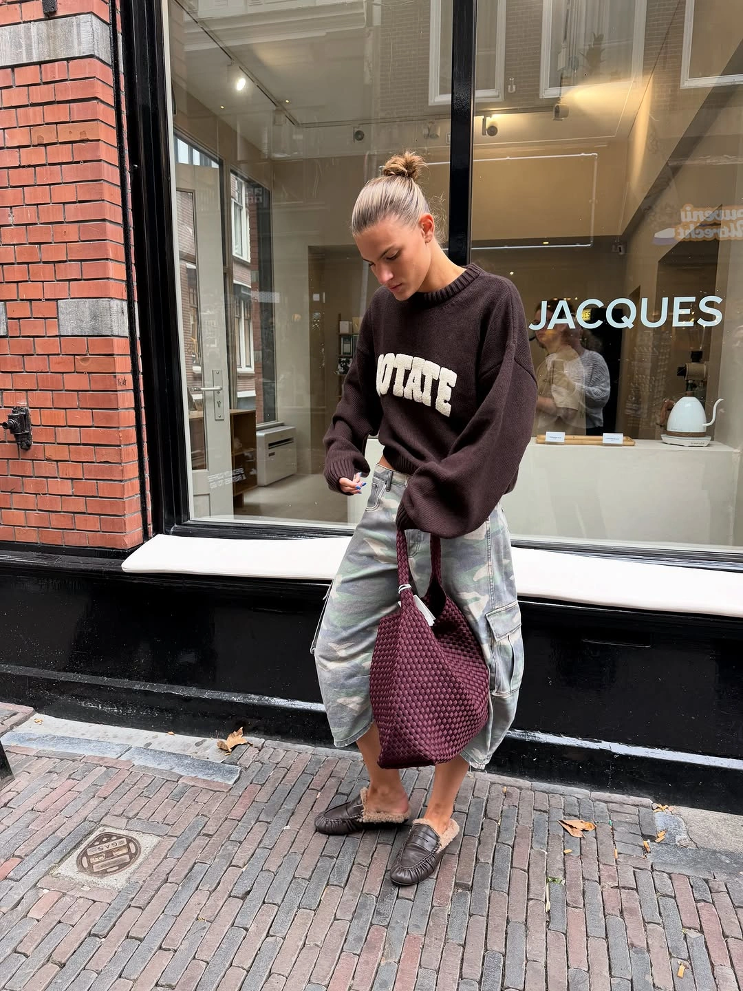
Photo via Instagram
A burgundy textured-looking shoulder bag adds a denser surface and a deeper reddish tone beside the brown sweater, creating a compact focal point against the broader shapes. Black flats keep the finish low and visually simple, so they do not add another layer of volume near the ground. The combination works through scale changes: oversized clothing, a medium patterned area, and one smaller accessory.
Volume does not have to be balanced by something narrow every time. When both upper and lower pieces read loosely, pattern and accessory scale can provide the definition that a fitted counterpoint would otherwise create.
White Repetition Connects Burgundy and Beige
A burgundy graphic sweatshirt forms the strongest color block, with a crisp white collar visible at the neckline and a beige pleated short skirt creating a lighter section below. The white collar is small, but its placement makes it noticeable against the burgundy. That same light note reappears at the feet, where white boots give the outfit a second clear white boundary.
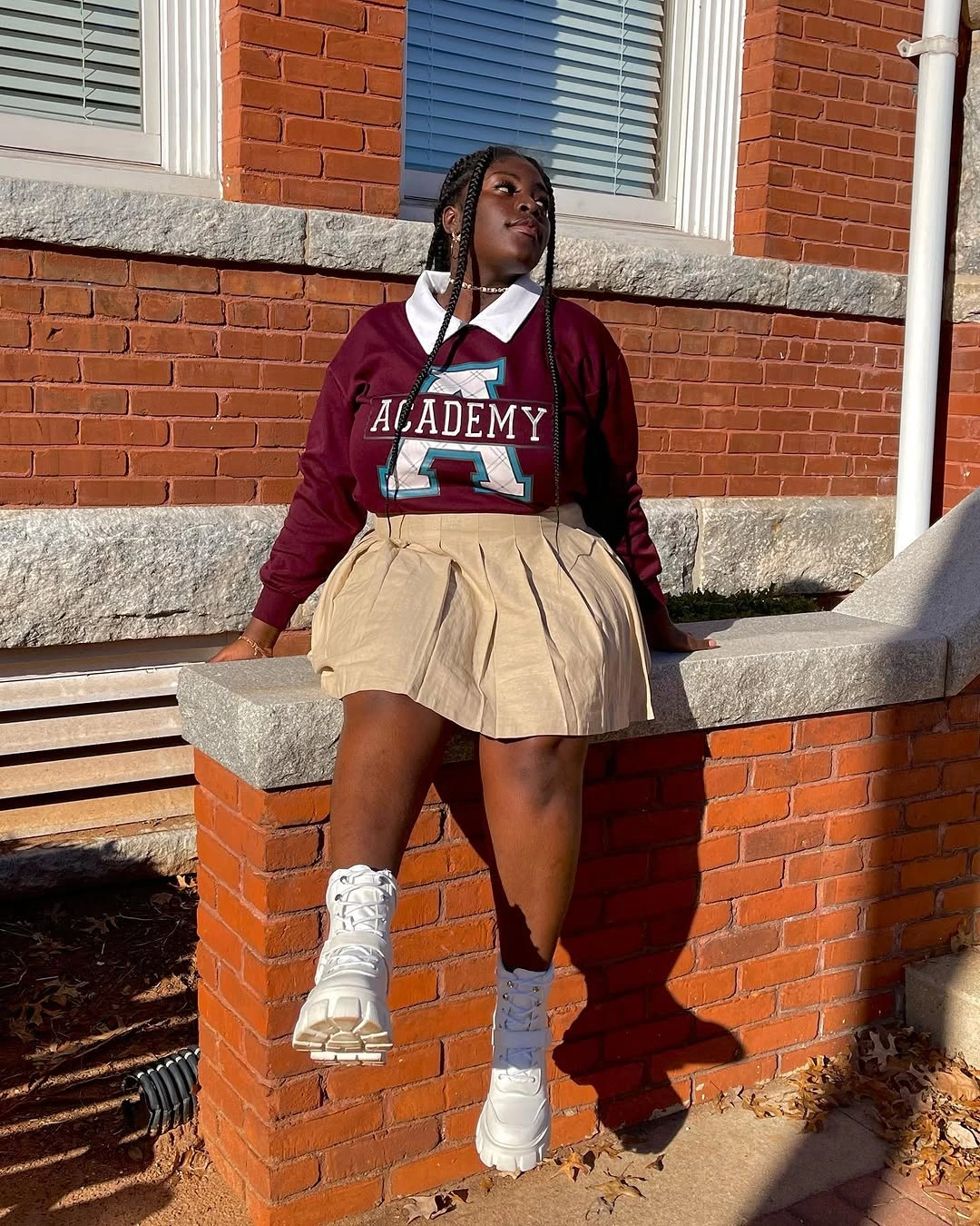
Photo via Instagram
The repeated white is what organizes the combination: one detail sits above the burgundy, while the footwear appears below the beige pleats. This creates a top-and-bottom connection without requiring the skirt to match either piece exactly. The beige middle keeps the burgundy and white from turning into a simple two-color block, while the pleats add visible structure to that central section.
Repeating a light color at separated points can make several stronger colors feel related without forcing them into a matching set. Here, the collar and boots create that link, while burgundy and beige remain distinct in the middle.
High-Tops Interrupt an Almost Solid Black Column
The outfit reads as an almost continuous black column, with a dark long-sleeve top, a long black lower layer, and a black bag all staying within the same narrow value range. Because the construction of the lower piece is not completely visible, its length and color matter more than a precise garment label. The uninterrupted dark area makes the silhouette feel especially unified from torso to hem.
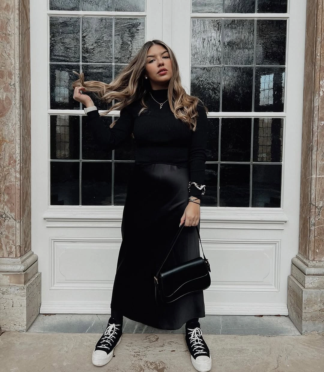
Photo via Instagram
Black-and-white high-top sneakers create the clearest break in that column by introducing bright graphic lines right at the bottom edge. Their lighter sections are small compared with the amount of black above, but the contrast is sharp enough to become the finishing detail. The black bag stays inside the dominant palette, which prevents the accessory from competing with the sneaker contrast.
A nearly monochrome outfit can reserve its strongest contrast for the final few inches near the ground. Graphic footwear becomes more noticeable when every larger piece above it stays visually consistent.
Open Trench Panels Frame a Simple Center
The beige trench is worn open, so its two long front panels act more like a frame than a solid outer block. Inside that frame, a white tee and blue jeans create a straightforward vertical center with a clear change from light top to denim below. The open construction keeps both inner pieces visible, making the layered relationship depend on spacing as much as on color.
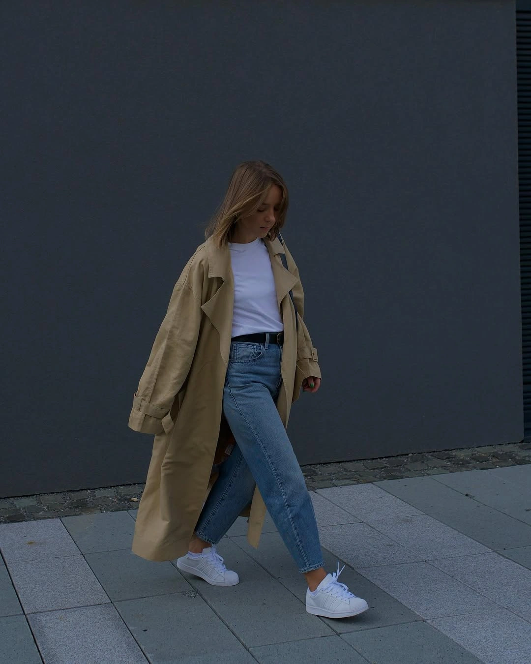
Photo via Instagram
White sneakers repeat the tee at the lowest point of the outfit, giving the central white-and-blue combination a small visual return after the denim. The trench remains separate in beige, outlining the sides rather than covering the center. This makes the look useful for studying how an open outer layer can add length and structure while still leaving the simpler pieces underneath fully readable.
The main lesson is about framing rather than concealment. Leaving a long outer layer open can preserve a simple inner combination and let repeated footwear color tie the top and bottom together without adding another strong accent.
Pale Blue Boots Shift the Color Downward
The long taupe coat and layered scarf occupy most of the upper silhouette in closely related neutral tones, so that portion reads as one broad visual field. A white knit cap adds a lighter note near the top without breaking that continuity sharply. The clearest change in color arrives much lower, where the pale blue boots separate themselves from the taupe and white above.
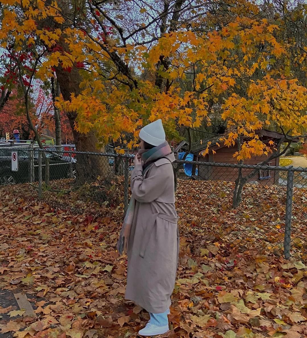
Photo via Instagram
Placing the most noticeable color shift at the feet changes how the outfit is read from top to bottom. Instead of building toward a bright accessory near the face or torso, the neutral coat and scarf remain dominant until the pale blue footwear appears below the hem. The orange leaves around the boots make that low placement especially visible without becoming part of the outfit itself.
This is a useful way to move color away from the usual scarf-or-bag position and let footwear carry the contrast. Keeping the larger upper layers close in tone gives the pale blue boots enough space to register as a deliberate finishing change.
Staggered Hemlines Define the Dark Layers
The strongest structural detail is the gray lower layer extending visibly beneath the dark coat, creating two separate hem lengths instead of one continuous outer silhouette. That difference gives the layered outfit depth before color becomes the main consideration. Dark boots continue the deeper tone near the ground, while the longer gray section remains clearly exposed between coat and footwear.
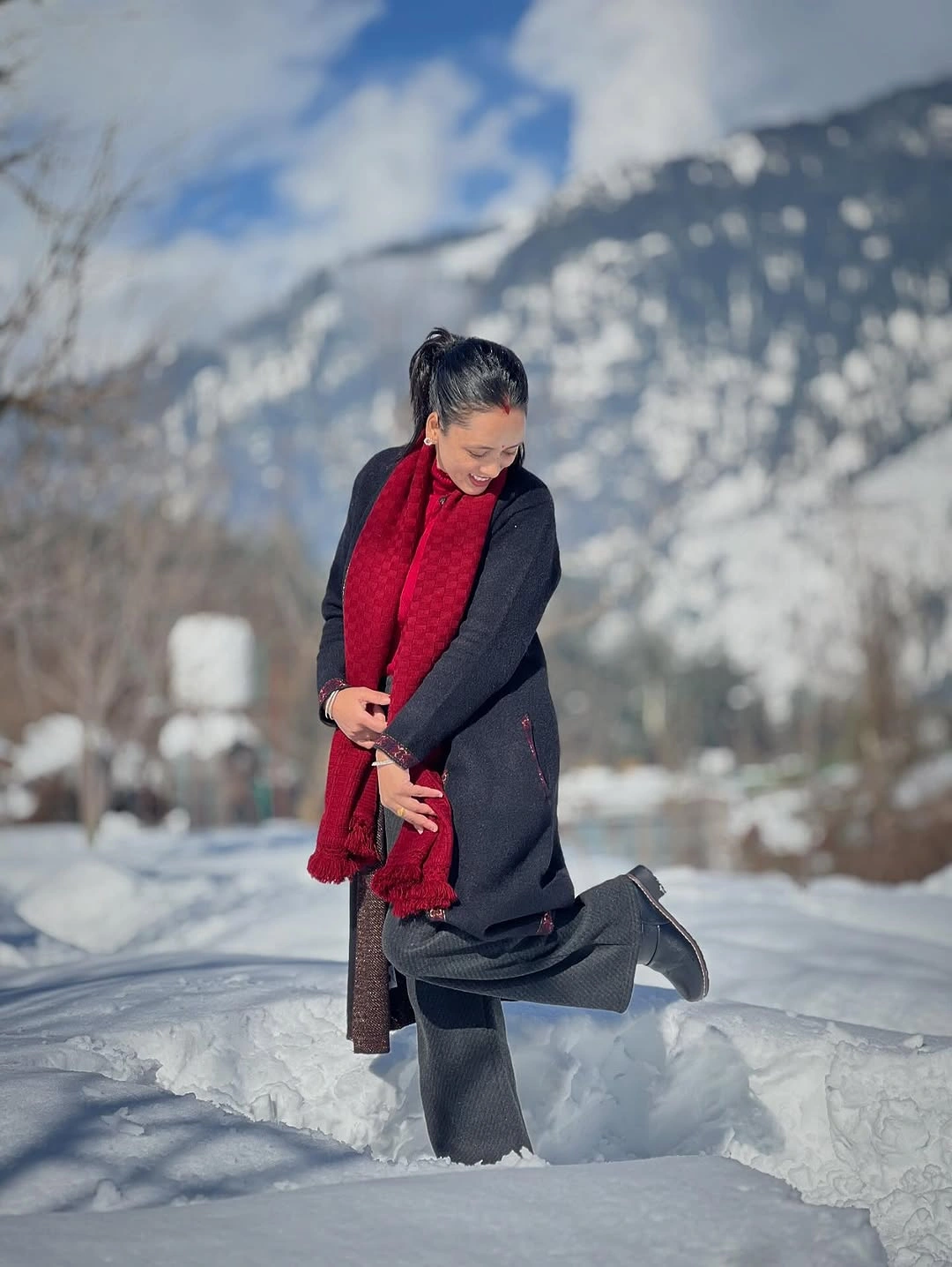
Photo via Instagram
The vivid red scarf is noticeable, but it works as a secondary upper detail rather than the organizing feature. The eye can first follow the dark coat to its hem, then continue through the longer gray layer before reaching the boots, which makes proportion central to the composition. This staggered arrangement is practical when you want several dark and neutral pieces to remain individually readable.
Letting an inner or lower layer extend beyond a coat can create a clear late-fall styling rhythm without relying on extra pattern or multiple competing colors. The useful move is to make the difference in lengths visible enough to feel intentional, then allow a smaller color accent to sit above that structure.