
How much can a manicure say after the shine has been taken away? With matte fall nails design 2026, the most interesting tension is between a surface that asks to be noticed and a mood that refuses to shout. A finish with no obvious reflection makes the eye linger on the outline of a fingertip and the pause between colors, so one small decision can carry more presence than it ever would beneath a glossy surface.
Start with the level of attention you want the manicure to hold at arm’s length, then allow only one element to become clearer on a closer look. When color, shape, and finish all demand equal attention, the result can feel restless; when one leads and the others give it room, matte polish turns a personal preference into something composed enough to live with every day.
Sage Green With One Quiet Accent
Soft sage green covers the medium square nails with an even matte surface, while one gray-green accent carries a slightly rougher-looking texture. That one interruption is doing real visual work: the repeated green keeps the hand calm, then the changed surface makes the eye slow down without introducing a new color or a competing motif.
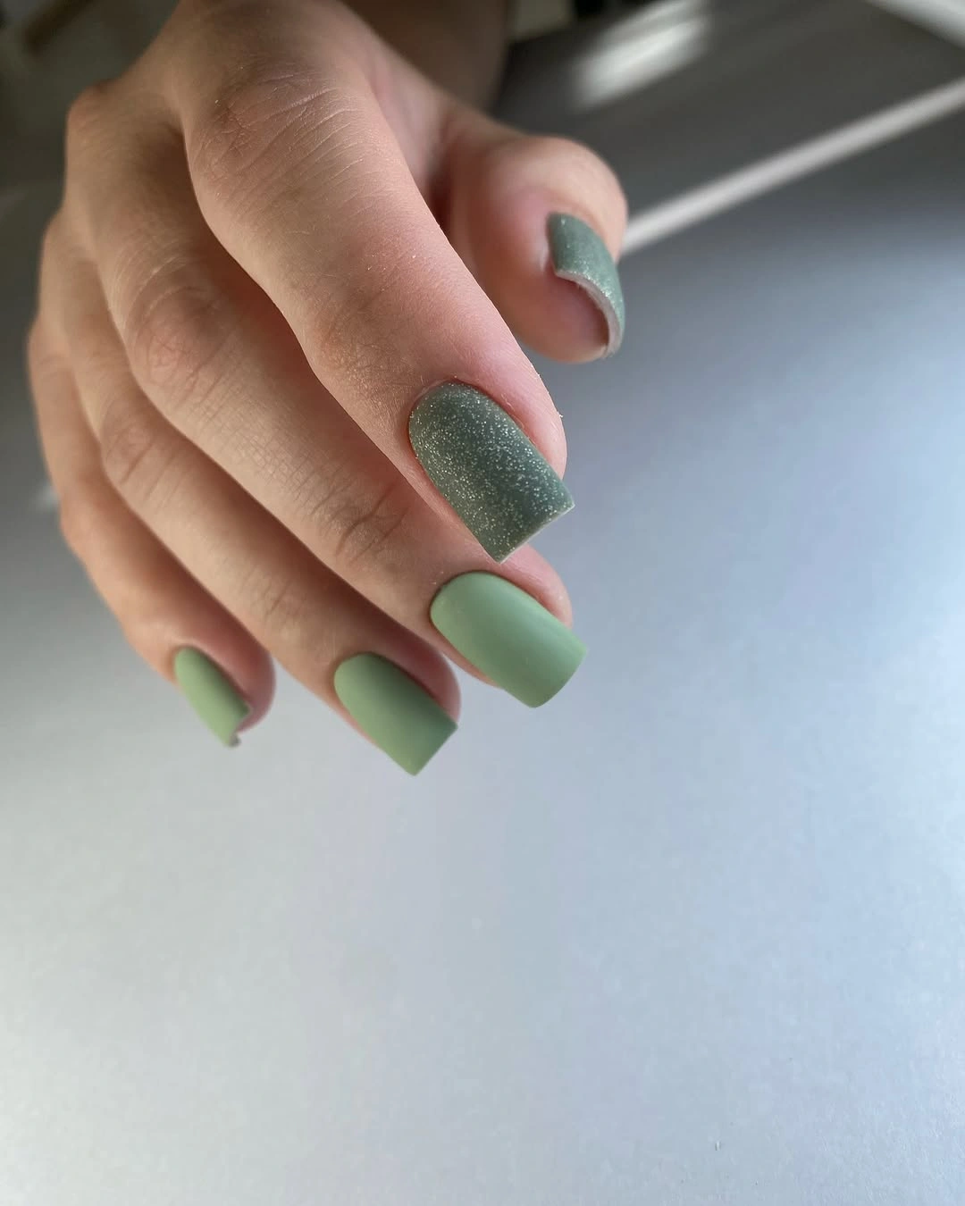
For a more restrained version, keep the accent on a less central finger and let the surrounding nails stay completely plain. The squared length gives the muted green a tidy framework, so shortening it a little would preserve the same balanced effect for someone who wants color but does not want an especially noticeable silhouette.
Matte greens benefit from clean sidewalls and an unbroken surface because small scuffs can interrupt their soft appearance more quickly than they would on a reflective finish. The textured-looking nail is a good detail to retain when the set needs personality, but adding a second texture or another pattern would weaken the measured contrast that makes this pairing effective.
Burgundy Hearts Framed by Negative Space
Deep burgundy appears on the short squared nails as large heart forms that curve around pale nude centers, rather than filling every nail from edge to edge. The bare-looking middle is what keeps the motif from becoming overly sweet: it creates a pause inside the darkest color and gives the heart outline a crisp, graphic role.
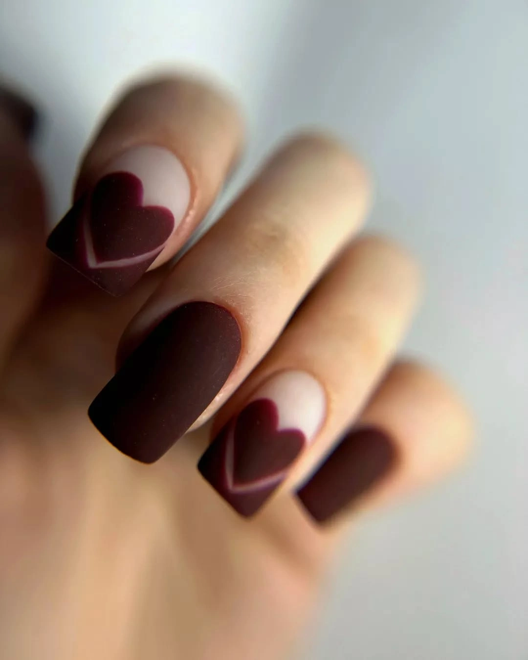
A person drawn to the color more than the romantic motif could place the heart on only one or two nails and leave the rest burgundy. That edit would keep the visual idea intact while making the short shape feel even cleaner, especially if the goal is a dark manicure with one intentional detail instead of a fully patterned finish.
The strongest feature here is the scale difference between the compact nail and the oversized curved form, so the edges need to remain distinct as the manicure grows out. A smaller heart would be easier to repeat, yet it would lose the relaxed negative space that makes the burgundy feel modern rather than densely decorative.
Fine White Lace on Blush Nails
The pale blush base is almost quiet enough to disappear, which lets the fine white leaf-like lines become the point of interest across the short rounded-square nails. Their repeating curve has a lace-like softness, but the compact length prevents the pattern from becoming overly formal and keeps the small marks visually close together.
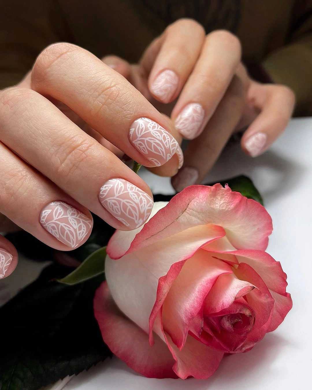
Choosing a similarly pale base is important if the linework is meant to feel airy instead of stamped on top of the nail. A shorter version would still hold the pattern well, while a much longer shape would need more open base around each motif or the white lines could start to read as a continuous crowded surface.
Fine contrast details ask for a careful balance: too much repetition turns them into texture, while too little can make them look accidental. Keeping the white marks concentrated through the center or tip area would preserve their delicate quality and make the design easier to refresh without relying on large, attention-grabbing additions.
Coral Nails With Flowing Yellow Lines
Warm coral-pink nails are crossed by thin yellow waves that bend differently from nail to nail, creating movement on a short rounded shape. The bright line color could have become sharp against the coral, yet its narrow width keeps the contrast playful and lets the pink continue to occupy most of the visual space.
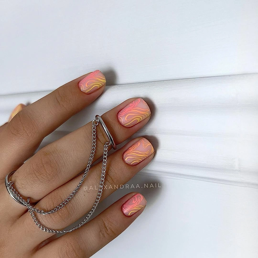
The design would translate well to a simpler version with only one or two waves on each nail, particularly for anyone who prefers a busy color combination but not a dense pattern. Rounded edges suit the looping lines because they echo their curves, whereas a very square free edge would make the same motif feel more angular and less fluid.
What matters most is not copying every bend but preserving the varying spacing between the yellow marks. When lines sit too close together, the short nail can lose its sense of openness; when they are allowed to drift across the coral base, the eye reads a lively contour rather than a block of ornament.
Matte Taupe With Irregular Black Print
Warm taupe and irregular black patches turn a familiar animal-inspired print into something calmer because the whole set stays matte. The medium square length gives the uneven shapes a useful grid, while the low shine softens the contrast and prevents the black accents from taking over the entire manicure at first glance.
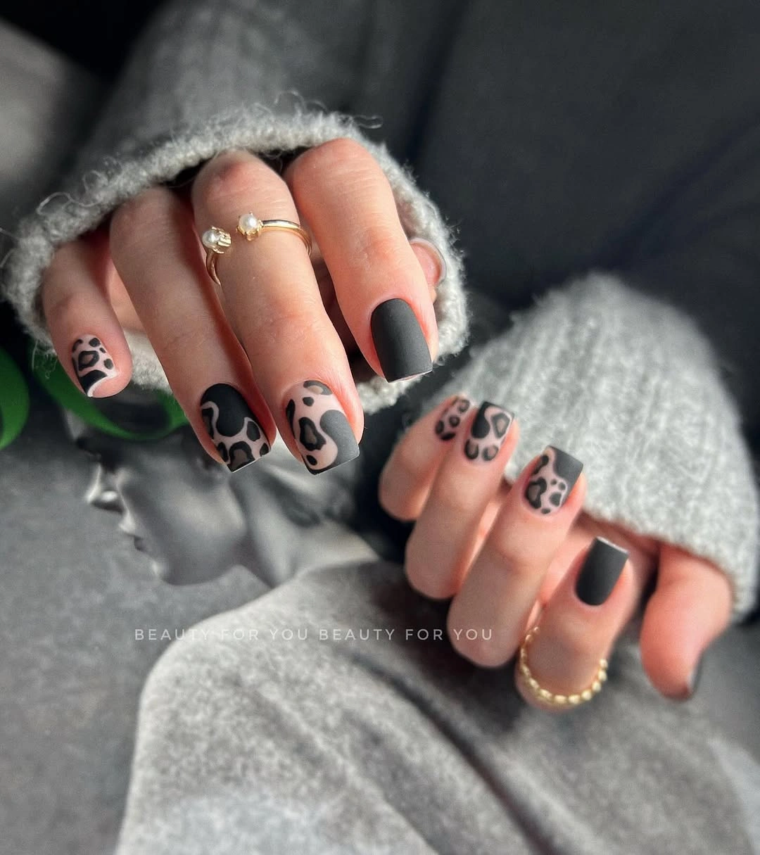
Alternating patterned and plain nails would be the most practical adjustment for someone who likes the color story but finds a full print too assertive. It also creates an easy route into related fall matte nails, where finish can do as much work as a motif without forcing every nail into the same amount of detail.
Irregular marks look best when their size is not perfectly matched, but they still need enough empty taupe around them to feel intentional. The tradeoff is clear: larger black patches make the design bolder from a distance, while smaller scattered ones keep the neutral base visible and make the manicure more adaptable to everyday styling.
Cream Ground With Curved Color Blocks
A creamy nude base makes room for navy, dark red, and fine black curves that sit in separate zones on the short rounded nails. The color combination succeeds because none of the deeper tones covers the whole surface; each arc has a boundary, giving the eye several small contrasts without allowing the manicure to become visually noisy.
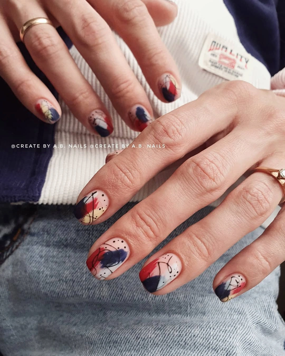
Keeping the base light is the simplest way to adapt this idea, even if the accent colors change to shades already in a wardrobe. On a shorter nail, one curved block can be enough, because an additional large section would compress the pale background and take away the open space that makes the color placement feel considered.
The useful limitation is that three colors need a clear hierarchy, and here the cream does that work by acting as relief between the darker pieces. A more minimal variation could drop the black line while retaining the navy and burgundy, but it should keep the curved placement rather than replacing it with straight stripes.
Cool Gray With Whispered White Texture
Pale gray covers the short oval-to-squoval nails, with fine white diagonal texture appearing quietly across the surface. It is a close-color design rather than a high-contrast pattern, so the interest arrives slowly through the small marks and their direction instead of through a dramatic shift in color or an elaborate focal nail.
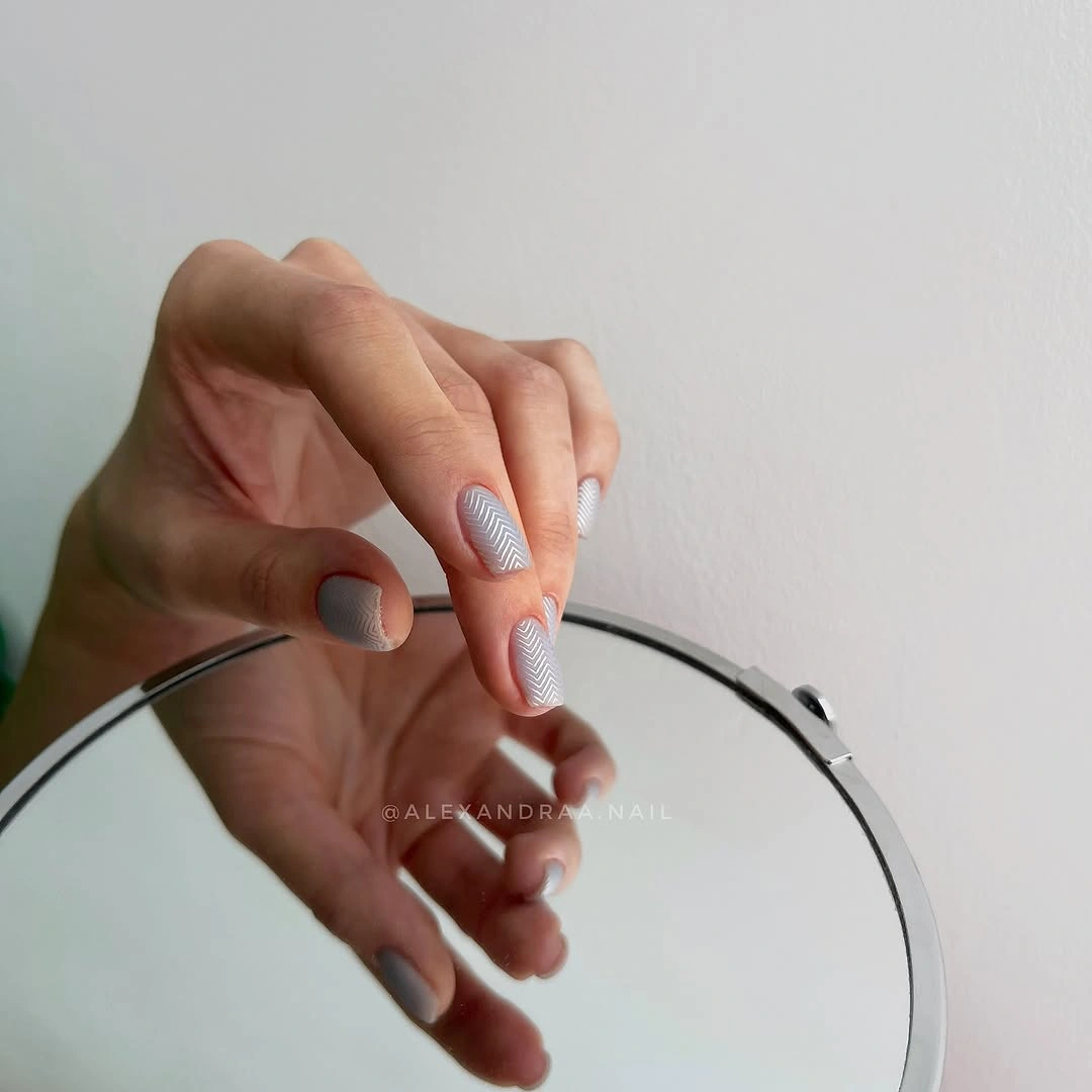
This kind of detail is especially useful for a person who wants something beyond a solid gray but does not need the manicure to announce itself across the room. Staying compact helps the faint lines remain refined; a longer extension would need fewer marks or a larger spacing pattern so the surface does not start to feel repetitious.
The finish and the linework are close in value, which means neat placement matters more than dramatic contrast. A slightly softer gray base would make the white texture nearly disappear, while a darker gray would turn it into a stronger graphic, so the final mood depends on preserving that narrow distance between the two visible tones.
Neon Lime Made Softer by Matte
Vivid yellow-green color is the entire focal point on these short oval nails, but the full matte surface takes away the glare that would otherwise make the shade feel even louder. The rounded shape also helps, since it gives an intense color a softer outline and lets the saturated green read as a single confident decision.
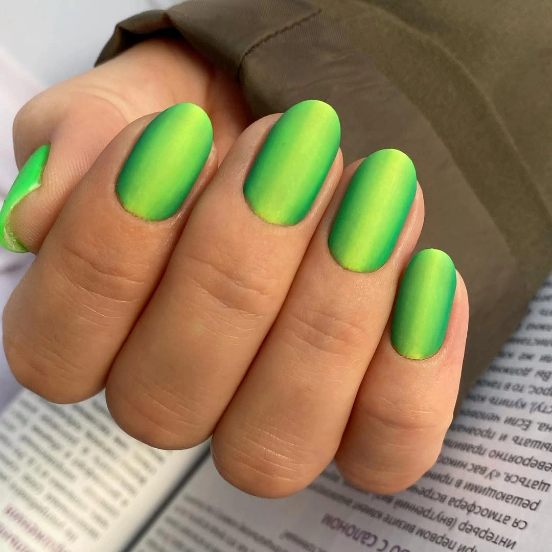
Anyone who loves the energy but wants less visual impact could keep the same lime on a slightly shorter oval or use it only on alternating nails. That adjustment would preserve the unusual color while allowing a neutral companion shade to create breathing room, rather than trying to dilute the lime with extra decoration that competes for attention.
A neon matte surface shows how color can replace pattern, which makes surface consistency more important than ever. The look becomes less effective if a few nails read shiny while others stay velvety, because the deliberate contrast between electric pigment and low reflection is the reason the manicure feels balanced rather than simply bright.
Grass Green in a Clean Short Shape
Saturated grass green is carried across short rounded-oval nails with no accent color and no visible pattern, leaving the matte finish and smooth outline to do all the styling. The uncluttered silhouette is what keeps this strong color from feeling random: every nail repeats the same decision, so the set reads as deliberate from fingertip to fingertip.
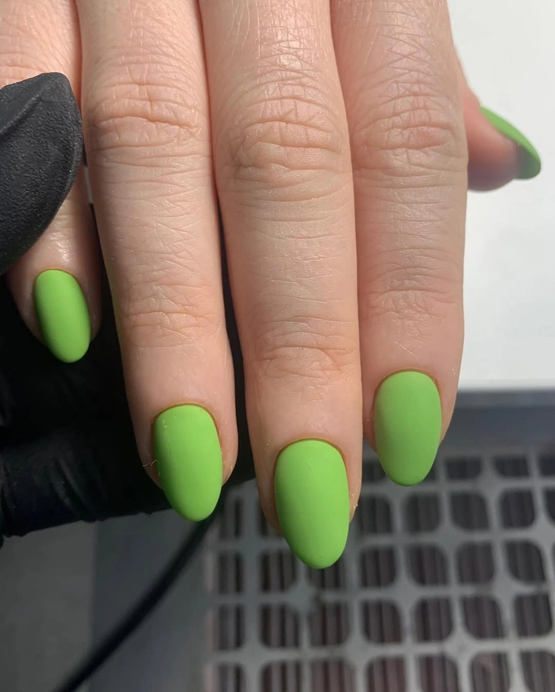
A small difference in length would not change the idea much, but changing the finish would. Gloss would pull attention toward reflections, whereas the matte surface holds the color as a soft block, making this a sensible option for someone who wants green to feel graphic and seasonal without relying on literal leaf or floral decoration.
One advantage of an all-over color is that there is nothing else to maintain visually as the set wears, although the tips still deserve attention because green makes a break in the outline easy to notice. Keeping the shape uniformly rounded gives the shade a friendly quality that a sharply squared edge would make more severe.
Cloudy Gray and Silver Sparkle Alternates
Cloudy gray matte nails sit beside two dense silver glitter accents, creating a cool contrast between softened color and visible sparkle. The alternation is effective because the gray nails remain broad, quiet fields, while the silver is concentrated rather than sprinkled across every finger and therefore reads as a punctuation mark in the rhythm.
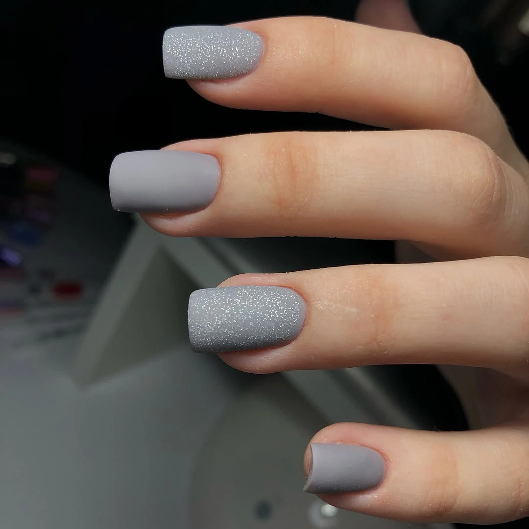
Separating the glitter nails instead of placing them side by side gives the hand a more even distribution of light. A person who prefers a quieter version could use just one silver accent, while someone wanting more contrast could deepen the gray, but changing both at once would remove the understated cool relationship that makes the combination feel measured.
The practical tradeoff is between texture and simplicity: glitter creates instant interest, while the matte gray makes the set easier to pair with different colors and materials. Keep the sparkle limited to complete nails rather than adding a scattered glitter overlay, because a partial application would blur the crisp shift between the two finishes.
Compact Berry Purple With Velvet Depth
The berry-purple shade has enough saturation to make the short square shape feel graphic even before the matte surface removes its reflection. Nothing interrupts the color, which is precisely why the manicure works: the square tips create a repeated edge, and the velvety finish turns the rich purple into a solid, controlled plane rather than a glossy statement.
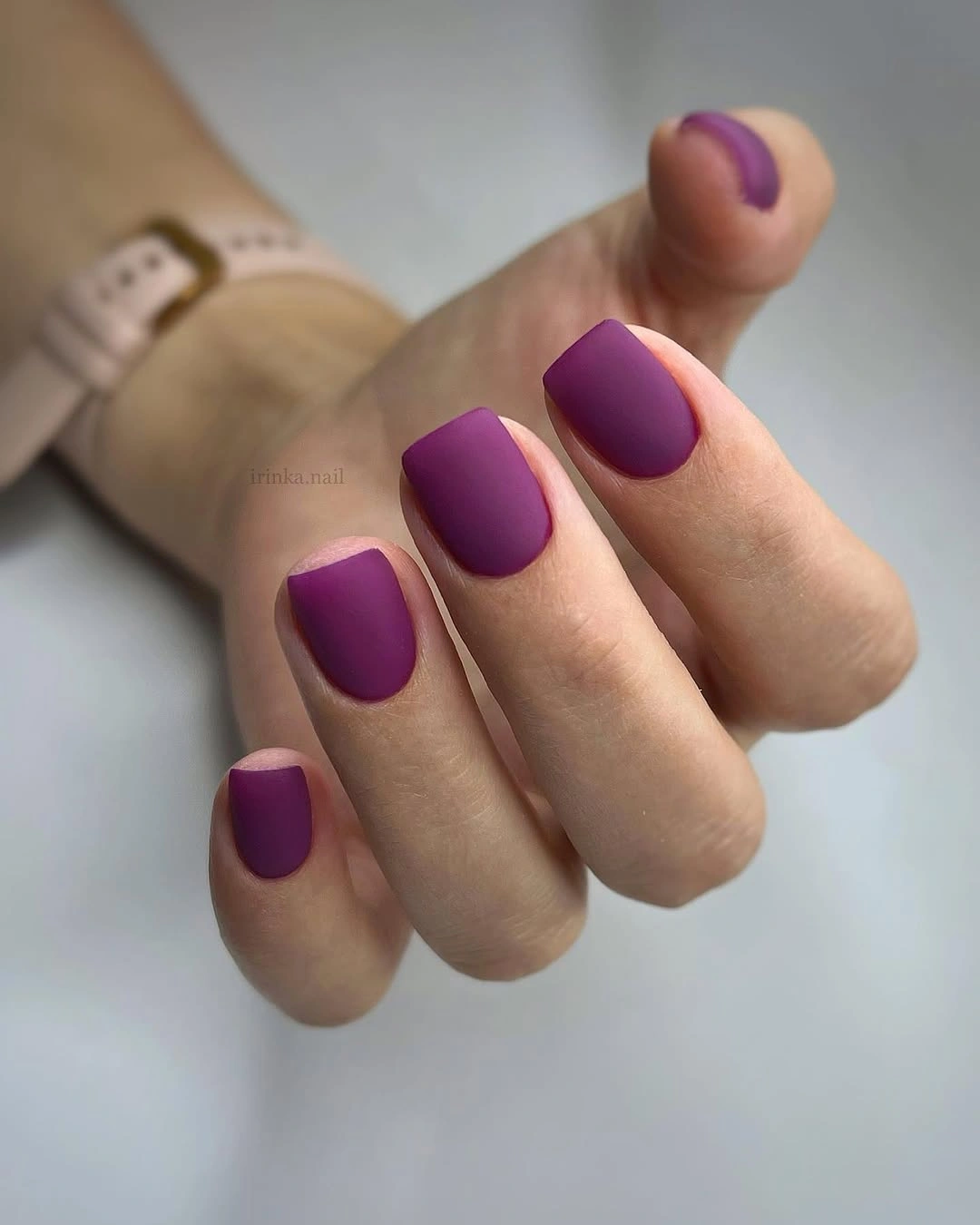
For someone considering this as a simple fall manicure, the key choice is whether to preserve the compact square line or soften it toward a squoval. The color will remain strong either way, but rounded corners reduce the architectural effect, while a straight tip makes the deep purple feel sharper and more intentionally modern.
Because matte color highlights the border of each nail, clean cuticle lines and evenly matched lengths matter more here than an added accent would. The best tradeoff is to let the purple stay alone: a small metallic detail could be attractive, but it would shift attention away from the broad, unbroken color field that gives this set its depth.
Pink Almonds With Fine Gold Lattice
Soft pink almond nails are crossed with fine gold lattice lines that turn a gentle base into a much more detailed surface. The long tapered shape gives the crisscross pattern room to move, and the small gold marks remain light enough that they decorate the pink rather than covering it or turning the nail into a solid metallic block.
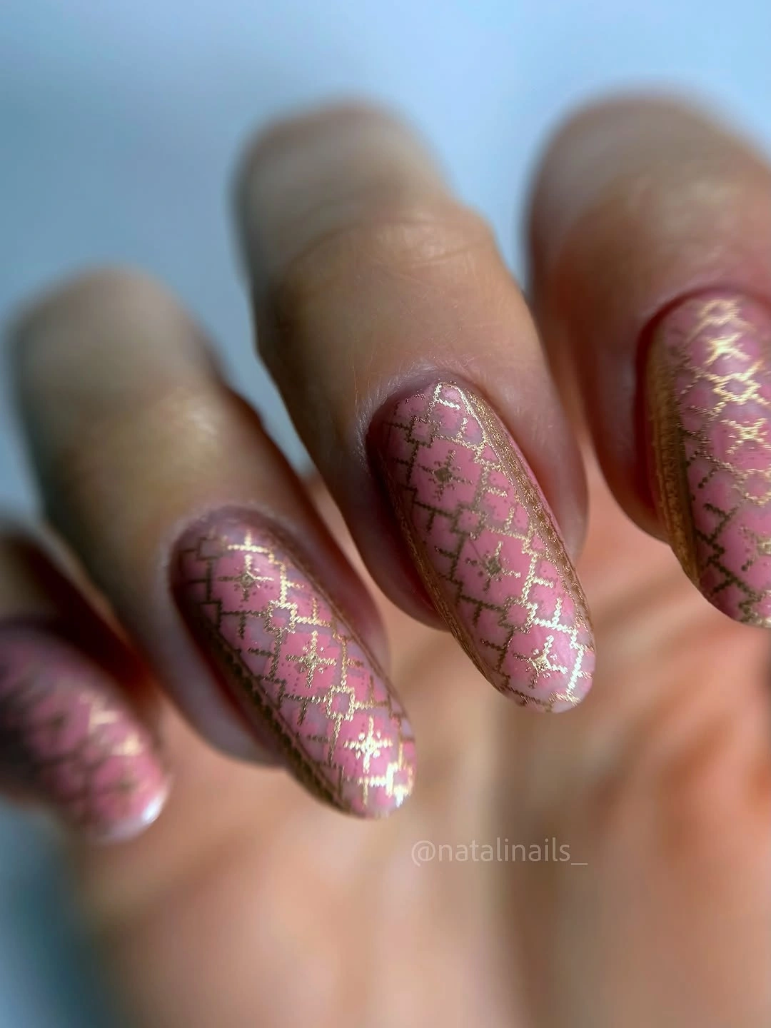
To make the look easier to wear, reserve the lattice for two or three nails and keep the others pink, which would preserve the same precious-looking contrast with more visual relief. The almond outline is especially helpful because its narrower tip gives the lines a natural taper, something a blunt square shape would make more rigid.
The appeal lies in the fine spacing between the gold intersections, so a simplified version should remove whole crossings rather than thicken the remaining ones. Heavier metallic marks would change the mood from delicate to assertive, while the thin lattice retains the soft pink base as the main color and lets the detail read only on a closer look.
Milky Pink With Blurred Pastel Marks
Milky pink almond nails carry soft blended touches of pink and yellow-green that look intentionally blurred rather than sharply drawn. The muted base is important because it gives the irregular marks somewhere to dissolve, making the multitone result feel gentle and painterly instead of like a set of separate bright shapes placed on top of the nail.
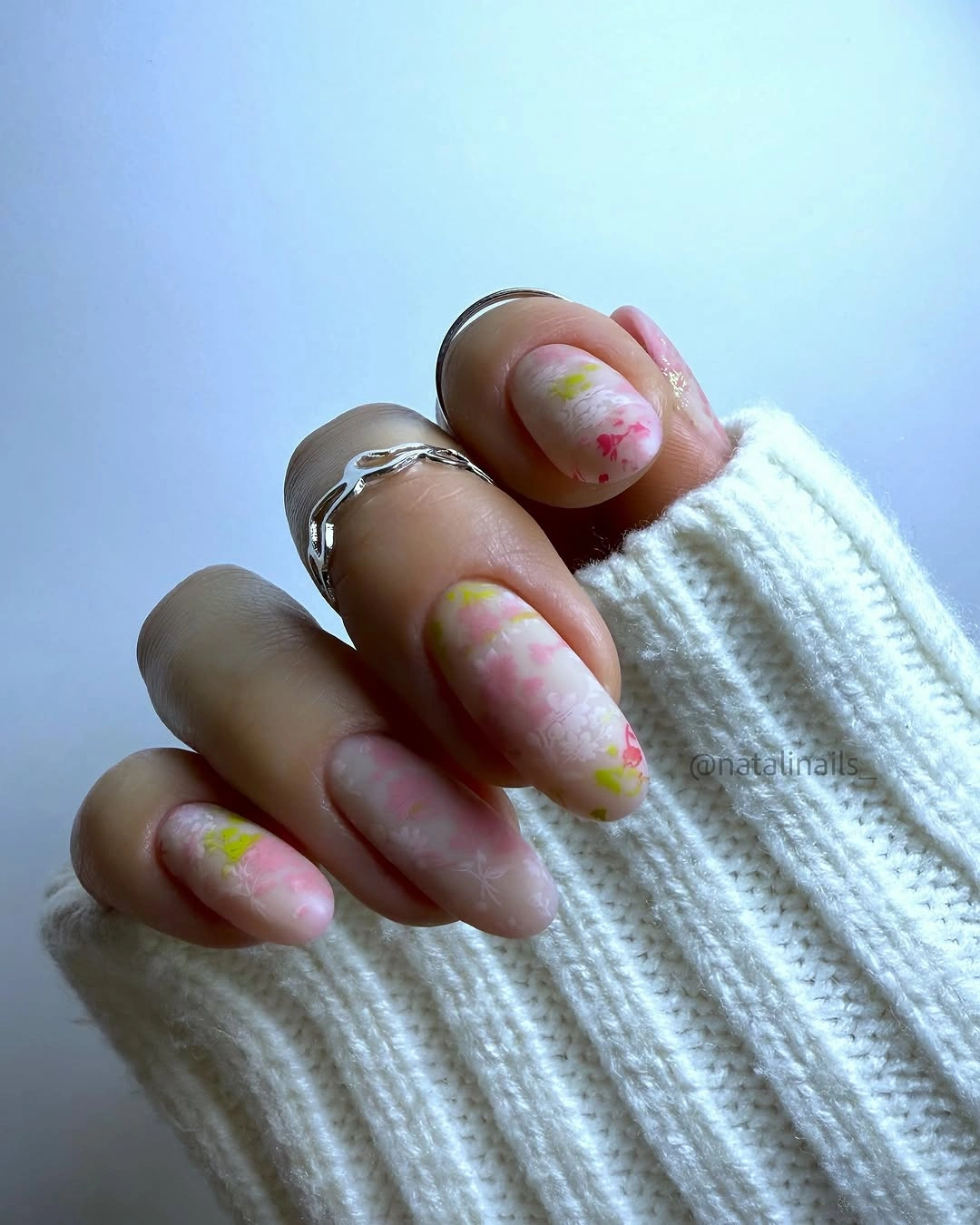
A similar effect can stay wearable by limiting the blended color to the outer half of each nail, leaving more of the pale base clear near the cuticle. That choice gives the pattern a softer grow-out zone and lets the almond shape remain visible, rather than allowing several hazy colors to obscure the nail’s natural direction.
The visual risk with a blurred design is making every nail identical, which can cause the softness to become flat instead of expressive. Varying where the pastel touches sit creates a quieter rhythm, while keeping the colors low in contrast ensures that the result remains about gentle movement rather than a loud marbled effect.
Powder Blue With Two Speckled Accents
Matte powder blue creates a clean base across the medium square nails, and black speckles appear only on selected accents instead of across the whole hand. That restraint is useful: the pale blue remains open and calm, while the spotted nails bring enough dark contrast to give the set a focal point without changing its cool, simple direction.
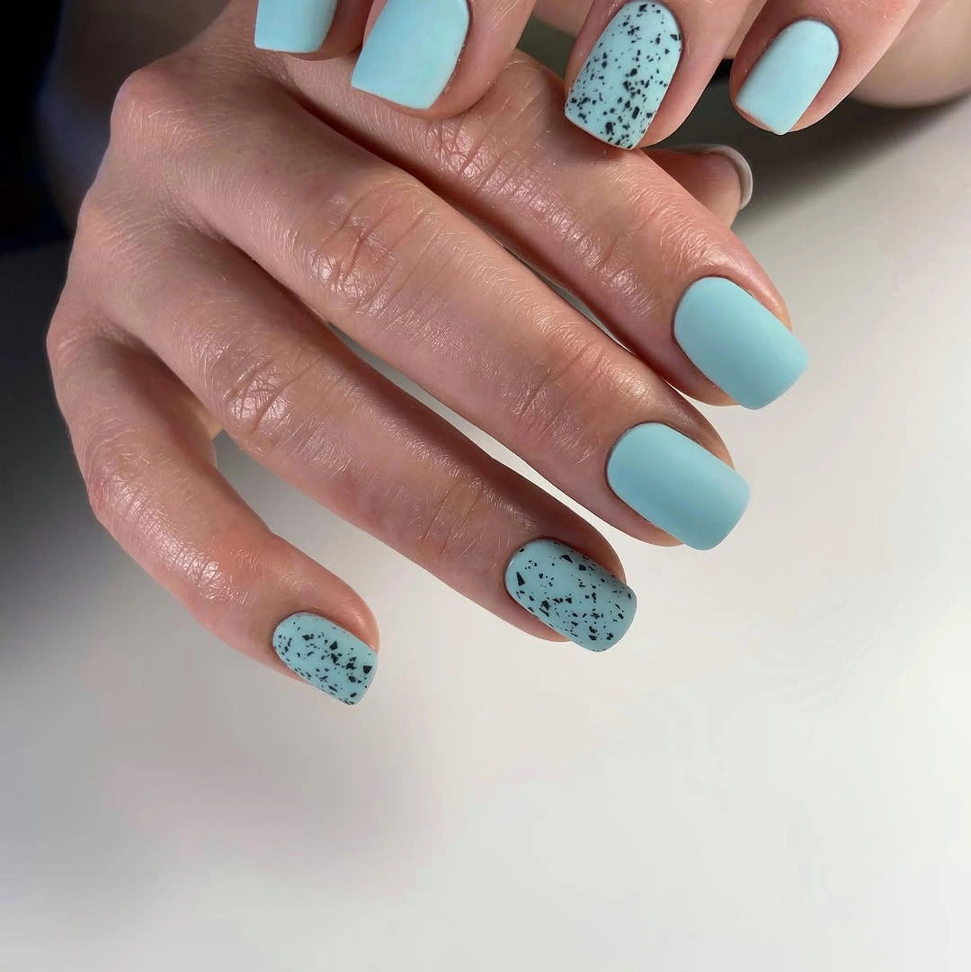
Repeating the speckles on just two nails is the easiest way to keep the composition balanced, especially with a square shape that already has a strong outline. A person who wants a less obvious contrast could swap black for a deep blue-gray, but they should still preserve the solid-to-pattern ratio instead of covering every blue nail in dots.
Small dots have a different effect from large irregular marks: they read as surface texture and let the base color remain the first impression. The maintenance advantage is that a mostly solid manicure is simpler to refresh visually, while the tradeoff is that the accent nails need clean spacing or they can lose the quiet, scattered quality that makes them appealing.
Milky White With Sparse Tiny Flecks
Long coffin nails in milky white are scattered with tiny red and dark flecks that stay small against the broad pale surface. The light base makes each mark noticeable without allowing any one fleck to become a focal point, so the result reads more like fine texture than a conventional printed pattern despite the extended squared silhouette.
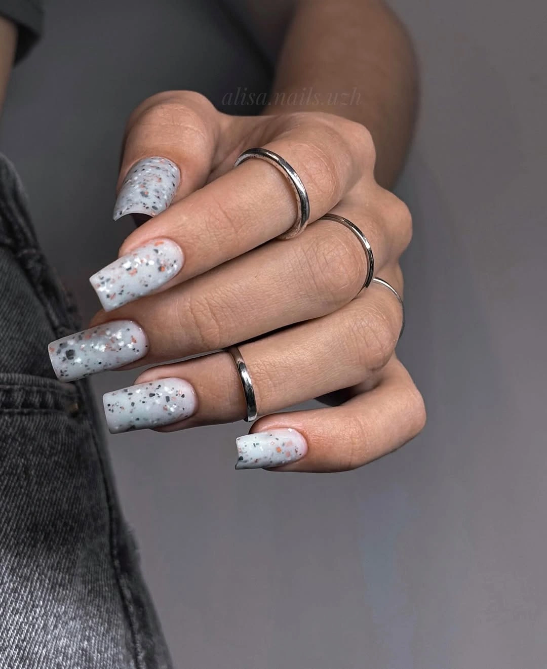
Keeping the flecks irregular in placement is more effective than lining them up, but their scale should remain small for the length of the nail. If the marks grew larger, the coffin shape could feel visually heavy; if there were fewer of them, the design would move closer to a minimal white manicure with only a faint, unexpected interruption.
White space is carrying most of the composition here, which makes this a useful reference when considering other fall nail art ideas that need detail without a crowded finish. The practical limitation is that a light base shows edge wear clearly, so the sparse pattern is best treated as an accent to a carefully kept outline.
Charcoal Matte With Smoky Blue Movement
Dark charcoal matte nails are interrupted by subtle blue-gray swirls on selected squares, adding movement without lifting the whole manicure into a brighter palette. The near-tone pattern is effective because it stays within the same shadowy range, which lets the eye notice the curved marks slowly instead of reading them as a loud decorative overlay.
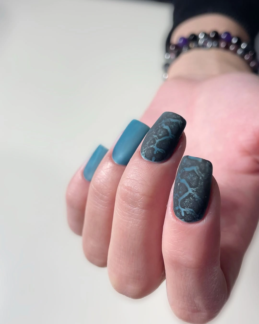
For a simpler interpretation, place the blue-gray movement on only one nail per hand and leave the rest charcoal. That edit would hold onto the dark-on-dark idea while creating more relief, and it would be especially useful for anyone who wants a muted fall mood but does not want every nail to carry a visible pattern.
There is a clear tradeoff between subtlety and legibility: if the blue is too close to the charcoal, the detail can disappear; if it becomes too bright, the set loses its quiet depth. Keeping the swirls broad and restrained lets the matte finish remain the dominant texture while still giving the dark color a reason to be examined.
Fuchsia Matte With a Long Square Edge
Vivid fuchsia stretches across long square nails with an uninterrupted matte surface, so the color and the straight free edge share equal attention. The lack of added art is a strength here, because the high-energy pink has room to feel intentional and the long shape gives it a strong, almost poster-like clarity from a distance.
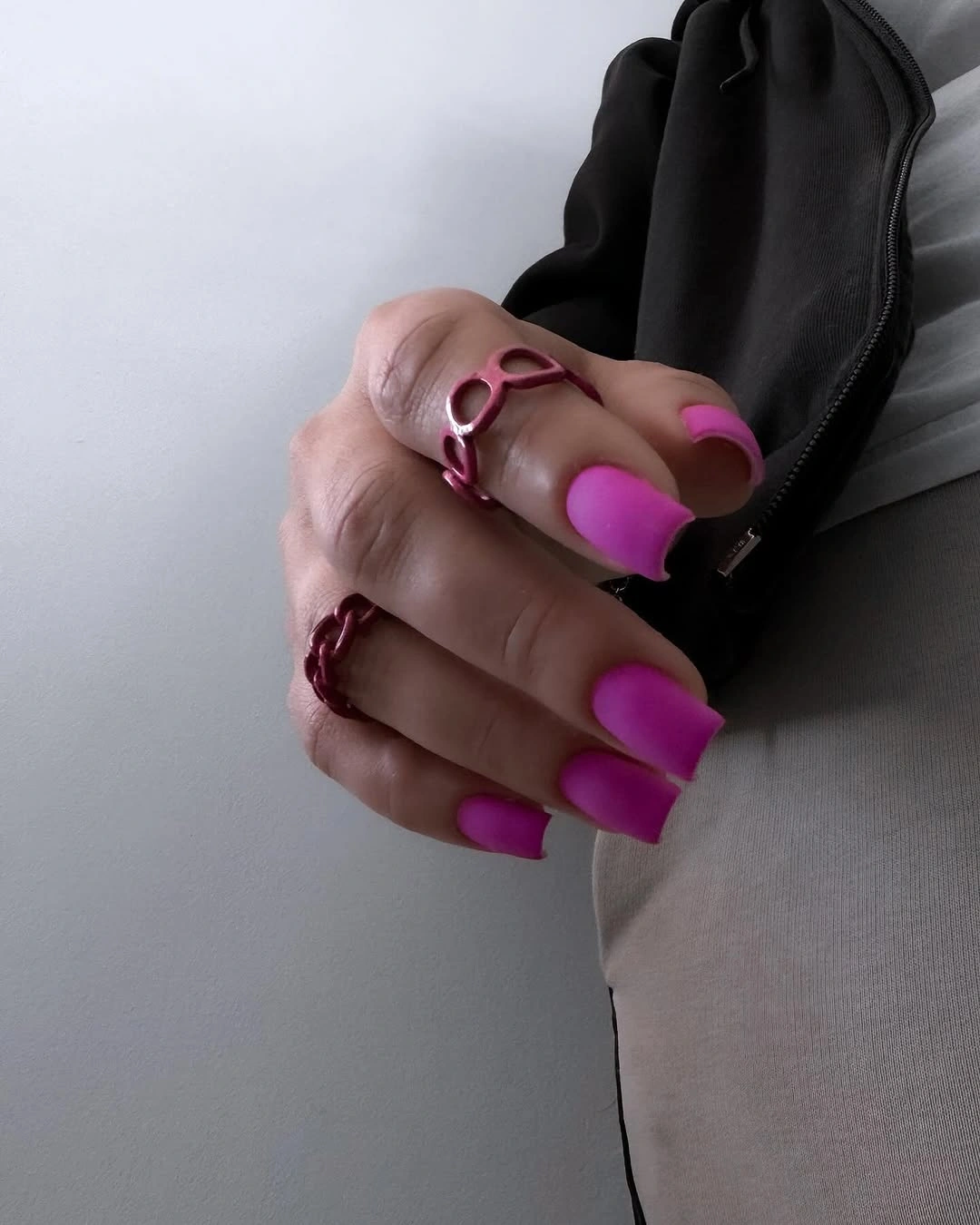
A slightly shorter square version would still retain the same direct color statement while making the silhouette easier to manage in daily routines. Keeping every nail matte is more important than adding a contrasting accent, since a single reflective nail would break the visual agreement and make the set feel less like one clear decision.
Bright pink and a long edge together will always be noticeable, so the realistic adjustment is shape rather than decoration. Softening the corners would reduce the graphic force, while keeping them straight preserves it; either choice can work, but the surface should stay clean because matte fuchsia makes even small marks along the tip stand out.
Open Green Pattern Across Square Nails
Pale neutral nails are covered with an irregular green outlined pattern that leaves open spaces between the looping sections. Because the marks are not solid blocks, the graphic design still has air around it, and the medium-long square shape gives each line enough room to travel without making the surface read as a dense green field.
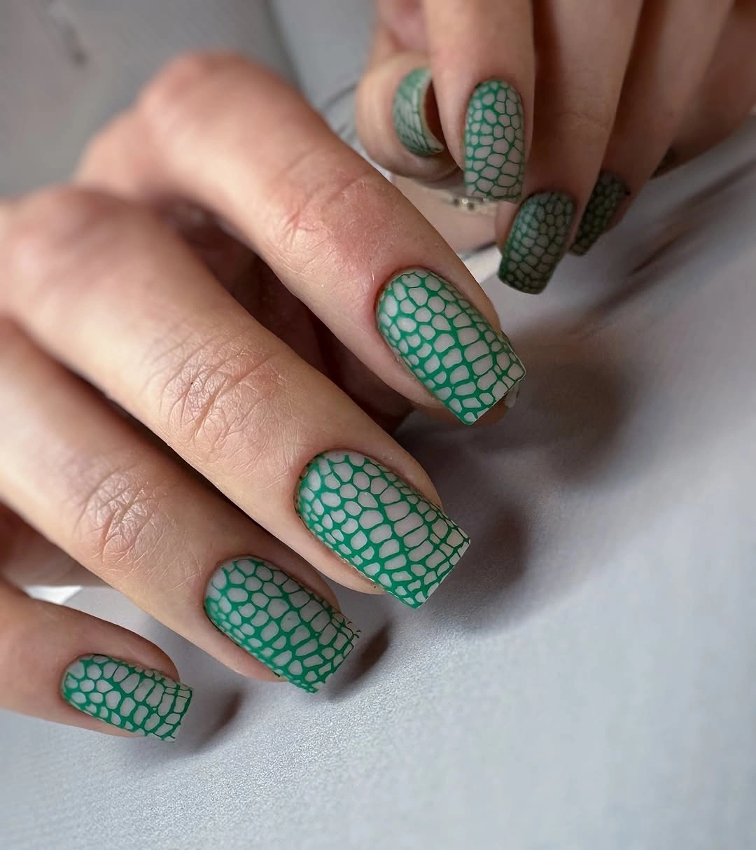
A more practical adaptation would reduce the number of outlined loops near the cuticle and concentrate the pattern toward the tips. That leaves a cleaner grow-out area and gives the eye a natural starting point, while still preserving the unusual green motif that makes the manicure feel more playful than a simple solid-color fall choice.
The design is strongest when the lines vary slightly rather than forming a perfectly even grid, yet they need consistent width so the open pattern stays readable. Adding a second bright color would make the marks compete, whereas keeping the green alone lets the neutral base provide the relief that turns a busy idea into a balanced one.
Hot Pink Coffin Nails Without Decoration
Saturated hot pink covers long coffin nails from cuticle to tip, and the completely matte surface lets the extended silhouette do most of the expressive work. The color is bright, but the absence of any motif keeps the manicure surprisingly focused: each narrow tapered nail repeats the same block of pink instead of asking the eye to decode a second design layer.
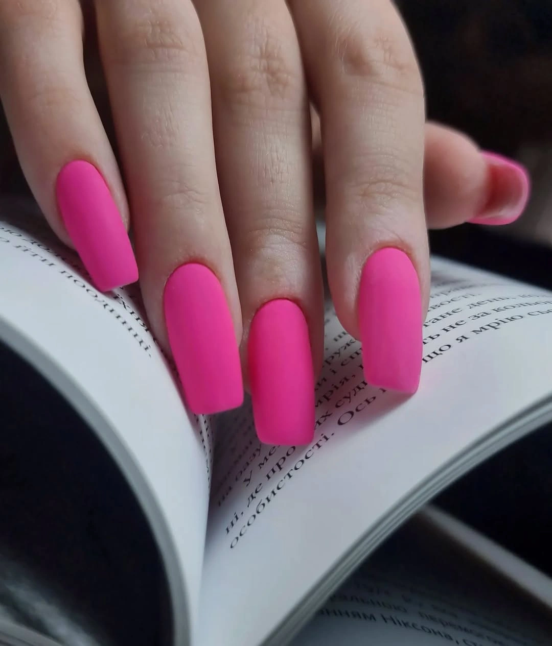
Someone who likes the energy but wants a more everyday version could preserve the pink and choose a shorter coffin or a softened square. That change would reduce the length-driven drama while retaining the strong color story, which is a cleaner adjustment than adding a neutral accent that would distract from the simplicity of the set.
Long matte nails benefit from a careful, even outline because their silhouette is part of the design, not merely a support for color. The tradeoff is visibility: the same length that makes the pink feel bold also makes it less subtle, so this choice works best when the wearer wants the manicure to remain a clear feature of an outfit.
Sharp Red Edges Over Sheer Pink
Sheer pink space is cut by bright red angled edges, with a few small red dots adding an extra point of attention near the tip. The red does not cover the nail, and that restraint makes its geometric placement feel sharper: the pale center stays visible, so the contrast reads as a frame and not as a full dark manicure.
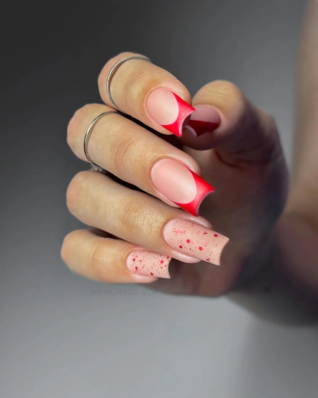
Keeping the red confined to the tips is the key adaptation if negative space is what appeals most here. A deeper red section would produce a bolder result, but it would also remove the airy pause that gives the medium square shape its balance, particularly when several nails already carry angled color in different directions.
The tiny dots work because they are secondary to the red edge, not a second full pattern. If the design needs simplifying, remove the dots before changing the angular French line; the edge is the structural idea, while the small marks simply add a little irregularity and keep the set from becoming too perfectly matched.
Muted Forest Green Along an Almond Shape
Deep forest green with a softened matte surface follows a medium almond shape, creating a calmer relationship between dark color and tapered length. The shade has enough depth to feel seasonal, but it does not rely on a literal motif; the smooth low-shine finish and the gently narrowed tip are enough to give the manicure its natural, grounded direction.
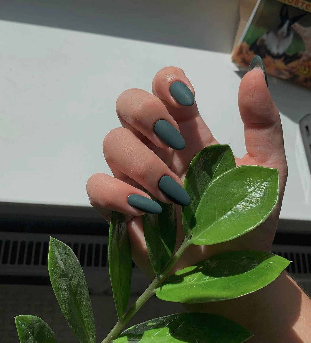
A person wanting the same mood on shorter nails could keep the muted green and move toward a compact oval, which would preserve the soft quality while reducing the elongating effect. This is also a useful color family for a minimal set because it can sit beside warm browns, black, or cream without requiring added art to create a fall feeling.
The matte surface is what keeps the green from becoming too polished or formal, so it should be smooth and consistent across the hand. A glossy top layer would change the impression substantially, bringing more attention to reflections, while the low-shine finish lets the subtle dark tone and almond outline remain the details doing the real work.
Silver Texture With Neon Green Tracing
Dense silver sparkle covers the square nails, while thin neon green outlines trace around selected edges rather than sitting on top as large colored blocks. That narrow line is a smart contrast because it lets the texture of the silver remain visible, then adds a precise burst of green that changes the outline without turning the set into a full neon manicure.
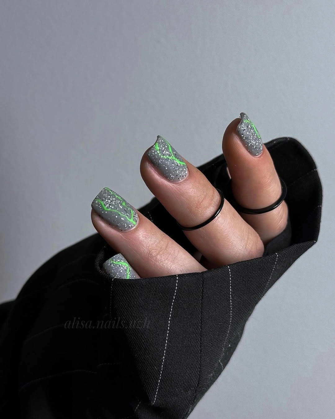
The most wearable variation would keep the green tracing on only a couple of nails and leave the remaining silver surfaces plain. Glitter already provides a lot of visual activity, so the bright edge works best as a controlled accent; extending it across every finger can make the two distinct textures fight for attention instead of supporting one another.
Placement matters more than complexity here: a thin border makes the green feel crisp, while a thick one would cover the sparkle that gives the design its texture. The practical limitation is that both a glitter surface and a light-catching outline reveal uneven edges, making tidy nail shape more important than adding another color or motif.
Violet and Near-Black Matte Color Blocks
Violet nails alternate with a very dark green-black shade, and both colors share the same quiet matte finish across a medium square shape. The contrast comes from the color split rather than from pattern, which gives the hand a clean, ordered rhythm and lets the dark tones feel intentionally paired instead of like two unrelated leftover shades.
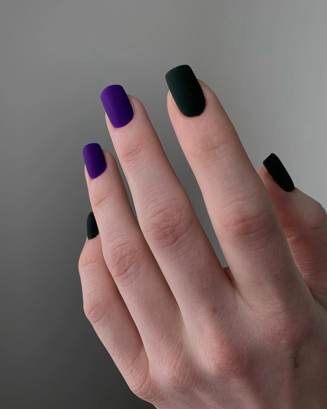
Even alternation is the crucial part of this idea, because a random arrangement would make the two deep colors feel less connected. Someone who wants a softer result could use a slightly grayer dark companion, while someone who wants more drama could deepen the violet, but the shared finish should stay consistent so the split palette remains the whole point.
The benefit of this design is its clarity: there is no small motif to maintain visually, only color balance and shape. A square edge reinforces the graphic alternation, whereas an oval would make the same shades gentler; neither is wrong, but the matte surface should remain smooth so the pair reads as one deliberate composition rather than two separate manicures.