
When fall dip nails start to feel difficult to choose, the problem is often not a lack of inspiration but too many competing decisions on one hand. A dark surface can look deliberate or heavy depending on how far the edge extends, how much light it returns, and whether the shape gives the eye somewhere to rest. That small difference is where personal style usually appears.
Use one question before committing: what should still look intentional after a week of ordinary movement? If the answer is the outline, keep the surface quieter; if it is the finish, let the shape recede; if it is a detail, give it clear breathing room. The choice becomes easier when maintenance is treated as part of the design rather than an afterthought.
Fine Blue Sparkle Softens a Dark Almond
The medium rounded almond shape gives this deep navy manicure a quiet, tapered line, while the fine glitter only appears fully when the light moves across the surface. That order matters: the color reads dark and composed at first, then reveals a scattered blue reflection instead of announcing a separate glitter effect. Because the shape is moderate, the sparkle has enough space to register without making the set feel costume-like.
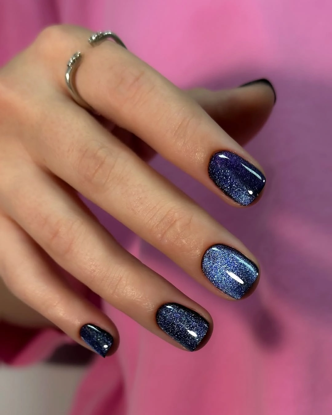
This is a useful way to make a near-black palette feel less severe without adding a motif. The cool undertone would sit neatly beside gray knitwear, denim, or silver jewelry, but warm brown clothing could make the blue look sharper by comparison. Keep the glitter fine if you shorten the nails, since larger reflective particles would occupy more of the small canvas and change the restrained balance.
Maintenance is mostly about the dark edge rather than the sparkle itself. Small chips will contrast with the base, especially on the rounded corners, so the compact length is a practical advantage. If you like the idea but need less taper, a short squoval can preserve the dark color and reflective flicker while making the manicure easier to live with during ordinary tasks.
Wine Red Lets the Almond Length Speak
Here the long almond outline supplies nearly all of the visual movement, because the wine-red surface is uniform, glossy, and free from extra art. The eye follows the gradual taper toward the point, then returns to the rich color, which keeps the manicure polished rather than busy. A simple surface is especially effective on a longer nail because it allows proportion to become the styling decision instead of competing with it.
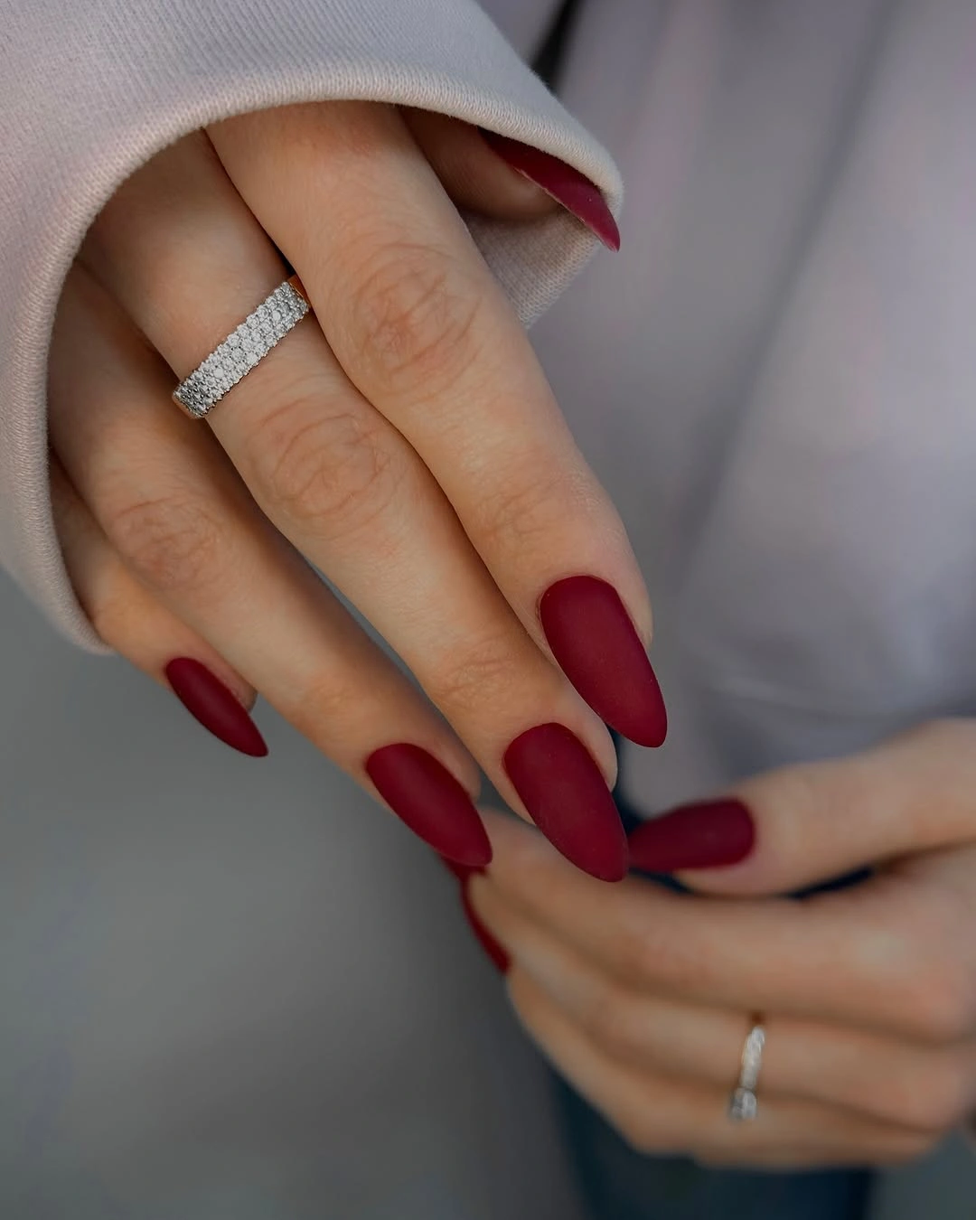
The deep red has enough warmth to work with camel, cream, chocolate, or muted olive clothing, while the clean surface prevents those pairings from feeling overworked. If the same color were placed on a short square, it would read more compact and direct; on this almond length it feels more elongated and deliberate. That difference is worth considering when comparing broader fall dip nail ideas before treating length as a minor detail.
The tradeoff is practical and visible. A pointed almond gives the wine color an elegant line, but it can be less convenient when opening packages, typing, or handling small fasteners. Readers who want the same depth with less care can move to a medium almond or short oval, keeping the glossy solid finish and letting the color remain the main feature.
Bright Red Gains Authority from a Square Edge
This saturated red set takes a different route from the wine almond because the long squared ends make the color feel crisp and graphic. Broad highlights run across the glossy surface, so the manicure reads as a strong block of red rather than a soft wash. The straight edge gives the brightness a frame, which is why the design can stay completely plain and still hold attention.
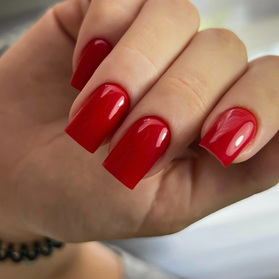
There is no need to add a second shade when the red already has this much visual weight. A simple black sweater, denim shirt, or cream coat would leave the manicure room to lead, while a busy print could compete with the clean block. For a shorter adaptation, keep the square corners slightly softened so the vivid color feels intentional instead of rigid on a smaller canvas.
The main limitation is not the color but the combination of length and edge. Long squares can catch more easily in daily movements, and any uneven corner changes the rhythm of the whole set. A medium square would keep the same red impact with less leverage at the tip, while a short rounded square would make the shade look friendlier without losing its seasonal strength.
Red Flashes Give Black a More Active Rhythm
The long almond base is glossy black, but small red reflective or textured details appear on selected fingers and stop the dark surface from becoming flat. The accents are not spread evenly enough to form a repeated pattern; instead, they create brief points of heat inside a controlled field. That uneven distribution is what makes the set feel layered while keeping black as the first decision.
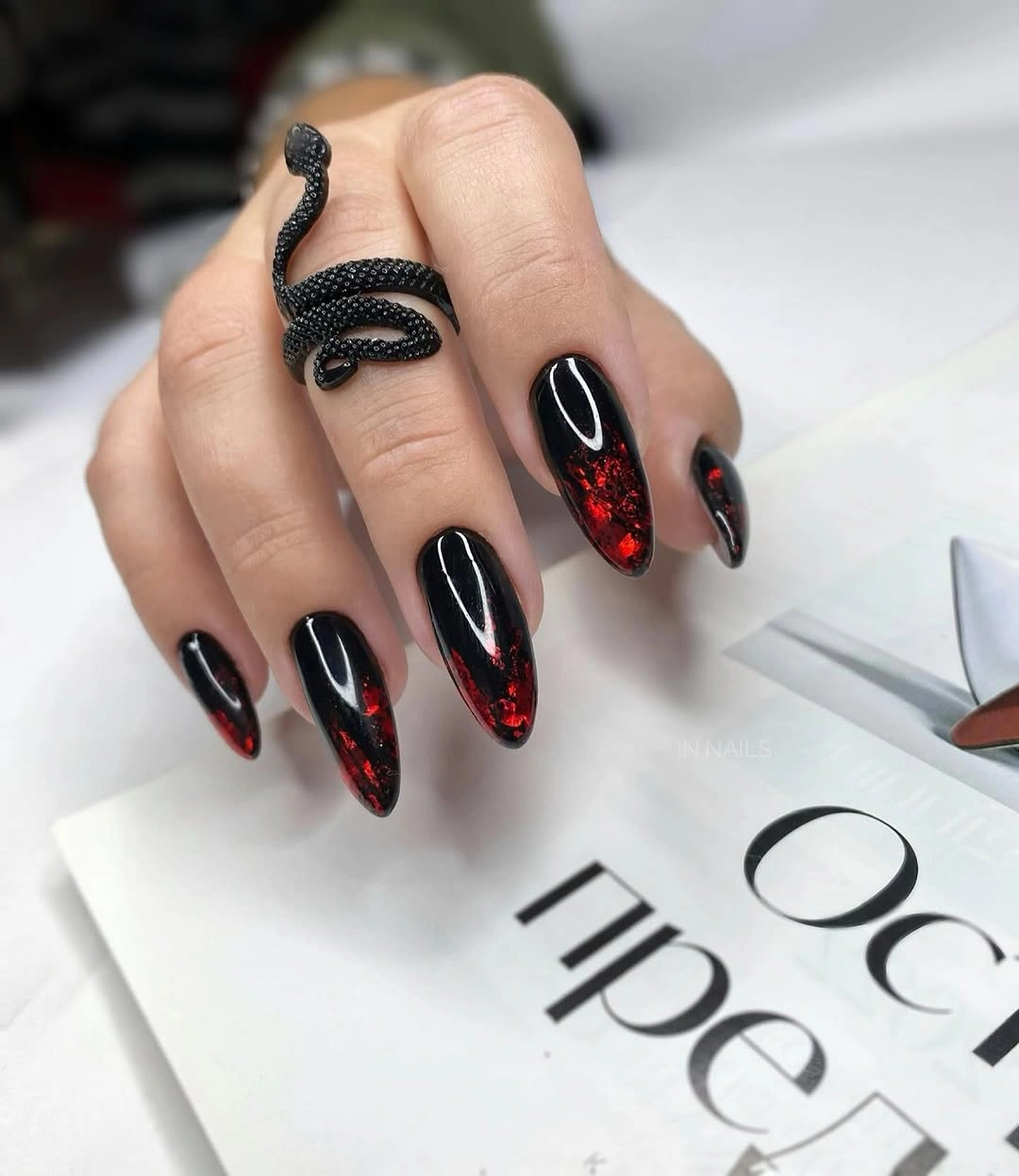
A shorter version would benefit from choosing one accent finger rather than shrinking every detail onto a smaller nail. The contrast would remain clear if the red stayed near the tip or center, and the remaining black nails would provide the necessary relief. This approach also makes the design easier to pair with clothes because the warm color becomes a deliberate punctuation mark instead of a second all-over statement.
The long almond shape carries a lot of the drama, so upkeep should be considered before copying the density. Dark polish makes edge wear noticeable, and the small red elements can lose their definition if the surface becomes crowded. Keep the black base clean, reduce the accent scale first, and let the taper provide the movement that the original set gets from both length and contrast.
Tiny Taupe Specks Keep Ivory from Feeling Plain
Short squared nails make this ivory set feel compact and easy to read, while tiny warm taupe marks add just enough irregularity to break the solid base. The dots are spaced with plenty of pale surface between them, so they behave more like a quiet texture than a full pattern. That proportion lets the light color remain dominant and keeps the detail from overwhelming the short shape.
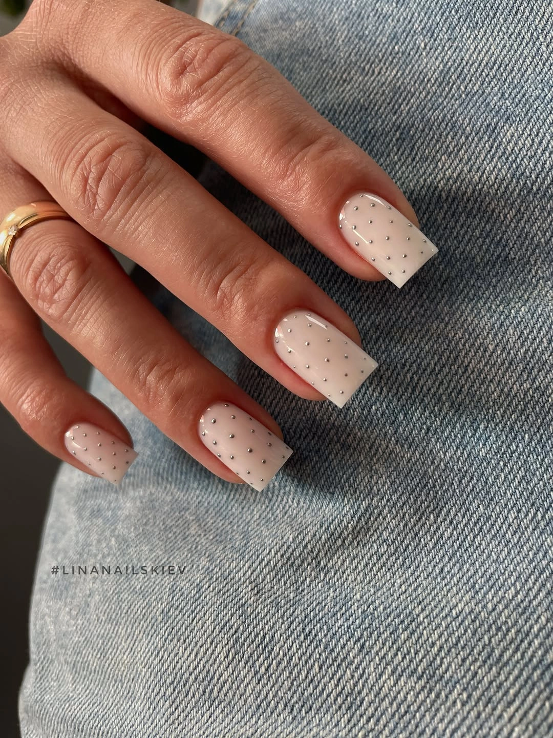
The design is strongest when the rest of the styling gives it visual room. A patterned shirt or heavily embellished ring could compete with the small marks, while denim, gray, or a simple knit would echo the relaxed palette. If you are collecting short fall nail designs, this is a good reminder that a little repeated detail can be enough when the base is light.
The compact square also makes the idea easy to adjust. Keep the dots farther apart if the nail bed is very short, or place them on two accent nails while leaving the others plain. The realistic limitation is edge precision: tiny marks cannot rescue an uneven outline, so the pale base and short corners still need to look intentional before the pattern matters.
Blush Pink Relies on Clean Short Proportion
This short square manicure has no motif, shimmer, or contrasting tip, which places all the attention on the even pale pink surface and the softened corners. The color feels neat because the shape keeps it contained, not because it is trying to make a dramatic statement. On a larger or longer nail the same pink could read delicate, but here it reads controlled and useful for everyday styling.
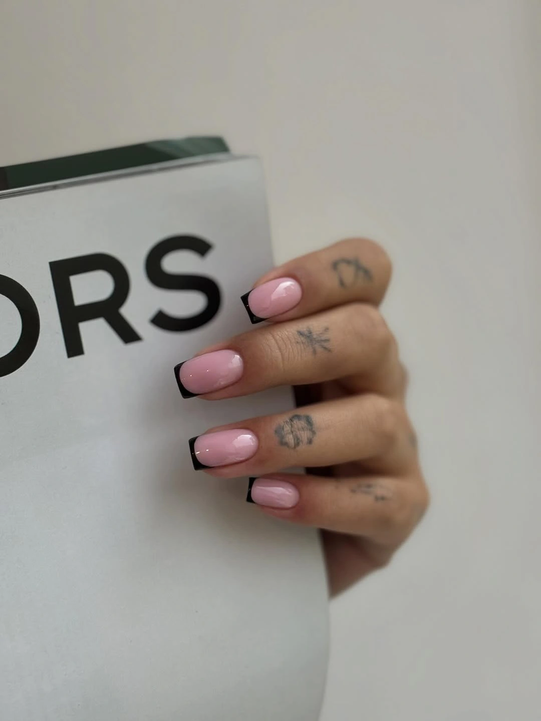
A plain pale shade benefits from surroundings that add texture without competing for color, such as denim, gray wool, or a matte neutral bag. Jewelry can remain present because the manicure does not introduce another focal motif. If you want a little more seasonal depth, changing only the undertone toward a dusty rose would alter the mood while preserving the same low-detail structure.
The surface will show small chips or uneven edges sooner than a busy design would, so the short length is doing practical work. It reduces leverage and keeps the manicure tidy even when the color is close to the skin. A rounded short shape would make the result softer, while a slightly sharper square would make the same pink feel more graphic without adding any art.
Deep Teal Brings Color without a Motif
The medium oval outline softens this very dark teal manicure, giving the saturated blue-green color a smoother landing than a hard square would. It looks almost black in the shadowed areas, but the green undertone appears when the glossy surface catches light. That shift gives the solid design a little narrative movement without requiring any pattern, accent nail, or extra texture.
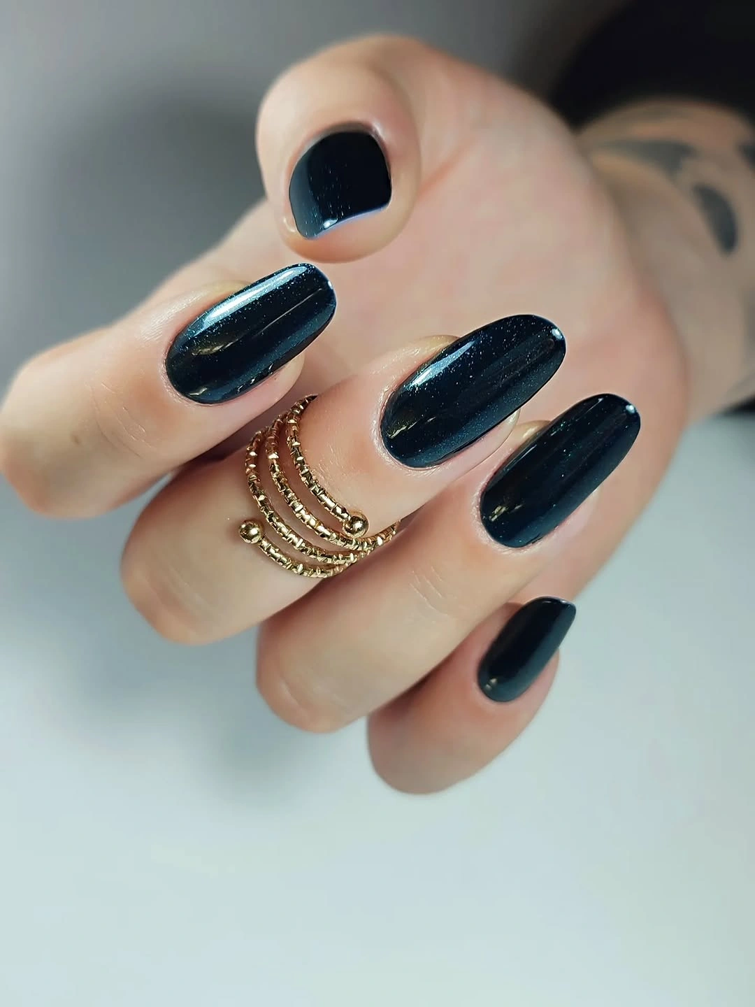
The color can fill the role of a fall dark while feeling fresher than black or burgundy. It would pair well with charcoal, cream, denim, and muted green, and silver jewelry would underline the cooler side of the palette. It also offers a cooler direction within wider fall nail colors without needing a second shade. If you prefer a shorter manicure, a rounded square can keep the same dark teal while giving the edges a little more structure than the oval shape.
Because the shade is deep, the quality of the outline matters more than the amount of design. Any uneven side edge will be easy to see, and a glossy surface reflects small bumps rather than hiding them. The medium length is a sensible compromise: it lets the color show clearly but keeps the hand from becoming visually dominated by a long dark silhouette.
Espresso Brown Feels Warmer than Black
These medium square nails use a deep brown surface that shifts toward near-black in the darker areas but keeps a warmer undertone in the highlights. The shape is straight enough to make the color feel orderly, while the brown prevents the manicure from looking as severe as a fully black set. Nothing else is needed because the value change between light and shadow supplies the interest.
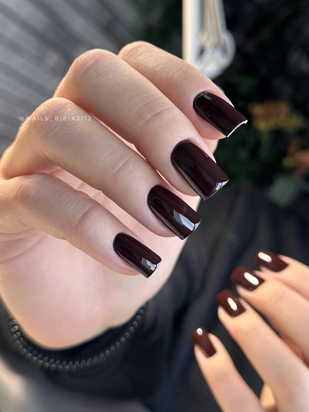
The warmth makes this a natural partner for cream, camel, rust, denim, or a muted brown fall nails wardrobe, though the deep surface can still hold its own beside black. A shorter square would make the color feel more practical, while a medium oval would soften its edges if the straight corners seem too strict. The choice depends on whether you want the palette or the shape to lead.
Dark brown is forgiving in mood but not always in upkeep. Chips at the corners will show, and the glossy surface can reveal an uneven edge quickly, especially against light clothing. Keep the shape moderate, avoid overloading the hand with similarly dark accessories, and let the warm undertone provide the seasonal cue instead of adding another motif.
Red and Black Blocks Need One Clear Focal Nail
The medium square design combines strong red and black diagonal shapes, then adds a busier pale and metallic-looking accent on one finger. The limited palette keeps the graphic field connected, but the accent nail is clearly carrying more information than the others. That hierarchy prevents the set from reading as a collection of unrelated marks and gives the eye a place to settle.
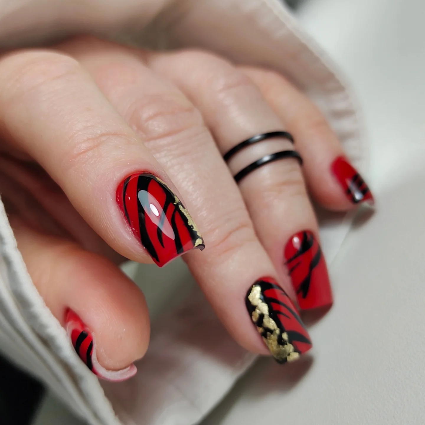
For a wearable adaptation, keep the red-black relationship on the main hand and move the detailed motif to one accent rather than repeating it. The square shape helps because it gives the blocks a firm boundary, while a shorter nail needs wider shapes and fewer internal lines. A calm outfit would allow the contrast to speak without turning the whole look into a contest between clothing and manicure.
The honest tradeoff is density. The red and black areas are easy to recognize, but the small accent can become muddy if the nail is shortened too far or if several competing details are added. Preserve the two-color structure first, then choose whether the focal finger should be patterned, reflective, or simply a different block arrangement.
Pale Pink Looks Sharper with Fine Dark Lines
The long tapered nails begin with a pale pink base, but narrow dark lines on selected fingers introduce a small graphic edge. Because the lines are fine and the background remains light, the design does not become a full pattern; it reads as a quiet frame around an elongated shape. The contrast is enough to make the manicure noticeable while keeping the pink surface in charge.
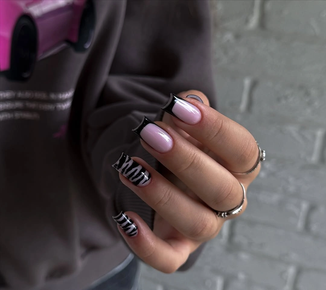
That balance would translate well to a shorter almond if the line count were reduced. One dark curve or narrow edge on each accent nail would preserve the idea, while a full repeat could make a small nail look divided into too many sections. The pale base also makes it easy to style with gray, black, denim, or soft brown without forcing a single clothing direction.
The long taper is doing more work than the accents, so do not treat the lines as a substitute for a balanced shape. They should follow the length rather than fight it, and their spacing needs to remain visible from a normal distance. If maintenance is a concern, keep the lines on the most visible fingers and leave the rest as clean pale pink support.
Sheer Blush Lets a Long Almond Stay Quiet
This long almond set is almost entirely about the translucent blush-nude surface and the narrow taper. The base lets a little light through visually, which keeps the long shape from appearing heavy even though the silhouette is noticeable. With no motif to interrupt the line, the manicure feels calm, refined, and more dependent on consistent length than on decorative skill.
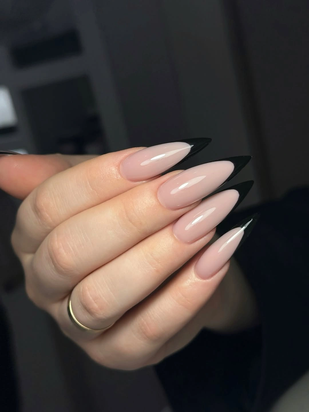
The color can move between casual and dressed-up depending on the surrounding textures. A chunky knit makes the transparent-looking base feel soft, while a dark jacket would emphasize the pale contrast. Readers who want the same quiet effect on a shorter nail can use a medium almond, oval, or squoval and keep the color close to the same blush family.
The practical limitation is the pointed length. It can look graceful but may be less comfortable during repetitive hand work, and small breaks change the whole line because there is no art to distract from them. Choose this direction when you are comfortable maintaining the silhouette; otherwise, keep the neutral surface and shorten the shape rather than adding unnecessary decoration.
Burgundy Looks Intentional on a Short Square
The short square shape gives this burgundy manicure a firm, compact presence, while the glossy wine color provides all of the seasonal depth. The surface is uninterrupted, so the eye notices the relationship between the dark red value and the small, practical outline. Compared with a longer almond, the same color feels more direct and less ornamental because the squared edge stops the line sooner.
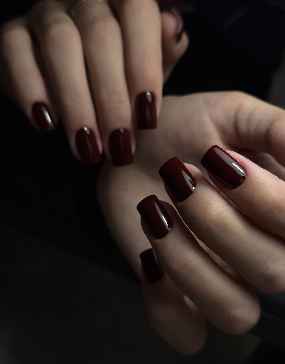
This is the kind of solid shade that can carry a fall wardrobe without demanding matching accessories. It would sit comfortably beside oatmeal, gray, denim, or black, and a simple gold ring would add warmth without creating another design. If you want a slightly softer version, round the corners while keeping the length short; if you want more authority, sharpen the square and leave the color alone.
Deep red makes chips visible, especially at the corners, but the compact proportion reduces the chance of snagging. That makes the shape a practical compromise for readers who love a dark color but do not want long maintenance. The finish should stay smooth and the edge neat, because any extra detail would compete with the clean reason this set works.
Orange and Spotted Accents Share a Neutral Base
This medium square set uses a pale peachy base to separate two stronger choices: bright orange on selected fingers and black-and-white spotted accents on others. The neutral nails are not empty space; they provide the visual pause that keeps the two accents from competing directly. The result feels lively because the colors are distinct, yet it remains organized because each finger has a clear role.
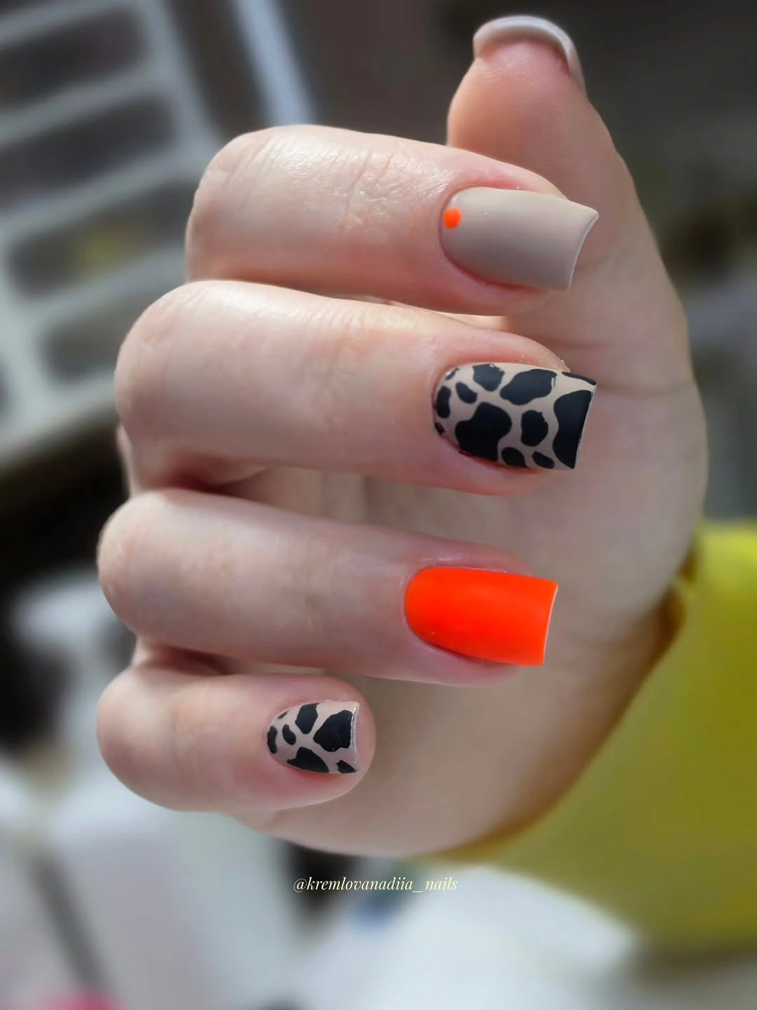
The best adaptation is to keep the orange and spotted detail on separate accent nails rather than putting both on every finger. A shorter square can handle one bright orange nail, one patterned nail, and several quiet neutrals without losing the contrast. Clothing should stay relatively simple around this set, since the hand already carries both a vivid warm note and a high-contrast print.
The design has more maintenance variables than a solid manicure. Small pattern marks can blur if the nail is too short, while bright orange exposes uneven edges quickly, so proportion matters before detail. If the set starts to feel crowded, remove one accent type first and keep the pale base visible; the balance comes from the pauses between stronger elements.
Glossy Black Finds Balance in a Medium Square
This medium square manicure is a clean field of glossy black, but the softened corners prevent the color from looking overly rigid. The surface reflects light in long highlights, which gives the dark shade a polished quality without introducing shimmer or art. Because the length is moderate, the black reads as a deliberate statement rather than a dramatic extension of the fingers.
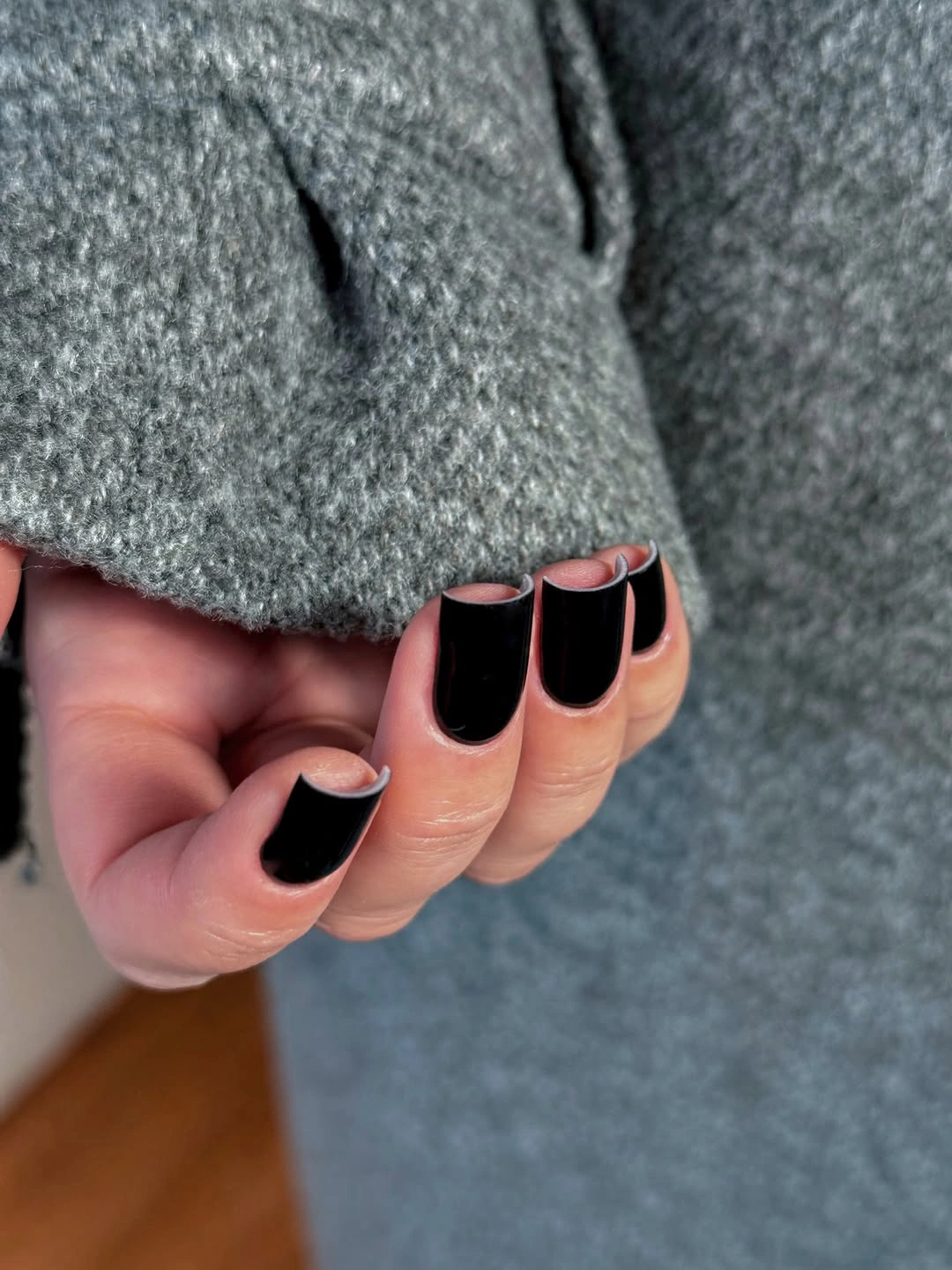
A solid black set can sit beside almost any wardrobe, but the strongest pairings leave some texture elsewhere, such as gray knitwear, denim, or a matte leather bag. Bright jewelry can work as a small counterpoint, while several high-shine accessories may compete with the reflected surface. If you prefer less contrast, a rounded square would soften the outline without changing the color choice.
Dark glossy polish asks for tidy edges because small gaps and chips are visible against the skin. The medium square helps with daily movement, yet readers who use their hands constantly may prefer a short squoval with the same finish. This is a useful reminder that a plain design is not maintenance-free; its simplicity makes proportion and edge quality easier to notice.
Extreme Length Makes Silver Lines Feel in Motion
The very long pointed nails use pale, translucent, dark, and silver-looking details in sweeping shapes that appear to travel across the surface. The design is dramatic because the lines follow an already extreme silhouette, so the eye moves from the sharp tip through the curved reflective marks. The dark background and bright highlights create contrast without relying on a large block of color.
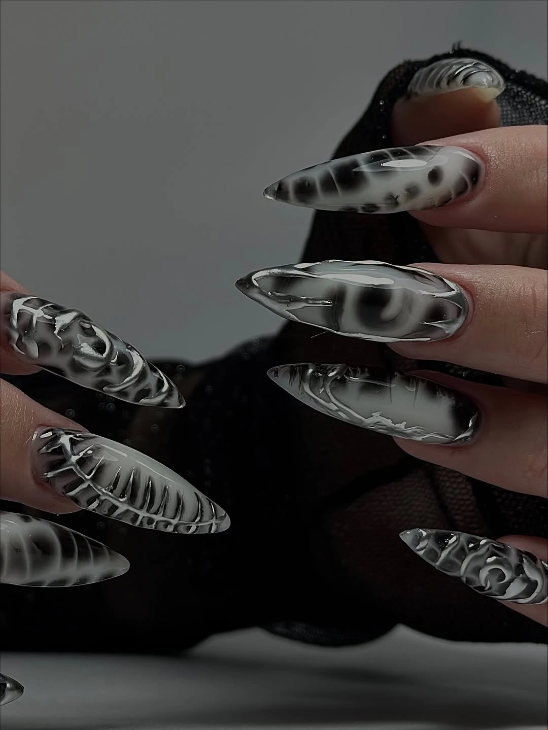
This is best treated as a composition to edit rather than a set to copy in full. On a shorter almond or coffin shape, keep one curved silver-black line on an accent nail and let the other fingers stay pale. That preserves the sense of movement while reducing density, catching, and the amount of detail that must remain crisp, much like a pared-back approach to fall chrome nails.
The practical limit is obvious in the silhouette. Very long points can interfere with everyday tasks, and layered reflective elements may catch against fabric or draw attention to every small edge change. Readers who want the visual energy without the same commitment should shorten first, simplify second, and only then decide whether a second accent is still necessary.
Turquoise Makes a Short Square Feel Brighter
This saturated turquoise set is entirely solid, so the compact square shape has to control a color that could otherwise become visually loud. The glossy surface keeps the shade clear and smooth, while the short length prevents the bright cool tone from stretching into a dramatic silhouette. The simplicity is useful because it lets color replace decoration without feeling unfinished.
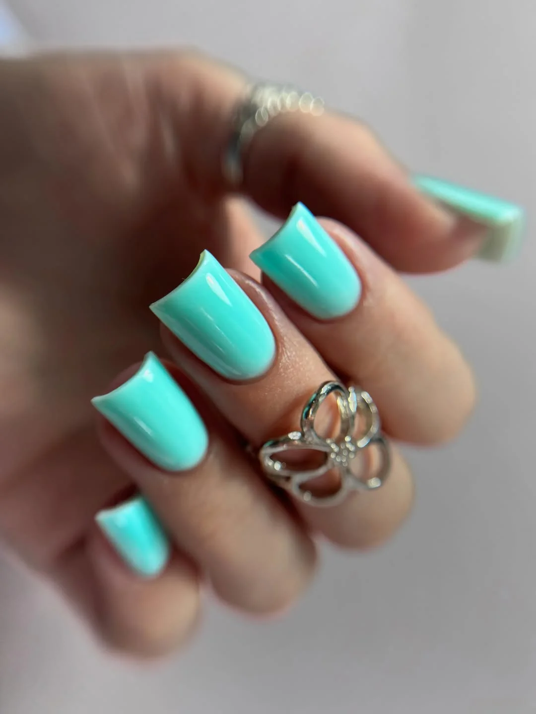
The shade would stand out beside gray, cream, black, or washed denim, and a neutral wardrobe would give it more room than a similarly bright patterned outfit. If you want to pull the color toward fall, surround it with warm brown textures instead of adding a second nail-art motif. A softer rounded square can make the same turquoise feel more playful, while a sharper edge makes it more graphic.
The short proportion is doing important balancing work. A longer turquoise set could feel more costume-like because the color would occupy more visual space, while a tiny nail could make the shade look dense. Keep the surface even and the edges clean, then let the one saturated color remain the focal choice rather than apologizing for its brightness with extra accents.
Gold Accents Warm Up a Glossy Red Set
Most of these medium square nails are glossy red, while two fingers shift into a gold-looking metallic texture. The placement creates a simple rhythm: red establishes the base mood, and the warm reflective accents arrive as concentrated interruptions. Limiting the metallic detail keeps the set from becoming a full gold manicure and lets the red remain the dominant color.
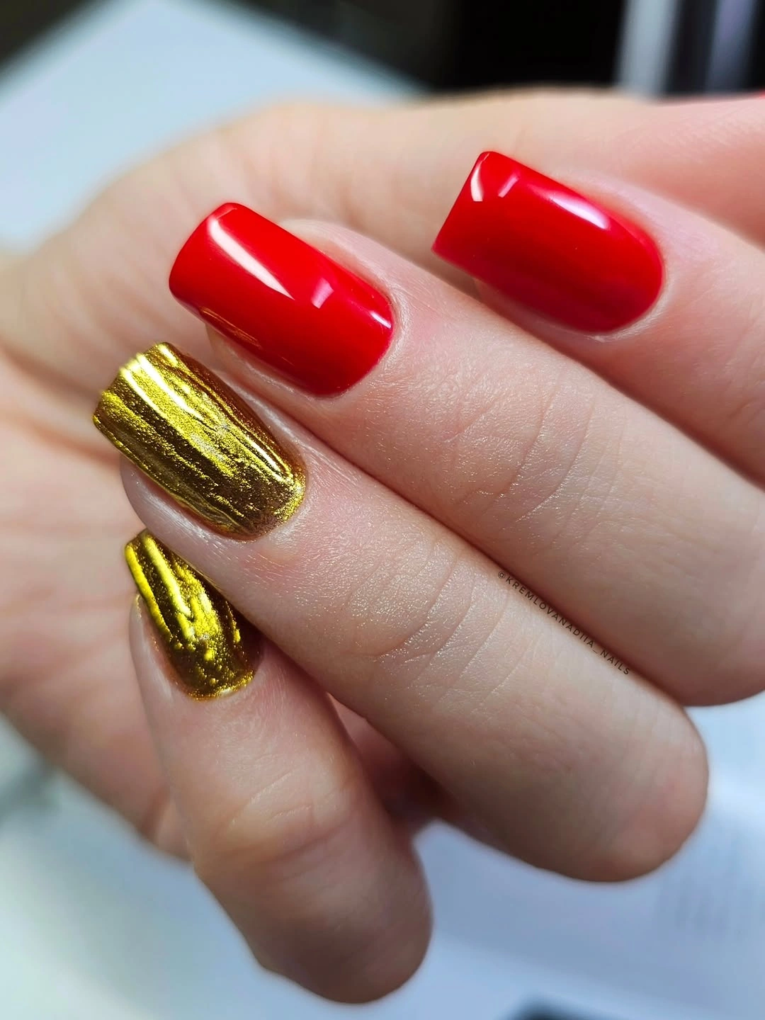
This pairing would work with cream, black, brown, or warm gray clothing, especially when the rest of the jewelry is kept deliberate rather than layered without purpose. A shorter square could keep one metallic accent and several red nails, while a longer shape might support the two-finger split more easily. The key is not the amount of gold but the breathing room around it.
Metallic-looking texture can catch on the eye and on fabric, so the accent nails deserve a realistic maintenance check. If the surface starts to feel too busy, smooth the distribution by moving one accent back to red instead of adding another neutral. The design stays strong when the red is unmistakable and the warm shine feels like a measured change in surface.
Another Black Solid Shows the Value of Shine
The medium square outline is similar to the earlier black set, but this view makes the uninterrupted glossy surface and clean proportion especially easy to read. Without a motif, the manicure is not asking the viewer to decode anything; it is offering a direct relationship between dark value, straight edges, and reflected light. That clarity can be more useful than novelty when choosing an everyday fall color.
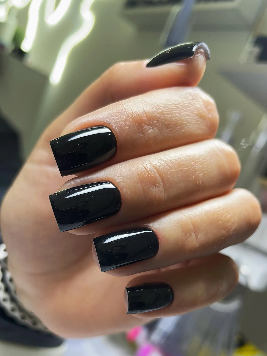
Pairing the black with a soft green sweater, pale denim, or silver jewelry would create contrast without adding another nail color. If you prefer a more relaxed result, shorten the square and round the corners slightly. The finish can stay glossy, because the surface reflection is what keeps the dark shade from becoming visually flat.
The limitation is that a plain black manicure gives no place for uneven work to hide. Edge gaps, chips, and rough corners stand out immediately, especially against light skin or fabric. Keep the shape moderate and treat maintenance as part of the design decision; the less decoration you add, the more important the basic outline becomes.
A Small Green Accent Breaks Up the Black
Most of the short rounded nails are glossy black, but one or two fingers introduce green botanical-looking detail over a darker base. The green is restrained enough to read as a cool interruption rather than a second full palette, and the rounded silhouette keeps the whole set approachable. This is a careful use of accent placement: the base stays authoritative while the smaller color adds relief.
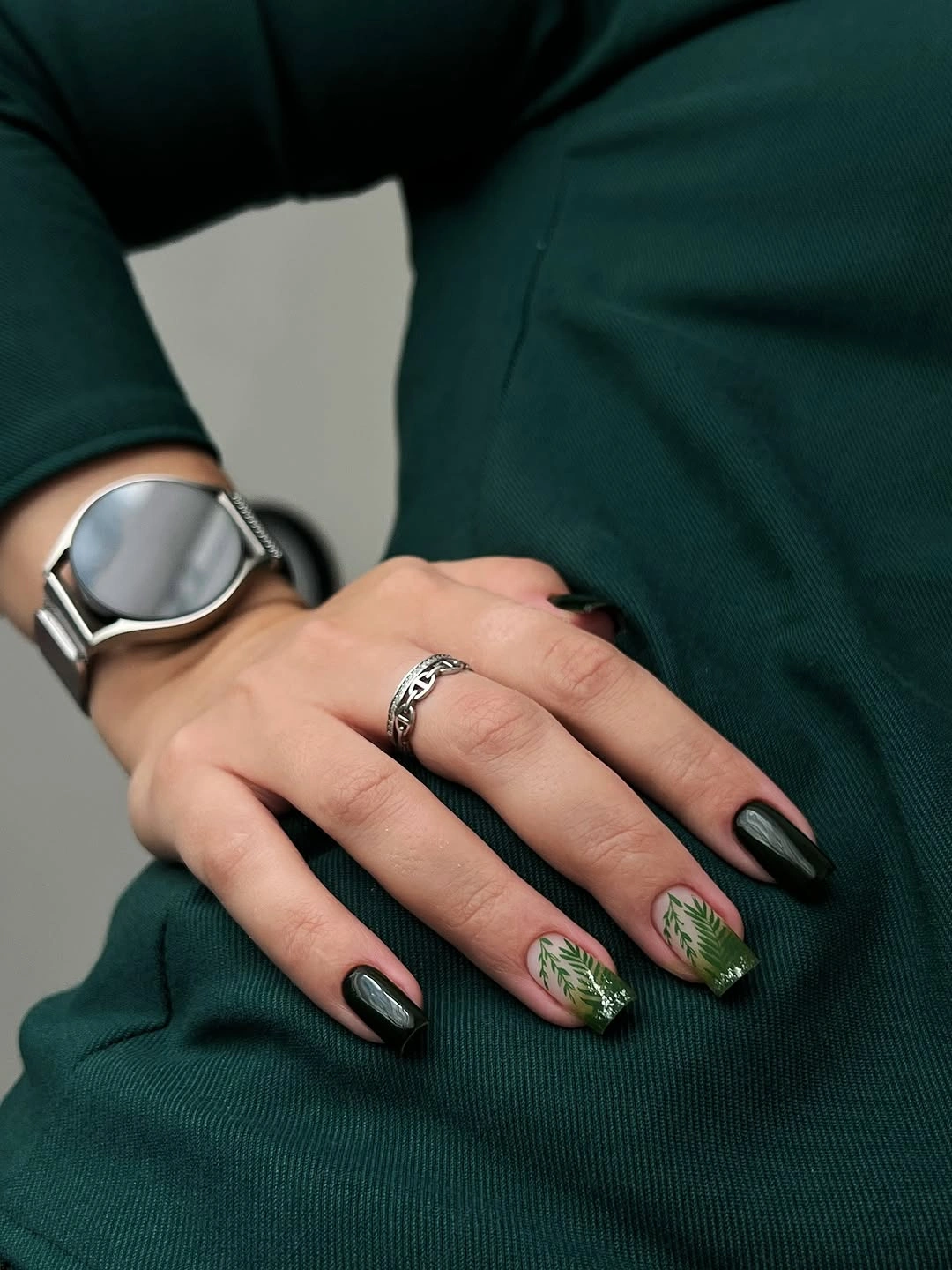
The accent can be simplified easily for a shorter manicure. Keep the green to one visible leaf-like mark or a small patch, then leave the surrounding nails solid black so the contrast remains legible. Deep green clothing could echo the detail, but neutral gray, cream, or denim would give the accent more separation and keep the hand from becoming too coordinated.
The practical advantage is that the short rounded shape limits both snagging and visual density. The dark base still needs neat edges, but the small green detail does not have to be repeated perfectly across every finger to work. If the design grows out or begins to feel busy, remove complexity from the accent first and preserve the simple black framework.
An Open Metallic Frame Gives Nude Space to Breathe
The long squared nails finish the group with a translucent nude-brown base, pale inner shapes, dark curves, and glittering gray or silver-looking borders near the edges. The design is elaborate, but the center remains visibly open, so the frame creates structure without covering every part of the nail. The long square is well suited to this arrangement because it offers enough length for the border to read as a deliberate architecture.
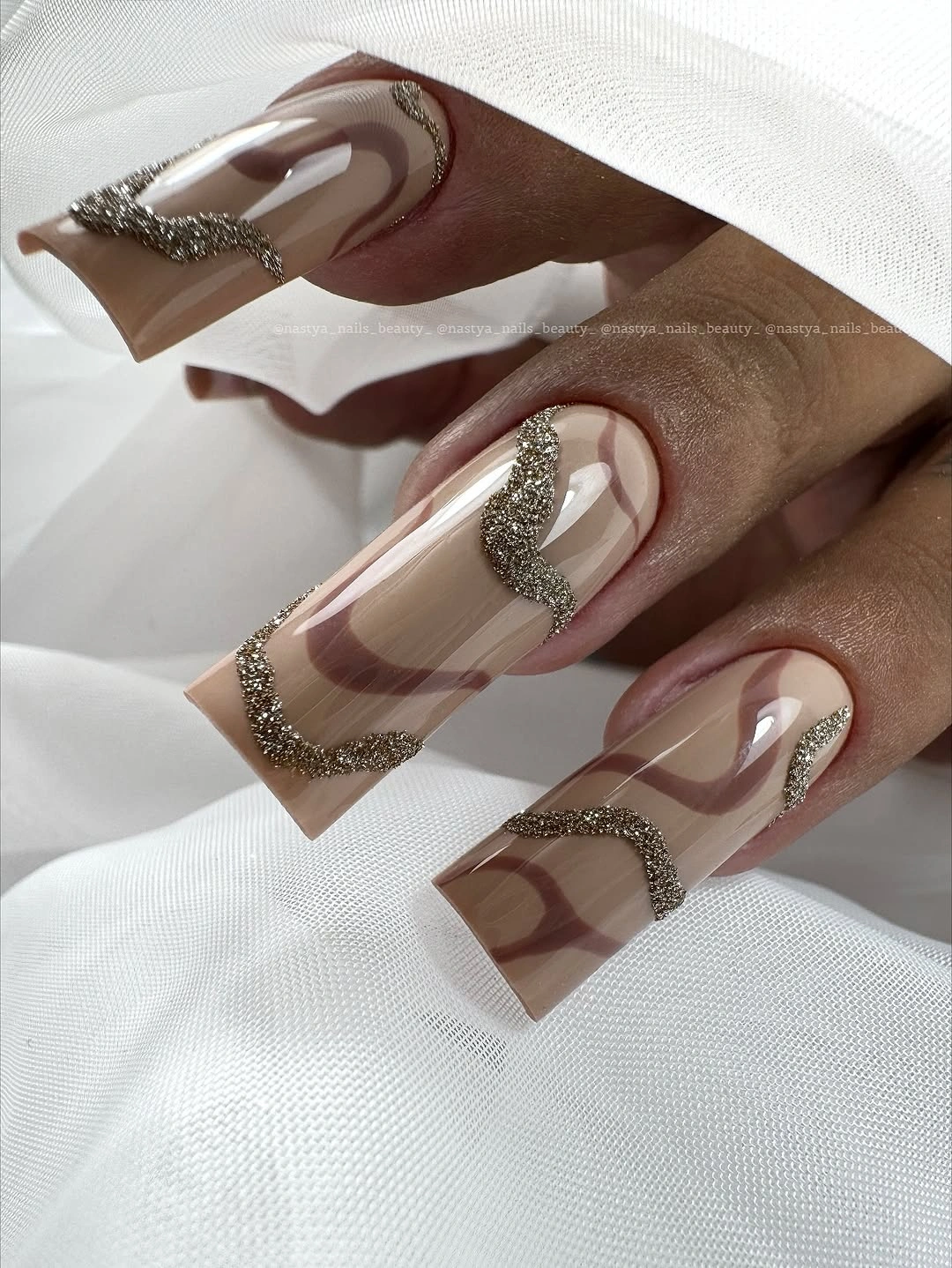
For everyday wear, borrow the framing idea on one or two accent nails and keep the others translucent or softly nude. That change reduces visual density while preserving the contrast between open center and defined edge. A shorter square could use one curved border rather than a complete frame, and a medium coffin shape would keep the layered idea without the same amount of tip exposure.
The tradeoff is upkeep at every boundary. Layered lines, pale centers, and reflective edges all make chips or uneven spacing more visible, and the long shape adds its own practical demands. Let the open space do the calming work, simplify the border before shortening too aggressively, and resist adding another motif when the frame already gives the manicure a complete visual structure.