
Burgundy has enough depth to make a manicure feel finished before any design is added, which is exactly why extra detail needs a reason to exist. On a short edge, too much darkness can close the shape; on a longer silhouette, the same color can become the entire atmosphere. The interesting work happens in that tension, where one deliberate break in the surface keeps the shade rich without letting it become visually heavy.
Choose the source of contrast before choosing the ornament. A lighter base, a reflective interruption, a changed tip, or a single focal nail can open the composition, but several competing accents usually make the dark color harder to read. The strongest fall burgundy nails with design leave a little silence around the feature that matters, which also makes the final look easier to adapt and maintain.
Small gold notes warm deep burgundy
Deep burgundy dominates this short square-coffin manicure, while tiny gold-toned details appear near selected tips over pale sections. The dark red carries the mood, but the small warm accents keep the set from closing in on itself. Because the decoration is limited, the compact shape remains neat and the gold reads as a quiet flash rather than a second design language.
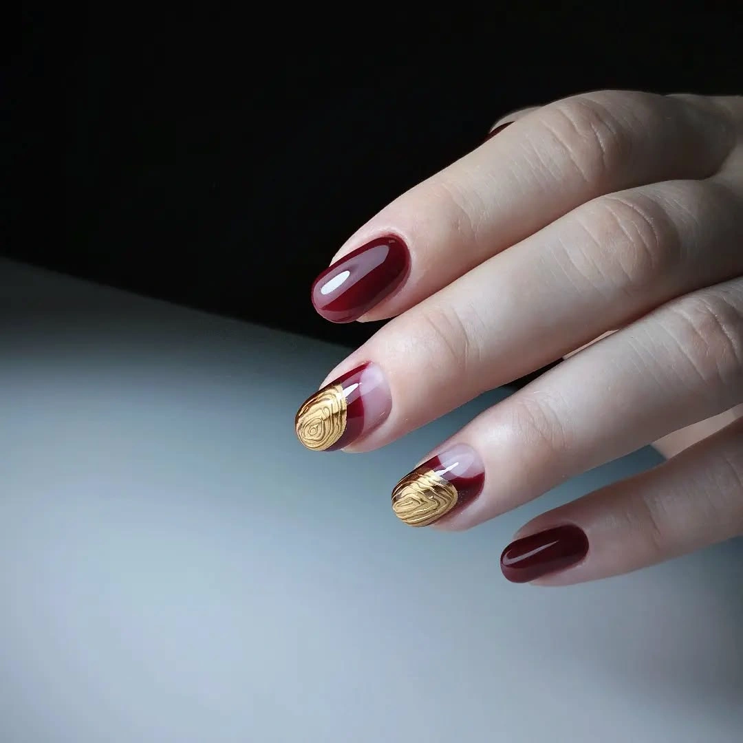
The balance comes from scale. Burgundy covers most of the visible surface, and the warm marks are small enough to function as punctuation, giving the eye a place to stop before returning to the deep color. Bronze or a nude-only companion could soften the effect, but retaining one warm detail would preserve the tension that makes the set memorable.
Metallic-looking accents are also the first details likely to show wear at the edge, especially on a short nail where the tip is constantly visible. Keep the gold close to the free edge and avoid scattering it across every finger if maintenance needs to stay simple. The manicure has enough atmosphere already; restraint is what keeps the burgundy readable.
Long almond burgundy holds the frame
A long almond silhouette turns solid glossy burgundy into a strong statement without any added motif. The tapered shape narrows toward the tip, letting the dark red surface carry a continuous line from base to edge. There is little visual noise here, which makes the length and the rich color feel deliberate rather than decorative.
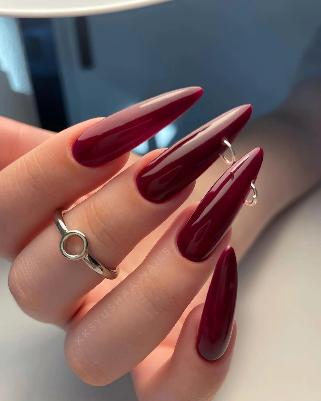
Length is doing the dramatic work, while the gloss supplies a clean highlight that keeps the wine color from appearing flat. A shorter oval or soft square could bring the same shade closer to everyday proportions without losing its depth. The adaptation is straightforward because the design does not depend on a pattern – only on preserving the relationship between silhouette and color.
Extra length changes the practical balance of a manicure even when the surface is plain. The tapered point may be less convenient during ordinary tasks, and its visual presence will be stronger than a short version. That limitation is part of the appeal, but if wearability matters more than drama, reduce the length before adding any art; the burgundy itself already has enough weight.
Sparse reflective accents on wine almond nails
Long burgundy almond nails are joined by small bright embellishment-like clusters near selected tips and side areas. The dark wine base remains continuous on the companion fingers, while the reflective accents break the surface in only a few places. That selective placement gives the manicure a jewelry-like glint without covering the whole silhouette in shine.
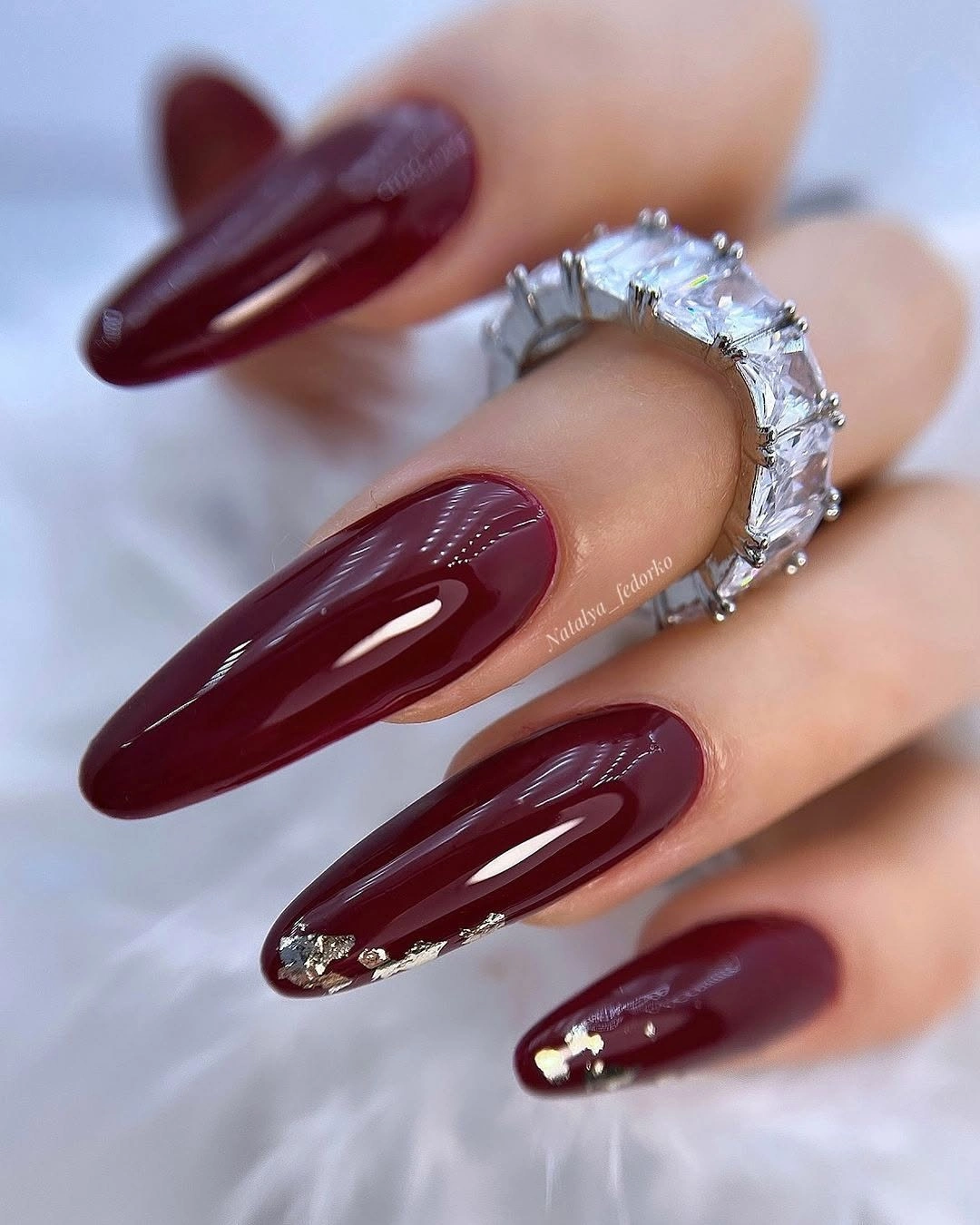
The solid nails matter as much as the decorated ones. They create quiet intervals around the small bright details, so the eye can distinguish each accent instead of reading the set as one glittering mass. For a shorter adaptation, keep one embellished nail and let the remaining fingers stay plain burgundy, preserving the same controlled contrast.
Small raised-looking details may catch on fabric or require more attention than a flat line, so their construction should not be assumed from appearance alone. The visual lesson is enough: use a few bright points against a dark base, then stop. The long almond shape can carry the drama, while the accents simply give it a place to flicker.
Short square burgundy keeps the mood grounded
Short square nails in solid burgundy provide the most direct version of the row’s signature color. The dark red is glossy and even, and the compact shape gives it a grounded quality that feels more everyday than the long almond examples. Nothing interrupts the surface, so the straight tip and rich tone remain the complete design decision.
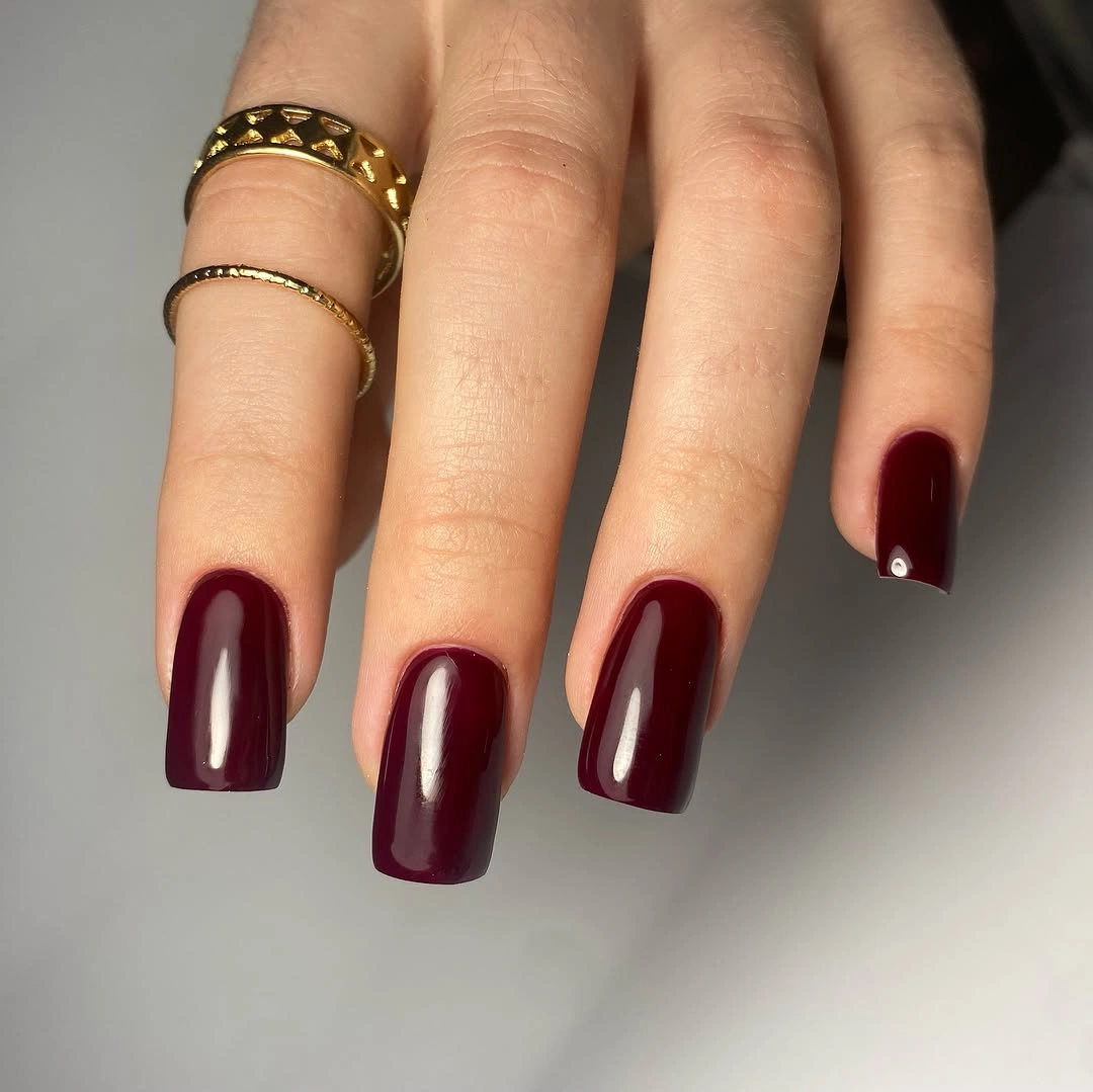
Reducing the length changes the emotional temperature of burgundy. The shade still has depth, but the short square edge makes it feel practical and clear rather than theatrical. A rounded-square outline or slightly softer wine undertone could make the look gentler, while keeping the surface plain preserves its controlled character.
Dark solid color still exposes edge wear even when the length is short, because the contrast between nail and background is high. That is a reason to keep the outline clean, not a reason to add decoration. This example works precisely because it shows how little the color needs when the proportion and finish are doing their jobs.
Fine red sparkle changes the surface
Long almond nails remain within the burgundy family here, but fine red sparkle changes the way the surface catches light. The color stays dark and cohesive, while the scattered reflective particles give the tapered silhouette a soft evening glow. There is no separate motif to compete with the shape; finish alone provides the shift from plain to embellished.
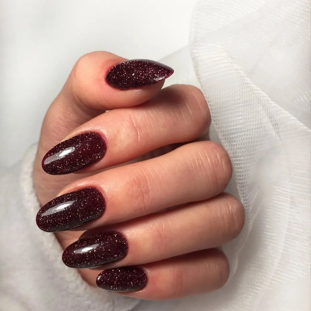
Fine sparkle is effective because it adds movement without breaking the wine palette. Light travels across the long nails, making the color appear deeper in shadow and brighter at the curved highlights. If the same idea is adapted to a shorter shape, placing the sparkle on two accent nails could keep the look lighter while preserving its reflective character.
A textured-looking surface can reveal unevenness more readily than a flat solid color, especially under direct light. That is the honest tradeoff for the extra glow. Keep the sparkle fine and evenly distributed, and resist adding separate metallic lines; the finish already supplies enough visual information for the burgundy to feel dimensional.
Short burgundy square returns to clarity
This short burgundy square set is deliberately plain, with an even glossy surface and no visible art. The color sits close to the deeper wine examples, but the compact tips give it a clearer, more practical profile. It is a quiet reminder that repetition does not have to mean sameness: the same dark family can feel different when the length and setting change.
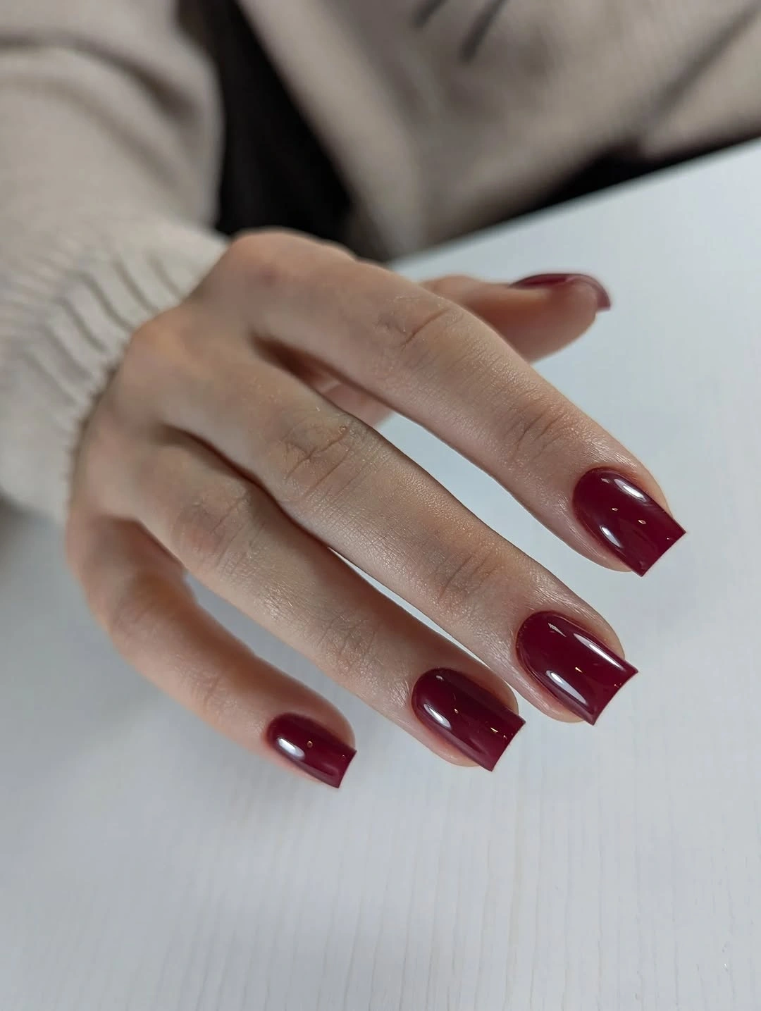
The manicure stays coherent because the dark red is allowed to occupy the whole field without competing details. A softened red-brown or slightly lighter wine could make it more approachable, while the square edge would continue to give the color a crisp frame. This is a good base from which to decide whether art is truly needed.
If a solid dark set begins to feel too uniform, one small change is enough – a single metallic dot, a lighter tip, or a subtle finish shift on one finger. Adding multiple motifs would weaken the calm visual line. The strongest reading remains the simplest one: short length, deep color, and a surface that holds its shape.
Cherry-toned burgundy stays almost monochrome
Short dark burgundy nails appear beside cherries in this collage, but the nails themselves remain a glossy solid color. The surrounding red fruit reinforces the seasonal association, while the manicure stays free of literal fruit motifs. That separation matters: the mood comes from the shared depth of color, not from transferring the background into unsupported nail art.
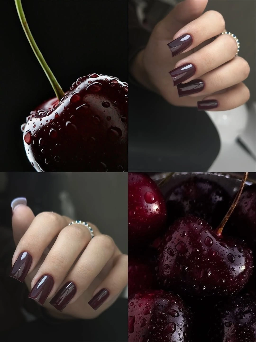
A plain wine set can feel strongly autumnal through undertone alone. The burgundy reads richer beside the red background, and the short square shape keeps the composition grounded even when the color carries a lot of atmosphere. If you want a tiny nod to the setting, use one darker red accent nail rather than painting a literal symbol across the set.
Context can influence styling, but it should not replace what is visibly on the nails. Keep the color relationship central and treat the surrounding fruit only as a mood cue. That approach makes the idea more transferable: the same burgundy can work with neutral clothing, silver jewelry, or a dark coat without needing a themed prop.
Pale marble opens a dark wine set
Most nails are long burgundy, while two pale accents carry soft pink and red swirls that look marbled or petal-like. The lighter fingers create a sharp interruption in the deep color, but the burgundy companions preserve the collection’s dark identity. The accent count is limited, so the pattern reads as a deliberate opening in the palette rather than a second full manicure.
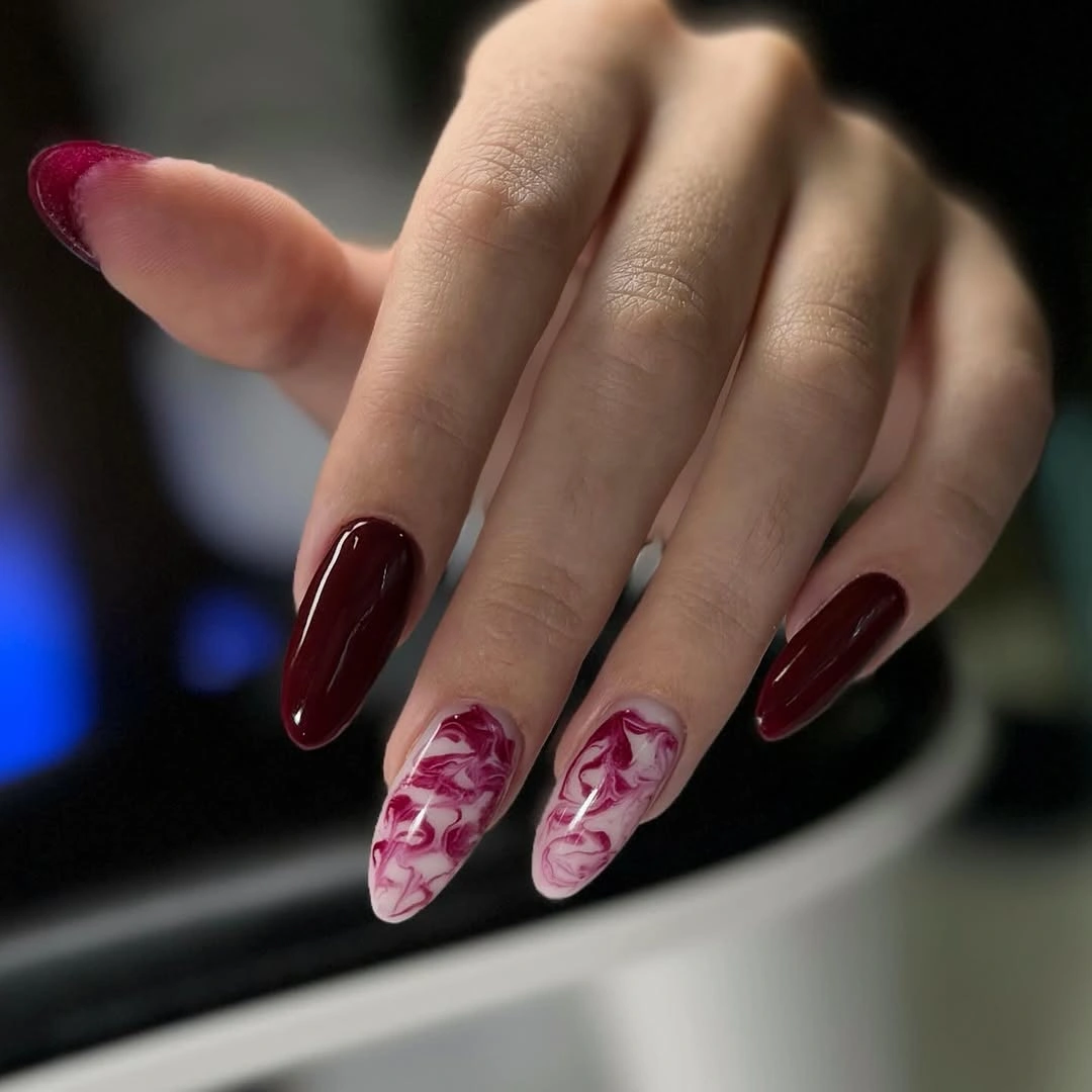
Contrast gives the set relief. Burgundy supplies depth, the pale accents bring light, and the swirling marks make the transition feel organic rather than geometric. On a shorter shape, one pale accent would likely be enough; keeping the rest solid would protect the balance while making the lighter design easier to see.
Marbled detail can vary from nail to nail, and pale surfaces may show wear sooner than dark companions. That is not a reason to force identical swirls. Keep the accent areas generous enough for the pattern to read, but do not extend them across every finger – the beauty of this idea is the moment where the dark field opens.
Elongated light panels sharpen burgundy
Long square burgundy nails carry tall pale reflective-looking panels that interrupt the dark surface like narrow windows. The repeated vertical shapes echo the length of the nail and create a graphic structure without adding several colors or symbols. The effect is controlled and architectural, with the light panels giving the deep red somewhere to reflect.
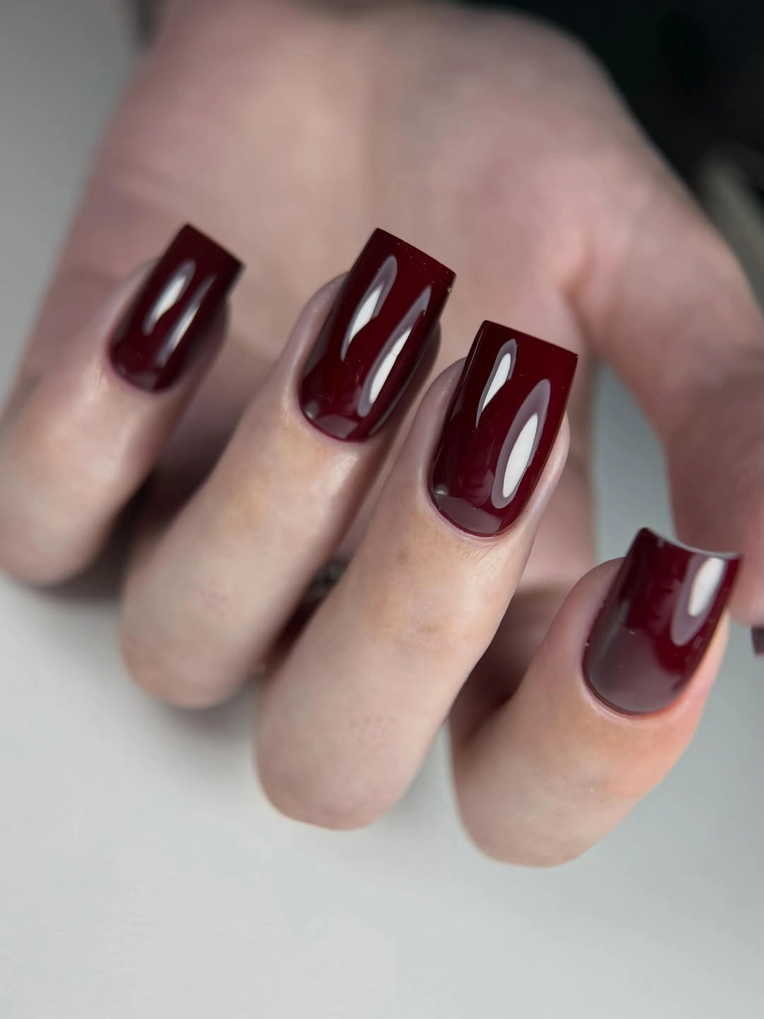
Direction is the reason this design feels elongated rather than simply decorated. The eye follows the tall panels from base toward tip, while the surrounding burgundy keeps the contrast narrow and deliberate. A shorter adaptation could use one vertical line or a single panel on the ring finger, preserving the movement without forcing the geometry across a smaller canvas.
The exact construction of the panels is not as important as their visible role, and it is safer to describe them as reflective-looking rather than assign a technique. Repeated edges will show chips or growth clearly, so reduce the number of panels if upkeep becomes demanding. Let one sharp vertical accent create the tension; more would make the dark field harder to read.
White contrast lets burgundy breathe
Short rounded-square burgundy nails look especially clear against a pale orchid, but the manicure itself stays a plain glossy dark red. The light setting gives the color a clean edge and prevents the compact silhouette from disappearing into shadow. There is no additional art, so the design depends on contrast between a deep wine shade, a short outline, and a bright surrounding field.
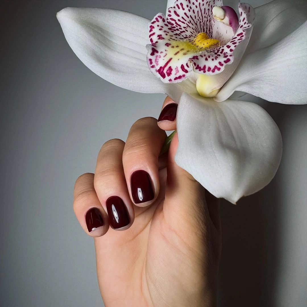
This is a useful styling lesson for dark color: it does not always need a lighter nail to become readable. A pale background, cream clothing, or a light metal accessory can perform that balancing role while leaving the manicure solid. If you do add a detail, keep it small and warm so the burgundy remains the dominant visual note.
Background contrast can make a shade appear deeper or brighter than it feels in ordinary light, so rely on the nail surface first when adapting the color. The short rounded square keeps the look practical, but the edges still need care because dark polish exposes wear. The quietness of the set is a strength, not a missing element.
One ornate accent breaks the dark field
Long square burgundy nails are mostly solid here, with one focal nail carrying a dark ornate decoration accented by a vivid pink detail and small bright points. The decorated finger is visibly heavier than its companions, but the rest of the set stays quiet enough to give it a clear role. This is controlled drama through one concentrated interruption.
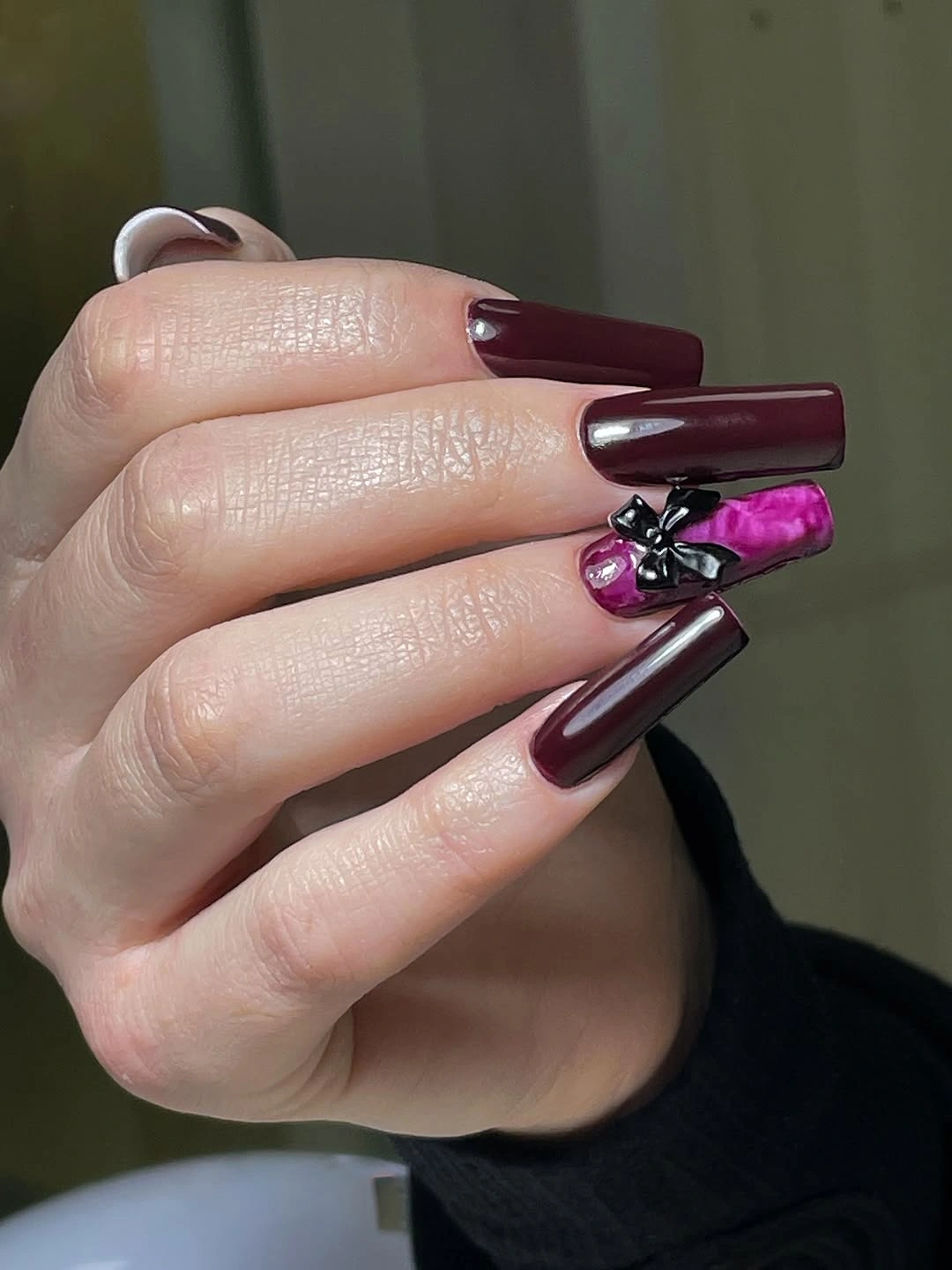
The single-finger approach keeps the visual story legible. Burgundy establishes the atmosphere, the pink detail provides a sudden flash of contrast, and the plain nails create the silence around it. A shorter adaptation could flatten the focal idea into a bright line or one metallic dot, retaining the placement without relying on a protruding-looking ornament.
Any detail that appears raised may have practical implications, but the visible lesson does not require a material claim. One accent is enough because the long square silhouette already has presence. If the focal nail begins to compete with the rest of the hand, reduce its scale before adding more color; the tension works when the exception remains exceptional.
Long square wine color feels architectural
Deep burgundy covers these long square nails in a uniform glossy finish, and the straight tips give the dark color an architectural weight. Unlike the almond examples, this silhouette feels broader and more deliberate at the edge, so the manicure reads as a study in proportion rather than softness. No art is needed because the length and geometry already create the visual statement.
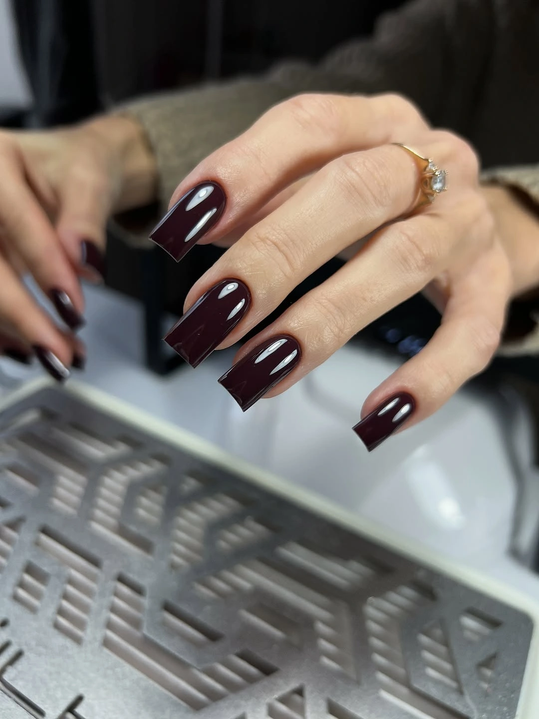
The straight line of the tip amplifies the density of the shade, making the wine color feel inky and grounded. A shorter soft square would reduce that weight, while an almond shape would make it more fluid; either change would alter the mood before any design is added. That makes this a helpful reference for choosing silhouette first.
Long square corners can be less forgiving during everyday tasks, and the dark surface will show damage clearly against light clothing or backgrounds. If you want the same depth with a quieter footprint, shorten the nail and keep the finish plain. The essential idea is still intact when the architecture becomes smaller.
Wavy monochrome accent interrupts burgundy
Short rounded-square burgundy nails are paired with one pale accent carrying black-and-white wavy stripes. The patterned finger interrupts the deep red with a sharp monochrome rhythm, but the surrounding solids keep the set from becoming print-heavy. The design feels graphic because of the line movement, not because every nail carries a separate symbol.
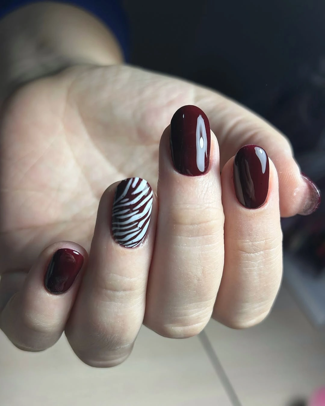
One high-contrast accent works as a controlled counterpoint to the dark base. Burgundy supplies warmth and depth, while the pale striped nail creates a moment of brightness that is easy to locate. If the print feels too assertive, use thin burgundy lines over a pale base instead, keeping the motion but lowering the contrast.
Wavy lines can look softer than rigid geometry, yet the black-and-white contrast still exposes smudges or chips. Keep the pattern on one nail and let the burgundy companions remain glossy and plain. That gives the manicure a clear focal point without asking the short shape to carry a full collection of competing details.
Medium length balances depth and ease
This medium-length square-coffin set keeps the nails solid burgundy, offering a middle point between the very short examples and the long dramatic silhouettes. The straight tips still give the color presence, but the overall shape does not feel as visually heavy as extra-long square or almond nails. The design is plain, which makes the length change especially easy to observe.
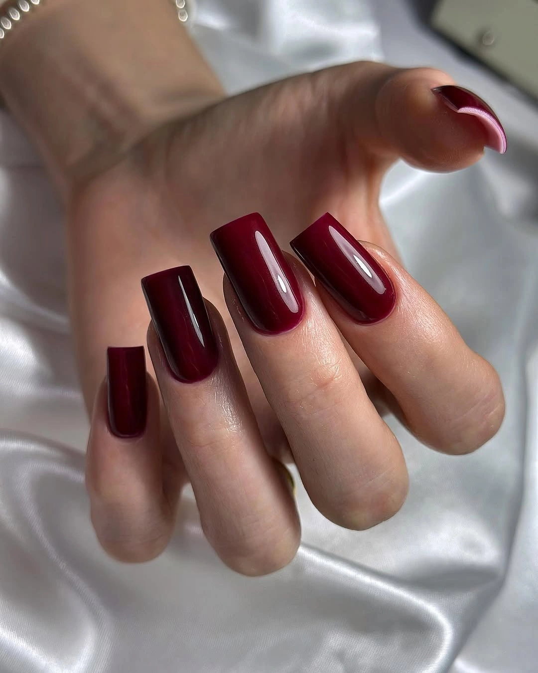
Medium length can be a useful compromise when you want the deep red to feel noticeable without letting the silhouette dominate the hand. A softer corner or slightly shorter free edge would make the same color even more practical, while a French placement could lighten the surface if full coverage feels too dense. Start with proportion before adding art.
Even a middle length can catch on daily objects more than a short nail, and a dark solid edge will reveal wear. That limitation is manageable when the shape is kept even and the color remains the single focus. The set works as a quiet bridge through the collection, showing that burgundy does not need maximum length to hold attention.
Deep burgundy tips leave the base light
Long nails use a pale pink base with deep burgundy concentrated at the tips, creating a dark French effect that feels lighter than full coverage. The extended silhouette supplies drama, but the open nail beds keep the set from becoming one solid wine block. Because the dark color repeats only at the edge, the design has both depth and visible breathing room.
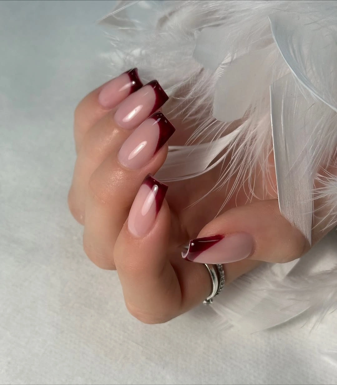
Tip placement changes the mood of burgundy more than a new motif would. The pale base makes the dark red feel sharper and lets the long almond-coffin shape remain legible, while a shorter rounded-square version would bring the same contrast closer to everyday wear. A narrower tip would make the result even quieter without losing the fall color.
French color boundaries show growth quickly because the pale base and dark tip create a clear line. Keep the edge proportion consistent across the hand, especially if the nails are shortened. The design succeeds through the tension between light base and deep edge, so avoid adding another strong accent that would compete with that simple division.
One lighter accent on short burgundy
Short square burgundy nails carry one ornate-looking lighter accent while the remaining fingers stay solid dark red. The detail appears floral or decorative, but its exact identity is less important than the contrast between one pale patterned surface and the surrounding wine color. On a short shape, that single focal point gives the set personality without crowding every tip.
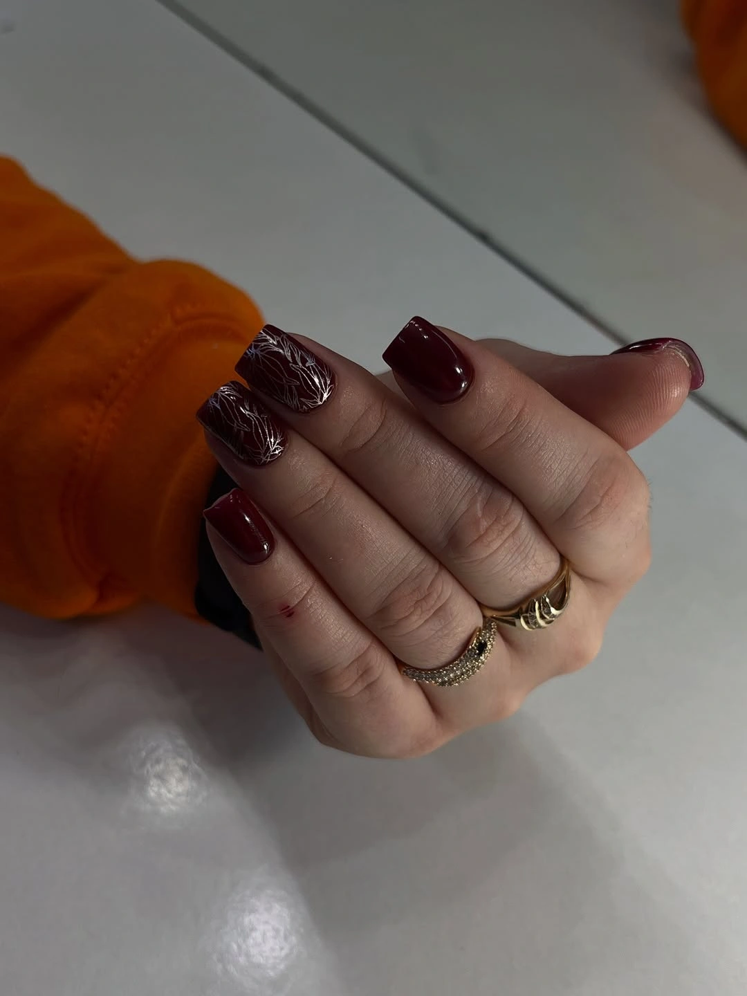
Focal isolation makes the manicure easier to read. The burgundy base establishes a controlled atmosphere, and the lighter accent opens a small window in the color field without changing the whole palette. If the intricate detail feels too demanding, replace it with one curved line or a small metallic mark while keeping the same finger as the focal point.
Fine ornament can lose definition first as the surface wears, so its scale should stay generous enough to be recognized. The surrounding solids provide useful pauses and make that detail feel intentional. A second ornate nail is not necessary; the short silhouette already keeps the overall composition close and clear.
Reflective panels deepen medium burgundy
Medium burgundy square nails show strong pale reflections that read like elongated inset panels across the dark glossy surface. The color remains mostly solid, but the repeated light shapes make each nail appear more dimensional and emphasize the straight tips. This is drama created by reflection and surface rather than by a separate painted motif.
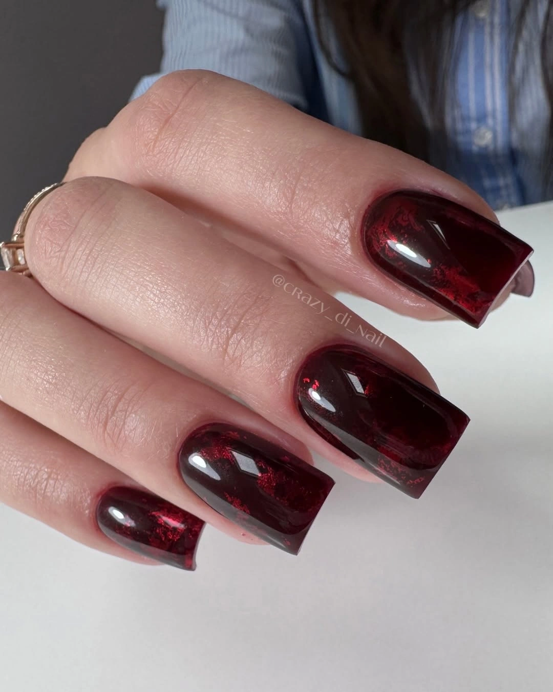
The highlights create a vertical pull and keep the medium length from feeling broad or flat. A plain gloss would make the design quieter, while a single reflective accent could preserve the idea on a shorter set. When adapting it, keep the light shape narrow enough that burgundy remains the dominant field.
It is safer to describe the panels by what they look like than to assign them a material or finish not proved by the brief. Strong reflections can reveal surface marks, and repeated edges may show grow-out. Reducing the number of accents can make upkeep easier while retaining the central tension between deep color and pale light.
Pale marble gives burgundy a second register
Deep burgundy nails are mixed with pale accent nails carrying gray, white, and muted red swirls. The lighter pattern creates a clear break from the dark field, but the repeated burgundy fingers keep the set cohesive and atmospheric. The design feels more open than a full wine manicure because the pale accents occupy only a small, deliberate share of the hand.
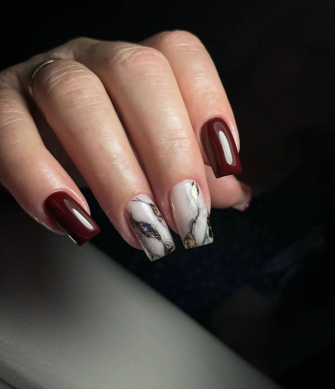
Contrast is the organizing principle. The dark red provides depth, the pale base catches light, and the swirling marks create a softer transition than a hard geometric line. For a warmer fall version, cream with brown-red movement would keep the same balance, while one accent nail would be enough on a shorter silhouette.
Pale patterned nails can show wear and staining sooner than dark companions, so their placement should be treated as a visible maintenance choice. Let the swirls remain spacious instead of stacking too many lines. The collection’s dark character survives because the light accents are selective, not because every finger is asked to carry equal complexity.
Tone-on-tone marbling stays within wine
Short square burgundy nails show darker and brighter red patches that create a marbled, layered-looking surface without introducing a pale contrast color. The variation stays inside the same wine family, so the set feels richer rather than busier. This is a controlled way to add movement to short nails when a solid color seems too quiet but a bright accent would feel too sharp.
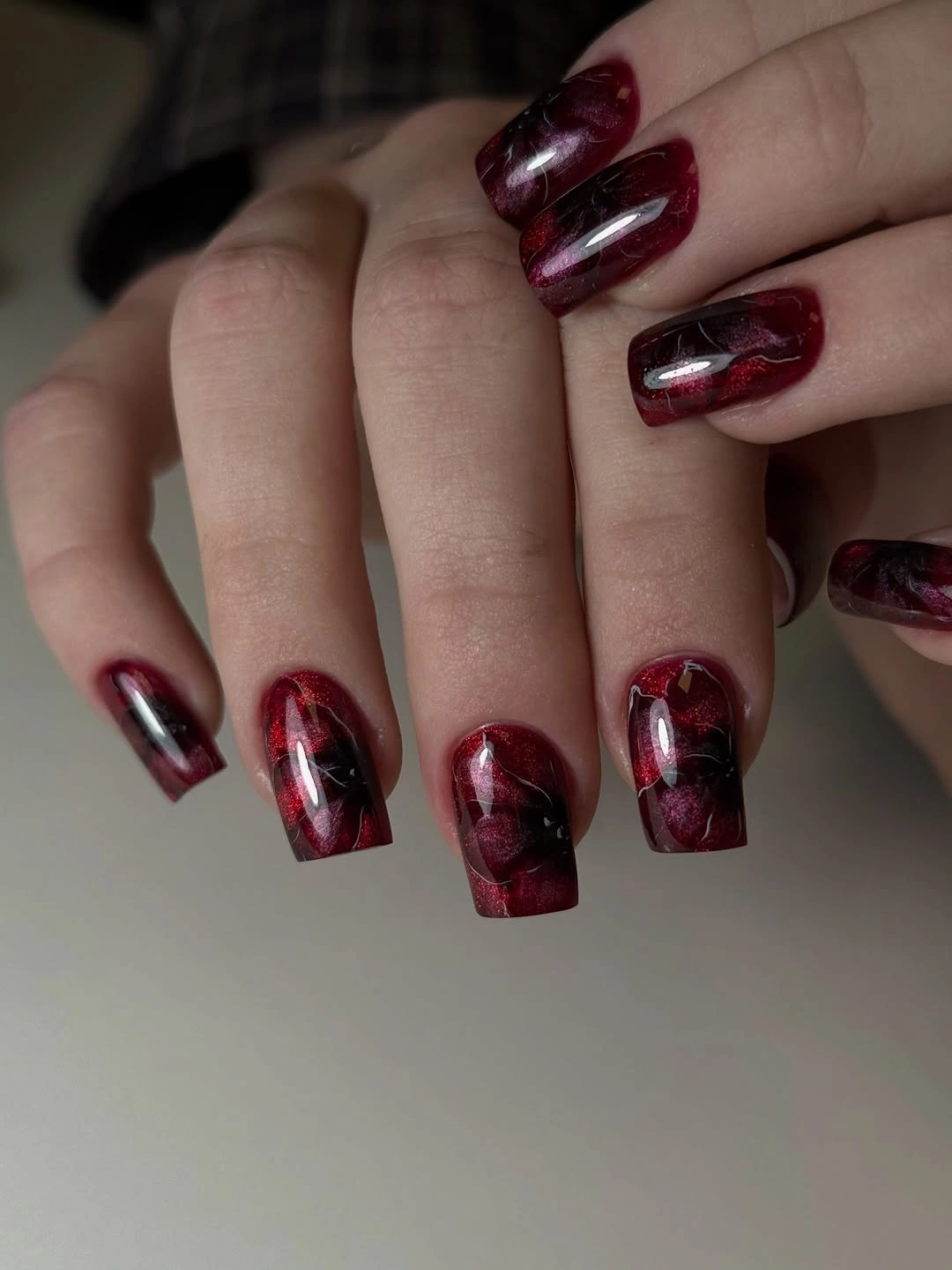
Same-family contrast keeps the manicure cohesive. Dark red anchors the composition, crimson-looking areas add movement, and the short square edge stops the tonal pattern from becoming overly dramatic. A single marbled accent nail would create an even quieter version, leaving the remaining fingers glossy and plain.
Layered tonal patterns may look less crisp as they grow out because there is no pale border to define the changes. Keep the patches broad enough to read and avoid forcing a perfectly matched repeat on every nail. The strength of the idea lies in depth within one color family, not in exact symmetry.
French edges meet abstract burgundy accents
Medium square-coffin nails mix pale pink bases, burgundy tips, solid wine fingers, and two abstract red-white accents. Burgundy repeats in more than one placement, which gives the varied set a common thread even though not every nail follows the same construction. The result is expressive but still organized because the dark red remains the dominant visual language.
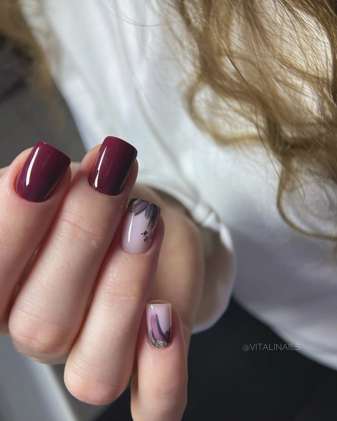
Repetition is what prevents the manicure from feeling like separate ideas placed together. The burgundy tip echoes the solid burgundy nail, while the lighter accents introduce a small amount of movement and keep the pale bases from looking plain. For a simpler version, keep the French edges and remove the abstract marks; the color relationship will still hold.
Mixed designs need consistent proportions. If one abstract accent grows too large or the tips become too heavy, the set can lose its visual breathing room. On a shorter nail, use burgundy on the edge and one accent finger only, letting the repeated color do the connecting work instead of adding more motifs.
Medium-short burgundy ends on a practical note
The final look returns to a medium-short square silhouette with a solid glossy burgundy surface. The dark red still feels rich, but the compact length reduces the visual weight seen in the longer almond and square examples. With no art competing for attention, the set becomes a practical endpoint for the collection’s central color story.
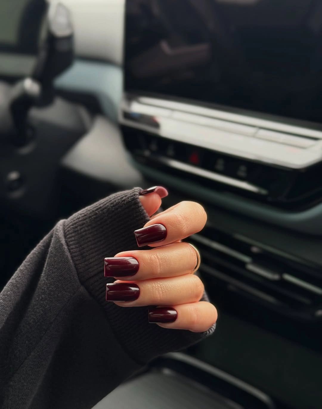
Shortening the shape does not erase the atmosphere; it simply makes the wine color easier to live with and easier to style beside ordinary clothing. A rounded corner could make the silhouette softer, while a slightly redder or brown-toned burgundy could adjust the intensity. The important decision remains the same – keep the surface clean and let the color stay deep.
Solid dark polish still benefits from tidy edges because any chip will contrast with the surrounding skin or fabric. That is a manageable limitation compared with the daily demands of extra length, and it shows why proportion is part of design rather than an afterthought. A medium-short burgundy set can hold the mood, the shine, and the season without needing one more detail.