

Fall short coffin nails designs solve a small but familiar style problem: how to make a compact shape feel intentional without piling detail onto every finger. The coffin edge already creates a strong outline, so the manicure becomes more interesting when color, spacing, or one unexpected accent is allowed to take the lead. That kind of editing keeps the result expressive while leaving enough room for the shape to remain practical.
The most useful choice is often the one you can still recognize after removing one element. A bright edge can survive without glitter, a soft base can hold one sharp mark, and a bold shade can look considered when its companions stay quiet. Start with the feature that gives the set its character, then reduce anything that hides the short silhouette or makes ordinary upkeep feel like a second project.
Mint and blush stars on a compact shape
Pale mint and blush pink share the short coffin outline here, with mint concentrated on selected tips and soft pink carrying tiny white stars and curved marks. The cool colors stay light against one another, so the design reads playful rather than loud, and the small scale of the motifs respects the limited nail length. It is a good example of letting color blocking create structure before adding decoration.
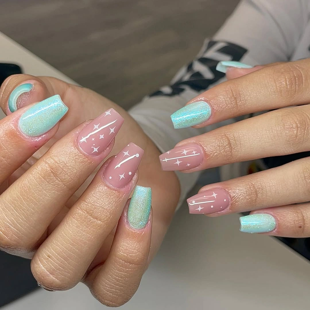
The set works because the eye can find a repeated pattern without seeing the same nail copied exactly. Mint gives the brighter edge, pink provides a quiet field, and the little white marks connect the two without becoming a competing stripe. If you want a more autumnal direction, keep the arrangement and shift mint toward muted sage or dusty blue while leaving the blush base soft.
There is a practical limit to this kind of small detail: stars and fine curves look crisp only while their edges remain distinct. Keeping the motifs on two or three nails would make the idea easier to maintain and would preserve the same playful balance. The short coffin shape already supplies enough definition, so adding more symbols would probably make the manicure feel busier instead of more finished.
Dusty pink softened by two marble accents
A dusty pink base makes this short coffin set feel calm, while two accent nails introduce cloudy white swirls with bright pink and blue-purple touches. The marbled areas are busier than the solid companions, but their placement is limited enough that the overall manicure still looks organized. Because the base color returns across most fingers, the abstract accents feel like a deliberate interruption rather than unrelated samples.
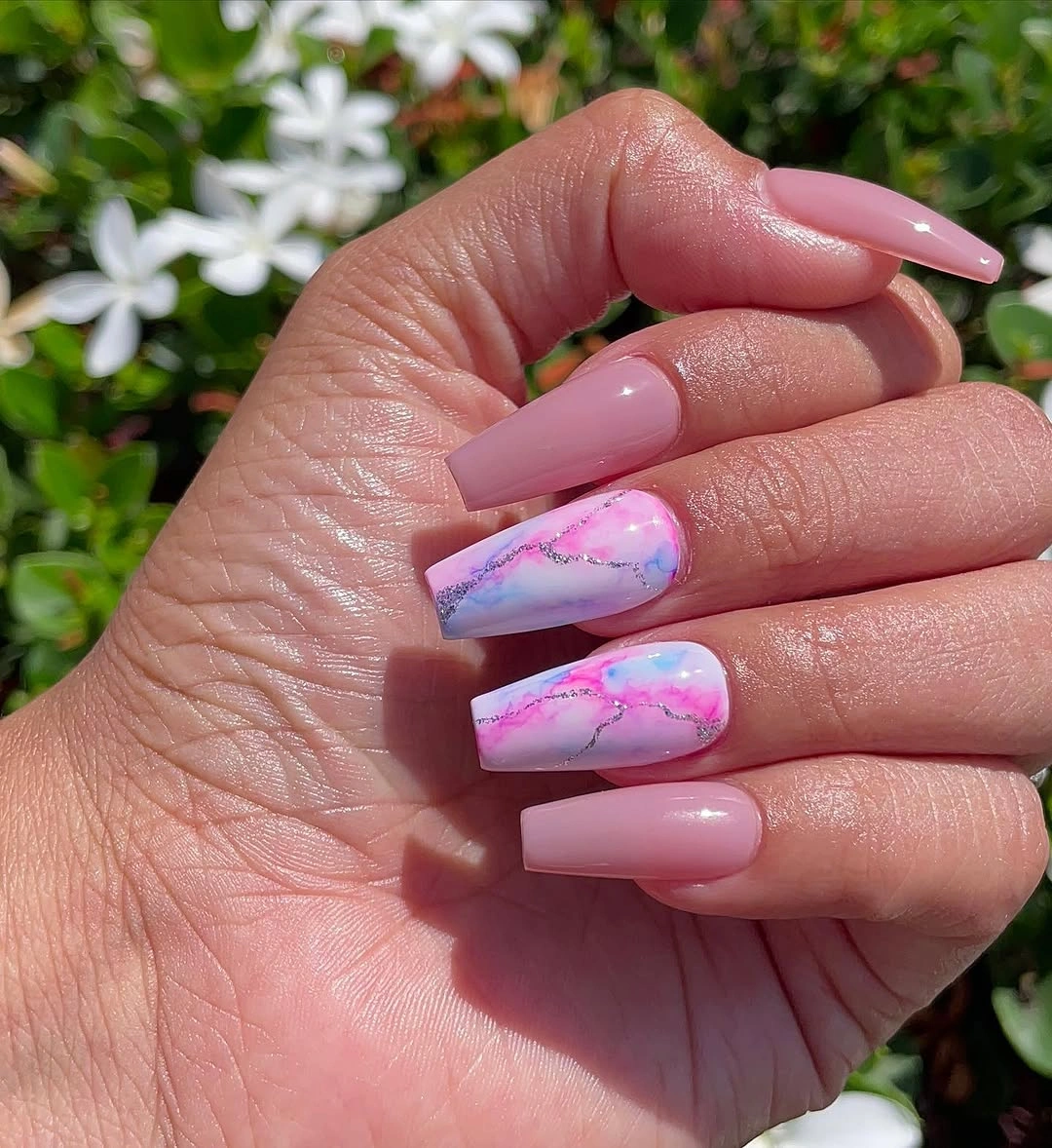
The contrast is strongest where the pale pink meets the brighter blue and fuchsia movement, so the accents become the visual center without needing a separate metallic or glitter finish. A reader adapting this set could retain the two-accent ratio and trade the cooler blue for olive, cocoa, or a softened berry. That keeps the composition recognizable while making the palette sit more comfortably beside fall clothing.
Marbling has an honest tradeoff: each accent can vary, and the swirls may not land with identical density on both hands. That irregularity is part of the charm, but a short version will look cleaner if the base remains mostly solid and the accent areas do not climb too far toward the cuticle. The compact coffin edge then stays visible instead of disappearing inside the pattern.
Angled white edges with one glitter nail
Sheer pink centers, crisp white diagonal tips, and one silver-flecked nail give this short coffin manicure a graphic personality. The white does not simply follow a conventional horizontal French edge; it cuts across the tip and creates direction, while the glitter concentrates the brightest texture on one finger. That combination makes the design feel detailed without covering every nail in an equally strong element.
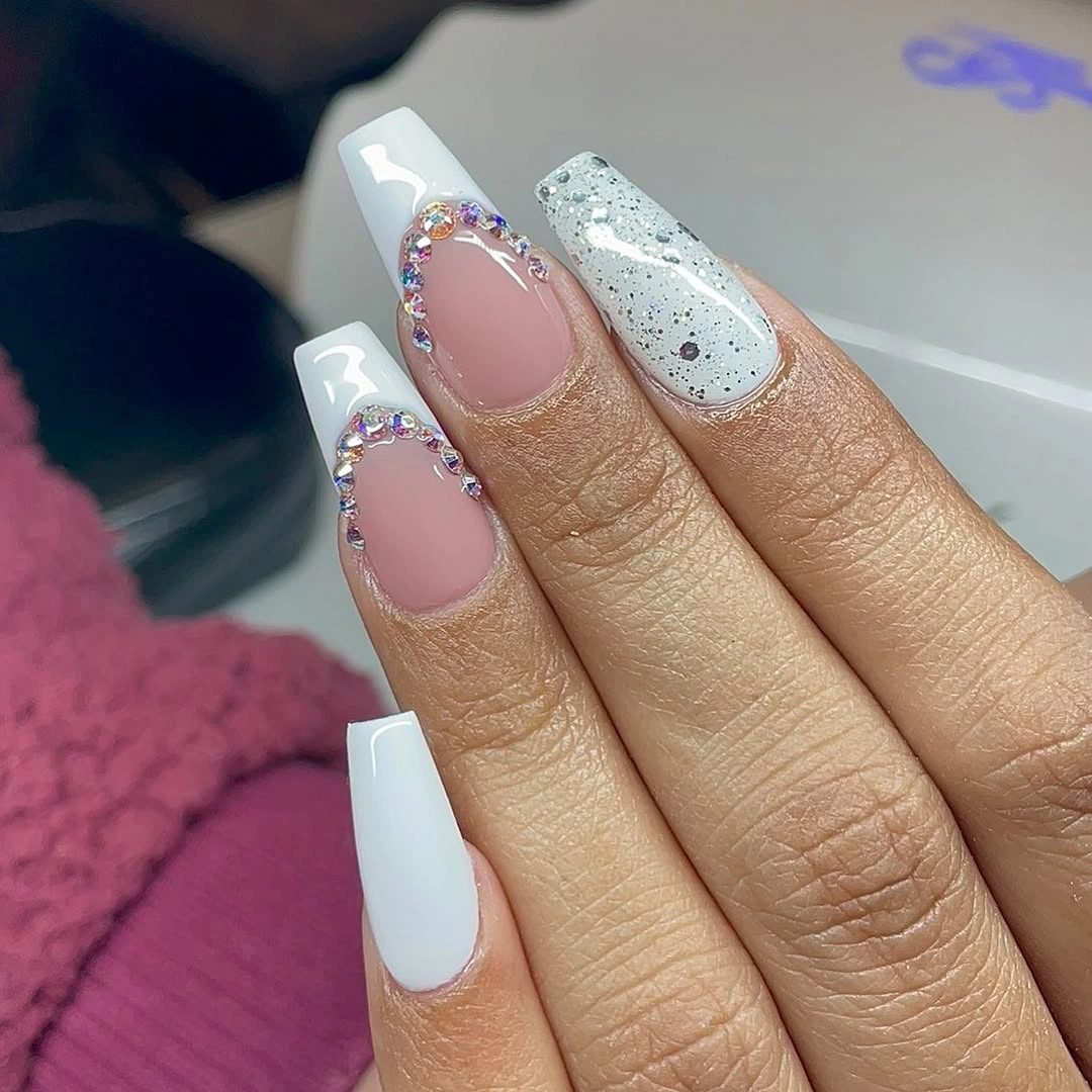
The slanted edge is useful because it adds a sense of length through movement rather than actual extension. Negative space around the white sections keeps the pale pink visible, and the single glitter surface acts as a pause between the sharper lines. For a softer version, use a warm cream edge or champagne sparkle, but keep the diagonal placement so the manicure retains its defining rhythm.
Precision matters more here than the number of colors. An angled border can show growth or small chips quickly, especially when the rest of the nail is translucent and the edge remains exposed. If upkeep needs to be simpler, reserve the crisp diagonal for two accent nails and use a narrow straight tip elsewhere; the idea will still read as graphic, only with less pressure on every line.
Quiet nude bases warmed by scattered accents
This pale nude set uses small warm brown-gold patches and outlined details rather than a dense fall pattern. Most of the nail stays light, and the accents appear in different positions, which gives the manicure a handmade, collected feeling without asking the short square-coffin shape to carry heavy decoration. The result is seasonal through warmth and contrast, not through a literal leaf or pumpkin motif.
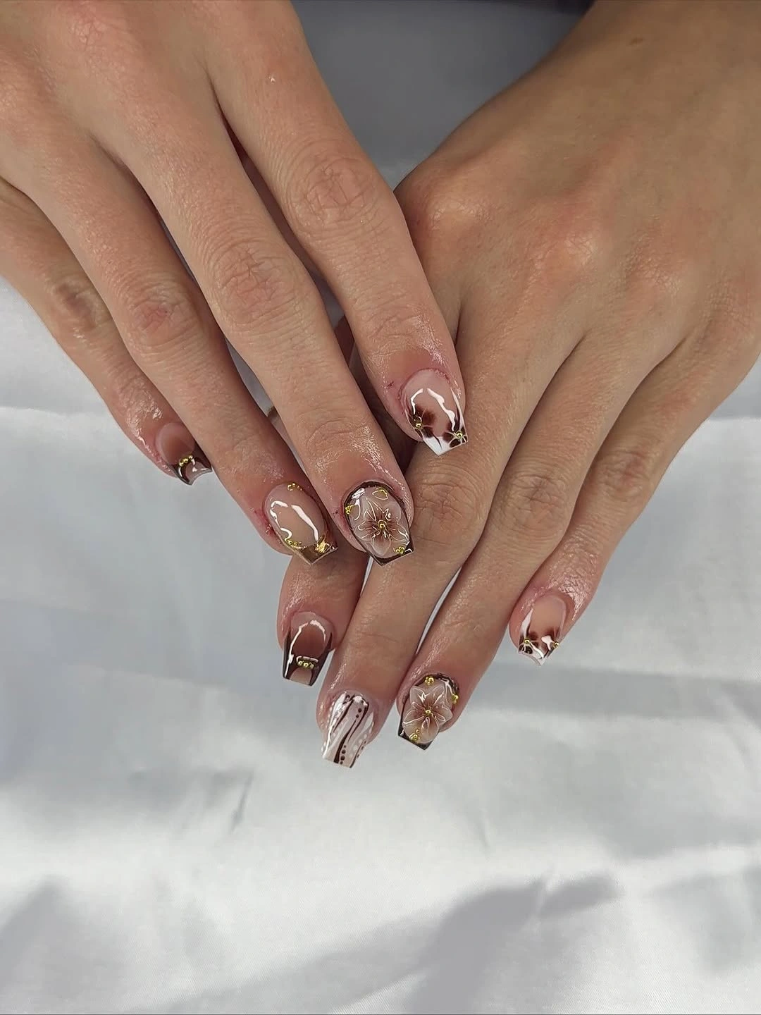
The low-contrast base is doing important work: it leaves enough visual air around each small mark for the eye to register the variation. Warm accents also bring a little depth to a pale manicure without forcing a dark red or brown color across every finger. You could make the set more consistent by repeating one copper-toned detail on two nails and leaving the rest nearly bare.
Because the accents are small and irregular, they may be the first part to look tired when the edges begin to grow out. A shorter adaptation should keep the marks close to the free edge or replace them with one simple curved line that is easier to refresh. The design is strongest when it stays restrained; adding more scattered pieces would weaken the quiet balance that makes the pale base wearable.
Lavender blocks and glitter against soft pink
Lavender, sheer pink, white, and violet sparkle share the short square-coffin silhouette in this more jewel-toned idea. Purple appears in both solid tips and glitter panels, while the softer pink sections prevent the color from becoming one dense block. The repeated lavender link is what makes the varied placement feel intentional, even though individual nails use different amounts of color and sparkle.
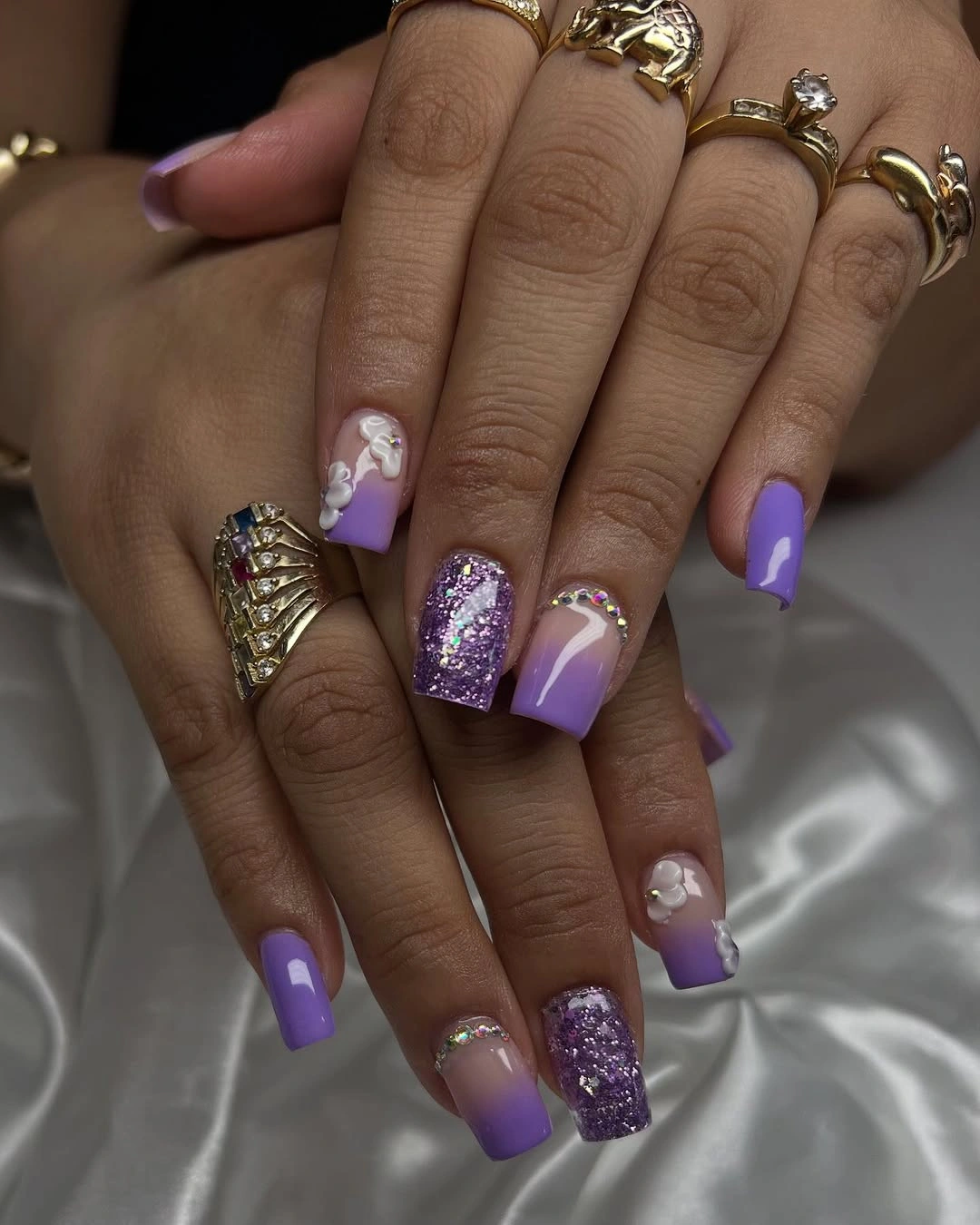
A cool statement shade becomes easier to wear when it is echoed rather than isolated. Here, the eye moves from a lavender tip to a purple glitter accent and back to a pale base, so the manicure has a path instead of a single loud focal point. If you prefer less sparkle, leave the glitter on one nail and use a glossy lavender edge on the companion accent for a similar color relationship.
Glitter changes the upkeep conversation because it draws attention to the exact border where it begins and ends. The short length helps keep the set grounded, but an uneven panel can look more obvious than an uneven solid nail. A careful edit is to keep the sparkle toward the tip and leave the center pale, preserving both the compact outline and the visual break between saturated purple and soft pink.
Tiny flowers on a blush pink field
Small pink flowers and warm dot-like details sit over a pale blush base in this delicate short manicure. The motifs appear near tips or side areas rather than filling the entire nail, so the surrounding pink remains visible and the square-coffin outline stays easy to read. Nothing relies on a loud contrast; the interest comes from scale, placement, and the small shift between the flower centers and petals.
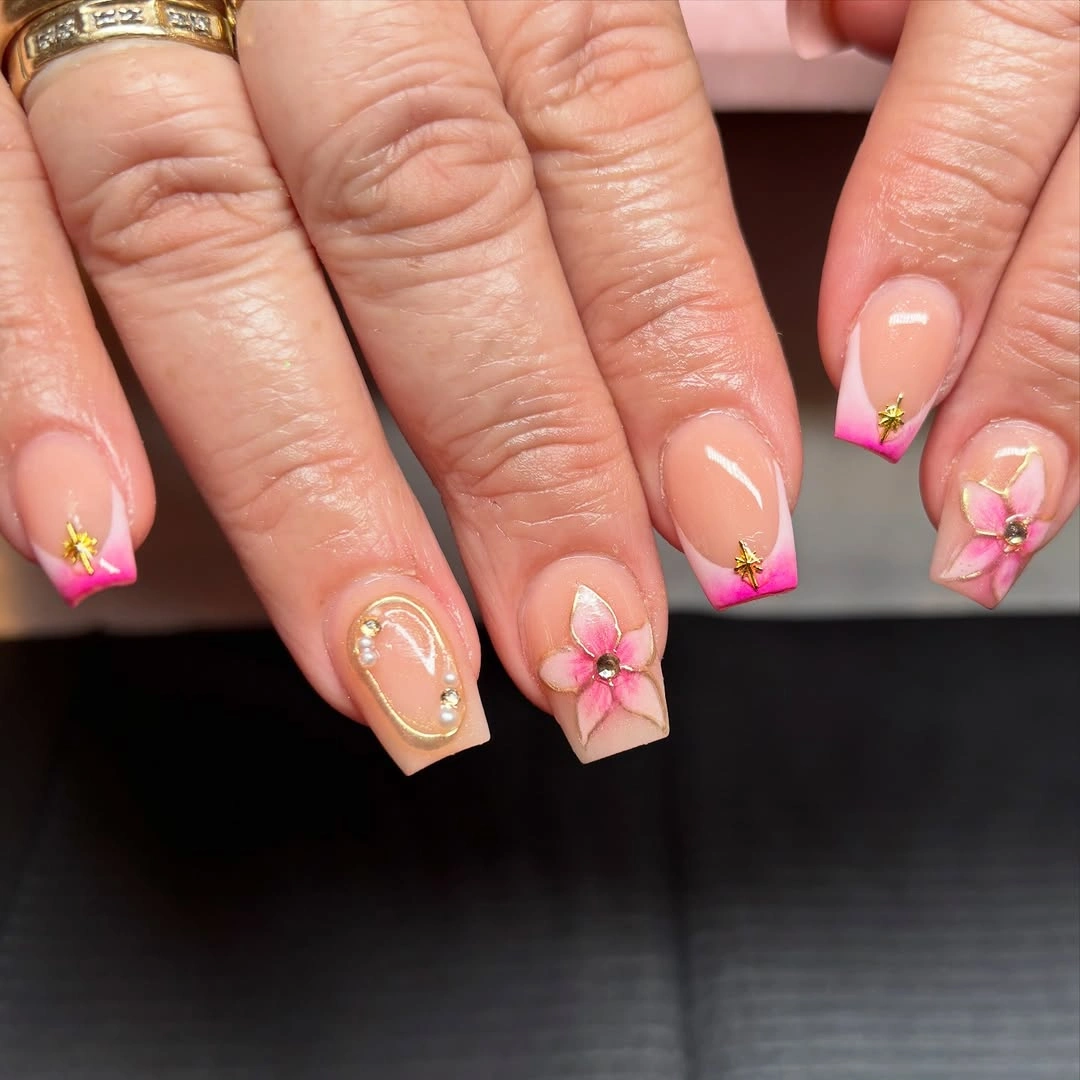
This is a convincing way to use floral detail on short nails because the flowers are treated as punctuation, not wallpaper. The soft base makes the set feel light, while a warmer dot gives each motif a little definition against the pink. For an even simpler fall version, place one small flower on the ring finger and let the other nails remain a clean blush or muted rose.
Fine petals are visually pretty but not especially forgiving once their edges soften, so the design benefits from a modest motif count. Keep the flowers separated from the cuticle and avoid crowding the corners of a short tip; that leaves room for normal growth before the pattern begins to look compressed. The quiet base should remain the main field, with decoration serving the shape rather than competing with it.
Hot pink tips over a sheer base
Bright fuchsia is concentrated along the free edge of these short square-coffin nails, while the rest of each nail remains a sheer pink. That narrow band gives the manicure immediate contrast without covering the whole nail in a saturated color. The idea is simple, but the strong edge makes the compact shape look deliberate and turns a plain base into a clear color statement.
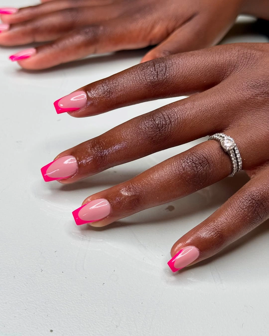
The design works through concentration: the strongest color sits exactly where the eye expects a tip, and the pale center keeps the overall set open. A deeper berry, muted orange, or burgundy edge could shift the mood toward fall while preserving the same construction. That makes the idea more adaptable than a full bright set, especially if you want color that still leaves room for neutral clothes and jewelry.
Tip-only color also comes with a visible growth line, particularly when the base is very pale and the fuchsia is highly saturated. Keeping the border narrow and even will help the short shape stay balanced, while a slightly softer curve can be more forgiving than a perfectly rigid edge. There is no need to add extra art; the contrast between sheer center and vivid tip already supplies the design.
Navy framing a pale pink center
Deep navy forms a dark frame around pale pink centers in this short coffin manicure, with slim blue edges defining the outer contour. The design feels graphic because the dark color is placed around the nail rather than spread evenly across it. The light center keeps the compact silhouette from becoming visually heavy, creating a clear contrast between structure and open space.
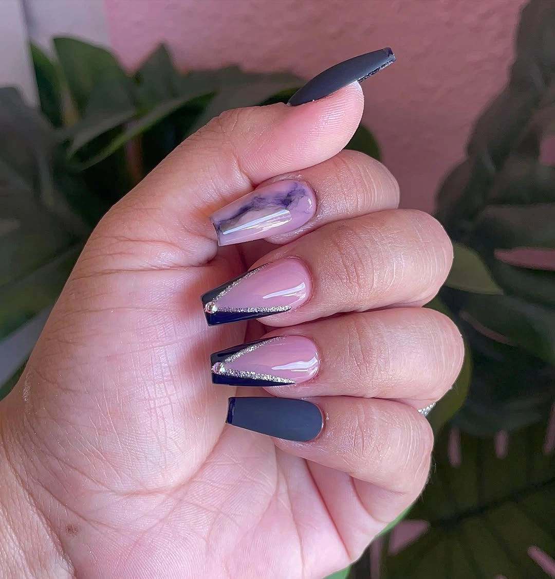
The framed effect is useful when you want to wear a deep shade but do not want a fully dark manicure. Navy supplies the autumn depth, the pink center softens it, and the repeated border gives every nail a common visual language. A burgundy frame with a taupe center would be an easy seasonal substitution, although keeping the center light is what preserves the airy quality.
Crisp borders ask for more maintenance than a solid color because the frame needs to stay even on both sides. If the design is adapted to an even shorter nail, narrow the navy to the tip and one side rather than trying to preserve a thick outline. That change reduces visual weight while keeping the important idea – a dark edge surrounding a gentler center.
Minimal French lines with a tiny motif
A sheer nude base and light French edge keep this short square-coffin manicure classic, while a small outlined accent near one center adds personality. The decorative mark is used sparingly, and the pale foundation gives it enough room to be seen without changing the calm character of the set. The defining choice is restraint: one small motif is allowed to stand out because the rest of the manicure stays quiet.
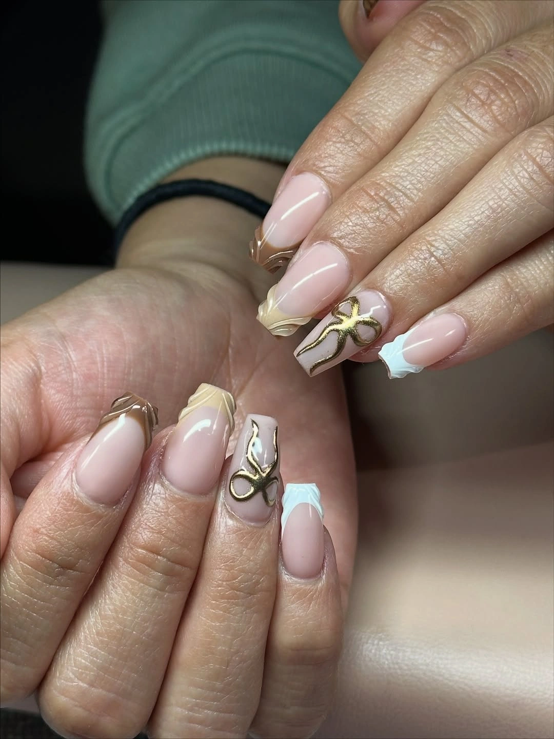
The light tip and translucent-looking base create a clean frame for a small detail that might otherwise feel fussy. If the accent resembles a butterfly, bow, or another airy outline, its exact identity matters less than its scale and placement; the eye reads it as a personal mark rather than a full illustration. A simple dot or leaf-like curve could replace it while preserving the same one-detail logic.
This approach is forgiving in color but delicate in line work. Tiny outlines can lose clarity first, so keep the motif away from the busiest edge and let the French line remain the stronger structural element. On a shorter version, reduce the accent to one nail and use a soft white tip on the others; the manicure will stay recognizable as minimal, not unfinished.
Muted green silver fading at the tips
These short square nails begin with a pale translucent-looking base and fade toward cool green-silver at the free edge. The finish has a fine reflective quality, but the color remains muted enough that the manicure feels subtle rather than glitter-heavy. Instead of a hard French border, the soft transition lets the short shape stay neat while giving the tips a little seasonal depth.
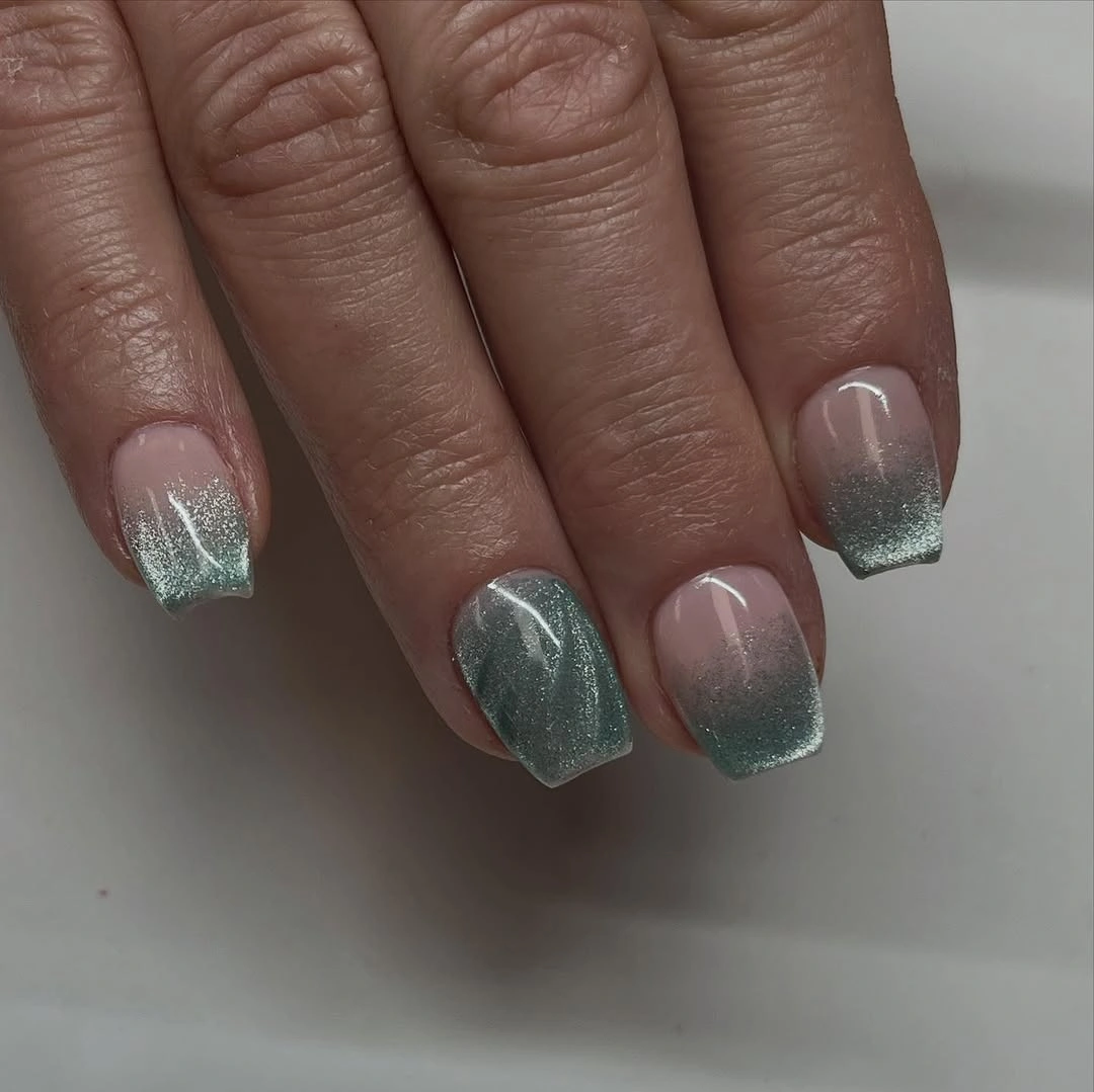
The value of the idea is its low contrast: the eye notices the cool shimmer, then returns to the pale base without encountering a strong graphic stop. A warmer champagne or bronze could take the same fade into a different fall direction, while a gray-green version would keep the restrained mood. The important part is the gentle edge, not a specific metallic label.
Soft transitions are less exacting than bold lines in one way, yet they can reveal unevenness when the color stops at different heights. Keep the fade shallow and concentrated near the free edge so normal grow-out does not create a large empty band. The look is strongest as a trace of cool light on a short shape, not as full shimmer across the whole nail.
Dark brown curves on a short silhouette
Deep brown covers these short rounded-square nails, while curved bands create a sculptural-looking rhythm across the dark surface. The palette stays nearly monochrome, so the design depends on the way the lines bend and overlap rather than on a contrast between bright colors. That gives the manicure a richer fall mood while keeping the short outline visible under the dark finish.
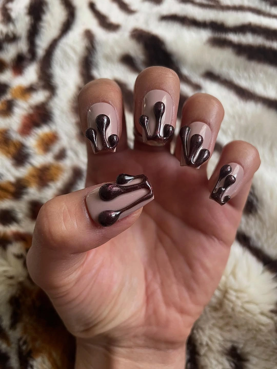
A monochrome design can feel detailed when the finish and line direction change the surface, even if every visible tone remains close. The curved accents make the eye travel across the nail, and the espresso base gives the set a grounded quality. For a lower-profile adaptation, use flat brown line art over a slightly lighter cocoa base so the movement stays visible without relying on raised-looking detail.
Any accent that appears physically raised may have a different practical feel from a flat line, so it is better to treat the texture as a visual cue rather than promise a specific construction. Dark curves can also catch light unevenly and expose chips at the edges. Keeping the pattern on two accent nails would reduce that risk while allowing the short shape and deep brown color to remain the main story.
Diagonal black bands sharpen nude centers
Sheer nude centers are crossed by black and white diagonal bands in this sharply graphic short coffin design. The dark edge has a textured-looking finish on some nails, while the white line keeps the split readable and prevents the black from swallowing the whole tip. Because the direction repeats across the set, the pattern gives the short silhouette a sense of movement and visual length.
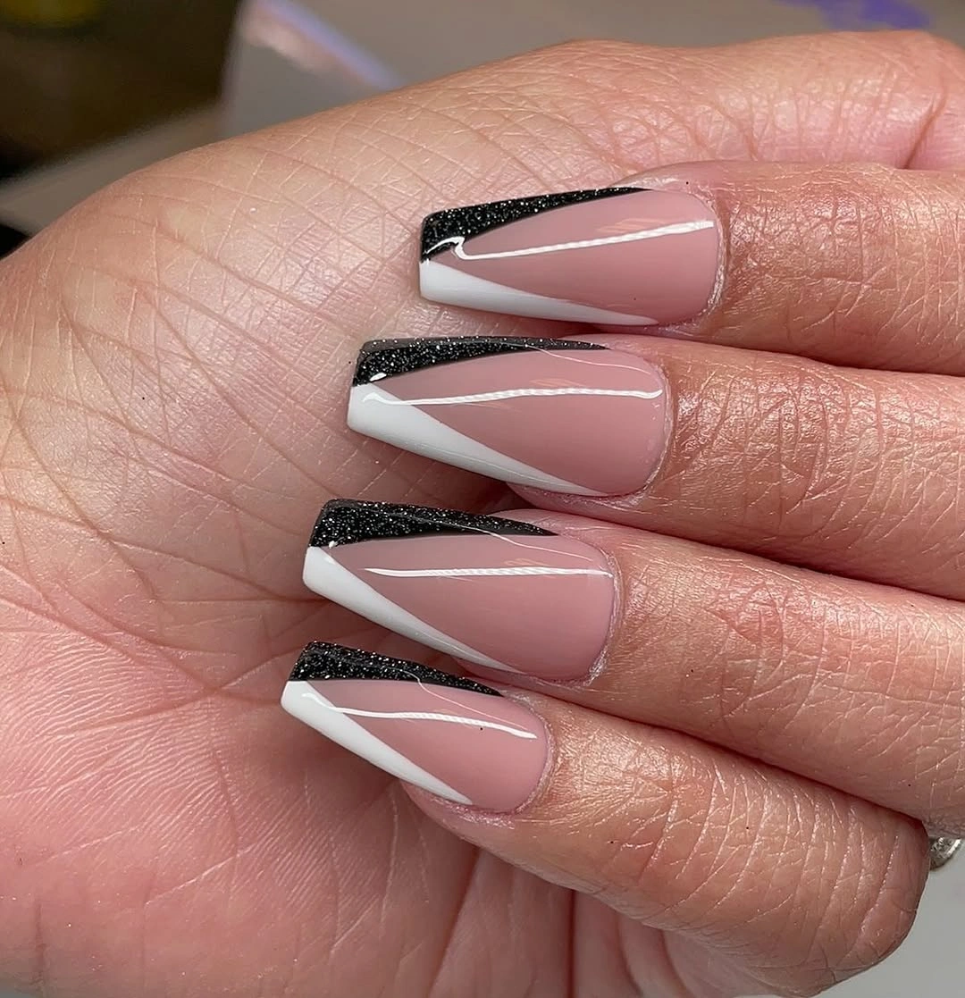
Diagonal placement is doing more than adding decoration: it directs the eye from one side of the tip to the other and makes the compact shape feel less static. The nude center supplies negative space, so the monochrome contrast stays crisp instead of becoming a solid dark block. A brown-and-cream version would soften the look for fall, but the angled rhythm should remain recognizable.
This is one of the more demanding designs in the collection because repeated lines reveal small differences in angle or width. If daily upkeep needs to be gentler, keep the double band on two nails and use one narrow dark tip on the rest. That edit reduces the amount of exact geometry while protecting the central idea: a light nail made directional by a dark diagonal edge.
One saturated blue across every nail
A vivid sky blue fills the short square-coffin nails in a completely solid finish, with no visible art competing with the color. The simplicity puts all the attention on the saturated shade and the compact outline, making the set a useful reminder that a single decision can be enough. Against different skin tones and an outdoor background, the blue still reads clearly as the manicure’s main event.
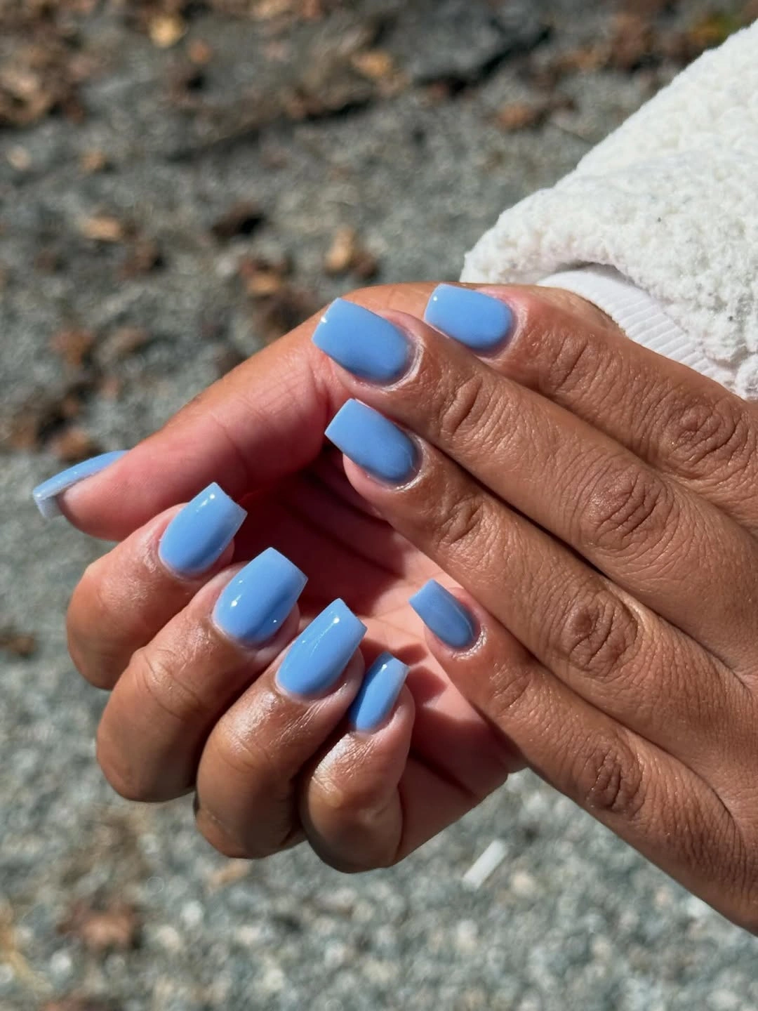
Solid color has its own kind of structure: the shape must be even, the edges must be clean, and the shade must carry the mood without help from a motif. This blue feels lively rather than heavy, so it can replace the expected autumn brown while still working with denim, gray, or simple black clothing. A muted teal or slate would keep the same idea with lower saturation.
The tradeoff is visibility. A bright, uninterrupted surface exposes uneven edges and small chips sooner than a busy accent pattern would, so the color benefits from simple upkeep. There is no need to add sparkle or line work to make the set feel finished; the short coffin outline and confident blue already provide the necessary contrast.
Purple and pink crossed by white motion lines
Violet and bright pink move across these short nails in a blended-looking transition, while slim white curves sweep over the surface. The colors are saturated, but the white marks break the field into visible sections and give the manicure a feeling of motion. The shape appears compact enough for the palette to stay playful rather than turning into a long, overly dramatic statement.
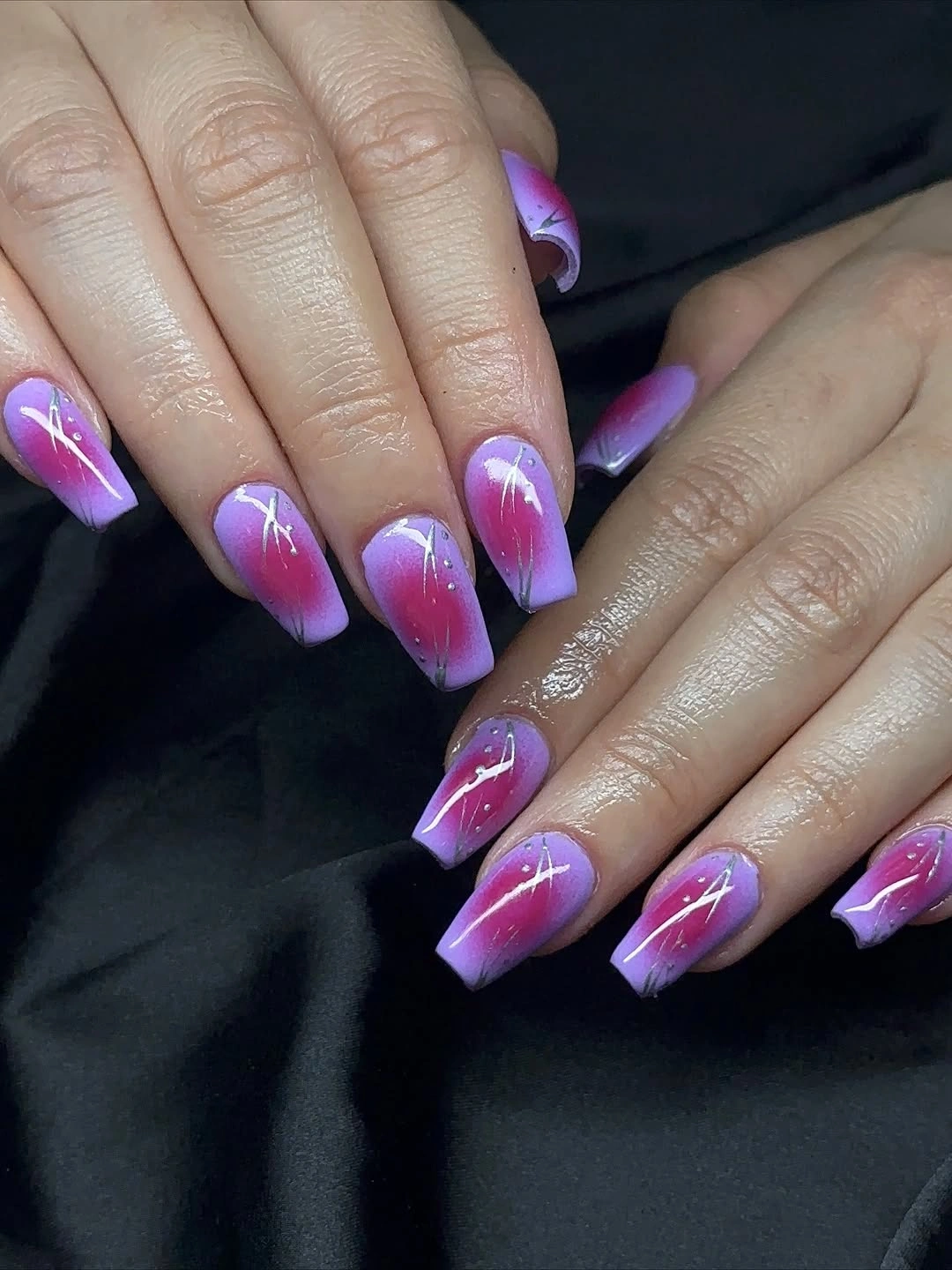
The line is the small decision that makes the color blend feel dimensional. It does not add a second competing motif; instead, it highlights the change from purple to pink and gives the eye a route across each nail. For a calmer fall adaptation, limit the blend to two accent nails and use a single berry or mauve solid color on the companions.
Color transitions can be more difficult to keep visually even than flat polish, and a pale line may expose any change in density beneath it. Keeping the curve simple and placing it only where the color shift is strongest will make the idea more readable on a shorter nail. The point is movement through one clear stroke, not a collection of unrelated marks.
Glossy red proves color can be enough
These short square-coffin nails use one vivid glossy red and nothing else. The compact outline keeps the statement controlled, while the reflective surface gives the solid color a bright focal point that a matte finish would not provide. It is a direct fall option for anyone who wants impact without flowers, glitter, French edges, or additional patterning.
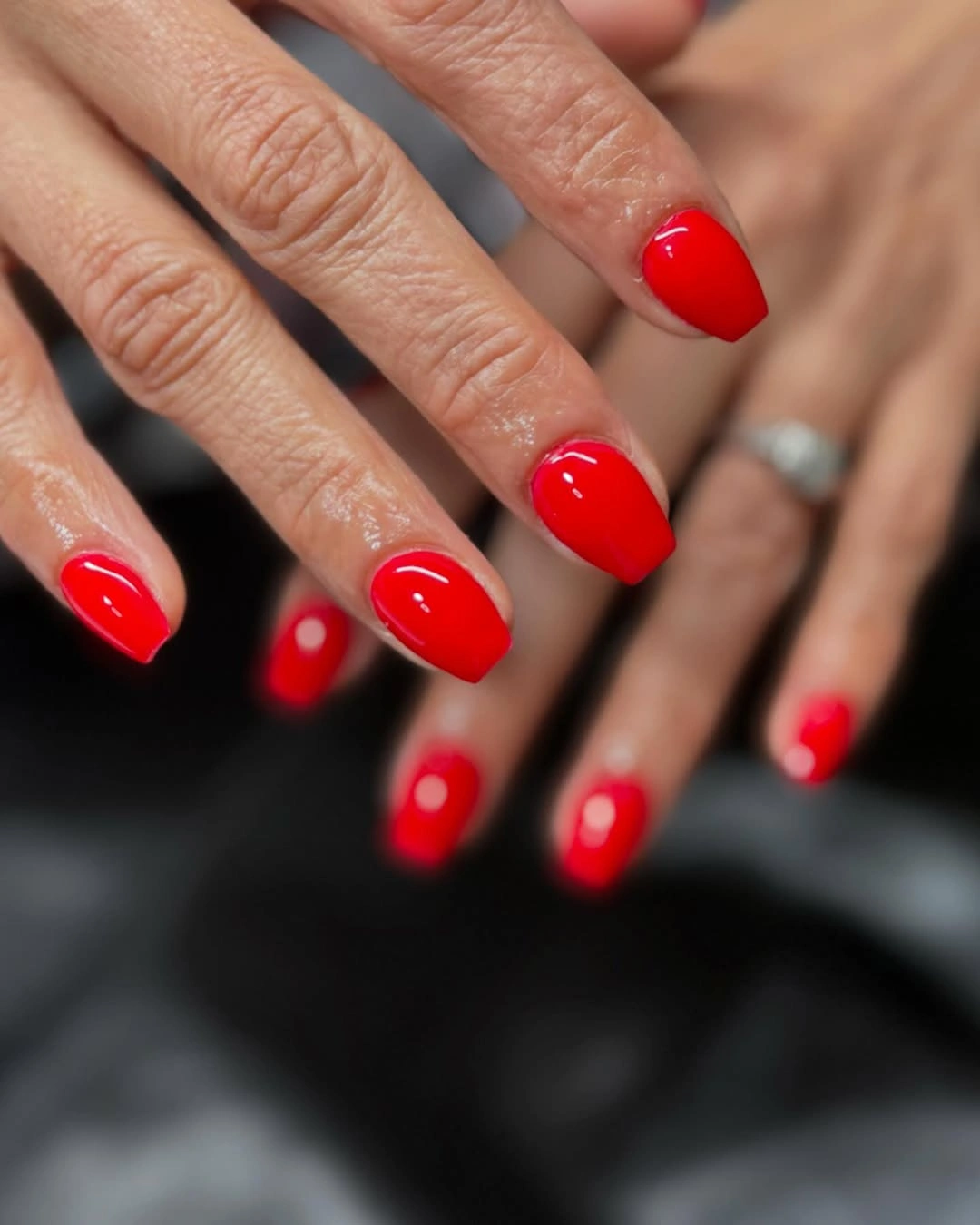
The manicure works because red is allowed to remain the main visual decision from cuticle to tip. A deeper brick, oxblood, or wine tone could shift the mood toward a quieter autumn palette without changing the structure. The short length also gives the color a more everyday balance than an extra-long silhouette would, especially beside simple jewelry or neutral sleeves.
Solid saturated red has a clear limitation: chips and uneven borders are easy to notice because there is no texture to break up the surface. Keeping the edge clean matters more than adding another design element. If you want a little variation, change only the undertone or use a slightly different red on one finger; the strength of the set comes from its disciplined simplicity.
Pale pink with a fine black outline
Soft pink fills these short square nails, and fine black curves trace selected tips or side edges. Tiny dark speckles appear near some borders, but the pale base remains the larger visual field, keeping the manicure light. The contrast is graphic without becoming heavy because black is used as a line rather than a block.
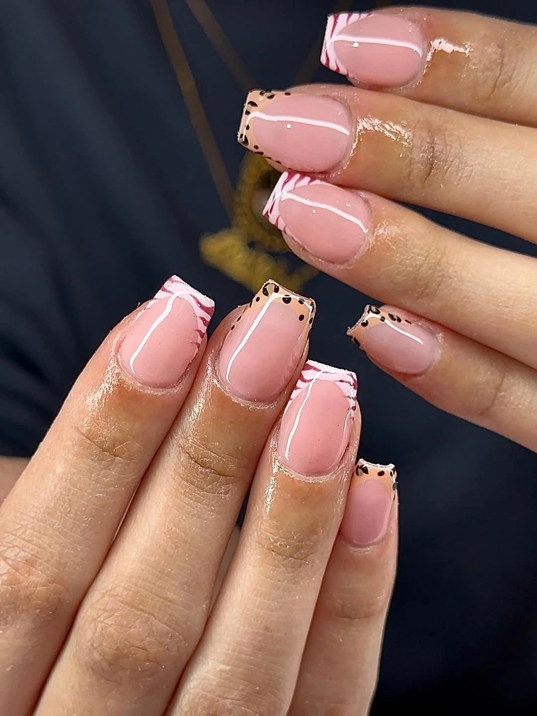
Line weight is the key to why this works. A narrow black mark can define the short shape and add a little edge without changing the gentle pink mood, while the small dot-like accents give the repeated outline an imperfect, personal quality. Brown or burgundy could replace black if you want a warmer fall interpretation with the same drawing-based structure.
Thin outlines are also the part most likely to lose clarity as the manicure grows out or catches on daily wear. Keeping the curves short and the speckles limited will help the design remain legible rather than turning into a dark border. A simpler version could place the full outline on two nails and leave the others pale pink, preserving the contrast with less maintenance.
Red solids balanced by geometric negative space
Bright red full-color nails alternate with nude panels crossed by thin white diagonal lines in this short square-coffin set. The contrast is strong, but the transparent-looking sections interrupt the red rhythm and give the eye a lighter place to rest. Instead of repeating one pattern on every finger, the manicure alternates solid color and geometry to build structure.
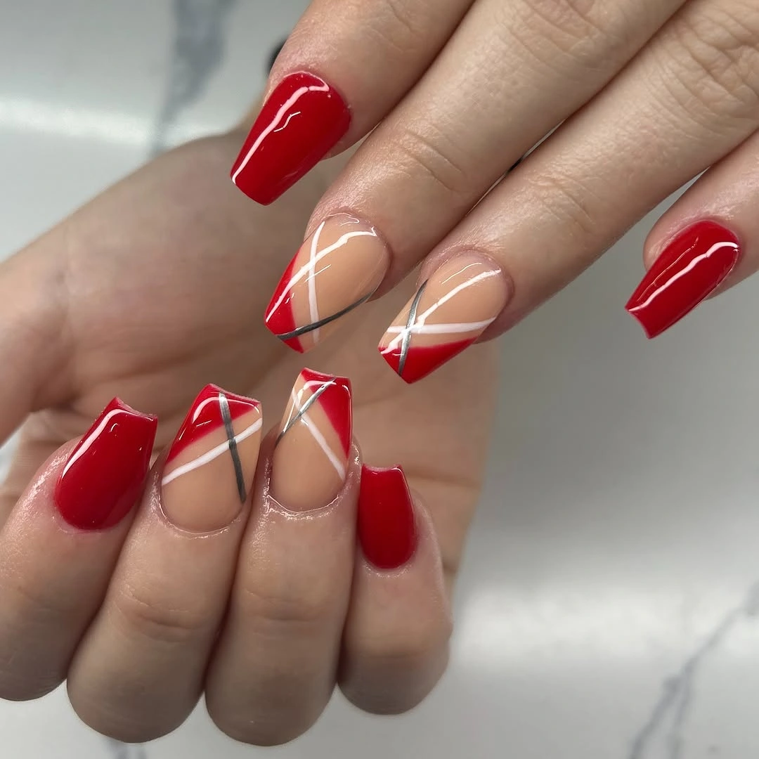
The design feels coherent because red returns in both the full nails and the geometric accents. White lines make the intersections easier to read, while the nude center prevents the darker color from filling the entire silhouette. A burgundy or rust substitution would make the set more obviously autumnal, but the same alternating sequence would keep the palette from becoming flat.
Geometric lines ask for a little honesty about upkeep: exact angles can reveal growth and small smudges quickly. A shorter version could keep the red solids and use one nude accent with a single diagonal line instead of several intersections. That edit reduces complexity while preserving the useful lesson – a bold color often looks more balanced when negative space gets a real role.
Blue illustrated accents beside solid companions
Several nails are solid blue, while pale accent nails carry curved white-and-blue marks and small playful details. The exact illustrations are less important than the visible contrast between plain color and decorated space: the set gives the eye both a calm pause and a point of curiosity. Silver-looking sparkle near one accent adds a small reflective note without taking over the palette.
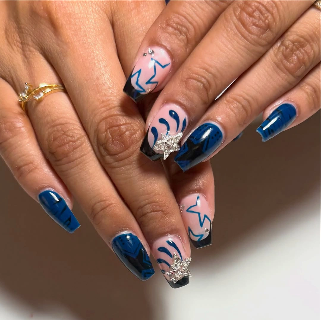
Alternating solid and art nails keeps the details readable and stops the short shape from feeling crowded. The repeated blue links the simple fingers to the lighter illustrated ones, while white creates enough contrast for the marks to stand apart. If you want a cleaner adaptation, keep the illustration on one nail and replace the others with a single curved blue line over white.
Small figures or symbols can lose definition faster than a solid color, especially near a short tip where there is less room to spread the drawing. That makes motif scale more important than adding more characters or marks. The set is strongest when the decorated nails feel like deliberate accents and the blue companions remain plain enough to frame them.
Black square French tips on nude pink
Bold black tips form squared blocks over pale nude-pink centers in this compact coffin manicure. The palette is only two colors, yet the contrast reads immediately because the tip has a clear horizontal weight and the center stays open. The result is more graphic than a delicate French edge, but the short length keeps the dark block from feeling oversized.
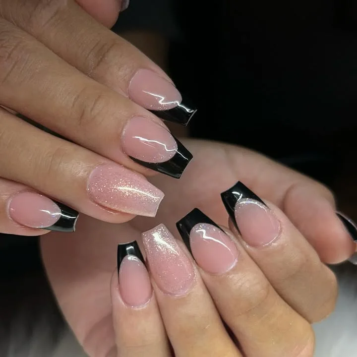
Proportion is the main decision here: the dark tip is wide enough to be seen, while the pale base prevents the entire nail from becoming visually black. A narrower line would make the look quieter, and espresso or burgundy would soften the contrast without losing the squared structure. Either adaptation keeps the design based on edge placement rather than extra decoration.
The strong border has a practical downside because chips and grow-out show at the exact place the eye notices first. Keeping the tip slightly slimmer on a very short nail can give more room for natural movement, while a clean rounded-square edge may feel less severe than a hard corner. The set does not need a motif; the black-and-nude proportion already supplies a complete idea.
Spotted brown tips over a nude base
Most of each nail stays sheer nude-pink here, while the tips carry dark brown, black, and warm amber-looking flecks. The pattern resembles a small tortoiseshell-like accent, but its practical value is clearer than its label: only the free edge is busy, so the short shape remains open. The neutral base makes the warm print feel seasonal without covering every nail in brown.
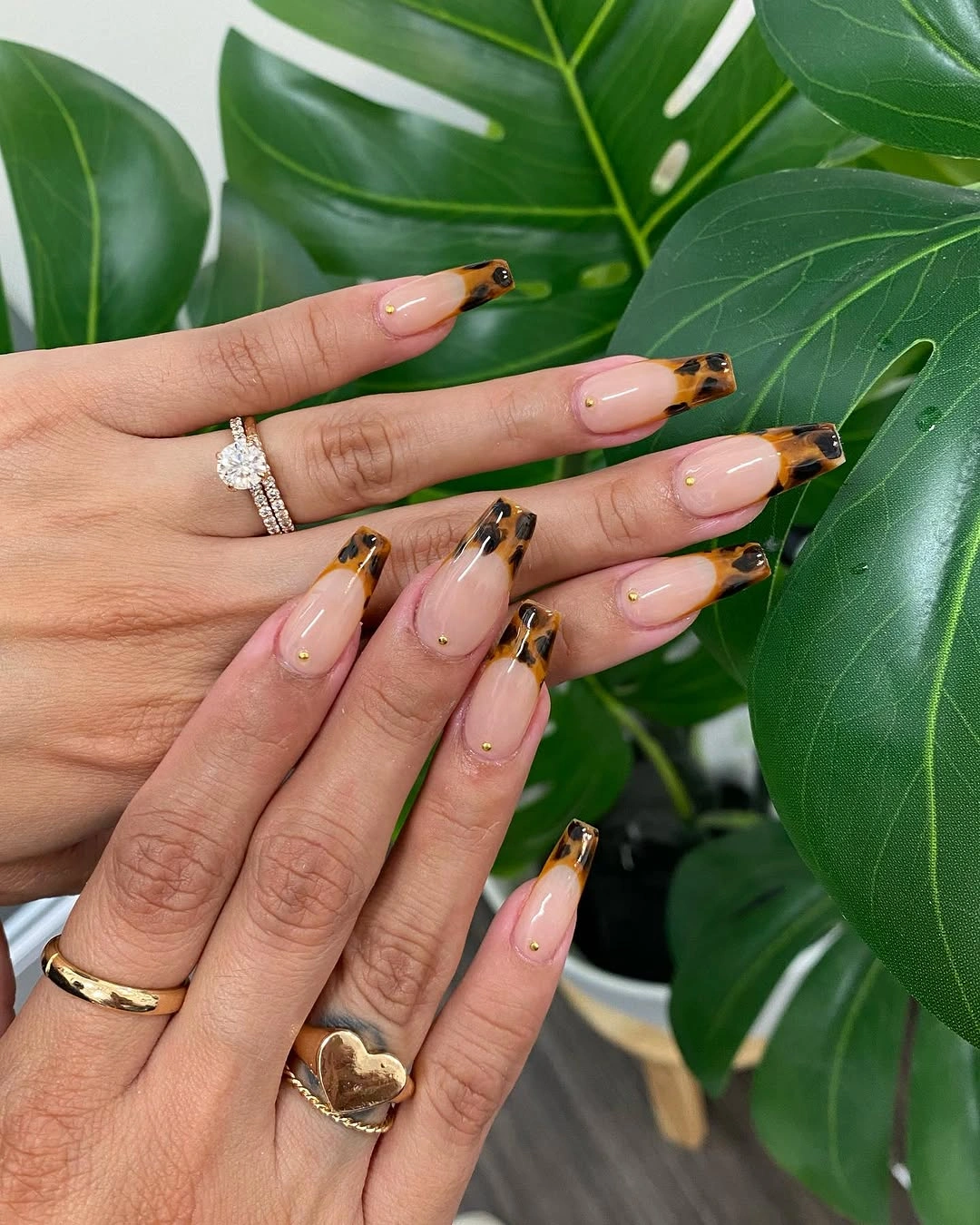
Concentrating the pattern at the tip is a smart way to borrow print without letting irregular marks dominate the hand. The brown and amber tones connect naturally to fall accessories, while the pale center keeps the manicure lighter than a full animal-inspired set. If the pattern feels too specific, replace it with a simple mottled brown French edge and keep the same narrow placement.
Irregular spots are forgiving in one sense because they do not need to match perfectly, yet their uneven boundary can look worn in patches as the tip grows. Keeping the print shallow and leaving the sidewalls pale will protect the compact silhouette. The design should be read as a small seasonal texture, not as a reason to add additional motifs across the remaining nails.
Micro dots finish a pale pink set
A pale pink base keeps this final manicure quiet, with tiny black marks and delicate edge details appearing on only a few short nails. The decoration is so limited that the soft color remains the first impression, while the dark points reward a closer look. The shape appears compact and gently tapered, making the idea suitable for anyone who wants something beyond plain polish without a full art set.
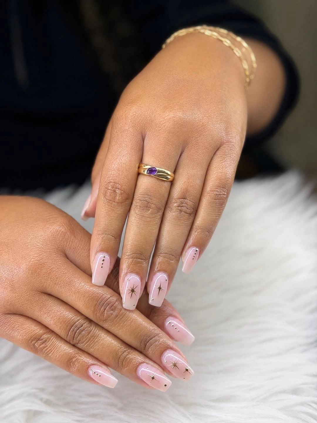
Low motif density is what gives the design its calm character. A small dot near the tip can create a focal point, but the untouched pink around it prevents the detail from feeling random or crowded. For a warmer fall edit, use a deep burgundy or cocoa mark instead of black, keeping the same sparse placement and pale field.
Because the accents are tiny, they may fade into the base before the main color looks tired, so their position should stay comfortably away from the edge. One or two marked nails would be enough if you need easier upkeep, and a single thin curve could replace several dots. The finish is strongest when the final detail feels intentional but never louder than the short pink shape.