

Dark fall nails are not one mood repeated twenty-three times. Black can look glassy and compact, brown can carry warmth, purple can sit just outside the black spectrum, and green can hold a little light around its edges. The collection becomes more useful when you watch what keeps each deep color readable: a softened corner, a sharp tip, a pale counterpoint, a reflective line, or simply enough open surface.
Use the images as a study in controlled contrast. Some sets ask the silhouette to do the talking, while others keep the shape quiet and let spots, flecks, lace-like texture, or one bright accent change the balance. The practical question comes after the atmosphere: how much length, shine, pattern, or raised-looking detail will still feel comfortable when the manicure leaves the evening setting and meets an ordinary day?
Glossy Black With a Compact Silhouette
True black does not need an additional motif in the opening set. The nails are short and softly squared, covered in a smooth high-gloss surface where bright reflections curve across the dark field. That plain treatment gives the manicure a graphic quality without drawing a line, adding glitter, or changing colors from nail to nail.
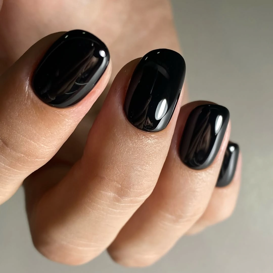
The neutral background leaves the reflections to create the movement, and the compact outline keeps the black from becoming too severe. Short corners give the color a practical frame, while the clean surface makes the manicure look intentional from a distance and precise up close. This is a strong starting point when you want after-dark energy but do not want the design to depend on a special occasion.
Gloss is also the visible limitation because chips appear clearly against true black. The repair is straightforward since there is no artwork to match, but the edge has to stay even for the set to keep its sharpness. If the contrast feels too strong, keep the shape and move the color toward charcoal rather than adding a second motif.
Inky Violet Instead of True Black
Inky violet gives the second manicure a black-adjacent depth while showing a clearer blue-purple note in the highlights. The short rounded-square nails are solid and glossy, with no visible accent or pattern, so the distinction comes from undertone and the way the color changes between light and shadow. It is a small shift, but it keeps the set from reading as a repeat of the first.
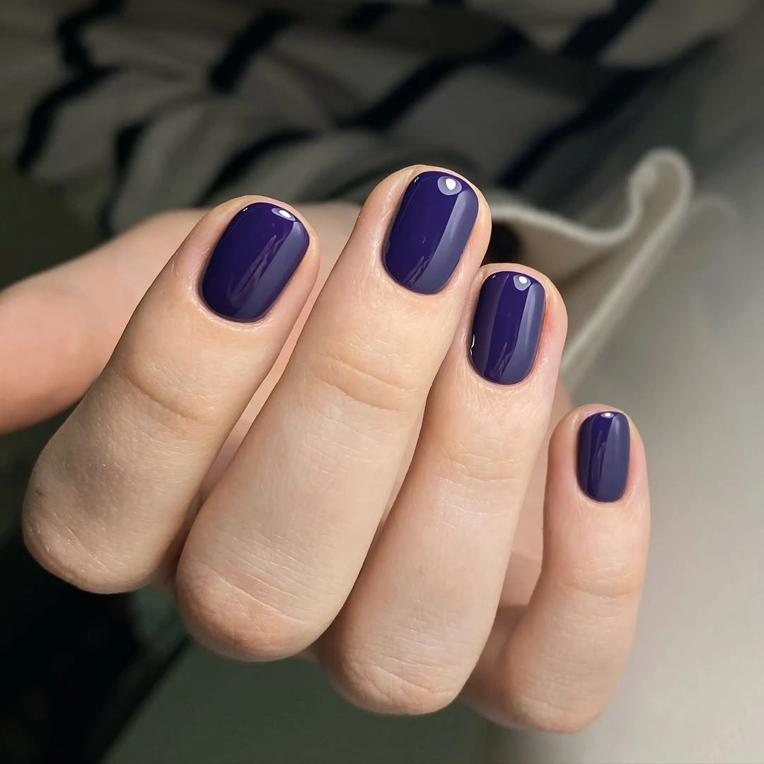
Dark fabric behind the hand supports the mood, yet the violet remains legible because the reflections are clean and the shape is compact. A short edge helps this color feel less formal than a long pointed version would, making plum or aubergine an easy direction for everyday dark fall nails. The look works best when the purple stays uninterrupted and the surrounding clothing supplies any lighter relief.
Because the surface is plain, edge wear is the main maintenance thought rather than a problem of matching a drawing. Choose a slightly warmer wine-purple if you want more autumn warmth, or keep the cool violet and pair it with gray. The useful difference from black is subtle color, not more decoration.
Plum Sparkle With a Short Edge
Dense fine shimmer gives this short purple manicure a different kind of depth. The compact rounded-square nails are saturated plum, and tiny reflective particles are spread throughout the base so the color flashes rather than sitting flat. No single nail breaks the pattern; the entire hand shares the same dark surface and the same controlled sparkle.
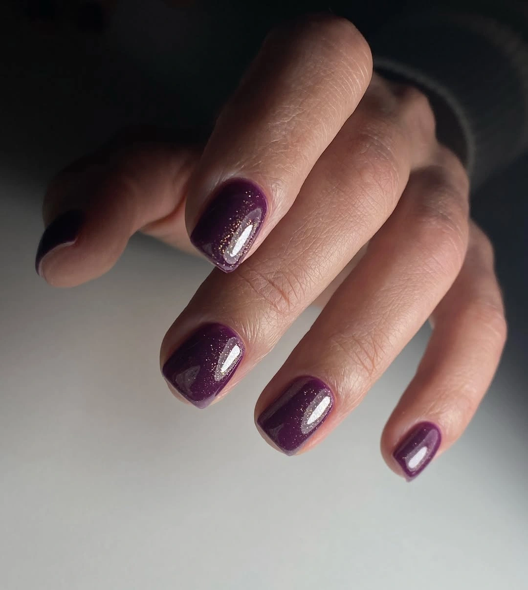
A pale gray background makes the purple and shimmer easier to separate, while the short shape keeps the glitter from becoming too theatrical. The reflective points add motion when the hand turns, but the solid base remains the strongest visual block. That balance suits someone who wants dark fall nails with light-catching interest but does not want a large accent stone or a literal graphic motif.
Fine shimmer can be forgiving of tiny surface marks, although the tips still need a clean border when the color is this deep. For a quieter version, keep the plum solid on most nails and move the sparkle to two accents. The shape can stay short because the finish already supplies enough intensity for the whole hand.
Long Black With Tiny Bright Interruptions
Long tapered black nails create the drama in the fourth image, while small white and red marks appear only near selected edges. The dark field remains dominant across the hand, and the narrow tips give the little bright interruptions a sharp graphic setting. Instead of turning the manicure into a full pattern, the details function like brief signals inside an otherwise continuous black surface.
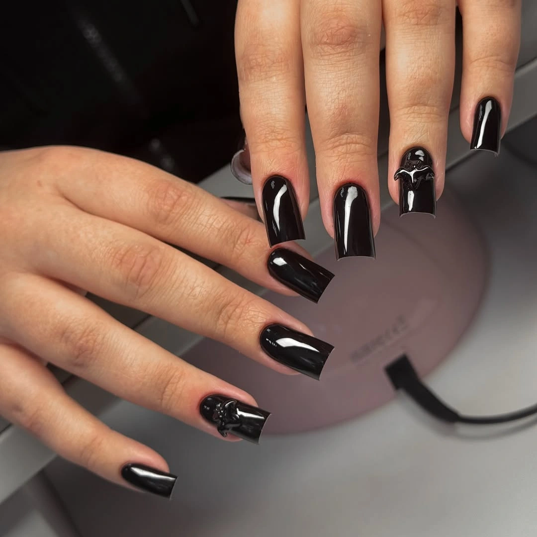
The close studio crop heightens the contrast, but the visual logic is simple enough to adapt. Keep black on most nails, use one small red or pale mark, and let the long outline provide the tension. If the length feels too theatrical for daily use, a medium tapered square will preserve the pointed direction while reducing the amount of silhouette competing with ordinary tasks.
Sparse accents are easier to simplify than full coverage, yet long corners remain the practical issue here. Marks close to the tip may need careful refresh as the edge wears, and any uneven line will show against black. The most wearable edit is less about changing the palette and more about shortening the frame around it.
Black With Scattered Multicolor Flecks
Scattered bright fragments give this short black set a loose, confetti-like surface. Tiny yellow, silver, red, and green marks appear across the compact nails, but they remain irregular and small enough that black still reads as the main field. The dark base creates the atmosphere; the flecks only break the surface when light finds them.
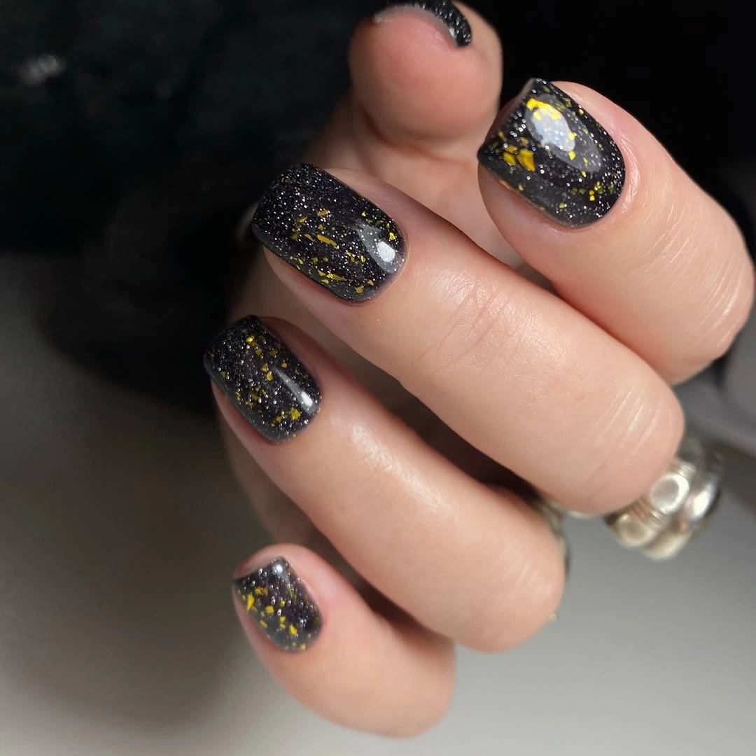
The curled hand and dark background make the fragments feel like small points of light rather than a cheerful all-over print. A short rounded-square shape helps because the surface has less room to become visually crowded, and the uneven distribution keeps the design from looking mechanically repeated. It is a useful direction when you want a dark base with a little movement but still want the manicure to feel controlled.
Reduce the number of colors if the set feels too busy, or concentrate the flecks on one or two accent nails. Irregular spacing is forgiving, although fragments near the edge can catch on fabric or make grow-out more visible. Keep black as the largest uninterrupted area and the visual tension will remain intact.
Burgundy Points as the Main Event
Burgundy becomes almost architectural in the sixth manicure because the nails are extremely long and pointed. The color is solid, glossy, and deep wine red, with no decoration competing with the narrow stiletto tips. Every visible decision supports the same direction: saturated color, sharp silhouette, and a clean surface that lets the outline feel deliberate.
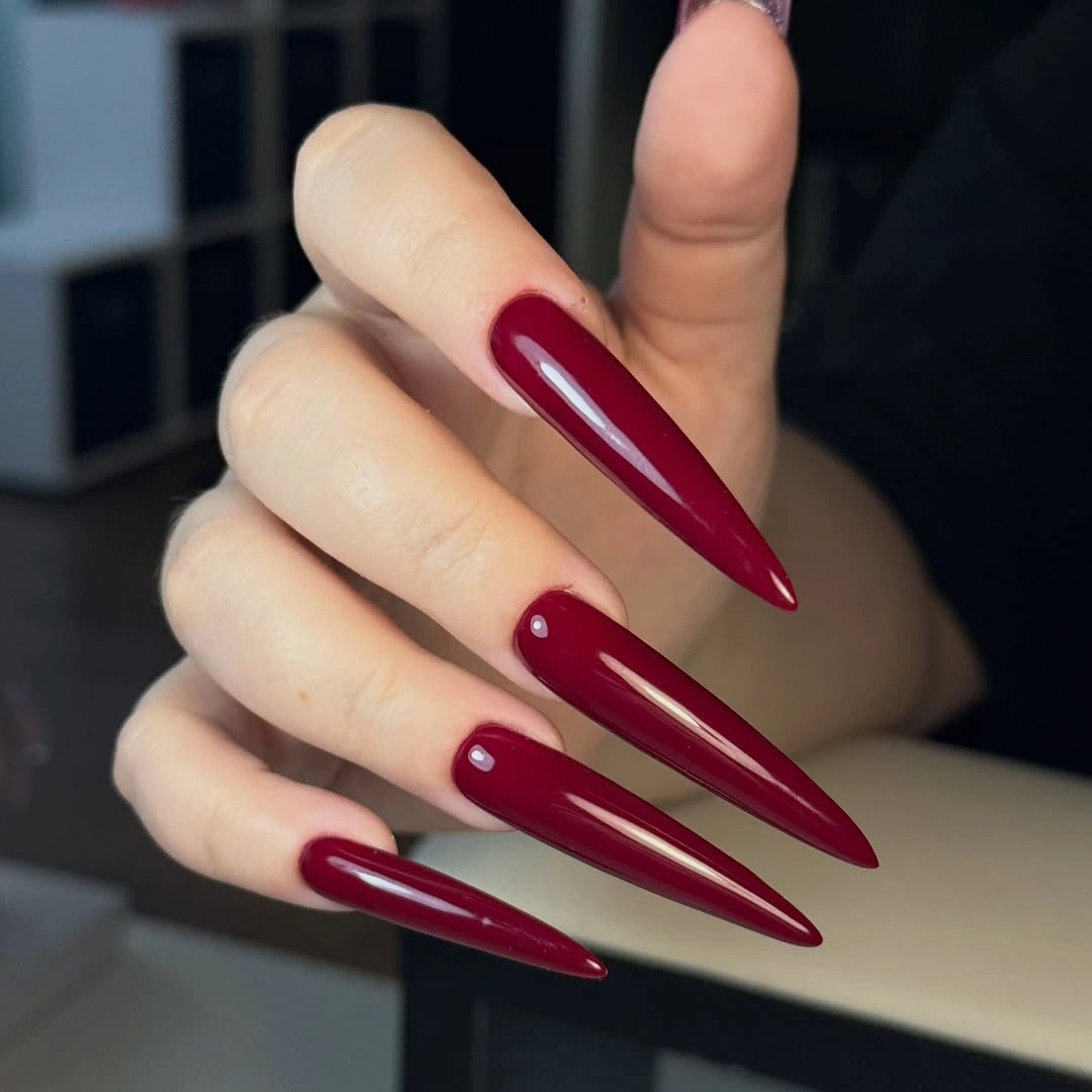
A pale background increases the contrast around the tips and makes the shape impossible to miss. That can be the appeal if you want dark fall nails to feel unapologetically dramatic, but the color itself would remain strong on a medium almond or shorter point. Moving the length down is enough to make the set more practical without losing the wine-toned mood.
Extreme tapering is the honest tradeoff here. A solid base is easy to refresh, yet the narrow length changes how the hand interacts with everyday objects and makes the tips the most vulnerable part of the look. If you are borrowing the idea, preserve the burgundy and decide on the silhouette only after considering how much point you actually wear comfortably.
Espresso Glitter in a Short Square
Dark brown glitter supplies warmth without weakening the collection’s shadowed direction. The short square nails are coated in an espresso field with dense copper-like sparkle, so the surface looks rich and textured while remaining one color at its core. The compact edge prevents the shimmer from turning the manicure into a long evening statement.
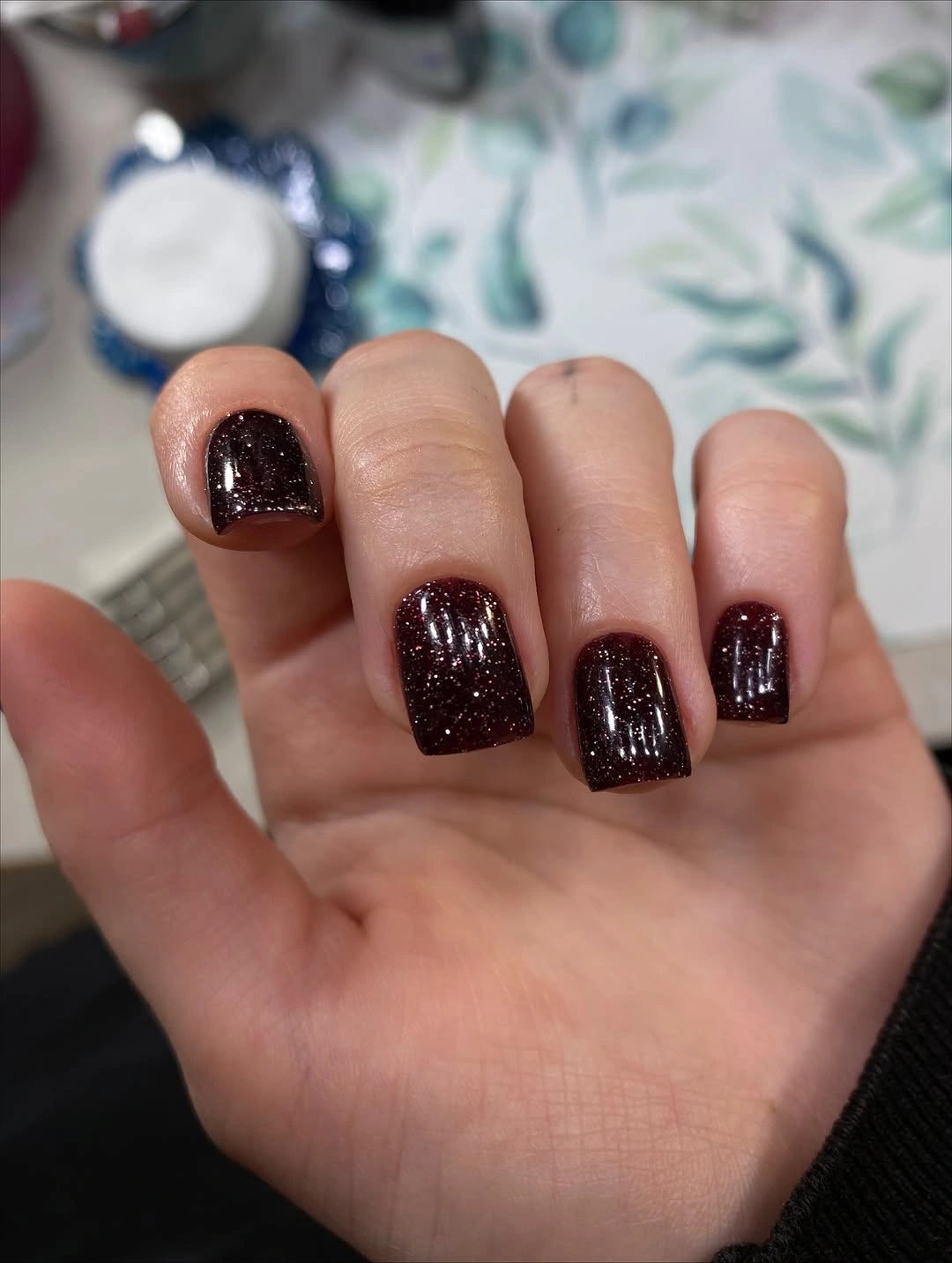
A cozy blurred background supports the brown, and the warm particles keep it from reading as flat black. The square outline gives the glitter a clear boundary, which is why the design feels neat even though the surface catches light in many places. This is a softer route into dark fall nails for someone who likes depth but wants more warmth than true black supplies.
Dense shimmer can hide a tiny mark better than a plain dark surface, but the tips still need to look even. Use bronze or muted copper rather than a brighter multicolor glitter if you want the espresso to stay central. A two-accent version can keep the short square companions nearly solid and reduce the amount of texture to maintain.
Chocolate Brown With Graphic Length
The eighth set keeps its surface completely plain and lets a long square outline make chocolate brown feel graphic. The dark brown nails carry smooth curved reflections, shifting close to black at the edges while keeping warmth in the center of the surface. That small change between light and shadow gives the monochrome manicure more depth than a flat swatch would have.
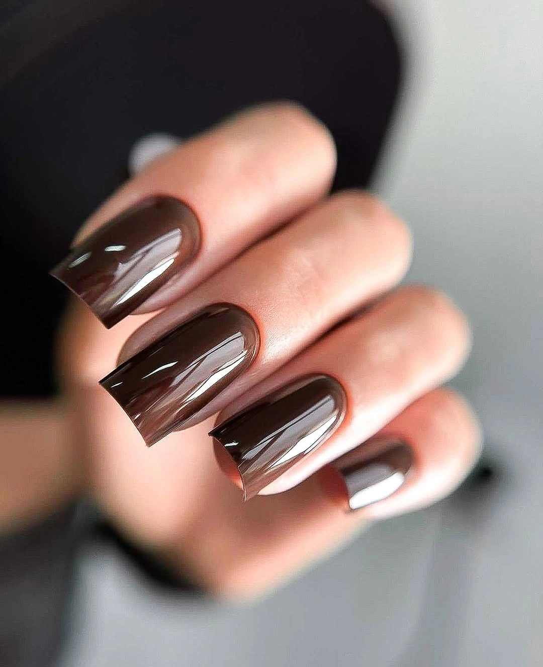
Soft surroundings keep the hand from feeling harsh, while the long straight tips give the color a clear architectural frame. There is no art to compete with the silhouette, so the manicure reads as a study in reflection, proportion, and restraint. A shorter square would keep the same chocolate direction for someone who wants a darker neutral without the full visual weight of long corners.
The longer edge is the practical limit, not the brown itself. A plain glossy surface is easy to coordinate and refresh, but it shows chips against the dark field and makes the corners more noticeable during daily use. Shift toward cocoa or espresso if you want a warmer version, and let the shape remain the only strong line.
Forest Green Framed With Gold-Like Edges
Forest green becomes more refined when thin gold-looking lines sit near the edges of the short rounded-square nails. The dark green remains the dominant surface, while the narrow border follows the shape and gives the eye a small reflective route around each nail. Nothing is filled in with a second pattern, so the frame creates detail without losing the depth of the base.
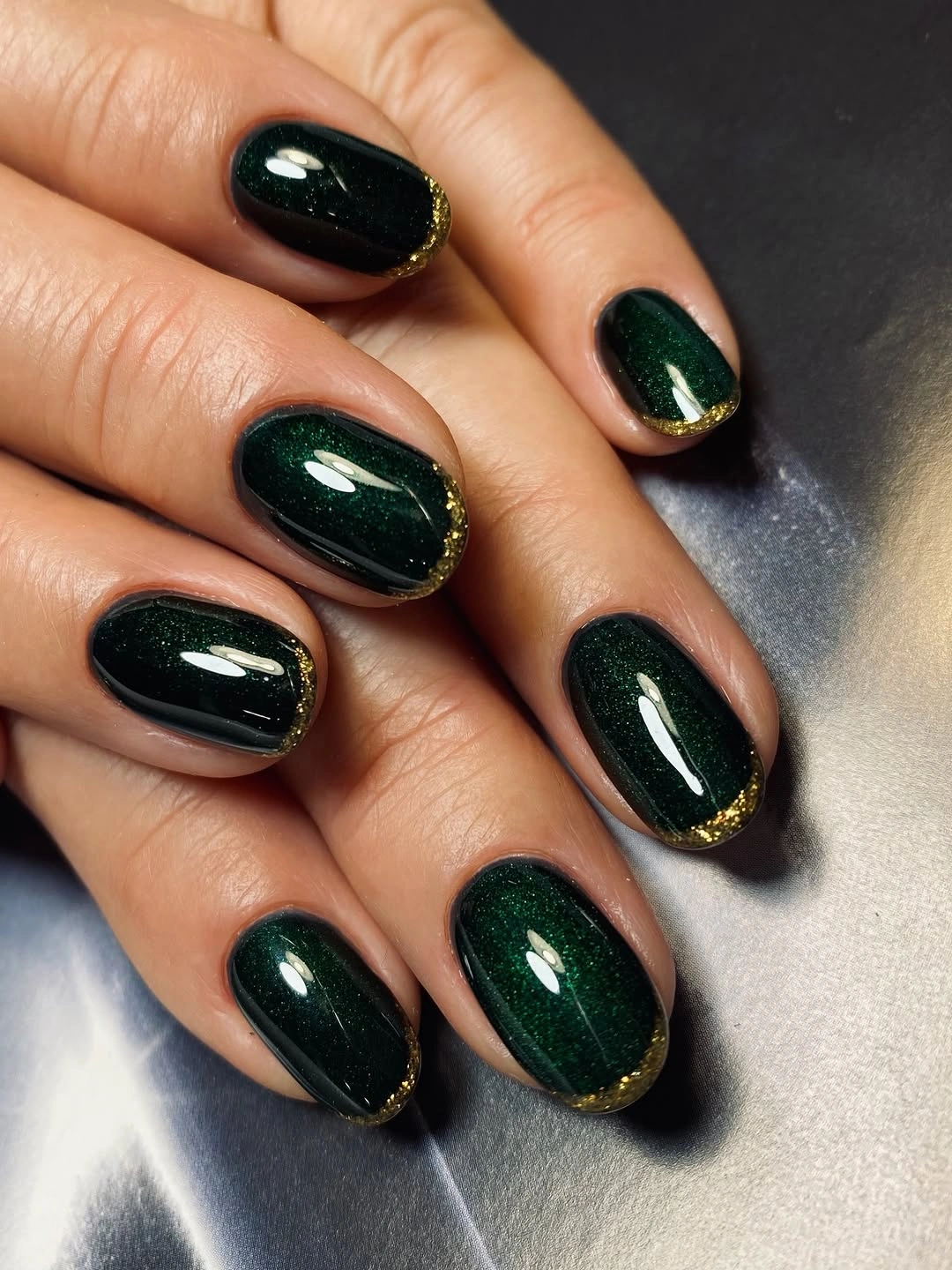
A metallic background echoes the reflective quality, but the manicure itself stays focused because the border is so restrained. Short length keeps the green and edge work close to the hand, which makes the set feel polished rather than elaborate. This is a good dark fall direction when you want a little jewelry-like light but still want most of the nail to remain dark and open.
Fine border work can reveal unevenness as the nail grows or the tip wears, so a simpler version could place the line on one accent nail only. You could also replace the gold-like edge with a muted tan or pale green line. Keep the border narrow and the forest base uninterrupted; the contrast works because it is controlled.
Emerald Green Without Extra Decoration
Emerald green replaces black in the tenth image while keeping the same disciplined structure: short rounded-square nails, one saturated shade, and a high-gloss surface. The color is dark enough to hold a moody atmosphere but clearer in its green identity where the reflections catch. With no art or accent nail, the entire manicure depends on the relationship between jewel tone, compact shape, and shine.
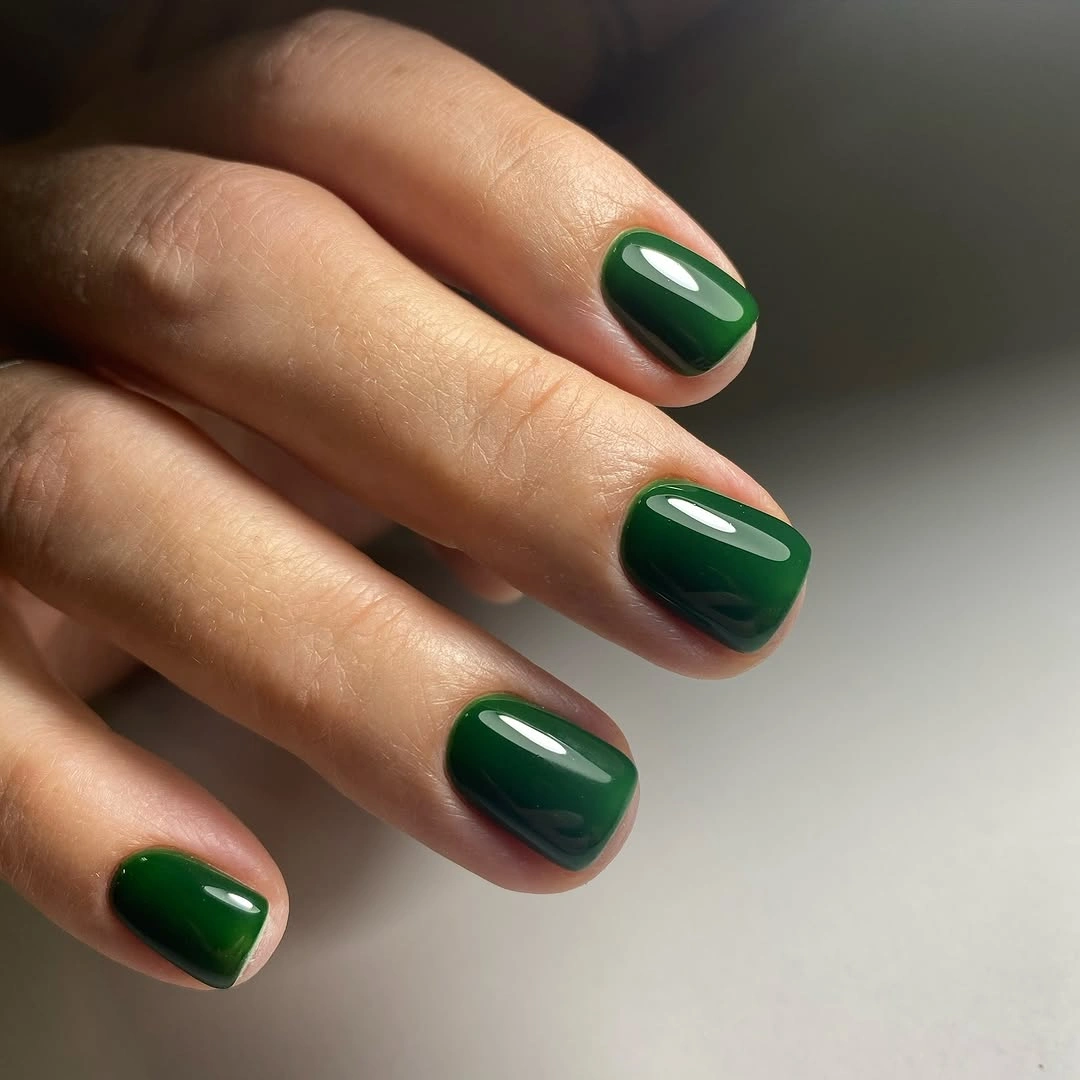
The neutral background lets the green remain concentrated, and the short corners keep the jewel color from becoming too formal. Gloss gives the surface a clean vertical highlight, which adds a little motion without introducing glitter. Choose this direction when you want dark fall nails that have depth but still look distinct from the many black and brown options in the season.
Edge wear will show because the surface is both dark and reflective, yet the lack of artwork keeps maintenance simple. Move toward pine or blue-green if you want the shade to feel cooler, or use the emerald on two accent nails with charcoal companions. The strongest edit preserves one uninterrupted green field.
One Spotted Accent Inside Deep Green
Deep green and one pale spotted accent create the eleventh manicure’s tension. Most of the nails are long and tapered in a dark teal-green, while a visible light nail carries irregular dark spots with a thin warm outline. The pale accent changes the rhythm sharply, but because it appears selectively, the green remains the collection’s main visual weight.
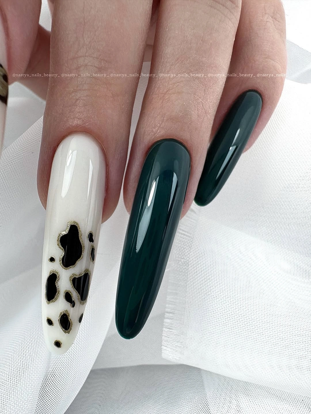
White fabric helps the light nail read clearly and makes the dark companions look even deeper. The contrast works because the pattern has a defined place rather than spreading across the whole hand, and the long outline gives the accent enough space to be seen. For a more practical version, keep the green on a shorter almond and reserve the spotted idea for one nail.
The exact motif is less important than the placement, especially at this resolution. A taupe or warm beige base would soften the pale accent without losing the dark contrast, while fewer spots would make grow-out easier to ignore. The useful decision is to keep one counterpoint and let the rest of the hand stay quiet.
Black-On-Black Lace-Like Texture
Fine dark texture gives the twelfth manicure depth without changing its black palette. The long square nails remain glossy, but selected surfaces carry gray patterned detail that looks mesh-like or lace-like beneath the reflections. Because the contrast stays close in value, the pattern appears gradually as the hand moves instead of announcing itself in a bright accent color.
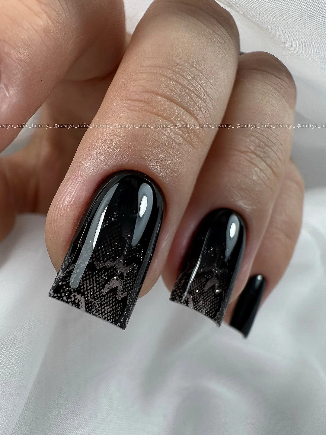
White fabric increases the visibility of the fine pattern, yet the dark surfaces remain the dominant impression. Long square tips make the design feel graphic, while the tone-on-tone approach keeps it more restrained than a pale print would be. If you prefer less drama, place the textured surface on two accents and leave the companion nails glossy black.
Fine pattern can lose clarity near the edge or as it grows out, so spacing matters more than adding density. A shorter square would reduce the silhouette while preserving the black-on-black idea. Avoid forcing a literal label onto the texture; its value is the relief and quiet contrast it brings to an otherwise deep field.
Short Black Softened by Cream Knitwear
Another black manicure appears here, but the surrounding cream knit changes its balance. The nails are short and rounded-square, evenly coated in glossy black with broad white reflections that make the surface look smooth and deliberate. The hand stays compact, so the dark color feels close and wearable rather than stretched into a dramatic point.
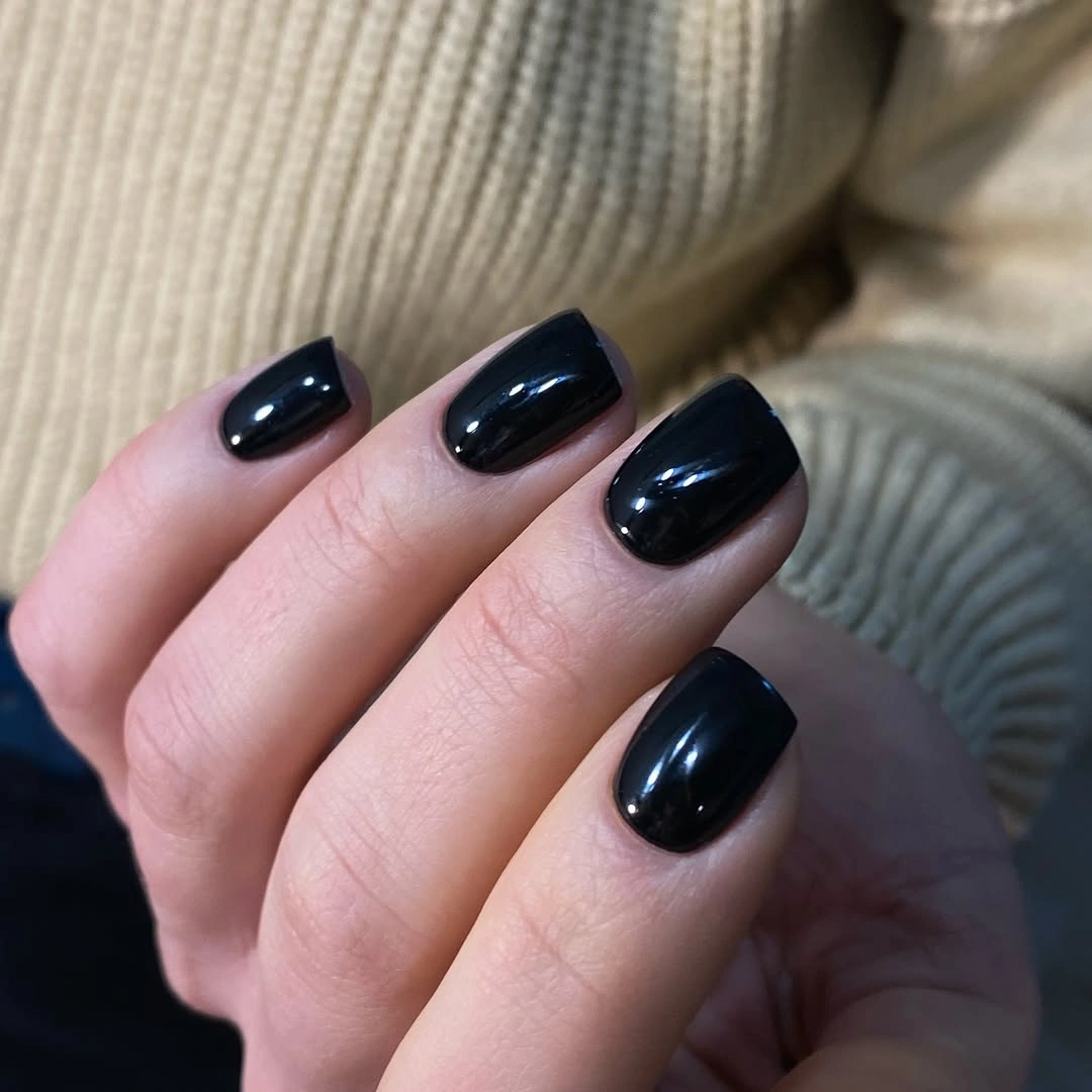
The light knit supplies softness around the dark manicure and shows how styling can change the emotional temperature of a plain color. Rounded corners keep the silhouette approachable, while the gloss adds enough light that the black does not disappear into the sleeve. This pairing works well for layered fall clothing because the contrast is strong but not dependent on a decorative nail motif.
Chips will still show against black, especially where the light reflection makes the edge easy to inspect. The absence of art keeps the repair uncomplicated, and a short squoval can make the shape even easier for daily use. Keep the cream or oatmeal surroundings if you want the black to feel less severe without changing the manicure itself.
Cobalt Blue With One Pale Counterpoint
Cobalt blue brings a sharp color break to the fourteenth set, and one pale nail interrupts the long square rhythm. Most of the visible nails are vivid blue with squared tips, while a lighter translucent-looking nail sits among them as a quiet counterpoint. The manicure stays simple because the contrast comes from one change of value rather than a full pattern.
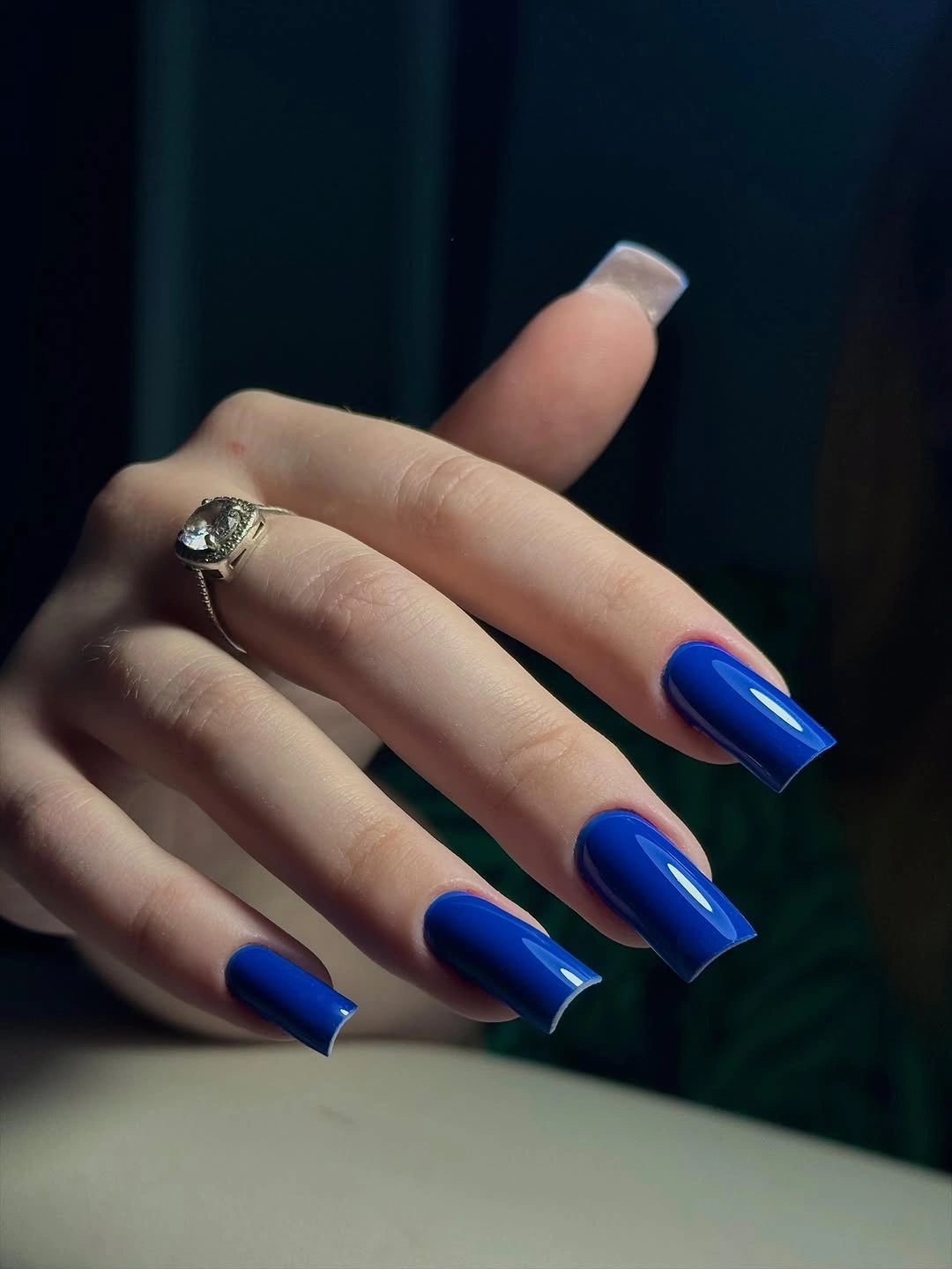
Dark studio lighting makes the blue look intense and turns the pale nail into a clear focal shift. The long square shape supplies enough structure for the color contrast to read, but it also adds the main wearability question. A shorter square with the same blue and one pale accent would preserve the composition while reducing the amount of length in the frame.
Keep the pale accent in one place if you want the set to feel graphic, or repeat it on a second nail for more balance. Because there is no line work, color replacement is easy: ink blue, deep teal, or slate would all keep the same structure. Let the counterpoint remain pale and simple so it does not turn into a separate motif.
Medium Burgundy With a Soft Almond Line
Medium almond burgundy offers a quieter kind of darkness than the pointed set earlier. The nails are deep wine and glossy, with a smooth curved reflection that travels along the oval edge and keeps the color luminous. No decoration is visible, so the softened almond silhouette does the work of making the dark shade feel fluid rather than blocky.
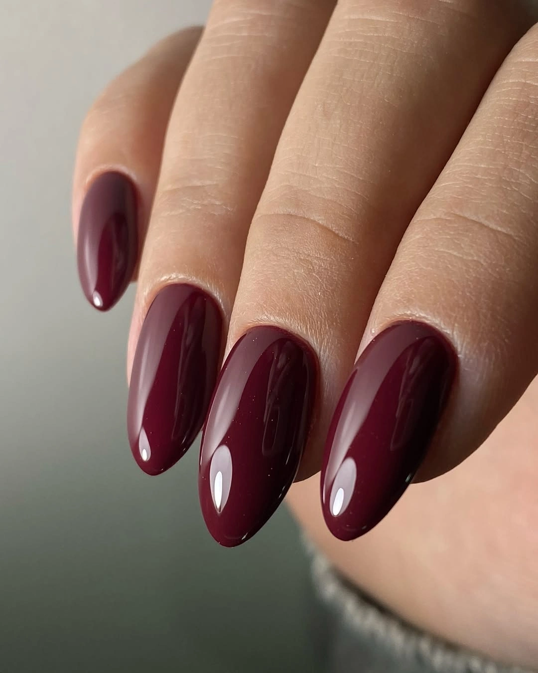
A neutral background keeps the wine color focused, and the moderate length gives it enough presence without turning the tip into the entire story. This is the sort of dark fall nail that can move between casual clothing and a more dressed-up setting because it has depth but not excessive detail. Plum or cherry-brown would shift the temperature while preserving the same calm structure.
The glossy surface shows tip wear clearly, but a plain burgundy manicure is easy to refresh and does not require matching a motif as it grows out. If you prefer less length, keep the almond curve and shorten the free edge instead of changing to a completely round shape. The color remains strongest when the surface is smooth and uninterrupted.
Pointed Black Under Low Light
Low side lighting turns the sixteenth manicure into a study of pointed black shape. The nails are long and narrow, with glossy highlights tracing the tips and centers while the rest of the hand falls into shadow. The surface carries no artwork, so the silhouette, pose, and contrast between black and gray clothing create the entire atmosphere.
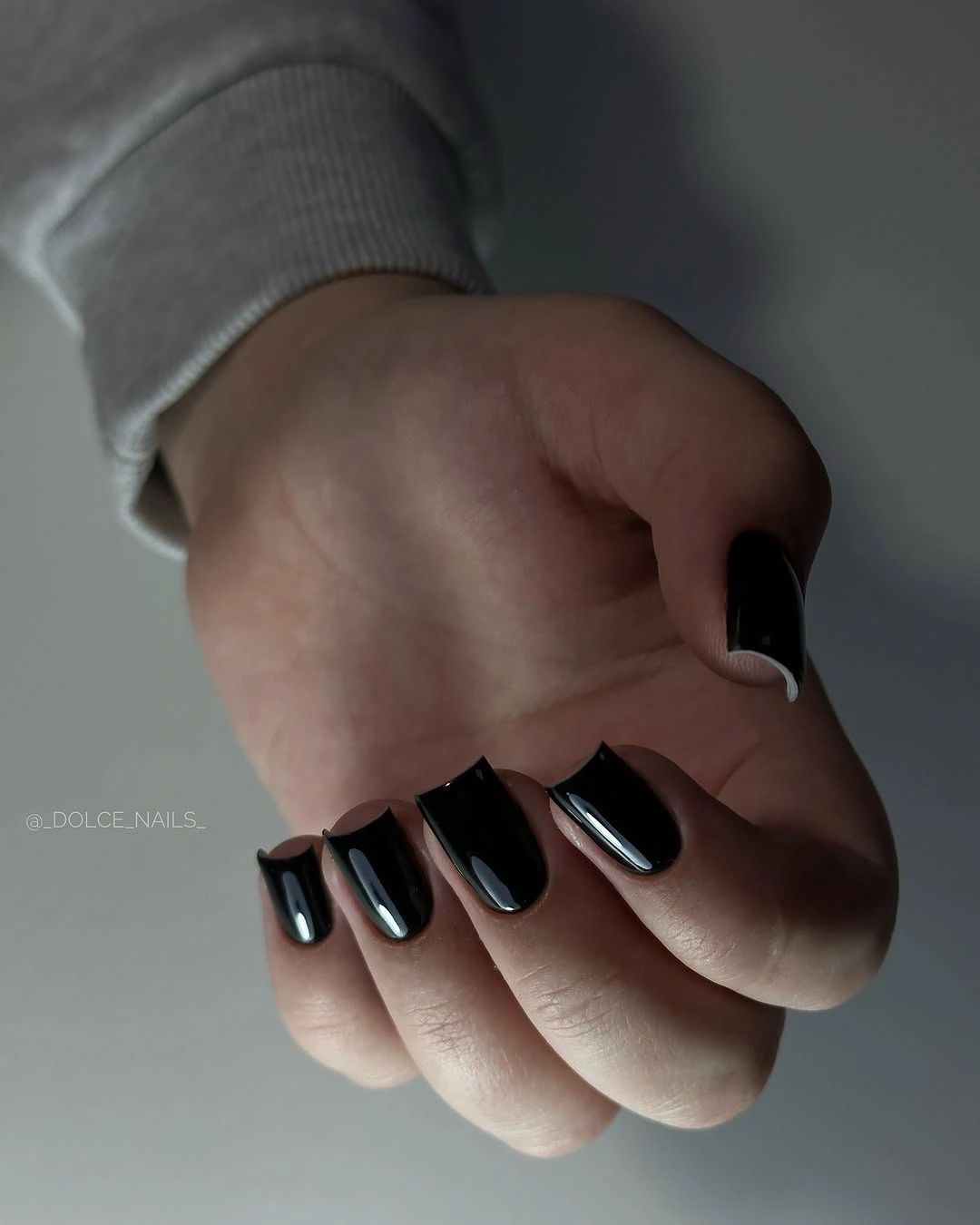
The dim setting does not hide the form; it makes the narrow outline more legible because every bright reflection marks the curve. That is why the plain color feels sculptural rather than empty. If you want to borrow the direction for a normal day, use medium almond or a shorter point and keep the same black base with a single clean reflection.
Extreme length is again the practical limitation, especially when the tip is sharp enough to become the first thing the hand communicates. A gray-black or deep charcoal version can soften the contrast, but additional art would only make the shape busier. Let the lighting and silhouette remain the statement.
Nude Almond With Concentrated Leopard-Like Accents
Soft nude nails make room for the seventeenth manicure’s spotted accents. Most of the medium almond surfaces are pale and quiet, while selected nails carry irregular dark marks with warm metallic-looking flashes. The pattern is concentrated rather than spread across every nail, so the set has a clear focal area and enough neutral space around it.
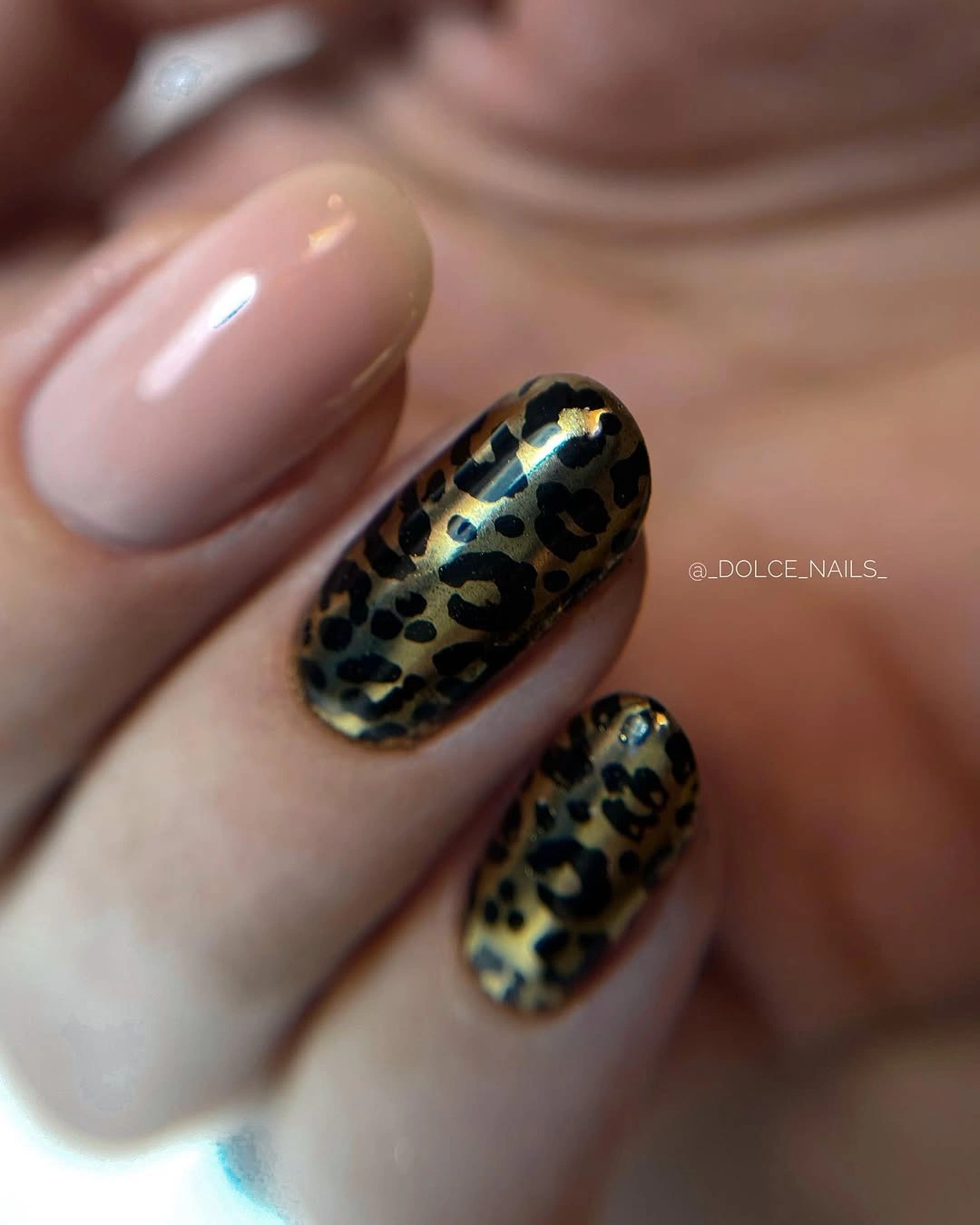
The blurred warm background keeps the palette cohesive, and the medium almond shape gives the accents space without making them feel oversized. A nude base is useful here because it warms the black and brown marks and keeps the contrast more wearable than a stark white would. Use one spotted accent if you want the print to become a small detail instead of the main event.
Do not rely on the exact label of the print; what matters is the irregular spacing, the dark contrast, and the placement on selected nails. Metallic-looking marks may need more care near the edge, while the nude companions are simple to refresh. Keep the base pale and let the accents remain concentrated so the balance does not disappear.
Black Texture With Pale Mesh Accents
The eighteenth manicure uses short rounded-square nails to hold a dark, textured-looking design. Most surfaces are black or charcoal, while two visible nails carry pale grid-like or mesh-like lines that interrupt the deep field. The contrast is stronger than the black-on-black idea, but the compact shape keeps the pattern from becoming too much for the hand.
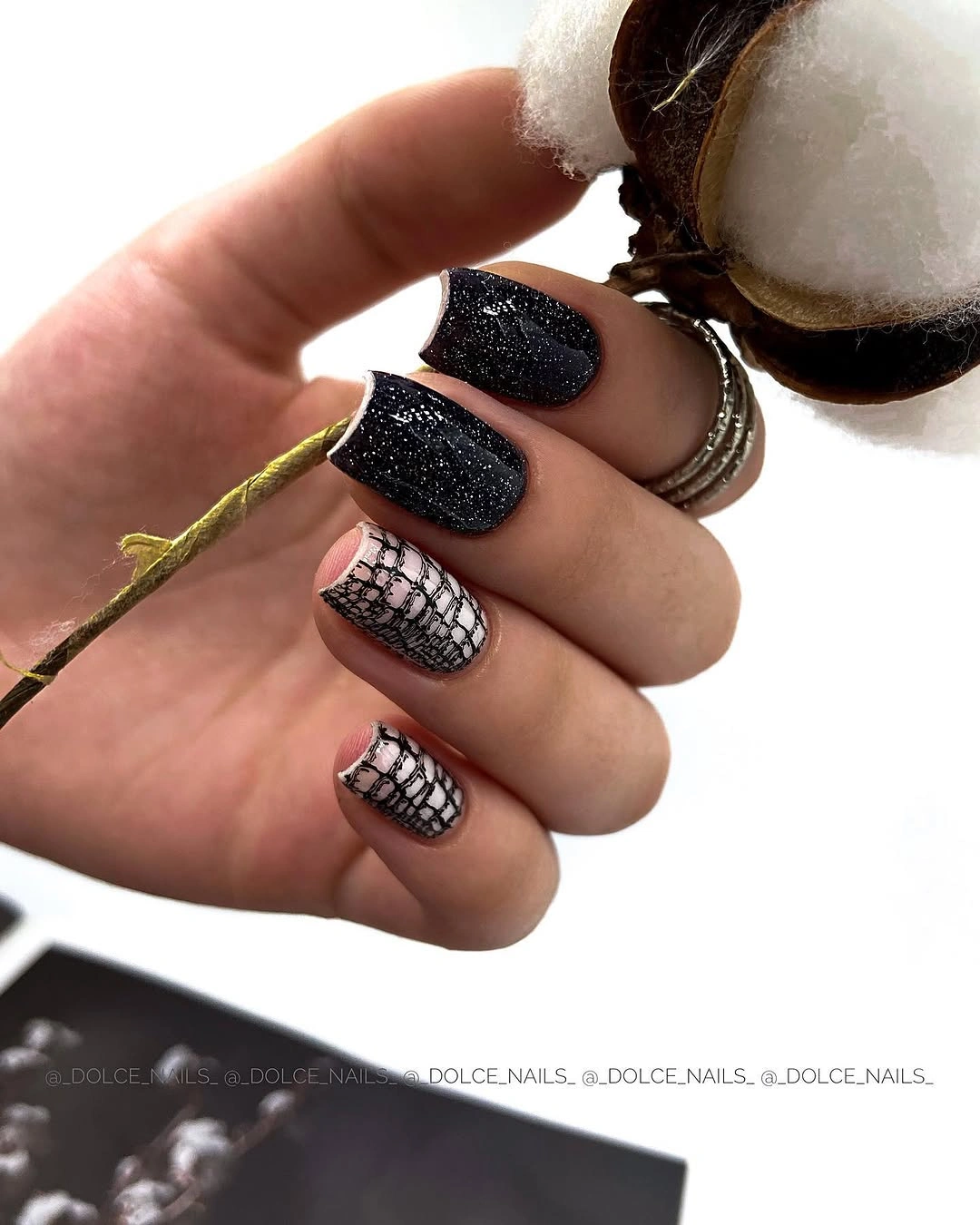
A pale object near the hand adds a light frame, while the dark background keeps the manicure moody. The line work creates a clear rhythm because it is reserved for selected nails, and the short length makes the contrast feel more wearable than the same pattern on a very long tip. A charcoal-and-gray palette could soften the effect without changing the placement strategy.
Fine lines need enough space to stay distinct, especially as the nail grows or the tip catches wear. Use one accent nail with a few broad intersecting curves if the full grid feels demanding. The design remains strongest when the dark companions are allowed to stay plain and the pale marks do not spread everywhere.
Abstract Gray Patches on Black Almonds
Soft gray patches give the nineteenth manicure a cloudy, abstract surface without committing to a literal print. The medium almond nails are black, glossy, and marked with irregular gray areas that look blurred or reflective rather than sharply outlined. Because the patches remain within the dark palette, the result feels dimensional but still controlled.
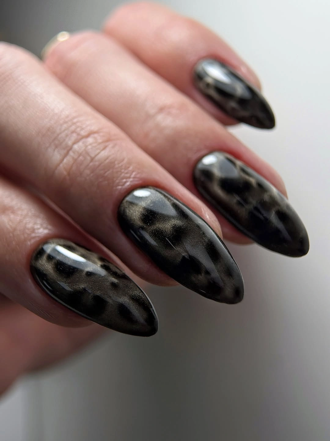
A pale background makes the curved almond tips visible and helps the gray areas separate from the black. The abstract quality is useful because it does not depend on exact symmetry; each patch can shift slightly while the overall balance remains moody. If you want a more wearable version, place the gray texture on two accent nails and leave the rest solid black.
The medium almond shape gives the patches enough room, but a shorter rounded almond can keep the same movement with less length. Avoid adding a fixed name to the effect when the visible evidence supports only irregular gray texture. The key is the soft contrast and the open black surface around it.
One Bright Accent Against Quiet Black
One concentrated metallic-looking accent changes the twentieth black manicure without disturbing its compact structure. Most nails are short and black, while one visible nail carries a dense silver-gold decoration that catches the light beside the plain companions. The dark base establishes continuity, and the single bright nail becomes the focal point by contrast alone.
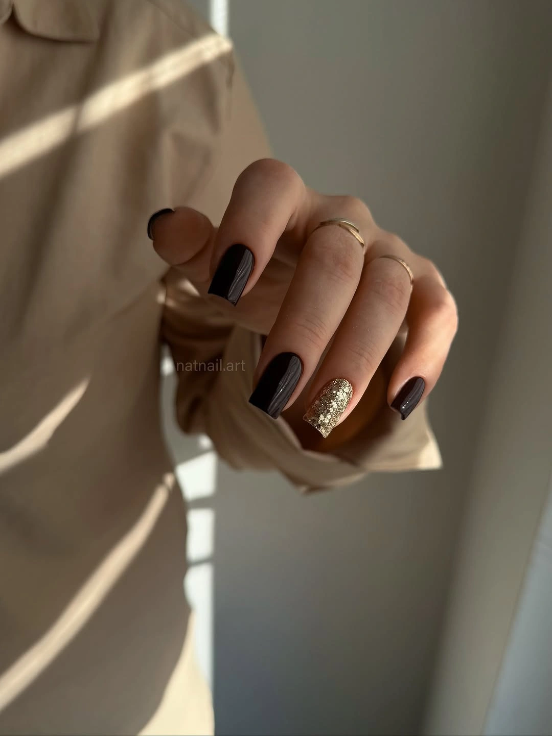
Warm clothing and soft light make the accent feel suitable for an evening setting, but the composition is practical enough to edit. One decorated nail gives the hand a point of interest without forcing every surface to match, and the short rounded-square outline keeps the color close to the hand. If dense detail feels too ornate, replace it with one metallic curve or a narrow bright line.
Concentrated reflective detail can catch on fabric or show uneven edges as the nail grows, so the accent deserves more attention than the black companions. The plain nails are easy to refresh and keep the whole set visually calm. Preserve the one-to-many relationship: one bright counterpoint, several quiet dark nails.
Espresso Brown in Near-Black Light
Near-black espresso gives the twenty-first manicure its depth, but the brown undertone becomes visible where light reaches the rounded-square surfaces. The nails are medium length, glossy, and solid, with no art competing with the warm darkness. Dotted translucent fabric around the hand adds softness without changing the manicure’s restrained structure.
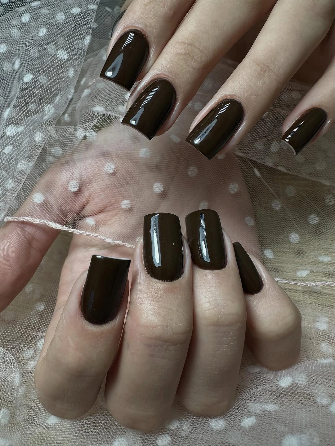
The softened square edge keeps the near-black color from becoming as severe as a long straight tip, while the sheer fabric adds a quiet layer of light around it. This is a useful middle ground for readers deciding between true black and brown: the mood stays deep, but the warmth appears when the hand moves. Pairing it with cream, tan, or muted denim would reveal that undertone more clearly.
Because the base is dark and glossy, chips still show, although the simple surface makes a refresh uncomplicated. A shorter squoval can reduce the functional demand without changing the color relationship. Let the brown remain slightly uncertain and atmospheric rather than forcing it into a precise shade label.
Charcoal With Small Orange Curves
Charcoal gray and vivid orange create the collection’s most direct warm counterpoint. The short rounded-square nails stay dark and muted, while two visible accents carry bright curved marks near the tips that read as flame-like without needing a fixed label. The orange is concentrated, so it warms the set without turning the whole hand into a bright manicure.
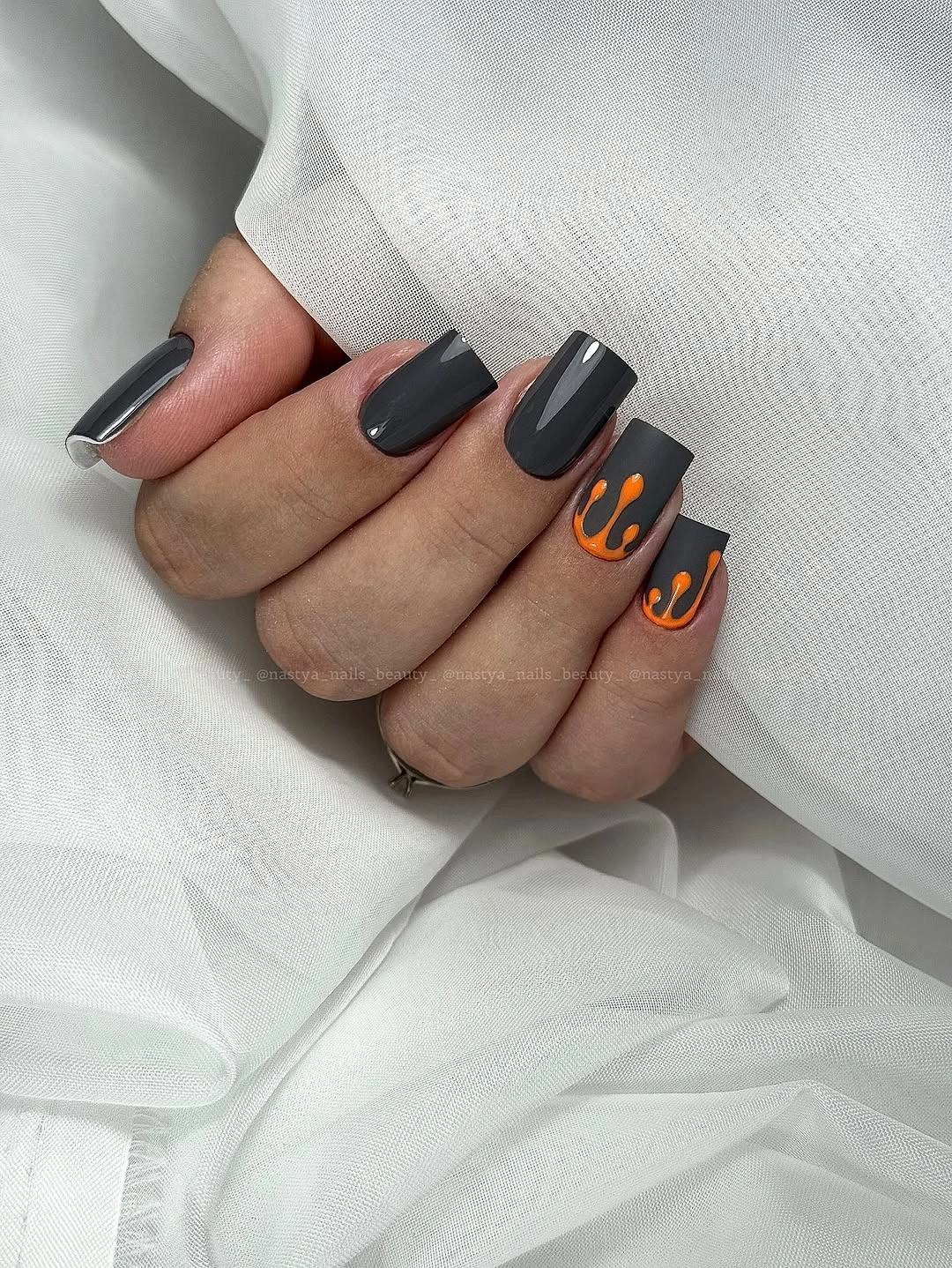
White fabric gives the dark base room and makes the orange details easy to follow. Short length keeps the graphic marks compact, and the rounded corners prevent the contrast from looking too sharp. For a more subdued fall direction, replace the orange with rust or copper, or keep the bright color on one accent nail and leave the companions plain charcoal.
The curved marks are the part that needs the most visual control because a small shift near the edge changes the whole balance. A simple orange arc can preserve the idea without recreating every detail, and the plain charcoal nails remain easy to maintain. The contrast works best when the warm mark stays small and the dark base remains dominant.
Black With Pale Repeated-Pattern Accents
The final set returns to black but adds two pale accents covered in dense repeated marks. Most nails are short and rounded-square, glossy black, while the pale nails carry a dark scale-like or dotted pattern that reverses the collection’s usual dark-field hierarchy. Rings and a dark sleeve reinforce the palette, but the manicure remains readable because the pattern is limited to a couple of nails.
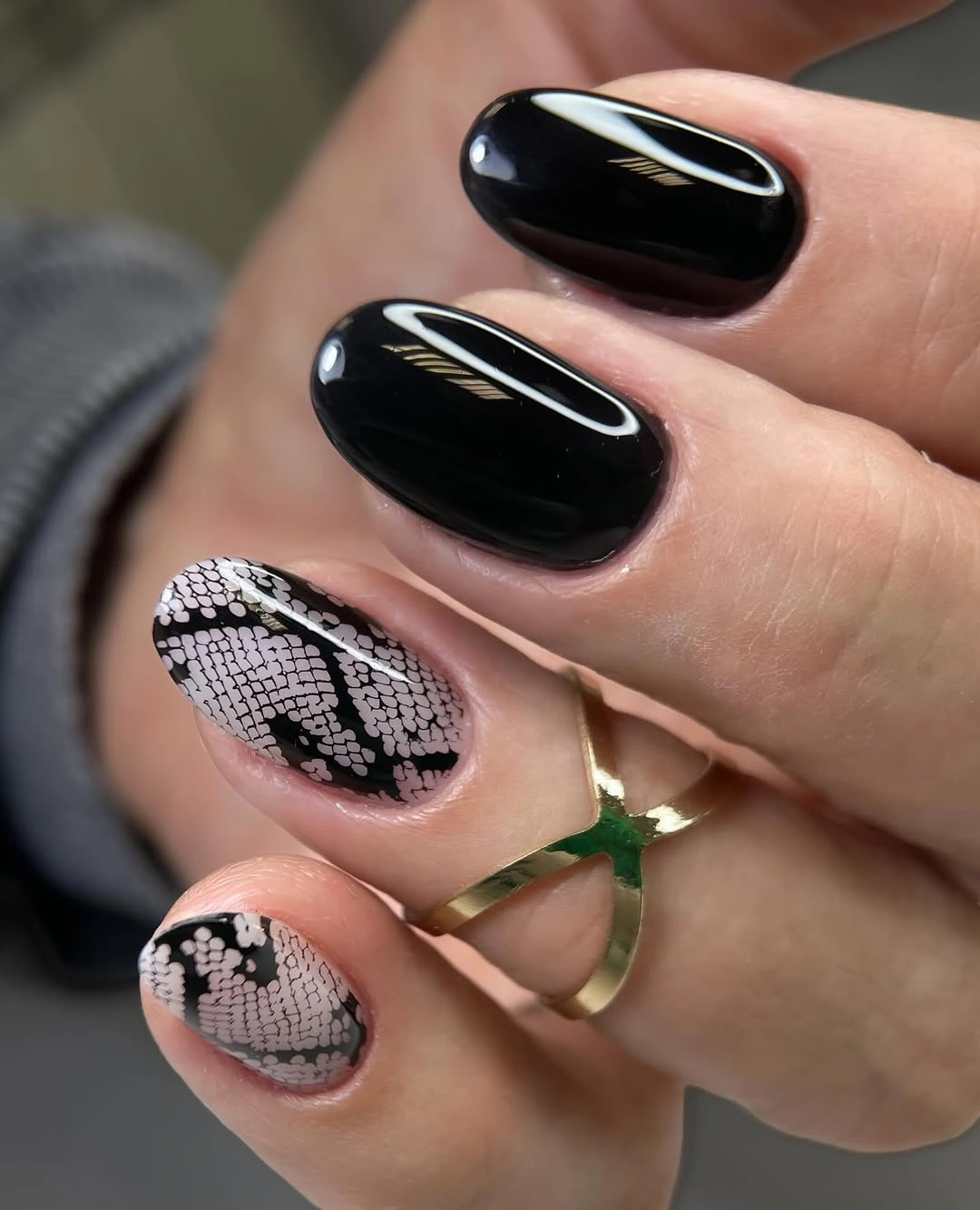
The pale accents create the strongest value contrast in the group, yet the short shape keeps the effect contained. Repetition gives the pattern its identity, while the black companions provide relief and make the detailed nails feel intentional rather than randomly inserted. If you want less intensity, use one pale accent and reduce the repeated marks to a few scattered dots.
Small repeated details can demand careful upkeep, especially near the tip where the pattern may lose its rhythm first. A plain black companion set is easy to refresh, so the practical edit is to simplify the pale nail rather than change the entire palette. The collection ends with darkness still in control, but one lighter counterpoint keeps it readable.